How to run 1,000 miles in a year

Everything I read about “how I ran 1,000 miles!” didn’t actually explain how to run 1,000 miles. Or it did, but not in terms I could understand.

For context, I’m a slow runner. REALLY slow. My fast days (12-13 minute miles) are most people’s super slow days. More often, I’m a 14-15 minute per mile runner. And I historically haven’t run very much. Most years I ran ~60 miles. My biggest running year was the year I ran my first marathon (2013), when I accomplished 356 miles. Since then, I’ve never gone much above 200 on a really good year. It didn’t help that I broke my ankle in January of 2019 – or maybe it did, because it made me determined to learn how to walk and run again, and use running to help me regain and improve my overall biomechanics. So I decided to run a second marathon in 2020, which was canceled from the pandemic, and 2021 became the year of the second marathon. It was scheduled for July 2021, and my goal was 400 miles for the year IF I was successfully training for the marathon, and back to a “stretch” goal of 200 miles if I didn’t end up training (because of injury or other reasons like the pandemic).

But I set out, managed 400 and even 600 miles by the end of July when I ran the full marathon. And because my training had gone well (more below with the “how to”), I decided to also continue training and tackle a 50k (31 mile) ultramarathon at the end of September. From there, I thought I’d be stuck around 800 miles but then I decided with effort that I could make 1,000 miles. And I did. Here’s how it happened:

My activity tracker after it hit 1000 miles of running

Baby steps, a focus on process, and a heck of a spreadsheet. Or as they say in answer to “how do you eat an elephant?”, “one bite at a time”, ergo, one run at a time.

I focused on building consistency first, and at a weekly level. My goal was 3 runs per week, which I had never consistently managed to do before. That started as Monday, Wednesday, Friday, with a rest day in between each run. After a few months, I was able to add a 4th run to my week, which was often Saturday. This was my first time running back to back days, and so I started with my 4th run being only one mile for a few weeks, then increased it to two miles, then up to 3 miles. My other three runs consisted of one “long” run and two other short, 3ish mile runs.

The focus on consistency at a weekly level is what enabled me to run 1,000 miles in a year. Even 400 miles felt like too much for me to tackle. But 3 (then 4) runs a week? I could focus on that.

The spreadsheet helped. I had the number of miles for each run laid out. After I completed the run (using Runkeeper tracking on my phone so I knew how far I’d gone), I would hop on my spreadsheet (using Google sheets so it could be on my laptop or on my phone), and log the miles. I found just recording in Runkeeper wasn’t a good enough psychological anchor, I wanted to “write down” the run in some way. The other thing I did was put checkboxes for the number of runs per week into my spreadsheet, too (did you know you can do that? Awesome Google Sheets feature.) So it was satisfying to open my sheet and first, check the box that I had done one of my weekly runs. Then, I entered the miles for the run. I had put in conditional formatting to check for how many miles I was “supposed” to run for that run, so that if I was within a half mile or over the run distance, it turned bright green. Another nice feedback mechanism. If I was off by more than half a mile, it was a lighter green. But regardless, it turned a nice color and emphasized that I had been putting in some miles. And, I also had a formula set to calculate the weekly total, so after each run I could see my weekly total progress. (Again, all of this is automatically done in Runkeeper or Strava, but you have to go to a different screen to see it and it’s not as satisfying to be able to track inputs against multiple outputs such as weekly, monthly, and overall totals at a glance, which is how I designed my spreadsheet).

I added a miniature chart to visualize weekly mileage throughout the year, and also a chart with a monthly view. All of these made it easier to “see” progress toward the big mileage goals.

If you’re a well-established runner, that might sound silly. But if you’re trying to build up to consistent running…find a feedback mechanism or a series of logging mechanisms (maybe it’s a bullet journal, or a handwritten chart or log, or moving marbles from one jar to another) that you can do to help cement and anchor the completion of a run. Especially when running feels hard and terrible, it’s nice to find something positive and constructive to do at the end of the run to feel like you’re still moving forward toward your goal, even when it’s hard-earned progress.

The ‘baby steps’ I took to build up to 1,000 miles literally started from baby steps: my first run was only 5 steps of running. After I broke my ankle, it was a huge effort to return to weight-bearing and walking. Running was also a huge hurdle. I started with literally running 5 steps…and stopping. Calling that a success, and going home and logging it on my sheet with a checkbox of “done!”. The second time I went, I did 5 steps, walked a while, then did a second 5 steps. Then I stopped, went home, checked the box, etc. I focused on what the smallest running I could do successfully without pain or stress, built up a series of intervals. Once I had 10 intervals strung together, I expanded my intervals of running. 10 seconds, 20 seconds, 30 seconds, etc. That took months, and that was ok. The point I focused on was the attempt: go out and “run”, with the smallest measurable interval counting as success, and not worrying about or really even focusing on overall mileage. In part, because the amounts were SO small (0.07 miles, 0.12 miles, etc – nothing to write home about). Most people who talk about starting running focus on “30 minutes” or “1 mile” or “5k” which felt so far beyond my reach coming off of the broken ankle.

So take it from me (or really, don’t listen to anyone else, including me): focus on YOUR achievable interval of running (even if it’s measured in a handful of steps), do that, call it a win, and repeat it. Over and over. You’ll find you build some strength and endurance and improve your biomechanics over time, even with baby steps and small intervals of running. The consistency and repeated efforts are what add up.

It’s ok if you find a distance or time interval that you can’t go past – maybe it’s 15 seconds or 30 seconds (or more or less) of consecutive running that’s your sweet spot. Great, stick with it. Run that interval, then walk, then run again. There’s no wrong answer for what’s the best length of interval for you. I had a bunch of foot issues pop up when I was trying to lengthen my intervals, and it turns out 30 seconds of running is my sweet spot. I can run longer (now) but I still prefer 30 seconds because psychologically and physically that feels best, whether I’m running faster or slower. So I do most of my runs with a run of 30 seconds, then walking whatever intervals I want for that run, e.g. 30:30 (run 30 seconds, walk 30 seconds), or 30:60 (run 30 seconds, walk 60 seconds), etc.

Don’t believe it’s possible to do long distances that way? I did it for my 50k ultramarathon. In my July marathon I ran 60 seconds and walked 30 seconds. I achieved my time goal but it was hard and less fun during the race. For my ultramarathon two months later, my goal was to just finish before the time limit and to have more fun than I did during the marathon. I used 30 second run, 60 second walk intervals for the ultramarathon, and it was fantastic. I beat my time goal (finishing hours before the cutoff), and felt awesome throughout and at the end of the 50k. I even passed people at the end!

Remember, there are no rules in running, other than the ones you make for yourself. But don’t listen to rules you read on the internet and feel bad because you can’t do what other people do. Do what you can, repeat it, build up safely, and if you’re having fun you’ll be more likely to continue. And like my running 1,000 miles in a year, you may find yourself reaching goals that you never would have thought were possible!

Risk calculation in pandemic and post-pandemic era for assessing travel opportunities

As someone who’s frequently been asked to travel and give talks over the last decade or so, I’ve had an evolving calculation to determine when a trip is “worth” it. This includes assessing financial cost to me (whether accommodations and travel are paid for; whether my time being paid for or not); opportunity cost (if I do this trip, what can’t I do that I would be doing otherwise); relationship and family cost (time away from family); as well as wellness cost (such as jet lag and physical demands of travel during and after a trip).

It’s clearly not a straightforward calculation and it has changed over time. Some things can influence this calculation – for example, if someone is willing to pay for my time and indicate that they value my presence by doing so, I may factor that in as a higher signal of whether this trip might be “worth” it, among the other variables. (And I’ve written previously about all the reasons why people, including patients, should be paid for their time in giving talks and traveling for conferences, meetings, and events, and I still believe this. However, there *are* exceptions that I personally am willing to make regarding payment for my time, but those are unique to me, my situation, my choices, the type of organization or meeting, etc. and I make these exceptions on a case by case basis.)

The pandemic also changed this calculation by adding new variables.

After February 2020, I did not complete any travel for work (including giving talks, attending conferences, etc.) for the rest of the year or in 2021. I was an early voice for interventions for COVID-19 beginning in February 2020, in part because of the risk to the community around me as well as to the risk to myself as someone who has type 1 diabetes. I received a few in-person speaking invitations that I turned down directly, or encouraged them to evolve into virtual events so that I and others could participate safely.

Now, though, it’s becoming clear (sadly) that COVID-19 will be endemic, and although I am not ready to go back to in-person events, many people are, and conferences are increasingly returning and planning to return to in-person physical events moving forward.

And as a result, I see and experience a mismatch in risk tolerance and risk calculations among different groups of people.

For some people, the risk calculation is as simple as considering, “am I fully vaccinated? Then I’m good to go and attend any events and follow whatever regulation or lack of regulation exists for that conference.

For other people, it is a more complex risk calculation. It may take into account whether they are someone with a condition or chronic illness that puts them at higher risk for severe outcomes, even with COVID-19 vaccination. It may take into account a loved one or family situation where someone close to them is at higher risk. It may take into account that there are different rates of COVID-19 cases, and different rates of vaccination, at their home location compared to the conference location. It may take into account the risk of disruption to their lives if they were to acquire COVID-19 during travel or at the conference and be forced to remain in a different city or country, sick and alone, until they were cleared to travel. That also includes the financial disruption of paying for lodging, changed travel plans, as well as any disruption to home life where childcare or other plans were upended at home while the person was stuck elsewhere.

It is, therefore, much more complicated than “am I vaccinated?” and “does the conference have a protocol?”.

There’s no straightforward answer; there may not be the same answer for everyone in the same situation. Therefore people are also likely to have different risk calculations to make and may arrive at a different decision than you might want them to make.

I hope we can all expand our awareness and recognize that different people have different situations and that the COVID-19 pandemic – still – affects all of us very differently.

What I wanted to know when I started eating a low FODMAP diet, resources for a low FODMAP diet, and what to explain to family and friends about the FODMAP diet

As part of my pandemic “fun” (but fortunately not from COVID-19 infection, which I’ve avoided), I developed some gastrointestinal dysbiosis. Gastrointestinal dysbiosis generally means microbiome dysfunction of some kind, hypothetically caused by a loss of ‘good’ bacteria and getting out of balance with ‘bad’ bacteria. I don’t have a diagnosable disease such as IBS (that and many other things were ruled out through a variety of medical testing), but I definitely have some dysfunction going on causing varying levels of GI symptoms now for almost a year and a half. At their worst, I was waking up overnight suddenly with sharp abdominal pain out of the blue – scary! At their least annoying, it was excess gas and general abdominal discomfort after eating. It ebbed and flowed and did not seem to be traceable to any particular cause. After several months, I consulted a gastroenterologist and did an assortment of tests over the course of ~10 months, slowed down by the pandemic and my reluctance to do in-person clinical tests until I was fully vaccinated against COVID-19 (we checked for c-diff and inflammation among other blood tests, did a CT scan, and eventually did a colonoscopy and endoscopy). The test results all came back normal. Eventually, we decided on a treatment plan that involved an antibiotic to kill excess bacteria in my small intestines. That worked – for about two weeks – and then my symptoms returned. I needed another solution, and before I went back to my gastroenterologist to talk about more extreme options, I decided first to self-test a low FODMAP diet.

(As a note to those who don’t know – I have had type 1 diabetes for almost 19 years, and celiac disease for about 13 years. As a result, I’ve been 100% fastidiously gluten free for 13 years and already eating a gluten free diet. P.S. I’m not a doctor and nothing in this post or this blog is medical advice.)

Header image: What I wanted to know about starting a low FODMAP diet and how I explain low FODMAP to family and friends

What a low FODMAP diet means in simplified terms

FODMAP is an acronym for different groups of short-chain carbohydrates, or sugars, that can cause symptoms for some people when they eat them, because the small intestine absorbs them poorly. FODMAP stands for fermentable oligosaccharides, disaccharides, monosaccharides and polyols.

The FODMAP diet is often discussed in the context of IBS (one particular condition), but it can be used by people with a variety of gut dysbiosis issues, many of whom (like me) don’t necessarily have a diagnosable condition or disease.

One reason I decided to try a low FODMAP diet is because I had identified onion and garlic as potential food-related triggers or variables that correlated with some of the worst of my symptoms. I began attempting to eliminate onion and garlic (and then onion powder and garlic powder) from my diet from January 2021-May 2021. It helped, but I was still having varying levels of symptoms.

Generally, people who describe being on a low FODMAP diet are referring to the first step of a three-step or three-phase diet. The first step is eliminating the major sources of FODMAPs. Then, a careful re-introduction process takes place to “test” and see which of the groups of FODMAPs you react to, and in what amounts. With that knowledge, the third phase is then eating what you’re willing to eat based on your knowledge of what FODMAPs bother you and what you’re willing to tolerate symptom-wise.

What most people don’t realize at first is that the amount of FODMAP and type of FODMAP matter, in each of the phases.

For example, there are a lot of blog posts and lists that will describe things that are “low FODMAP”. And they are partially right, but they leave out specifications that if you eat too many of them, the FODMAP amount may be considered “high” (meaning likely to trigger symptoms). Additionally, you can eat multiple things with the same type of FODMAP and cause FODMAP stacking, meaning you cumulatively have too much of the group of FODMAP and can cause symptoms, even if you ate the “right” low FODMAP portion of each individual food. Sometimes eating the same group within a short period of time can cause stacking, and so spreading them out 3-4 hours apart (or longer) could help reduce the effect.

(P.S. If you are looking for a simplified explanation to share with family and friends, skip to the bottom of the post!)

Resources for getting started with low FODMAP diet and some pros and cons to each

There are many blogs out there that will describe FODMAPs and the process of FODMAP elimination pretty well. Many have short lists of examples of foods that are “high FODMAP” and to avoid. The challenge, as I mentioned, is that the amount of food matters and knowing the type of FODMAP it contains really helps. There are many “high FODMAP” foods that you can eat in small quantities, and it’s also possible that you can eat large quantities of “low FODMAP” foods and accidentally stack FODMAPS from the same group and cause symptoms. With this diet and process, knowledge is power (even though it is very annoying to have to read ingredient labels and super sleuth everything you eat…).

There are several lists or spreadsheets of low FODMAP foods. Here is one that I found that is freely available. It lists the ingredient, it’s “max use”, and has information about the FODMAP group. This is information pulled from the Monash app and may be out of date – same with many blog posts or online lists you might find, such as this one!

How I used many of these free lists and blog posts was to get a sense of “green” or “low FODMAP” foods. There are a few types of foods that are really “free” meaning you can eat as much as you want because they don’t contain any level of FODMAP, so they shouldn’t affect you regardless of the quantity you eat. I first made a list of these “free” foods (I’m probably pulling this “free” terminology from early-2000-era diabetes food terminology) that I actually like and want to eat. For example, for me, this was eggs, grits, carrots, baby corn, peanuts, most cheese, and popcorn. This is what I ate for the first handful of days while I was doing my research on what else would constitute a low FODMAP diet. It sounded and felt restrictive, but thankfully as I learned more I realized that I could eat a lot more things and a better diversity of things.

The next app/tool that helped was the Monash app. One caveat – it costs money. I waited a few weeks before I finally caved and paid $8 USD for it. The reason I finally decided to get it (vs using tools like that spreadsheet above and other places that have information from Monash available) is I wanted the quick visual glance the app has about whether the food is completely low FODMAP and ‘free’ to eat (e.g. carrots, eggs) or low FODMAP in certain portion sizes, or pretty much high FODMAP no matter what. Monash is a university in Australia that does most of the research and testing on FODMAPs in foods, so I decided paying for the app was a way to invest in the research that I’m clearly benefiting from.

Example from Monash's app showing different color orders
Example from Monash’s app showing different color orders

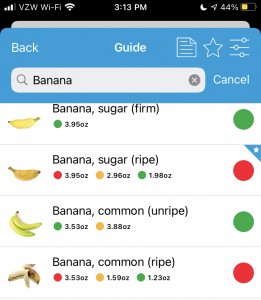
I do have some frustrations with the Monash app, though. It only includes foods that they’ve happened to measure…which is a good amount, but not as many as I’d like. It also confusingly sometimes lists the different serving sizes in opposite order. For example, there might be a “green” overall rating, with a certain portion size indicated in green but also showing the yellow/amber “moderate” amount portion size alongside the red “high” portion size, so you can see the difference. However, sometimes they list the portion size in opposite directions. This search for bananas is a good example – the color indicators on “Banana, sugar (ripe) goes red-amber-green; the color indicators on “Banana, common (unripe)” goes green-amber, and the color indicators on “Banana, common (ripe)” goes red-amber-green again.

Their rationale for this is that standard serving size and traffic light rating will always be the first traffic light so foods may start green and go red as serving sizes increase or start red and become green with smaller servings. However, it means as a user that you have to pay close attention to the order and serving sizes and it’s not the same across the app.

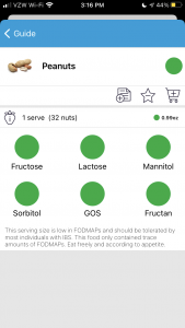
You also have to pay attention to the tiny, grey text at the bottom below the individual ratings. The text isn’t the same from item to item. For example, peanuts are marked as green, no other color rating. When you click to see the details, it shows a portion size of 32 nuts (0.99 ounce), and the text indicates the portion only contains trace amounts of FODMAPs and “eat freely according to appetite”. Same for carrots, so these are what would constitute a “free” food where you don’t have to worry about FODMAP stacking.

However, when you look at pecans, it also has a green overall rating. But the serving size is 10 pecan halves (0.71 ounce) and the grey text indicates that “Large servings (40 pecan halves or 100g/3.5oz) contains moderate amounts of the Oligos-fructans and intake should be limited.”

Example of Monash's app showing peanuts as the result
Example of Monash’s app showing peanuts as the result
Example of Monash's app showing pecans as the result
Example of Monash’s app showing pecans as the result
Example of Monash's app showing the search result with peanuts and pecans
Example of Monash’s app showing the search result with peanuts and pecans


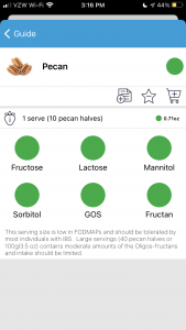
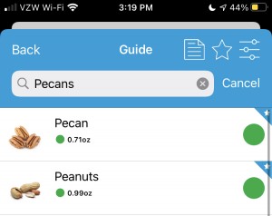
This means you can’t just eyeball the app and take the green overall traffic light rating, even if it just has a green overall rating and doesn’t have the additional lights (like under the bananas) indicating warnings about different portion sizes. The warnings about portion sizes may be hidden in the grey text that your brain doesn’t want to read because it assumes the text is always the same.

(The other thing I don’t love about the Monash app is that it’s language is very IBS focused. But there’s a lot of people using low FODMAP for non-IBS reasons, so you can mostly ignore that. It has other tools like a diary for symptoms and food intake and a re-introduction tracker for when you do re-challenges of FODMAPs.)

Another app resource is an app called “Spoonful”. It’s free: although you can pay something like $2.99 for a premium version, the free capabilities suit my purpose. You can scan a barcode or type and search for store-bought products, which is a great use case for me since I don’t cook a lot from scratch. It has different color coding (and you can limit your search to a color type) for whether a given food has low, moderate or high FODMAPs in one serving. It’s supposed to be dietitian-reviewed and approved. It’s good for gut-checking your interpretation of an ingredient label, but there’s a caveat that I’ve found several inconsistencies within the app (and already flagged and reported them). For example, I spotted a chip that was sour cream and onion and supposedly low (green rating) FODMAP *and* cited as officially certified as low FODMAP. Except…it has onion powder as a major ingredient and I am not sure it could be considered low FODMAP. (What I think happened is that Australia’s version of the company has a sour cream and chive chip that looks pretty similar and is certified low FODMAP, and they accidentally swapped them within the app.) I reported that one, and they were quick to fix it within days, so it  is now correctly marked as high FODMAP. In another search I did, milk and milk related products are flagged in one flavor of a food (e.g. an ice cream bar), but a slightly different flavor that’s still the same ice cream doesn’t have the milk ingredients flagged and has a completely different color rating as a result with those ingredients not flagged (in the same quantities). A third type of error I have found is that you can scan a barcode of a product, and the labeled ingredients listed in the app do not match the ingredients currently on the package – it’s pulling from a stored list of ingredients that could be outdated. So as a user, you have to eyeball and make sure the app listed ingredients matches the ingredients on the product in your hand, then compare any potential FODMAP-containing ingredients that are either flagged in the app or might be in your hand but not listed on the app, if those ingredient labels differ.

Hypothetically these are medium or small errors, but given the number of errors like that where they inconsistently flag ingredients across the same type of food item that result in variable color ratings, I would not rely just on their color rating and instead double check the ingredients yourself (including comparing them to the version you are holding in your hand). If you’re as sensitive to FODMAPs as I am, it’s worth double checking and thinking it through each time.

Additionally, the Spoonful app (as of August 2021) only supports one diet filter search at a time. Thankfully, I’ve had celiac forever and am comfortable knowing how to also determine if something is gluten free or not. So it’s not a big deal for me to “just” use the low FODMAP search to see what’s FODMAP-y or not, with the above caveats. But low FODMAP does not mean gluten free, even though some wheat-related items are high FODMAP, so do not use anything that’s low FODMAP as an indicator that it’s celiac-safe!

As another way of checking things out, it’s always helpful to google “Ingredient name FODMAP” or “Food name FODMAP” – often there are blog posts discussing the food type, or Reddit or similar forum posts discussing individuals’ experiences with that ingredient or food type.

However, one more important thing to keep in mind: it may be “low FODMAP” or “no FODMAP”, and it can still cause symptoms. Everyone is different, and that’s the point of needing to re-challenge each group to determine what groups bother you, and in what quantities. Additionally, some no-FODMAP foods or ingredients could be bothersome, and it has nothing to do with FODMAPs. For example, I noticed Crystal Light was bothering me last year and stopped drinking it. After I did the first phase of low FODMAP (the elimination phase) for a few weeks, I decided to test Crystal Light since it’s theoretically not containing FODMAP ingredients. However, it definitely caused symptoms that weren’t attributable to anything else, so it’s on my “don’t drink” list, just like onion soup would be, even though Crystal Light isn’t considered to have FODMAPs.

So how exactly do you do the different FODMAP diet phases?

Most everything I read online said the first phase, the elimination phase where you eat 100% low FODMAP, should be around 2-6 weeks. Another piece of data was that many dietitians recommend having 5-7 symptom-free days before starting food re-challenges (e.g. the second or next phase).

If you’re like me, you might get accidentally FODMAP’ed, as I call it, or experience FODMAP stacking by accident within your first few weeks as you work out the correct portion sizes of things and when to eat them. My rule of thumb was aiming for 2 weeks overall on the elimination/first phase, but also going for several days without symptoms so I had a “clean slate”, so to speak, before starting the challenges. I am lucky, relatively speaking, that I don’t have the major symptoms that most people with IBS who do FODMAP seem to experience – I don’t have diarrhea or constipation or that spectrum to deal with. My symptoms are usually noticeable immediately or within 12 hours, but they also resolve pretty quickly, so I can see the correlation between what I eat and the results fairly easily. As a result, I went a little more than 2 weeks attempting to do full low FODMAP elimination, had an extra few days added on due to some accidental FODMAP stacking, before I began my first “challenge” food.

The challenge foods should be ones that only contain one of the FODMAP groups. If you pick something that has multiple FODMAP groups, it’ll be hard to tell which FODMAP you’re reacting to or if it’s the stacking effect. I started with lactose (because I’m pretty confident already that I’m not lactose intolerant and it’s not an issue group for me) because it’s an easy one to start and cross off my list. The others I’ve personally decided to use as my test foods are cashews (Fructan+GOS); Apple (Fructose+Sorbitol); Raisins (Fructan: veggie & fruits); Almonds (GOS); Honey (Fructose); Sweet Potato (Mannitol); and Peach (Sorbitol).

Because I have celiac disease, I am of course skipping wheat bread and wheat pasta (Fructan: grain foods). I’m also skipping the separate fructan test for onions and garlic because I know I react to those and have already reverse-tested eliminating those in the past year. I might eventually test onion powder and garlic powder, but I’m de-prioritizing those to be after I test most of the others.

(The Monash app in the reintroduction section has several foods recommended for each group and the amounts for each, so that’s a good resource for selecting some of the challenge foods).

Two schools of thought for re-challenging: you can do day 1, 2, and 3 in a row with the increasing amount prescribed, or you can do every other day with a “washout” (e.g. fully low FODMAP) day in between. If you have moderate to major symptoms, you stop and have 3 washout days before you proceed with the next test. It’s up to you to decide what symptoms are tolerable and whether you proceed or cross that group off your list (for now). You can always come back and re-challenge or re-test groups or food at any time.

Finally, the third phase is what you get to when you’ve done all your testing and have an idea of what FODMAP groups are irritants or triggers, which foods as a result you want to avoid or continue to experiment with. Ideally, you arrive at a more diverse diet than the full elimination stage of low FODMAP. (Again, I’m not a doctor or dietitian, and I’m DIY-ing my low FODMAP experience, and these are all the conclusions I’ve arrived at after copious reading online and in the medical literature.)

What do you tell family and friends about the low FODMAP diet?

It depends, especially on what your lifestyle is and what stage of the diet that you are at (and also if you’re in a global pandemic which limits your eating-out options).

Because this experience has been during a global pandemic, I am no longer eating out at restaurants (to avoid being unmasked around strangers) which made things easier in the sense that I didn’t have to try to figure out low FODMAP restaurant options. But it was harder because I couldn’t even get gluten free takeout or delivery food anymore, and now have to make all my food myself. For the few social food situations I had with my in-laws (we are all fully vaccinated and use antigen testing to make sure we aren’t infectious on the days we visit in person), I have mostly decided to take my own food. I’ve stashed a few things in the freezer and pantry at their house to be able to make a meal and just let everyone else do takeout without me, so that we can all still sit down together for a meal. I have described what I’m doing and what it entails (such as avoiding onion and garlic and only eating particular things in particular amounts), but it’s hard to describe to most people at a high level because of the complexity of the types of foods (it seems random unless you think about the biochemistry) and the quantities. It makes me nostalgic for explaining only celiac to people, because “gluten free” is a much smaller category of ingredients to watch for and avoid, compared to FODMAPs and FODMAP quantity specifics. That being said, already being gluten free means I’m experienced at reading ingredient labels and have a head start on excluding some of the major FODMAP groups (fructan grain foods are usually gluten) and don’t have to (well, don’t get to) re-test those.

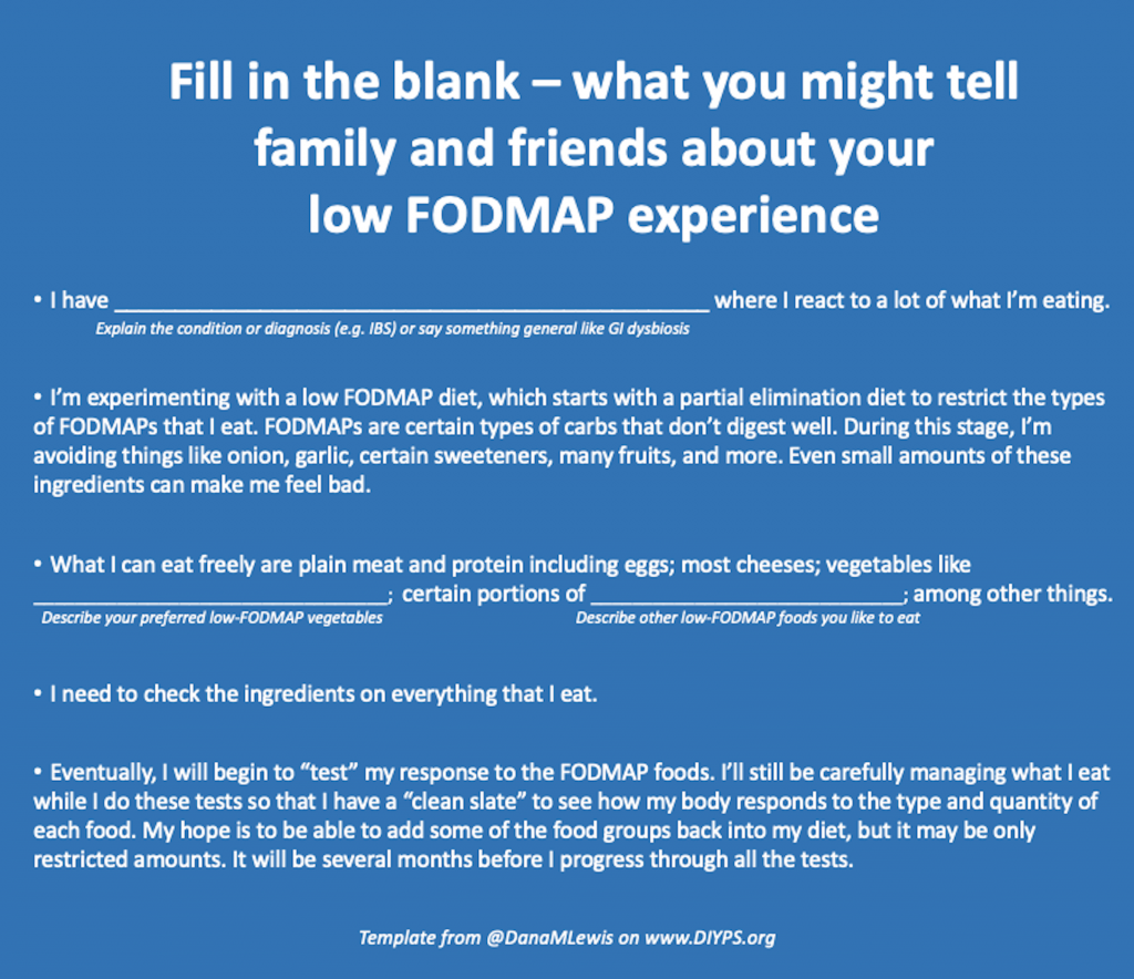
A friend recently said (because she’s amazing) that she wanted to read up on what a low FODMAP diet means, and I couldn’t find a good high level simple article to send to her, so I had to type up an explanation. So what I have summarized to her and family and other friends is this:

  • I have GI dysbiosis where I react to a lot of what I’m eating. I’m experimenting with a low FODMAP diet, which starts with a partial elimination diet to restrict the types of FODMAPs that I eat. FODMAPs are certain types of carbs that don’t digest well. During this stage, I’m avoiding things like onion, garlic, certain sweeteners, many fruits, and more. Even small amounts of these ingredients can make me feel bad, just like gluten, although they cause shorter term symptoms. What I can eat freely are plain meat and protein including eggs; vegetables like cucumbers, carrots, potatoes, and baby corn; and cheese, among other things. I need to check the ingredients on everything I eat, even things that we know are already gluten free.
  • Eventually, I will begin to “test” my response to the FODMAP foods. I’ll still be carefully managing what I eat while I do these tests so that I have a “clean slate” to see how my body responds to the type and quantity of each food. My hope is to be able to add some of the food groups back into my diet, but it may be only restricted amounts. It will be several months before I progress through all the tests.
  • I can use your support – I’m looking for low FODMAP alternatives to foods like X, Y, and Z, so if you’d like to help, in addition to listening to me vent, you could help me research some store-bought or homemade alternatives to these.

(One reason I add the “I can use your support” aspect for some people, which is obviously optional – I learned from being gluten free with celiac that having friends and family aware of what it takes to eat and find safe gluten-free options really cut down on the emotional labor required to find and suggest food every time. People try to be nice and let me offer gluten free options for eating out, but that means I have to do a lot of research every time. Having family members put the “Find Me Gluten Free” app on their phone and teaching them how to do basic searches so they could offer up suggestions, too, made a big difference. I won’t ask everyone for help re: FODMAP but for certain family members, they really can make a difference in doing some of the searching for low FODMAP alternatives to certain things that I haven’t been able to find yet! For me, this is things like finding a low FODMAP steak sauce that I could buy. I still haven’t found one. Thankfully, there’s also brands like Fody where I buy a lot of sauces (BBQ sauce, spaghetti sauce, ketchup) and salad dressings – plus now they have tasty BBQ chips that are also gluten free, and meal delivery services like Epicured that I’ve tried. Note – I am not sponsored or paid by either of those brands, I shell out my own money for them!)

Mad-lib style fill in the blank template to customize telling family and friends about your FODMAP experience. It's the same text in the above personal description without the personal examples of food I like to ea.
Example fill in the blank script to customize to help you explain your FODMAP experience to family and firends

At the end of the day, the one thing you need to know about FODMAP is that everyone is different. Literally, you are a scientific experiment of one. What works for someone else doesn’t necessarily work for you. You know you, and you get to decide what level of symptoms you are willing to tolerate – or not – in response to different quantities of food. Whether it’s IBS, small intestinal bacterial overgrowth (SIBO), some other condition, or general gastrointestinal dysbiosis, a low FODMAP diet may be one option that you can try and see if it helps you feel better. In diabetes, we often say “YDMV”, meaning ‘your diabetes may vary’. In the landscape of GI-related stuff, I think it’s “YFWV”, meaning “your FODMAP experience will vary.”

Everything I did wrong (but did anyway) training for a marathon after a broken ankle and marathon running with type 1 diabetes

This is another one of those posts for a niche audience. If you found this post, you’re likely looking for information about:

  • Running after a broken ankle (or are coming from my “tips for returning to weight bearing” and looking for an update from me, two years after my trimalleolar ankle fracture)
  • Running with the “Galloway method”, also known as run-walk or run/walk methods for marathon or similar long distances – but with information about run-walking for slow runners.
  • Running a marathon with type 1 diabetes, or running an ultra with type 1 diabetes
  • Running a marathon and training for a marathon and going without fuel or less fuel
    *Update: also running an ultramarathon with the same methods (less fuel than typical)!

There’s a bit of all of this in the post! (But TLDR – I ran my marathon (finally), successfully, despite having a previously broken ankle. And despite running it with type 1 diabetes, I had no issues managing my blood sugars during even the longest training runs, even with significantly less fuel than is typically used by marathon runners. I also ran a 50k ultra using the same methods!)

running a marathon after a broken ankle and with type 1 diabetes

First up, some context that explains why I chose run-walking as my method of running a marathon (as that also influences fueling choices) and what it is like to be a slow marathon runner (6 hour marathon ish). I broke my ankle in January 2019 and began running very tiny amounts (literally down the block to start) in summer 2019. I progressed, doing a short run interval followed by a walk interval, increasing the total numbers of intervals, and then slowly progressing to extend the length (distance and/or time) of the running intervals. In early fall 2019, I was attempting a couch-to-5k type program where I would extend my running intervals even longer, but I still had subsequent injuries (a very stubborn big toe joint, then intermetatarsal bursitis in TWO spots (argh)) that made this not work well. Eventually, I went back to running 30 seconds and walking 30 seconds, then keeping those “short” intervals and extending my run. I focused on time at first: going from 5 to 10 to 15 to 20 etc minutes, rather than focusing on distance. Once I built up to about 30 minutes of run-walking (30:30, meaning running 30 seconds and walking 30 seconds), I switched to adding a quarter or half mile each time depending on how I was feeling. But doing 30:30 seemed to work really well for me in terms of the physical impact to my feet, even with long miles, and also mentally, so I stuck with it. (You can go read about the Galloway run-walk-run method for more about run-walking; most people build up to running more, say 5 minutes or 8 minutes followed by a minute of walking, or maybe run 1 mile and then walk for a minute, or walk through the aid stations, but I found that 30:30 is what I liked and stuck with it or 60:30 as my longest intervals.)

This worked so well for me that I did not think about my right ankle a single time during or after my marathon! It took days to even remember that I had previously broken my ankle and it could’ve been problematic or weaker than my other ankle during my marathon. It took a long time to get to this point – I never thought I’d be forgetting even for a few days about my broken ankle! But two years later, I did.)

When COVID-19 struck, and as someone who paid attention early (beginning late January 2020), I knew my marathon would not be taking place in July 2020 and would be postponed until 2021. So I focused on keeping my feet healthy and building up a running “base” of trying to stay healthy feet-wise running twice a week into fall 2020, which worked fairly well. At the start of 2021, I bumped up to three runs a week consistently, and eventually began making one run every other a week longer. My schedule looked something like this:

Monday – 3 miles  Wednesday – 3 miles   Friday – 3 miles

Monday – 4 miles  Wednesday – 3 miles   Friday – 3 miles

Monday – 5 miles  Wednesday – 3 miles   Friday – 3 miles

Monday – 6 miles  Wednesday – 3 miles   Friday – 3 miles

Monday – (back to) 3 miles  Wednesday – 3 miles   Friday – 3 miles

Monday – 8 miles  Wednesday – 3 miles   Friday – 3 miles

Monday – (back to) 3  miles  Wednesday – 5 miles   Friday – 4 miles

Monday – 10 miles  Wednesday – 3 miles   Friday – 3 miles

Note that these runs I refer to were all technically run-walks, where I ran 30 seconds and walked 30 seconds (aka 30:30) until I covered the miles. I was running slow and easy, focusing on keeping my heart rate below its maximum and not worrying about speed, so between that and run-walking I was often doing 15m30s miles. Yes, I’m slow. This all enabled me to build up to safely be able to run 3 runs weekly at first, and then eventually progressed to adding a fourth run. When I added a fourth run, I was very conservative and started with only 1 mile for two weeks in a row, then 2 miles, then up to 3 miles. Eventually, later in my training, I had some of my other runs in the week be a bit longer (4-5 miles) in addition to my “long” run.

But, because I’m so slow, this means it takes a lot of time to run my long runs. If you estimate a 15-minute mile for easy math, that means an 8 mile “long” run would take at least 2 hours. With marathon training (and my goal to train up to multiple 22-24 mile runs before the marathon), that took A LOT of time. And, because of my broken ankle and intermetatarsal experiences from 2019, I was very cautious and conservative about taking care of my feet during training. So instead of following the usual progression of long runs increasing 2-3 weeks in a row, followed by a “cutback” long week, after I hit two hours of long running (essentially 8 miles, for me), I started doing long runs every other week. The other week was a “cutback” long run, which was usually 8 miles, 10 miles (for several weeks), up to eventually 12-14. In terms of “time on feet”, this meant 2-3 hours “cutback” long runs, which according to many people is the max you should be running for marathon training. That doesn’t quite work for slow runners such as myself where you might be doing a 6-hour marathon or 7-hour marathon or thereabouts. (The standard advice also maybe doesn’t apply when you are doing run-walking for your marathon training.)

I had ~6 months to build up to my marathon (from January to the end of July), so I had time to do this, which gave me a buffer in my overall training schedule in case of scheduling conflicts (which happened twice) and in case of injury (which thankfully didn’t happen). I ended up scheduling training long runs all the way to full marathon distance (26ish miles), because I wanted to practice my fueling (especially important for type 1 diabetes marathon runners, which I’ll talk about next) as well as get my feet used to that many hours of run-walking. I did my long runs without care for speed, so some of them were closer to 16-minute mile averages, some were around 15-minute mile averages for the entire run, and the day I ran the full marathon course for training I ended up doing 16+ minute miles and felt fabulous at the end.

I ended up doing a few “faster” “shorter” long runs (on my cutback weeks), where I would do a half marathon-ish distance on the actual marathon course (a public trail), and try to go faster than my super slow long run pace. I had several successful runs where I was at or near marathon pace (which for me would be around 13m30s). So yes, you can train slow and run fast for a marathon, even without much speed work, and even if you are doing a run-walk method, and even if you’re as slow as I am. Running ~15-minute miles took forever but kept my feet and body healthy and happy through marathon training, and I was still able to achieve my sub-6 hour marathon goal (running 13:41 average pace for 26.2+ miles) on race day.

Now let’s talk about fueling, and in particular fueling for people with type 1 diabetes and for people wondering if the internet is right about what fueling requirements are for marathon runners.

I previously wrote (for a T1D audience) about running when fasted, because then you don’t have to deal with insulin on board at the start of a run. That’s one approach, and another approach is to have a smaller meal or snack with fewer carbs before the run, and time your run so that you don’t need to bolus or inject for that meal before you start your run. That’s what I chose for most of my marathon training, especially for longer runs.

On a typical non-running day, I would eat breakfast (½ cup pecans, ¼ cup cranberries, and a few sticks of cheese), my OpenAPS rig would take care of insulin dosing (or I could bolus for it myself), and my BGs would be well managed. However, that would mean I had a lot of insulin on board (IOB) if I tried to run within an hour of that. So instead, during marathon training, I ended up experimenting with eating a smaller amount of pecans (¼ cup) and no cranberries, not bolusing or letting OpenAPS bolus, and running an hour later. I had a small BG rise from the protein (e.g. would go from 100 mg/dL flat overnight to 120-130 mg/dL), and then running would balance out the rest of it.

I generally would choose to target my blood sugar to 130 mg/dL at the start of long runs, because I prefer to have a little bit of buffer for if/when my blood sugar began to drop. I also figured out that if I wasn’t having IOB from breakfast, I did not need to reduce my insulin much in advance of the run, but do it during the duration of the run. Therefore, I would set a higher temporary target in my OpenAPS rig, and if I was doing things manually, I would set a temporary basal rate on my insulin pump to about ⅓ of my usual hourly rate for the duration of the run. That worked well because by the time the beginning of my run (30-45 minutes) brought my BG down a little bit from the start with the protein breakfast bump (up to 130 mg/dL or so), that’d also be when the reduced insulin effect would be noticeable, and I would generally stay flat instead of having a drop at the beginning or first hour of my run.

After my first hour or so, I just kept an eye periodically on my blood sugars. My rule of thumb was that if my BG drifted down below 120 mg/dL, I would eat a small amount of carbs. My carb of choice was an individually wrapped peppermint (I stuffed a bunch in my pocket for the run) that was 3-4g of carb. If I kept drifting down or hadn’t come back up to 120 mg/dL 10-15 minutes later, I would do another. Obviously, if I was dropping fast I would do more, but 75% of the time I only needed one peppermint (3-4g of carb) to pause a drift down. If you have a lot of insulin on board, it would take more carbs, but my method of not having IOB at the start of long runs worked well for me. Sometimes, I would run my entire long run with no carbs and no fuel (other than water, and eventually electrolyte pills). Part of this is likely due to the fact that I was run-walking at such low intensity (remember 15-ish minute miles), but part of this is also due to figuring out the right amount of insulin I needed for endurance running and making sure I didn’t have excess insulin on board. On my faster runs (my half marathon distance fast training runs, that were 2+ minutes/mile faster than my slow long runs) and my marathon itself, I ended up needing more carbs than a super slow run – but it ended up being about 30 grams of carbohydrate TOTAL.

Why am I emphasizing this?

Well, the internet says (and most coaches, training plans, etc) that you need 30g of carbs PER HOUR. And that you need to train your stomach to tolerate that many carbs, because your muscles and brain need it. And without that much fuel, you will ‘hit the wall’.

My hypothesis, which may be nuanced by having type 1 diabetes and wearing a CGM and being able to track my data closely and manage it not only by carbs but also titrating insulin levels (which someone without diabetes obviously can’t do), is that you don’t necessarily need that many carbs, even for endurance running or marathon running.

I’m wondering if there’s a correlation between people who max out their long runs around 16-20 miles and who then “hit the wall” around mile 20 of a marathon. Perhaps some of it is muscle fatigue because they haven’t trained for the distance and some of it is psychological of feeling the brain fatigue.

During my marathon, in which I ran 2+ min/mi faster than most of my training runs, I did not ever experience hypoglycemia, and I did not “hit the wall”. Everything hurt, but I didn’t “hit the wall” as most people talk about. Those might be related, or it might be influenced by the fact that I had done a 20, 22, 24, 26, and another 21 mile run as part of my training, so my legs were “used” to the 20+ mile distance?

So again – some of my decreased fueling needs may be because I was already reducing my insulin and balancing my blood sugars (really well), and if my blood sugar was low (hypoglycemia), I would’ve needed more carbs. Or you can argue my lower fueling needs are because I’m so slow (15-16 minute mile training runs, or a 13m40s marathon pace). But in any case, I wanted to point out that if the fueling advice you’re getting or reading online seems like it’s “too much” per hour, there are people who are successful in hitting their time goals and don’t hit the wall on lower fueling amounts, too. You don’t necessarily have to fuel for the sake of fueling.

Note that I am not doing “low carb” or “keto” or anything particular diet-wise (other than eating gluten-free, because I also have celiac disease) outside of my running fuel choices. This was a successful strategy for me, and I eat what might be considered a moderate carb diet outside of running fuel choices.

Ps – if you don’t fuel (carbs or other nutrients) during your runs, don’t forget about your electrolytes. I decided to keep drinking water out of a Camelbak in a running pack, rather than filling it with Gatorade or a similar electrolyte drink, but I’m pretty electrolyte sensitive so I needed to do something to replace them. I got electrolyte pills and would take them every 30 minutes or so on long training runs when it was hotter. Play around with timing on those: if you don’t sweat a lot or aren’t a salty sweater, you may not need as many as often. I ended up doing the bulk of my long runs on hot days, and I sweat a lot, so every 30 minutes was about right for me. On cooler runs, one per hour was sufficient for me. (I tried these chewable tabs in lemon-lime but didn’t like the salt feeling directly in my mouth; I ended up buying these to swallow instead: I didn’t have any digestion issues or side effects from them, and they successfully kept my electrolytes to manageable levels. The package says not to take more than 10 within a 24 hour period, but I ended up taking 12 for my longest training run and the marathon itself and suffered no ill effects. It’s probably set to max 10 because of the amount of salt compared to the typical daily amount needed..but obviously, if you’re doing endurance running you need more than the daily amount of salt you would need on a regular day. But I’m not a doctor and this isn’t medical advice, of course – I’m just telling you what I chose to do).

In terms of training, here’s everything the internet told me to do for marathon training and everything I did “wrong” according to the typical advice:

  • Your long run should be 20-30% of your overall weekly mileageWhat I did: Sometimes my long runs got up to 70% of my weekly mileage, because I was only running 3 and then 4 days a week, and not doing very long mid-week runs.
  • Have longer mid-week runs, and build those up in addition to your true long runWhat I did: I did build up to a few 5-6 mile mid-week runs, but I chose consistency of my 4 runs per week rather than overdoing it with mid-week medium runs
  • Run 5-6 days a weekWhat I did: Only run 4 times a week, because I wanted a rest day after each run, and wanted a rest day prior to my longest run. I ran Monday, Wednesday, Friday, then added Saturday short runs. Monday was my long run (because I have the benefit of a flexible schedule for work).
  • Get high mileage (start from a base of 30-40 miles a week and build up to 50-60 miles!)What I did: I started with a “base” of 10 miles a week with two runs that I was very proud of. I went to three runs a week, and then 4. My biggest running week during training was 40.55 miles, although they were all 20+ mile weeks (long or cutback weeks) after the first two months of training.
  • Do progressively longer long runs for two or three weeks in a row and then do one cutback week, then continue the progressionWhat I did: Because of the time on my feet cost of being a slower runner, I did an every-other-week long-run progression alternating with a shorter cutback week.
  • Long run, tempo run, speed work, etc. plus easy runs! All the things each week!What I did: a long run per week, then the rest of my runs were usually easy runs. I tried a handful of times to do some “speed” work, but I often time was trying to keep my feet from being injured and it felt like running faster caused my feet to be sore or have other niggles in my legs, so I didn’t do much of that, other than doing some “cutback” long runs (around half marathon distance, as well as my last 21-mile run) at close to marathon pace to get a feel for how it felt to run at that pace for longer.

TLDR, again:

I signed up for a marathon in fall 2018 planning to run it in July 2019 but was thwarted by a broken ankle in January 2019 and COVID-19(/20) for 2020, so I ultimately trained for and ran it in July 2021. I am a slow runner, and I was able to achieve my sub-6 hour marathon goal using run-walk and without causing additional injury to my feet. And, because of my “slow” or less intense running, I needed a lot less fuel than is typically recommended for marathoners, and still managed my blood glucose levels within my ideal target ranges despite 5, 6, and even 7 hours run on my feet. Yes, you can run marathons with type 1 diabetes. And yes, you can run any length endurance runs with type 1 diabetes! I also ran a 50k ultramarathon using the same methods.

How to deal with wildfire smoke and air quality issues during COVID-19

2020. What a year. We’ve been social distancing since late February and being very careful in terms of minimizing interactions even with family, for months. We haven’t traveled, we haven’t gone out to eat, and we basically only go out to get exercise (with a mask when it’s on hiking trails/around anyone) or Scott goes to the grocery store (n95 masked). We’ve been working on CoEpi (see CoEpi.org – an open source exposure notification app based on symptom reports) and staying on top of the scientific literature around COVID-19, regarding NPIs like distancing and masking; at-home diagnostics like temperature and pulse oximetry monitoring, prophylactics and treatments like zinc, quercetine, and even MMR vaccines; and the impact of ventilation and air quality on COVID-19 transmission and susceptibility.

And we live in Washington, so the focus on air quality got very real very quickly during this year’s wildfire season, where we had wildfires across the state of Washington, then got pummeled for over a week with hazardous levels of wildfire smoke coming up from Oregon and California to cover our existing smoke layer. But, one of our DIY air quality hacks for COVID-19 gave us a head start on air quality improvements for smoke-laden air, which I’ll describe below.

Here are various things we’ve gotten and have been using in our personal attempts to thwart COVID-19:

  • Finger pulse oximeter.
    • Just about any cheap pulse oximeter you can find is fine. The goal is to get an idea of your normal baseline oxygen rates. If you dip low, that might be a reason to go to urgent care or the ER or at least talk to your doctor about it. For me, I am typically 98-99% (mine doesn’t read higher than 99%), and my personal plan would be to talk to a healthcare provider if I was sick and started dropping below 94%.
  • Thermometer
    • Use any thermometer that you’ll actually use. I have previously used a no-touch thermometer that could read foreheads but found it varied widely and inconsistently, so I went back to an under the tongue thermometer and took my temperature for several months at different times to figure out my baselines. If sick or you have a suspected exposure, it’s good to be checking at different times of the day (people often have lower temps in the morning than in the evening, so knowing your daily differences may help you evaluate if you’re elevated for you or not).
    • Note: women with menstrual cycles may have changes related to this; such as lower baseline temps at the start of the cycle and having a temperature upswing around or after the mid-point in their cycle. But not all do. Also, certain medications or birth controls can impact basal temperatures, so be aware of that.
  • Originally, n95 masks with outlet valves.
    • Note: n95 masks with valves cannot be used by medical professionals, because the valves make them less effective for protecting others. (So don’t freak out at people who had a box of valved n95 masks from previous wildfire smoke seasons, as we did. Ahem.) 
    • We had a box we bought after previous years’ wildfire smoke, and they work well for us (in low-risk non-medical settings) for repeated use. They’re Scott’s go-to choice. If you’re in a setting where the outlet valve matters (indoors in a doctor’s/medical setting, or on a plane), you can easily pop a surgical/procedure mask over the valve to block the valve to protect others from your exhaust, while still getting good n95-level protection for yourself.
    • They were out of stock since February, but given the focus on n95 without valves for medical PPE, there have been a few boxes of n95 masks with outlet valves showing up online at silly prices ($7 per mask or so). But, kn95’s are a cheaper per mask option that are generally more available – see below.
    • (June 2021 note – they are back to reasonable prices, in the $1-2 range per mask on Amazon, and available again.)
  • kn95 masks.
    • kn95 masks are a different standard than US-rated n95; but they both block 95% of tiny (0.3 micron) particles. For non-medical usage, we consider them equivalent. But like n95, the fit is key.
    • We originally bought these kn95s, but the ear loops were quite big on me. (See below for options if this is the case on any you get.) They aren’t as hardy as the n95s with valves (above); the straps have broken off, tearing the mask, after about 4-5 long wears. That’s still worth it for them being $2-3 each (depending on how many you buy at a time) for me, but I’d always pack a spare mask (of any kind) just in case.
      • Option one to adjust ear loops: I loop them over my ponytail, making them head loops. This has been my favorite kn95 option because I get a great fit and a tight seal with this method.
      • Option two to adjust ear loops: tie knots in the ear loops
      • Option three to adjust ear loops: use things like this to tighten the ear loops
    • We also got a set of these kn95s. They don’t fit quite as well in terms of a tight face fit, but these actually work as ear loops (as designed), and I was able to wear this inside the house on the worst day of air quality.
  • Box fan with a filter to reduce COVID-19 particles in the air:
    • We read this story about using an existing AC air furnace filter on a box fan to help reduce the number of COVID-19 particles in the air. We already had a box fan, so we took one of our spare 20×20 filters and popped it on. I’m allergic to dust, cats (which we just got), trees, grass, etc, so I knew it would also help with regular allergens. There are different levels of filter – all the way up to HEPA filters – but we had MERV 12 so that’s what we used.
  • Phone/object UV sanitizer
    • We got a PhoneSoap Pro (in lavender, but there are other colors). Phones are germy, and being able to pop the phone in (plus keys or any other objects like credit cards or insurance cards that might have been handled by another human) to disinfect has been nice to have.
    • The Pro is done sanitizing in 5 minutes, vs the regular one takes 10 minutes. It’s not quite 2x the price as the non-pro, but I’ve found it to be worthwhile because otherwise, I would be impatient to get my phone back out. I usually pop my phone in it when I get home from my walk, and by the time I’m done washing my hands and all the steps of getting home, the phone is about or already done being sanitized.
  • Bonus (but not as useful to everyone as the above, and pricey): Oura ring
    • Scott and I also both got Oura rings. They are pricey, but every morning when we wake up we can see our lowest resting heart rate (RHR), heart rate variability (HRV), temperature deviations, and respiratory rate (RR). There have been studies showing that HRV, RHR, overnight temperature, and RR changes happen early in COVID-19 and other infections, which can give an early warning sign that you might be getting sick with something. That can be a good early warning sign (before you get to the point of being symptomatic and highly infectious) that you need to mask up and work from home/social distance/not interact with other people if you can help it. I find the data soothing, as I am used to using a lot of diabetes data on a daily and real-time basis (see also: invented an open source artificial pancreas). Due to price and level of interest in self-tracking data, this may not be a great tool for everyone.
    • Note this doesn’t tell you your temperature in real time, or present absolute values, but it’s helpful to see, and get warnings about, any concerning trends in your body temperature data. I’ve seen several anecdotal reports of this being used for early detection of COVID-19 infection and various types of relapses experienced by long-haulers.

And here are some things we’ve added to battle air quality during wildfire smoke season:

  • We were already running a box fan with a filter (see above for more details) for COVID-19 and allergen reduction; so we kept running it on high speed for smoke reduction.
    • Basic steps: get box fan, get a filter, and duct tape or strap it on. Doesn’t have to be cute, but it will help.
    • I run this on high speed during the day in my bedroom, and then on low speed overnight or sleep with earplugs in.
  • We already had a small air purifier for allergens, which we also kept running on high. This one hangs out in our guest bedroom/my office.
  • We caved and got a new, bigger air purifier, since we expect future years to be equally and unfortunately as smoky. This is the new air purifier we got. (Scott chose the 280i version that claims to cover 279 sq. ft.). It’s expensive, but given how miserable I was even inside the house with decent air quality thanks to my box fan and filter, little purifier, and our A/C filtered air… I consider it to be worth the investment.
    • We plugged it in and validated that with our A/C-filtered air combined with my little air purifier and the box fan with filter running on high, we already had ‘good’ air quality (but not excellent). We also stuck it out in the hallway to see what the hallway air quality was running – around 125 ug/m^3 – yikes. Turns out that was almost as high as the outside air, which is I’ve had to wear a kn95 mask even to walk hallway laps, and why my eyes are irritated. example air quality difference between hallway and our kitchen. hallway is much higher.
  • Check your other filters while you’re on air quality monitoring alert. We found our A/C intake duct vent had not had the air filter changed since we moved in over a year ago… and turns out it’s a non-standard size and had a hand-cut stuffed in there, so we ordered a correctly sized one for the vent, and taped a different one over the outside in the interim.
  • The other thing to fight the smoke is having n95 with valves or kn95 masks to wear when we have to go outside, or if it gets particularly bad inside. Our previous strategy was to have several on hand for wildfire season, and we’ll continue to do this. (See above in the COVID-19 section for descriptions in more detail about different kinds of masks we’ve tried.)
  • 2022 update: I got a mini personal air purifier to try for travel (to help reduce risk of COVID-19 in addition to all other precautions like staying masked on planes and indoor spaces), but it also turned out to be beneficial inside during the worst of our 2022 wildfire smoke season. I had a slightly scratchy throat even with two box fans and two different air purifiers inside; but keeping this individual one plugged in and pointed at my face overnight eliminated me waking up with a scratchy throat. That’s great for wildfire smoke, and also shows that there is some efficacy to this fan for it’s intended purpose, which is improving air around my face during travel in inside spaces for COVID-19 and other disease prevention.

Wildfires, their smoke, and COVID-19 combined is a bit of a mess for our health. Stay inside when you can, wear masks when you’re around other people outside your household that you have to share air with, wash your hands, and good luck.

Understanding Automated Insulin Delivery: A basic book for kids, family, and friends of people living with diabetes

tl;dr – A new book out for kids explaining the basics of automated insulin delivery, using the analogy of scuba diving to explain how the system makes small changes in insulin delivery to manage glucose levels! Watch the narrated video free online, and if you find the analogy useful, it’s available in book form as both a physical, print book as well as on Kindle via Amazon.DanaMLewis_UnderstandingAutomatedInsulinDelivery_KidsBook—-

A few weeks ago I was thinking about what the basic things that I wanted people to know about automated insulin delivery. A good portion of the general public – and even many family members of people with diabetes – thinks that a traditional insulin pump does what an automated insulin delivery system does: adjusting insulin delivery based on continuous glucose monitor (CGM) data. But a traditional pump doesn’t necessarily know about the CGM data and isn’t equipped with the algorithm to make those decisions and changes to insulin delivery, so the person with diabetes is doing a LOT of invisible labor to try to manage glucose levels constantly 24/7/365. That’s why an automated insulin delivery system is so useful, and why I’ve been using a DIY system for more than 5 years. Now, though, we’re (finally) starting to see commercial systems come to market that does the basic functionality similar to what OpenAPS could do five years ago. I want more people to have access to these systems and use them as best as they can be used to give people the best outcomes diabetes-wise and the best quality of life they can possibly have. Helping explain to more people how this technology works is one way I can help do this, and thus an idea was born for another book to explain the basics of automated insulin delivery systems.

Dana's first rough sketch of the scuba diving analogy for explaining automated insulin delivery
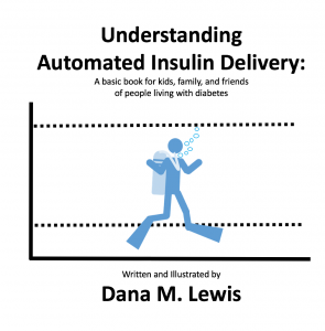
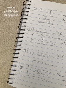
I started with a basic sketch of an idea to run it by Scott and a few other people to test the idea. I’m not much for drawing, so it was a *very* rough sketch. But the analogy seemed to resonate, so I moved on to mocking up a basic version on the computer. (I went down a rabbit hole because I thought it would be neat to make an animated video for people to see and share online, to accompany the book. But I don’t know how to illustrate on the computer, let alone animate, so I tried an open source illustration program called Synfig, then several other illustrator programs that were open source to do the basic design to import into Synfig to animate, but then realized what I had in mind was so simple that basic transitions and animations in PowerPoint would suffice for my animated video.) PowerPoint is also how I’ve made my other children’s books for self-publishing, so it was easy to do a widescreen, video design version and then modify a version for the print size book of choice (I chose an 8.5×8.5 to make it easiest to hold and read). 

I went from a paper and pencil sketch on July 18 to mocking up the video animation and designing the print book and requesting printed proofs on July 23. The printed proofs were a bit slow to ship compared to usual (probably something to do with a global pandemic), and arrived on August 4. I reviewed, made a few small changes, and hit ‘publish’ the same day, and Amazon reviewed and approved both the Kindle version and the print version, which are now available today (August 5, 2020) online. It took less than 3 weeks to go from idea to printed book available for shipping worldwide! (I am sharing all these details to hopefully encourage someone else to self-publish if they have an idea for a book they’d like to see available in the world – feel free to reach out if you have any questions about self publishing!)

Print_DanaMLewis_UnderstandingAutomatedInsulinDeliveryKindle_Amazon_DanaMLewis_UnderstandingAutomatedInsulinDeliveryHere is the link to the print book on Amazon.

Here’s the link to the Kindle book version on Amazon – it’s also available as part of Kindle Unlimited and the Kindle Lending Library, so feel free to share it out!

DanaMLewis_UnderstandingAutomatedInsulinDelivery_kidsbook_TheEnd

Also, if you’re looking for something to do with your kids (or have your kids do), I also made some of the scuba diving designs into a coloring sheet – check them out here (downloads as a PDF).

DanaMLewis_freescubacoloringsheets

Poster and presentation content from @DanaMLewis at #ADA2020 and #DData20

In previous years (see 2019 and 2018), I mentioned sharing content from ADA Scientific Sessions (this year it’s #ADA2020) with those not physically present at the conference. This year, NO ONE is present at the event, and we’re all virtual! Even more reason to share content from the conference. :)

I contributed to and co-authored two different posters at Scientific Sessions this year:

  • “Multi-Timescale Interactions of Glucose and Insulin in Type 1 Diabetes Reveal Benefits of Hybrid Closed Loop Systems“ (poster 99-LB) along with Azure Grant and Lance Kriegsfeld, PhD.
  • “Do-It-Yourself Artificial Pancreas Systems for Type 1 Diabetes Reduce Hyperglycemia Without Increasing Hypoglycemia” (poster 988-P in category 12-D Clinical Therapeutics/New Technology—Insulin Delivery Systems), alongside Jennifer Zabinsky, MD MEng, Haley Howell, MSHI, Alireza Ghezavati, MD, Andrew Nguyen, PhD, and Jenise Wong, MD PhD.

And, while not a poster at ADA, I also presented the “AID-IRL” study funded by DiabetesMine at #DData20, held in conjunction with Scientific Sessions. A summary of the study is also included in this post.

First up, the biological rhythms poster, “Multi-Timescale Interactions of Glucose and Insulin in Type 1 Diabetes Reveal Benefits of Hybrid Closed Loop Systems” (poster 99-LB). (Twitter thread summary of this poster here.)

Building off our work as detailed last year, Azure, Lance, and I have been exploring the biological rhythms in individuals living with type 1 diabetes. Why? It’s not been done before, and we now have the capabilities thanks to technology (pumps, CGM, and closed loops) to better understand how glucose and insulin dynamics may be similar or different than those without diabetes.

Background:

Mejean et al., 1988
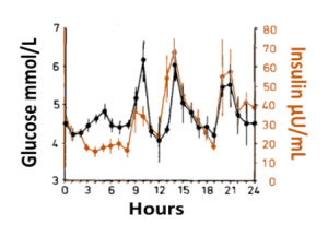
Blood glucose and insulin exhibit coupled biological rhythms at multiple timescales, including hours (ultradian, UR) and the day (circadian, CR) in individuals without diabetes. The presence and stability of these rhythms are associated with healthy glucose control in individuals without diabetes. (See right, adapted from Mejean et al., 1988).

However, biological rhythms in longitudinal (e.g., months to years) data sets of glucose and insulin outputs have not been mapped in a wide population of people with Type 1 Diabetes (PWT1D). It is not known how glucose and insulin rhythms compare between T1D and non-T1D individuals. It is also unknown if rhythms in T1D are affected by type of therapy, such as Sensor Augmented Pump (SAP) vs. Hybrid Closed Loop (HCL). As HCL systems permit feedback from a CGM to automatically adjust insulin delivery, we hypothesized that rhythmicity and glycemia would exhibit improvements in HCL users compared to SAP users. We describe longitudinal temporal structure in glucose and insulin delivery rate of individuals with T1D using SAP or HCL systems in comparison to glucose levels from a subset of individuals without diabetes.

Data collection and analysis:

We assessed stability and amplitude of normalized continuous glucose and insulin rate oscillations using the continuous wavelet transformation and wavelet coherence. Data came from 16 non-T1D individuals (CGM only, >2 weeks per individual) from the Quantified Self CGM dataset and 200 (n = 100 HCL, n = 100 SAP; >3 months per individual) individuals from the Tidepool Big Data Donation Project. Morlet wavelets were used for all analyses. Data were analyzed and plotted using Matlab 2020a and Python 3 in conjunction with in-house code for wavelet decomposition modified from the “Jlab” toolbox, from code developed by Dr. Tanya Leise (Leise 2013), and from the Wavelet Coherence toolkit by Dr. Xu Cui. Linear regression was used to generate correlations, and paired t-tests were used to compare AUC for wavelet and wavelet coherences by group (df=100). Stats used 1 point per individual per day.

Wavelets Assess Glucose and Insulin Rhythms and Interactions

Wavelet Coherence flow for glucose and insulin

Morlet wavelets (A) estimate rhythmic strength in glucose or insulin data at each minute in time (a combination of signal amplitude and oscillation stability) by assessing the fit of a wavelet stretched in window and in the x and y dimensions to a signal (B). The output (C) is a matrix of wavelet power, periodicity, and time (days). Transform of example HCL data illustrate the presence of predominantly circadian power in glucose, and predominantly 1-6 h ultradian power in insulin. Color map indicates wavelet power (synonymous with Y axis height). Wavelet coherence (D) enables assessment of rhythmic interactions between glucose and insulin; here, glucose and insulin rhythms are highly correlated at the 3-6 (ultradian) and 24 (circadian) hour timescales.

Results:

Hybrid Closed Loop Systems Reduce Hyperglycemia

Glucose distribution of SAP, HCL, and nonT1D
  • A) Proportional counts* of glucose distributions of all individuals with T1D using SAP (n=100) and HCL (n=100) systems. SAP system users exhibit a broader, right shifted distribution in comparison to individuals using HCL systems, indicating greater hyperglycemia (>7.8 mmol/L). Hypoglycemic events (<4mmol/L) comprised <5% of all data points for either T1D dataset.
  • B) Proportional counts* of non-T1D glucose distributions. Although limited in number, our dataset from people without diabetes exhibits a tighter blood glucose distribution, with the vast majority of values falling in euglycemic range (n=16 non-T1D individuals).
  • C) Median distributions for each dataset.
  • *Counts are scaled such that each individual contributes the same proportion of total data per bin.

HCL Improves Correlation of Glucose-Insulin Level & Rhythm

Glucose and Insulin rhythms in SAP and HCL

SAP users exhibit uncorrelated glucose and insulin levels (A) (r2 =3.3*10-5; p=0.341) and uncorrelated URs of glucose and insulin (B) (r2 =1.17*10-3; p=0.165). Glucose and its rhythms take a wide spectrum of values for each of the standard doses of insulin rates provided by the pump, leading to the striped appearance (B). By contrast, Hybrid Closed Loop users exhibit correlated glucose and insulin levels (C) (r2 =0.02; p=7.63*10-16), and correlated ultradian rhythms of glucose and insulin (D) (r2 =-0.13; p=5.22*10-38). Overlays (E,F).

HCL Results in Greater Coherence than SAP

Non-T1D individuals have highly coherent glucose and insulin at the circadian and ultradian timescales (see Mejean et al., 1988, Kern et al., 1996, Simon and Brandenberger 2002, Brandenberger et al., 1987), but these relationships had not previously been assessed long-term in T1D.

coherence between glucose and insulin in HCL and SAP, and glucose swings between SAP, HCL, and non-T1D
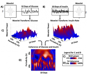
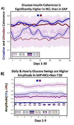
A) Circadian (blue) and 3-6 hour ultradian (maroon) coherence of glucose and insulin in HCL (solid) and SAP (dotted) users. Transparent shading indicates standard deviation. Although both HCL and SAP individuals have lower coherence than would be expected in a non-T1D individual,  HCL CR and UR coherence are significantly greater than SAP CR and UR coherence (paired t-test p= 1.51*10-7 t=-5.77 and p= 5.01*10-14 t=-9.19, respectively). This brings HCL users’ glucose and insulin closer to the canonical non-T1D phenotype than SAP users’.

B) Additionally, the amplitude of HCL users’ glucose CRs and URs (solid) is closer (smaller) to that of non-T1D (dashed) individuals than are SAP glucose rhythms (dotted). SAP CR and UR amplitude is significantly higher than that of HCL or non-T1D (T-test,1,98, p= 47*10-17 and p= 5.95*10-20, respectively), but HCL CR amplitude is not significantly different from non-T1D CR amplitude (p=0.61).

Together, HCL users are more similar than SAP users to the canonical Non-T1D phenotype in A) rhythmic interaction between glucose and insulin and B) glucose rhythmic amplitude.

Conclusions and Future Directions

T1D and non-T1D individuals exhibit different relative stabilities of within-a-day rhythms and daily rhythms in blood glucose, and T1D glucose and insulin delivery rhythmic patterns differ by insulin delivery system.

Hybrid Closed Looping is Associated With:

  • Lower incidence of hyperglycemia
  • Greater correlation between glucose level and insulin delivery rate
  • Greater correlation between ultradian glucose and ultradian insulin delivery rhythms
  • Greater degree of circadian and ultradian coherence between glucose and insulin delivery rate than in SAP system use
  • Lower amplitude swings at the circadian and ultradian timescale

These preliminary results suggest that HCL recapitulates non-diabetes glucose-insulin dynamics to a greater degree than SAP. However, pump model, bolusing data, looping algorithms and insulin type likely all affect rhythmic structure and will need to be further differentiated. Future work will determine if stability of rhythmic structure is associated with greater time in range, which will help determine if bolstering of within-a-day and daily rhythmic structure is truly beneficial to PWT1D.
Acknowledgements:

Thanks to all of the individuals who donated their data as part of the Tidepool Big Data Donation Project, as well as the OpenAPS Data Commons, from which data is also being used in other areas of this study. This study is supported by JDRF (1-SRA-2019-821-S-B).

(You can download a full PDF copy of the poster here.)

Next is “Do-It-Yourself Artificial Pancreas Systems for Type 1 Diabetes Reduce Hyperglycemia Without Increasing Hypoglycemia” (poster 988-P in category 12-D Clinical Therapeutics/New Technology—Insulin Delivery Systems), which I co-authored alongside Jennifer Zabinsky, MD MEng, Haley Howell, MSHI, Alireza Ghezavati, MD, Andrew Nguyen, PhD, and Jenise Wong, MD PhD. There is a Twitter thread summarizing this poster here.

This was a retrospective double cohort study that evaluated data from the OpenAPS Data Commons (data ranged from 2017-2019) and compared it to conventional sensor-augmented pump (SAP) therapy from the Tidepool Big Data Donation Project.

Methods:

  • From the OpenAPS Data Commons, one month of CGM data (with more than 70% of the month spent using CGM), as long as they were >1 year of living with T1D, was used. People could be using any type of DIYAPS (OpenAPS, Loop, or AndroidAPS) and there were no age restrictions.
  • A random age-matched sample from the Tidepool Big Data Donation Project of people with type 1 diabetes with SAP was selected.
  • The primary outcome assessed was percent of CGM data <70 mg/dL.
  • The secondary outcomes assessed were # of hypoglycemic events per month (15 minutes or more <70 mg/dL); percent of time in range (70-180mg/dL); percent of time above range (>180mg/dL), mean CGM values, and coefficient of variation.
Methods_DIYAPSvsSAP_ADA2020_DanaMLewis

Demographics:

  • From Table 1, this shows the age of participants was not statistically different between the DIYAPS and SAP cohorts. Similarly, the age at T1D diagnosis or time since T1D diagnosis did not differ.
  • Table 2 shows the additional characteristics of the DIYAPS cohort, which included data shared by a parent/caregiver for their child with T1D. DIYAPS use was an average of 7 months, at the time of the month of CGM used for the study. The self-reported HbA1c in DIYAPS was 6.4%.
Demographics_DIYAPSvsSAP_ADA2020_DanaMLewis DIYAPS_Characteristics_DIYAPSvsSAP_ADA2020_DanaMLewis

Results:

  • Figure 1 shows the comparison in outcomes based on CGM data between the two groups. Asterisks (*) indicate statistical significance.
  • There was no statistically significant difference in % of CGM values below 70mg/dL between the groups in this data set sampled.
  • DIYAPS users had higher percent in target range and lower percent in hyperglycemic range, compared to the SAP users.
  • Table 3 shows the secondary outcomes.
  • There was no statistically significant difference in the average number of hypoglycemic events per month between the 2 groups.
  • The mean CGM glucose value was lower for the DIYAPS group, but the coefficient of variation did not differ between groups.
CGM_Comparison_DIYAPSvsSAP_ADA2020_DanaMLewis SecondaryOutcomes_DIYAPSvsSAP_ADA2020_DanaMLewis

Conclusions:

    • Users of DIYAPS (from this month of sampled data) had a comparable amount of hypoglycemia to those using SAP.
    • Mean CGM glucose and frequency of hyperglycemia were lower in the DIYAPS group.
    • Percent of CGM values in target range (70-180mg/dL) was significantly greater for DIYAPS users.
    • This shows a benefit in DIYAPS in reducing hyperglycemia without compromising a low occurrence of hypoglycemia. 
Conclusions_DIYAPSvsSAP_ADA2020_DanaMLewis

(You can download a PDF of the e-poster here.)

Finally, my presentation at this year’s D-Data conference (#DData20). The study I presented, called AID-IRL, was funded by Diabetes Mine. You can see a Twitter thread summarizing my AID-IRL presentation here.

AID-IRL-Aim-Methods_DanaMLewis

I did semi-structured phone interviews with 7 users of commercial AID systems in the last few months. The study was funded by DiabetesMine – both for my time in conducting the study, as well as funding for study participants. Study participants received $50 for their participation. I sought a mix of longer-time and newer AID users, using a mix of systems. Control-IQ (4) and 670G (2) users were interviewed; as well as (1) a CamAPS FX user since it was approved in the UK during the time of the study.

Based on the interviews, I coded their feedback for each of the different themes of the study depending on whether they saw improvements (or did not have issues); had no changes but were satisfied, or neutral experiences; or saw negative impact/experience. For each participant, I reviewed their experience and what they were happy with or frustrated by.

Here are some of the details for each participant.

AID-IRL-Participant1-DanaMLewisAID-IRL-Participant1-cont_DanaMLewis
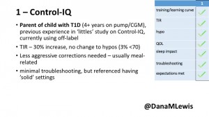
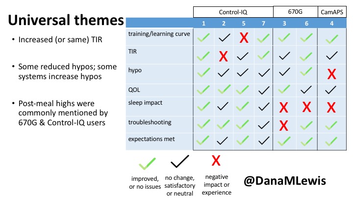
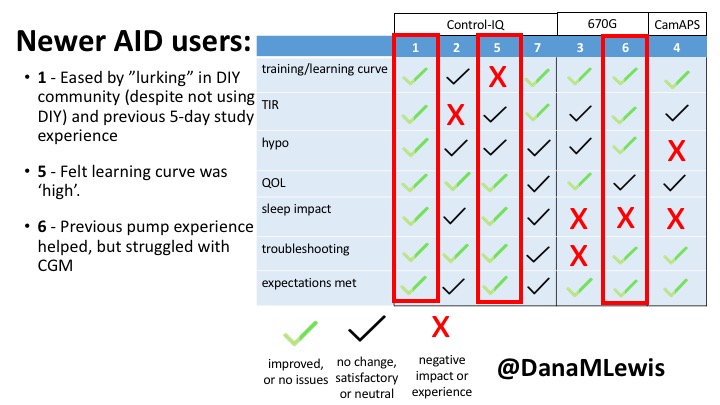
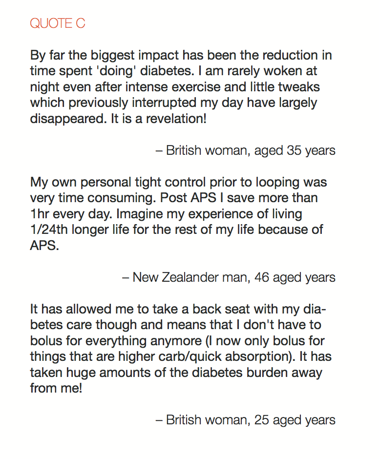
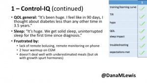
1 – A parent of a child using Control-IQ (off-label), with 30% increase in TIR with no increased hypoglycemia. They spend less time correcting than before; less time thinking about diabetes; and “get solid uninterrupted sleep for the first time since diagnosis”. They wish they had remote bolusing, more system information available in remote monitoring on phones. They miss using the system during the 2 hour CGM warmup, and found the system dealt well with growth spurt hormones but not as well with underestimated meals.

AID-IRL-Participant2-DanaMLewis AID-IRL-Participant2-cont-DanaMLewis
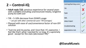
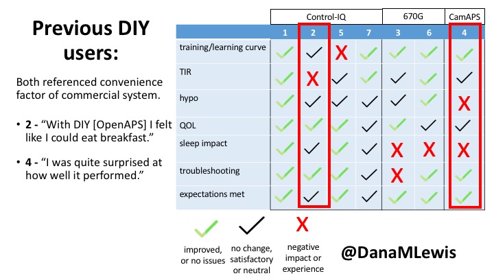
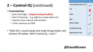
2 – An adult male with T1D who previously used DIYAPS saw 5-10% decrease in TIR (but it’s on par with other participants’ TIR) with Control-IQ, and is very pleased by the all-in-one convenience of his commercial system.He misses autosensitivity (a short-term learning feature of how insulin needs may very from base settings) from DIYAPS and has stopped eating breakfast, since he found it couldn’t manage that well. He is doing more manual corrections than he was before.

AID-IRL-Participant5-DanaMLewis AID-IRL-Participant5-cont_DanaMLewis
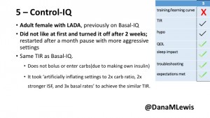
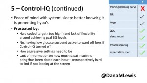
5 – An adult female with LADA started, stopped, and started using Control-IQ, getting the same TIR that she had before on Basal-IQ. It took artificially inflating settings to achieve these similar results. She likes peace of mind to sleep while the system prevents hypoglycemia. She is frustrated by ‘too high’ target; not having low prevention if she disables Control-IQ; and how much she had to inflate settings to achieve her outcomes. It’s hard to know how much insulin the system gives each hour (she still produces some of own insulin).

AID-IRL-Participant7-DanaMLewis AID-IRL-Participant7-cont-DanaMLewis
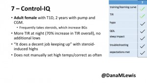
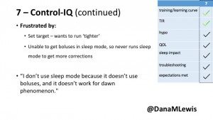
7 – An adult female with T1D who frequently has to take steroids for other reasons, causing increased BGs. With Control-IQ, she sees 70% increase in TIR overall and increased TIR overnight, and found it does a ‘decent job keeping up’ with steroid-induced highs. She also wants to run ‘tighter’ and have an adjustable target, and does not ever run in sleep mode so that she can always get the bolus corrections that are more likely to bring her closer to target.

AID-IRL-Participant3-DanaMLewis AID-IRL-Participant3-cont-DanaMLewis
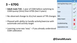
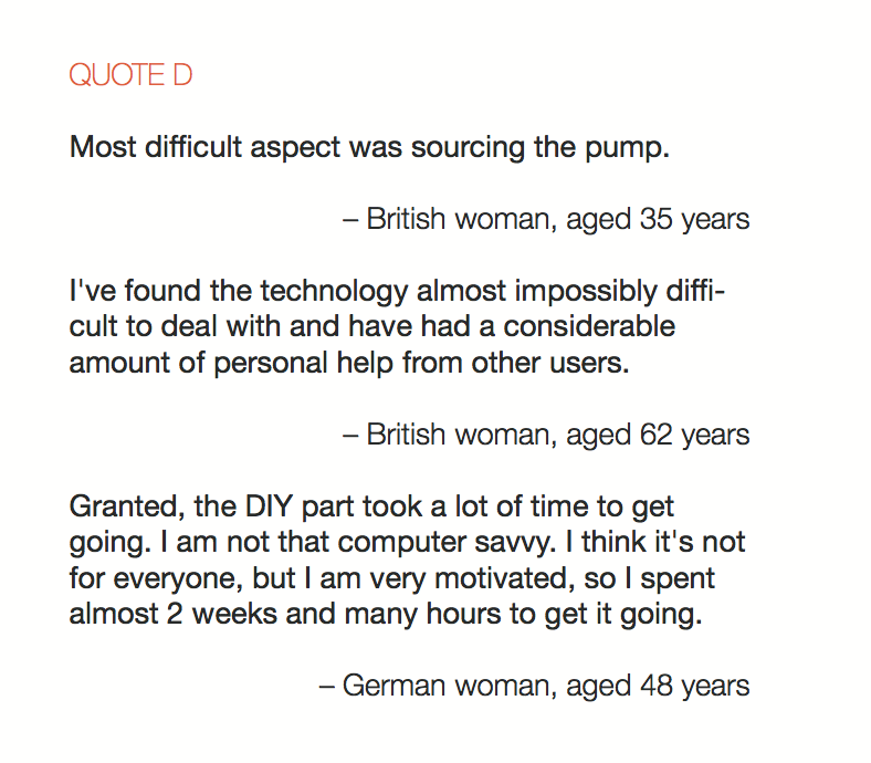
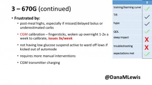
3 – An adult male with T1D using 670G for 3 years didn’t observe any changes to A1c or TIR, but is pleased with his outcomes, especially with the ability to handle his activity levels by using the higher activity target.  He is frustrated by the CGM and is woken up 1-2x a week to calibrate overnight. He wishes he could still have low glucose suspend even if he’s kicked out of automode due to calibration issues. He also commented on post-meal highs and more manual interventions.

AID-IRL-Participant6-DanaMLewis AID-IRL-Participant6-contDanaMLewis
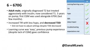
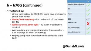
6 – Another adult male user with 670G was originally diagnosed with T2 (now considered T1) with a very high total daily insulin use that was able to decrease significantly when switching to AID. He’s happy with increased TIR and less hypo, plus decreased TDD. Due to #COVID19, he did virtually training but would have preferred in-person. He has 4-5 alerts/day and is woken up every other night due to BG alarms or calibration. He does not like the time it takes to charge CGM transmitter, in addition to sensor warmup.

AID-IRL-Participant4-DanaMLewis AID-IRL-Participant4-contDanaMLewis
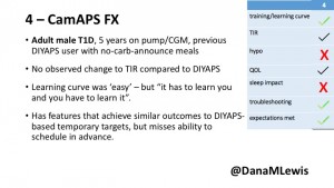
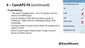
4 – The last participant is an adult male with T1 who previously used DIYAPS but was able to test-drive the CamAPS FX. He saw no TIR change to DIYAPS (which pleased him) and thought the learning curve was easy – but he had to learn the system and let it learn him. He experienced ‘too much’ hypoglycemia (~7% <70mg/dL, 2x his previous), and found it challenging to not have visibility of IOB. He also found the in-app CGM alarms annoying. He noted the system may work better for people with regular routines.

You can see a summary of the participants’ experiences via this chart. Overall, most cited increased or same TIR. Some individuals saw reduced hypos, but a few saw increases. Post-meal highs were commonly mentioned.

AID-IRL-UniversalThemes2-DanaMLewis AID-IRL-UniversalThemes-DanaMLewis

Those newer to CGM have a noticeable learning curve and were more likely to comment on number of alarms and system alerts they saw. The 670G users were more likely to describe connection/troubleshooting issues and CGM calibration issues, both of which impacted sleep.

This view highlights those who more recently adopted AID systems. One noted their learning experience was ‘eased’ by “lurking” in the DIY community, and previously participating in an AID study. One felt the learning curve was high. Another struggled with CGM.

AID-IRL-NewAIDUsers-DanaMLewis

Both previous DIYAPS users who were using commercial AID systems referenced the convenience factor of commercial systems. One DIYAPS saw decreased TIR, and has also altered his behaviors accordingly, while the other saw no change to TIR but had increased hypo’s.

AID-IRL-PreviousDIYUsers-DanaMLewis

Companies building AID systems for PWDs should consider that the onboarding and learning curve may vary for individuals, especially those newer to CGM. Many want better displays of IOB and the ability to adjust targets. Remote bolusing and remote monitoring is highly desired by all, regardless of age. Post-prandial was frequently mentioned as the weak point in glycemic control of commercial AID systems. Even with ‘ideal’ TIR, many commercial users still are doing frequent manual corrections outside of mealtimes. This is an area of improvement for commercial AID to further reduce the burden of managing diabetes.

AID-IRL-FeedbackForCompanies-DanaMLewis

Note – all studies have their limitations. This was a small deep-dive study that is not necessarily representative, due to the design and small sample size. Timing of system availability influenced the ability to have new/longer time users.

AID-IRL-Limitations-DanaMLewis

Thank you to all of the participants of the study for sharing their feedback about their experiences with AID-IRL!

(You can download a PDF of my slides from the AID-IRL study here.)

Have questions about any of my posters or presentations? You can always reach me via email at Dana@OpenAPS.org.

How the sausage gets made – guest editing and peer reviewing for scientific journals (and advice for future publications)

I’m not an academic, but I have spent a lot of time (especially lately) writing, editing, submitting, and reviewing for “peer-reviewed” scientific publications. As a result, I wanted to share some of my experiences and insights gained that may help others who are planning to write, submit, or review similar peer-reviewed process pieces!

My background in publishing in peer-review journals

In 2016, I presented my first poster at a scientific meeting. This was a big deal, because I’m not an academic, I don’t have an academic degree, and I didn’t “work” my day job in the space I was presenting in. After the conference, I was given an invitation to write an article with the results of the study I had presented the poster on. I was nervous, but accepted, and did it. It turns out, it wasn’t that hard. (Granted, it was a Letter to the Editor, rather than a longer format ‘original research article’, but it still wasn’t as hard as I had perceived it to be). My article was successfully published in a scientific journal.

In the years since, I have subsequently decided to write up more of my research and results of work happening in the open source, do-it-yourself diabetes community. Why? As I wrote in this post, I realize that not all HCPs are willing or able to stay up to date with the bleeding edge of what’s being created and innovated on in the diabetes community. If we want HCPs to get up to speed more quickly, we need to play a role in taking the information to them. Thus, I work to publish in journals (since they’re more likely to read or stumble across those than blog posts). (If you’re interested, most of my publications are listed in Google Scholar if you want to see the types of things I’ve been writing and contributing to.)

My new hat: guest editing for a journal

This year, though, I started having a whole set of new experiences with regards to the process of journal publications. I was asked to serve as Guest Editor for the forthcoming special “DIY” issue in the Journal of Diabetes Science and Technology.

Whoa. Hello, imposter syndrome! Who was I, a non-academic, non-MD, non-PhD, non-all-the-things, to play a role in what goes in the literature?! But I said yes anyway, because I figured it would be a good learning process for my own future efforts to publish. And it has been! (Although it is, like writing your own articles and peer-reviewing other people’s articles, unpaid work.)

Here’s what I do as guest editor:

  • First, I dreamed up a list of people who should write for the special issue and likely had new insights not already in the literature, or had new research that would be a good fit for the issue. I sent the list to the production editor, who sent out official invitations to submit, and got people to commit to writing for the special issue.
  • As manuscripts come in, it’s my job to review the submissions and recommend reviewers (usually 2-3) for each manuscript. Thankfully, I think every peer reviewer I have nominated has been willing to review the manuscripts we’ve sent to them – if you’re one of those folks, a big thank you!  
  • As editor, I then review the reviewer comments and make sure they’re appropriate to send back to the author. They have all been, so far. (This has been a super educational process in and of its own, more on that below.)
  • The authors then revise their article, write a response to the reviewer comments, and send it back. It’s my job to review the revisions and response. I can either, based on reviewer feedback: reject it, accept it as revised, have the reviewers re-review it, or in a few cases, I’ve made a few edits myself (when inaccuracies were introduced in the revision, particularly a new added section) and asked the authors to approve or further revise those edits before I accept it for the journal.

Here’s some of what I’ve learned as a result:

I’ve learned a lot from getting to read the reviewer comments on other manuscripts. It’s been really helpful, because I have my own opinions when reading the manuscript in the first pass for picking reviewers, and then I can compare my own perspective on how it might be improved with what the other reviewers have flagged as needing adjustment before publication.

Also, this is especially helpful because I somehow have started getting a lot of reviewer requests myself (separate from my guest editing role) from both diabetes and non-diabetes publications, and this helps with my deer-in-the-headlights feeling of not knowing how to write reviews, other than the reviews I’ve read on my own previous work. What I’ve learned by observing a lot of these other reviews now is that on the one hand, as an author, it can feel nice to get a short, sweet, and positive review. However, as an author who wants the strongest manuscript out in the world, a longer, detailed review with both thematic comments and specific recommendations for improvements both helps the publication in the short term, and helps me write better future publications as well.

Similarly, seeing the variety of author responses to reviewer commentary have been educational. The best responses both respond in a separate document and describe what adjustments or changes should be made in the manuscript, but also highlight (either using different colored font or tracked changes) in the manuscript what those changes are. It’s a lot harder to review the revisions when the edits are all accepted/not colored to be easily spotted.

To be fair, it’s not always easy as the author(s) to make the changes in track changes like this. I just participated in a revision of a publication where I’m a co-author: this was a 19 page manuscript with over a dozen co-authors and likely hundreds, if not thousands, of changes. That revision was a LOT of work. But when there are obvious and few changes, and you’re an author, if you don’t already, consider using tracked changes or coloring the edits/additions. It makes it easier for the (guest) editor(s) to review and accept your revision!

How this has influenced my own reviews and future articles:

I also have a better idea of how to do reviews in the future, too. I know now that if there are many flaws that would prevent the publication from getting accepted with only minor edits, I try to stay high level (thanks to Aaron Neinstein for this feedback!) and note the major revision areas, instead of getting stuck in the weeds, because major revisions mean a lot of details will change underneath. I also try to specify where my recommendations go – i.e. make them in order as I read the manuscript, note major section headings or line numbers (although page/line numbers can be hard depending on whether someone is looking at a PDF with the cover page and abstract page and then the article, or just the original article).

Also, I now have a much better sense of the time it takes to do a review. I always try to do a quick skim of the article first. If I only mentally make small, minor or pedantic comments/suggestions, the review itself should only take 15-30 minutes to write and upload/submit the review. However, a manuscript with major flaws and major revision needed should have at least an hour scheduled. I learned this the hard way: a manuscript I procrastinated reviewing because it needed a lot of work took about 45 minutes to provide detailed (but needed) feedback. My review ended up running more than 1,000 words! This has happened several times now, but at least I know to budget an hour for those reviews.

And as a result, the major things I learned from reviewing that will help me with my own articles that I write in the future will be to check for gaps in logic where I assume common understanding that may not exist, and to make sure not to mix commentary in the middle of an article when I’m presenting background or factual information. These are common issues I regularly provide feedback on when reviewing other articles, and so I plan to check my own writing for logical flow and to make sure that discussion points are gathered correctly in the discussion and conclusion sections instead of sprinkled throughout.

—-

I’m not done learning: I imagine I’ll continue having new insights as to the most effective way to write, provide reviews, and make edits to my own work in the future. But when I mentioned that I didn’t feel equipped to peer review at first, my brother (a professor with a PhD in math) wisely pointed out that academics don’t really get training in peer reviewing, or editing, either – so we’re all in the same boat of learning as we go along!

If you’ve ever guest edited or edited a journal, or served as a peer reviewer, what have you learned in the process that has been helpful for writing and submitting your own articles? What advice would you share? Please do share with us here!

Automated Insulin Delivery: How artificial pancreas “closed loop” systems can aid you in living with diabetes (introducing “the APS book” by @DanaMLewis)

Tl;dr – I wrote a book about artificial pancreas systems / hybrid and fully closed loop systems / automated insulin delivery systems! It’s out today – you can buy a print copy on Amazon; a Kindle copy on Amazon; check out all the content on the web or your phone here; or download a PDF if you prefer.

A few months ago, I saw someone share a link to one of my old blog posts with someone else on Facebook. Quite old in fact – I had written it 5+ years ago! But the content was and is still relevant today.

It made me wonder – how could we as a diabetes community, who have been innovating and exploring new diabetes technology such as closed loop/artificial pancreas systems (APS), package up some of this knowledge and share it with people who are newer to APS? And while yes, much of this is tucked into the documentation for DIY closed loop systems, not everyone will choose a DIY closed loop system and also therefore may not see or find this information. And with regards to some of the things I’ve written here on DIYPS.org, not everyone will be lucky enough to have the right combination of search terms to end up on a particular post to answer their question.

Automated_Insulin_Delivery_by_DanaMLewis_example_covers_renderingThus, the idea for a book was born. I wanted to take much of what I’ve been writing here, sharing on Facebook and Twitter, and seeing others discuss as well, and put it together in one place to be a good starting place for someone to learn about APS in general. My hope is that it’s more accessible for people who don’t know what “DIY” or “open source” diabetes is, and it’s findable by people who also don’t know or don’t consider themselves to be part of the “diabetes online community”.

APSBook_NowAvailable_DanaMLewisIs it perfect? Absolutely not! But, like most of the things in the DIY community…the book is open source. Seriously. Here’s the repository on Github! If you see a typo or have suggestions of content to add, you can make a PR (pull request) or log an issue with content recommendations. (There’s instructions on the book page here with how to do either of those things!) I plan to make rolling updates to it, so you can see on the change log page what’s changed between major versions.)

It’s the first book out there that I know of on APS, but it won’t be the only one. I hope this inspires or moves more people to share their knowledge, through blogs or podcasts or future books, with the rest of our community and loved ones who want and need to learn more about managing type 1 diabetes.

“I will immediately recommend this book not just to people looking to use a DIY closed loop system, but also to anybody looking to improve their grasp on the management of type 1 diabetes, whether patient, caregiver, or healthcare provider.”

Aaron Neinstein, MD
Endocrinologist, UCSF

And as always, I’m happy to share what I’ve learned about the self-publishing process, too. I previously used CreateSpace for my children’s books, which got merged with Amazon’s Kindle Direct Publishing (KDP), and there was a learning curve for KDP for both doing the print version and doing the Kindle version. I didn’t get paid to write this book – and I didn’t write it for a profit. Like my children’s books, I plan to use any proceeds to donate copies to libraries and hospitals, and send any remaining funds to Life For A Child to help ensure as many kids as possible have access to insulin, BG monitoring supplies, and education.

I’m incredibly grateful for many people for helping out with and contributing to this book. You can see the full acknowledgement section with my immense thanks to the many reviewers of early versions of the book! And ditto for the people who shared their stories and experiences with APS. But special thanks go in particular to Scott for thorough first editing and overall support of every project I bring up out of the blue; to Tim Gunn for beautiful cover design of the book; and to Aaron Kowalski to be kind enough to write this amazing foreword.

Amazon_Button_APSBook_DanaMLewis

Presentations and poster content from @DanaMLewis at #ADA2019

Like I did last year, I want to share the work being presented at #ADA2019 with those who are not physically there! (And if you’re presenting at #ADA2019 or another conference and would like suggestions on how to share your content in addition to your poster or presentation, check out these tips.) This year, I’m co-author on three posters and an oral presentation.

  • 1056-P in category 12-D Clinical Therapeutics/New Technology–Insulin Delivery Systems, Preliminary Characterization of Rhythmic Glucose Variability In Individuals With Type 1 Diabetes, co-authored by Dana Lewis and Azure Grant.
    • Come see us at the poster session, 12-1pm on Sunday! Dana & Azure will be presenting this poster.
  • 76-OR, In-Depth Review of Glycemic Control and Glycemic Variability in People with Type 1 Diabetes Using Open Source Artificial Pancreas Systems, co-authored by Andreas Melmer, Thomas Züger, Dana Lewis, Scott Leibrand, Christoph Stettler, and Markus Laimer.
    • Come hear our presentation in room S-157 (South, Upper Mezzanine Level), 2:15-2:30 pm on Saturday!
  • 117-LB, DIWHY: Factors Influencing Motivation, Barriers and Duration of DIY Artificial Pancreas System Use Among Real-World Users, co-authored by Katarina Braune, Shane O’Donnell, Bryan Cleal, Ingrid Willaing, Adrian Tappe, Dana Lewis, Bastian Hauck, Renza Scibilia, Elizabeth Rowley, Winne Ko, Geraldine Doyle, Tahar Kechadi, Timothy C. Skinner, Klemens Raille, and the OPEN consortium.
    • Come see us at the poster session, 12-1pm on Sunday! Scott will be presenting this poster.
  • 78-LB, Detailing the Lived Experiences of People with Diabetes Using Do-it-Yourself Artificial Pancreas Systems – Qualitative Analysis of Responses to Open-Ended Items in an International Survey, co-authored by Bryan Cleal, Shane O’Donnell, Katarina Braune, Dana Lewis, Timothy C. Skinner, Bastian Hauck, Klemens Raille, and the OPEN consortium.
    • Come see us at the poster session, 12-1pm on Sunday! Bryan Cleal will be presenting this poster.

See below for full written summaries and pictures from each poster and the oral presentation.

First up: the biological rhythms poster, formally known as 1056-P in category 12-D Clinical Therapeutics/New Technology–Insulin Delivery Systems, Preliminary Characterization of Rhythmic Glucose Variability In Individuals With Type 1 Diabetes!

Lewis_Grant_BiologicalRhythmsT1D_ADA2019

As mentioned in this DiabetesMine interview, Azure Grant & I were thrilled to find out that we have been awarded a JDRF grant to further this research and undertake the first longitudinal study to characterize biological rhythms in T1D, which could also be used to inform improvements and personalize closed loop systems. This poster is part of the preliminary research we did in order to submit for this grant.

There is also a Twitter thread for this poster:

Poster from #ADA2019

Background:

  • Human physiology, including blood glucose, exhibits rhythms at multiple timescales, including hours (ultradian, UR), the day (circadian, CR), and the ~28-day female ovulatory cycle (OR).
  • Individuals with T1D may suffer rhythmic disruption due not only to the loss of insulin, but to injection of insulin that does not mimic natural insulin rhythms, the presence of endocrine-timing disruptive medications, and sleep disruption.
  • However, rhythms at multiple timescales in glucose have not been mapped in a large population of T1D, and the extent to which glucose rhythms differ in temporal structure between T1D and non-T1D individuals is not known.

Data & Methods:

  • The initial data set used for this work leverages the OpenAPS Data Commons. (This data set is available for all researchers  – see www.OpenAPS.org/data-commons)
  • All data was processed in Matlab 2018b with code written by Azure Grant. Frequency decompositions using the continuous morlet wavelet transformation were created to assess change in rhythmic composition of normalized blood glucose data from 5 non-T1D individuals and anonymized, retrospective CGM data from 19 T1D individuals using a DIY closed loop APS. Wavelet algorithms were modified from code made available by Dr. Tanya Leise at Amherst College (see http://bit.ly/LeiseWaveletAnalysis)

Results:

  • Inter and Intra-Individual Variability of Glucose Ultradian and Circadian Rhythms is Greater in T1D
Figure_BiologicalRhythms_Lewis_Grant_ADA2019

Figure 1. Single individual blood glucose over ~ 1 year with A.) High daily rhythm stability and B.) Low daily rhythm stability. Low glucose is shown in blue, high glucose in orange.

Figure 2. T1D individuals (N=19) showed a wide range of rhythmic power at the circadian and long-period ultradian timescales compared to individuals without T1D (N=5).

A). Individuals’ CR and UR power, reflecting amplitude and stability of CRs, varies widely in T1D individuals compared to those without T1D. UR power was of longer periodicity (>= 6 h) in T1D, likely due to DIA effects, whereas UR power was most commonly in the 1-3 hour range in non-T1D individuals (*not shown).  B.) On average, both CR and UR power were significantly higher in T1D (p<.05, Kruskal Wallis). This is most likely due to the higher amplitude of glucose oscillation, shown in two individuals in C.

Conclusions:

  • This is the first longitudinal analysis of the structure and variability of multi-timescale biological rhythms in T1D, compared to non-T1D individuals.
  • Individuals with T1D show a wide range of circadian and ultradian rhythmic amplitudes and stabilities, resulting in higher average and more variable wavelet power than in a smaller sample of non-T1D individuals.
  • Ultradian rhythms of people with T1D are of longer periodicity than individuals without T1D. These analyses constitute the first pass of a subset of these data sets, and will be continued over the next year.

Future work:

  • JDRF has recently funded our exploration of the Tidepool Big Data Donation Project, the OpenAPS Data Commons, and a set of non-T1D control data in order to map biological rhythms of glucose/insulin.
  • We will use signal processing techniques to thoroughly characterize URs, CRs, and ORs in the glucose/insulin for T1D; evaluate if stably rhythmic timing of glucose is associated with improved outcomes (lower HBA1C); and ultimately evaluate if modulation of insulin delivery based on time of day or time of ovulatory cycle could lead to improved outcomes.
  • Mapping population heterogeneity of these rhythms in people with and without T1D will improve understanding of real-world rhythmicity, and may lead to non-linear algorithms for optimizing glucose in T1D.

Acknowledgements:

We thank the OpenAPS community for their generous donation of data, and JDRF for the grant award to further this work, beginning in July 2019.

Contact:

Feel free to contact us at Dana@OpenAPS.org or azuredominique@berkeley.edu.

Next up, 78-LB, Detailing the Lived Experiences of People with Diabetes Using Do-it-Yourself Artificial Pancreas Systems – Qualitative Analysis of Responses to Open-Ended Items in an International Survey, co-authored by Bryan Cleal, Shane O’Donnell, Katarina Braune, Dana Lewis, Timothy C. Skinner, Bastian Hauck, Klemens Raille, and the OPEN consortium.

78-LB_LivedExperiencesDIYAPS_OPEN_ADA2019

There is also a Twitter thread for this poster:

Poster from OPEN survey on lived experiences

Introduction

There is currently a wave of interest in Do-it-Yourself Artificial Pancreas Systems (DIYAPS), but knowledge about how the use of these systems impacts on the lives of those that build and use them remains limited. Until now, only a select few have been able to give voice to their experiences in a research context. In this study we present data that addresses this shortcoming, detailing the lived experiences of people using DIYAPS in an extensive and diverse way.

Methods

An online survey with 34 items was distributed to DIYAPS users recruited through the Facebook groups “Looped” (and regional sub-groups) and Twitter pages of the Diabetes Online Community (DOC). Participants were posed two open-ended questions in the survey, where personal DIYAPS stories were garnered; including knowledge acquisition, decision-making, support and emotional aspects in the initiation of DIYAPS, perceived changes in clinical and quality of life (QoL) outcomes after initiation and difficulties encountered in the process. All answers were analyzed using thematic content analysis.

Results

In total, 886 adults responded to the survey and there were a combined 656 responses to the two open-ended items. Knowledge of DIYAPS was primarily obtained via exposure to the communication fora that constitute the DOC. The DOC was also a primary source of practical and emotional support (QUOTES A). Dramatic improvements in clinical and QoL outcomes were consistently reported (QUOTES B). The emotional impact was overwhelmingly positive, with participants emphasizing that the persistent presence of diabetes in everyday life was markedly reduced (QUOTES C). Acquisition of the requisite devices to initiate DIYAPS was sometimes problematic and some people did find building the systems to be technically challenging (QUOTE D). Overcoming these challenges did, however, leave people with a sense of accomplishment and, in some cases, improved levels of understanding and engagement with diabetes management (QUOTE E).

QuotesA_OPEN_ADA2019 QuotesB_OPEN_ADA2019 QuotesC_OPEN_ADA2019 QuotesD_OPEN_ADA2019 QuotesE_OPEN_ADA2019

Conclusion

The extensive testimony from users of DIYAPS acquired in this study provides new insights regarding the contours of this evolving phenomenon, highlighting factors inspiring people to adopt such solutions and underlining the transformative impact effective closed-loop systems bring to bear on the everyday lives of people with diabetes. Although DIYAPS is not a viable solution for everyone with type 1 diabetes, there is much to learn from those who have taken this route, and the life-changing results they have achieved should inspire all with an interest in artificial pancreas technology to pursue and dream of a future where all people with type 1 diabetes can reap the benefits that it potentially provides.

Also, see this word cloud generated from 665 responses in the two open-ended questions in the survey:

Wordle_OPEN_ADA2019

Next up is 117-LB, DIWHY: Factors Influencing Motivation, Barriers and Duration of DIY Artificial Pancreas System Use Among Real-World Users, co-authored by Katarina Braune, Shane O’Donnell, Bryan Cleal, Ingrid Willaing, Adrian Tappe, Dana Lewis, Bastian Hauck, Renza Scibilia, Elizabeth Rowley, Winne Ko, Geraldine Doyle, Tahar Kechadi, Timothy C. Skinner, Klemens Raille, and the OPEN consortium.

DIWHY_117-LB_OPEN_ADA2019

There is also a Twitter thread for this poster:

DIWHY Poster at ADA2019

Background

Until recently, digital innovations in healthcare have typically followed a ‘top-down’ pathway, with manufacturers leading the design and production of technology-enabled solutions and patients involved only as users of the end-product. However, this is now being disrupted by the increasing influence and popularity of more ‘bottom-up’ and patient-led open source initiatives. A primary example is the growing movement of people with diabetes (PwD) who create their own “Do-it-Yourself” Artificial Pancreas Systems (DIY APS) through remote-control of medical devices employing an open source algorithm.

Objective

Little is known about why PwD leave traditional care pathways and turn to DIY technology. This study aims to examine the motivations of current DIYAPS users and their caregivers.

Research Design and Methods

An online survey with 34 items was distributed to DIYAPS users recruited through the Facebook groups “Looped” (and regional sub-groups) and Twitter pages of the “DOC” (Diabetes Online Community). Self-reported data was collected, managed and analyzed using the secure REDCap electronic data capture tools hosted at Charité – Universitaetsmedizin Berlin.

Results

1058 participants from 34 countries (81.3 % Europe, 14.7 % North America, 6.0 % Australia/WP, 3.1 % Asia, 0.1 % Africa), responded to the survey, of which the majority were adults (80.2 %) with type 1 diabetes (98.9 %) using a DIY APS themselves (43.0 % female, 56.8 % male, 0.3 % other) with a median age of 41 y and an average diabetes duration of 25.2y ±13.3. 19.8 % of the participants were parents and/or caregivers of children with type 1 diabetes (99.4 %) using a DIY APS (47.4 % female, 52.6 % male) with a median age of 10 y and an average diabetes duration of 5.1y ± 3.8. People used various DIYAPS (58.2 % AndroidAPS, 28.5 % Loop, 18.8 % OpenAPS, 5.7 % other) on average for a duration of 10.1 months ±17.6 and reported an overall HbA1c-improvement of -0.83 % (from 7.07 % ±1.07 to 6.24 % ±0.68 %) and an overall Time in Range improvement of +19.86 % (from 63.21 % ±16.27 to 83.07 % ±10.11). Participants indicated that DIY APS use required them to pay out-of-pocket costs in addition to their standard healthcare expenses with an average amount of 712 USD spent per year.

Primary motivations for building a DIYAPS were to improve the overall glycaemic control, reduce acute and long-term complication risk, increase life expectancy and to put diabetes on ‘auto-pilot’ and interact less frequently with the system. Lack of commercially available closed loop systems and improvement of sleep quality was a motivation for some. For caregivers, improvement of their own sleep quality was the leading motivation. For adults, curiosity (medical or technical interest) had a higher impact on their motivation compared to caregivers. Some people feel that commercial systems do not suit their individual needs and prefer to use a customizable system, which is only available to them as a DIY solution. Other reasons, like costs of commercially available systems and unachieved therapy goals played a subordinate role. Lack of medical or psychosocial support was less likely to be motivating factors for both groups.

Figure_OPEN_DIWHY_ADA2019

Conclusions

Our findings suggest that people using Do-it-Yourself Artificial Pancreas systems and their caregivers are highly motivated to improve their/their children’s diabetes management through the use of this novel technology. They are also able to access and afford the tools needed to use these systems. Currently approved and available commercial therapy options may not be sufficiently flexible or customizable enough to fulfill their individual needs. As part of the project “OPEN”, the results of the DIWHY survey may contribute to a better understanding of the unmet needs of PwD and current challenges to uptake, which will, in turn, facilitate dialogue and collaboration to strengthen the involvement of open source approaches in healthcare.

This is a written version of the oral presentation, In-Depth Review of Glycemic Control and Glycemic Variability in People with Type 1 Diabetes Using Open Source Artificial Pancreas Systems, co-authored by Andreas Melmer, Thomas Züger, Dana Lewis, Scott Leibrand, Christoph Stettler, and Markus Laimer.

APSComponents_Melmer_ADA2019

Artificial Pancreas Systems (APS) now exist, leveraging a CGM sensor, pump, and control algorithm. Faster insulin can play a role, too.  Traditionally, APS is developed by commercial industry, tested by clinicians, regulated, and then patients can access it. However, DIYAPS is designed by patients for individual use.

There are now multiple different kinds of DIYAPS systems in use: #OpenAPS, Loop, and AndroidAPS. There are differences in hardware, pump, and software configurations. The main algorithm for OpenAPS is also used in AndroidAPS.  DIYAPS can work offline; and also leverage the cloud for accessing or displaying data, including for remote monitoring.OnlineOffline_Melmer_ADA2019

This study analyzed data from the OpenAPS Data Commons (see more here). At the time this data set was used, there were n=80 anonymized data donors from the #OpenAPS community, with a combined 53+ years worth of CGM data.

TIR_PostLooping_Melmer_ADA2019
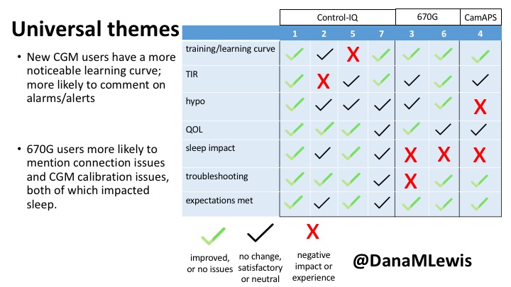
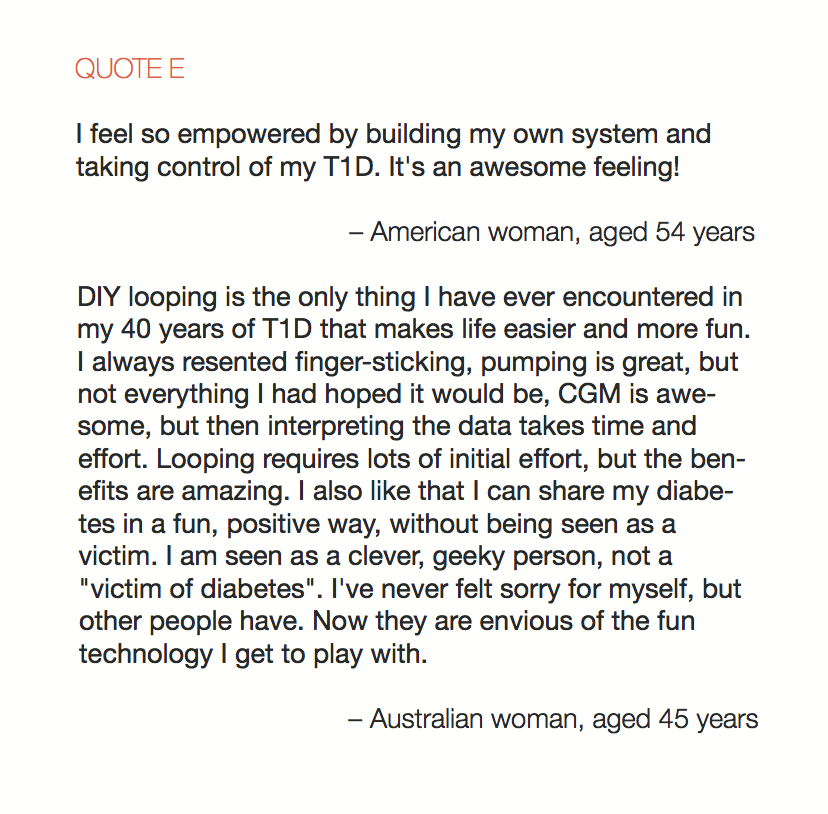
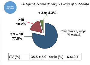
Looking at results for #OpenAPS data donors post-looping initiation, CV was 35.5±5.9, while eA1c was 6.4±0.7. TIR (3.9-10mmol/L) was 77.5%. Time spent >10 was 18.2%; time <3.9 was 4.3%.

SubcohortData_Melmer_ADA2019
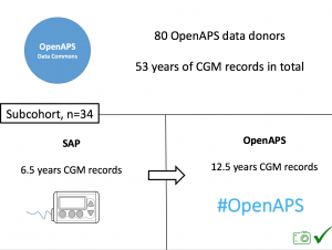
We selected a subcohort of n=34 who had data available from before DIY closed looping initiation (6.5 years combined of CGM records), as well as data from after (12.5 years of CGM records).

For these next set of graphs, blue is BEFORE initiation (when just on a traditional pump); red is AFTER, when they were using DIYAPS.

TIR_PrePost_Melmer_ADA2019
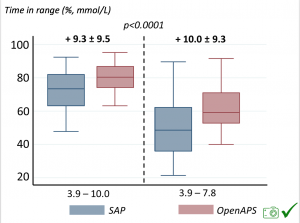
Time in a range significantly increased for both wider (3.9-10 mmol/L) and tighter (3.9-7.8 mmol/L) ranges.

TOR_PrePost_Melmer_ADA2019
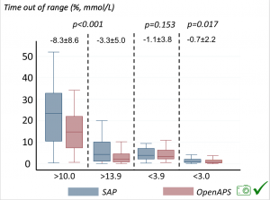
Time spent out of range decreased. % time spent >10 mmol/L decreased -8.3±8.6 (p<0.001); >13 mmol/L decreased -3.3±5.0 (p<0.001). Change in % time spent <3.9 mmol/L (-1.1±3.8 (p=0.153)), and <3.0 mmol/L (-0.7±2.2 (p=0.017)) was not significant.

We also analyzed daytime and nightime (the above was reflecting all 24hr combined; these graphs shows the increase in TIR and decrease in time out of range for both day and night).

TIR_TOR_DayAndNight_Melmer_ADA2019

Hypoglemic_event_reduction_Melmer_ADA2019
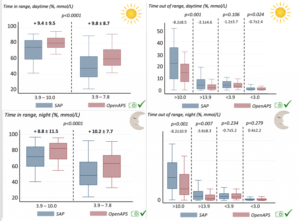
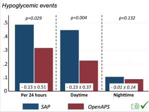
There were less CGM records in the hypoglycemic range after initiating DIYAPS.
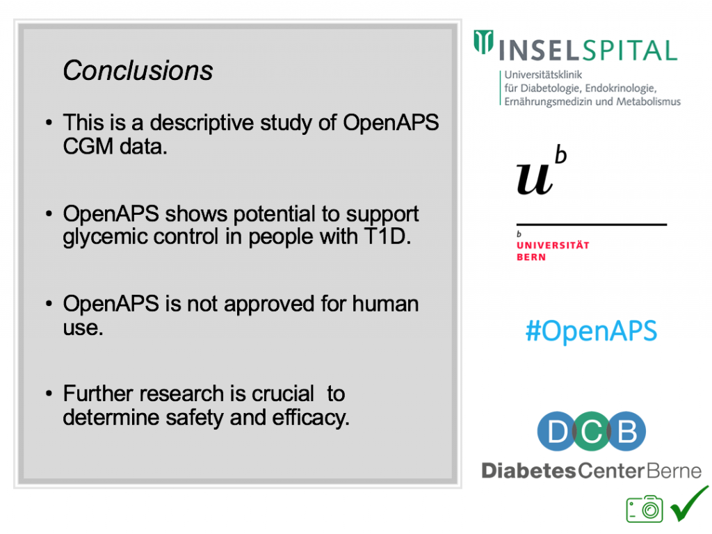
Conclusion: this was a descriptive study analyzing available CGM data from  #OpenAPS Data Commons. This study shows OpenAPS has potential to support glycemic control. However, DIYAPS are currently not regulated/approved technology. Further research is recommended.

Conclusion_Melmer_ADA2019

(Note: a version of this study has been submitted and accepted for publication in the Journal of Diabetes. Obesity, and Metabolism.)