Why I built another titration tool, this time for titrating subcutaneous IG (ScIG Pilot)

Why is everything a titration problem; why does the traditional healthcare / research system not solve titration for so many therapies; and why do I always find myself having to do it?

Good questions that I won’t answer (because I can’t), but it is a good introduction into what I have been working on. I built a titration simulation tool for clinicians and people who want to explore different adjustments to dosing immunoglobulin, especially through subcutaneous methods. AKA, subcutaneous IG, AKA ScIG (rhymes with “rig”).

What exactly is the problem?

ScIG is studied in very few conditions – the approved FDA indications are generally for PI (primary immunodeficiency) and CIDP (chronic inflammatory demyelinating polyneuropathy). But, ScIG (and IVIG) are used to treat a lot of autoimmune conditions (often used off-label, because the few other conditions studied have a much smaller population studied and lower-quality evidence bases). Thus, there are no approval studies nor good data for these other condition use cases. Instead, there is a smattering of literature showing that occasionally it works here and there. The dosing regimens are based on the PI/CIDP studies and there are very few of those studies beyond product-specific studies. ScIG has mostly been tested at a 7 day interval (meaning once per week) and there’s one study checking to see if you do it every 14 days (every two weeks) but double the dose to maintain the total dose per month, you get about the same outcome…that is, in people with PI, which means they were measuring infections. That doesn’t answer the “does it work” question for most other use cases for ScIG, which is a variety of other autoimmune diseases. It also doesn’t appear that they tested lower doses (?), so we can’t tell if the same dose over 14 days was effective because they doubled the weekly dose for the 14 day regimen they studied.

But does it work well if you do the same dose every 9-10 days? No one can tell you that, it hasn’t been studied, so if a patient is struggling with every 7 days scheduling, they may benefit from a schedule change, but there’s no data or guidance from research for the clinician to help estimate whether that may be ok, or a problem. Or, what happens if you slightly drop your dose by 10mL? Or what happens if you split your dose across 14 days? What happens if your dosing is evenly split over time or very differently split based on the pre-filled cartridges you have available?

Clinicians don’t often seem to prescribe ScIG to very many patients, so they also don’t have a strong feedback loop of data on alternative dosing regimens. And most indications are off-label and diverse, so that further dilutes that data stream: what works for someone could be unique to their disease rather than useful to extrapolate to everyone on ScIG.

Why does this matter?

ScIG is dosed based on body size. If you have a larger body, you have a larger dose. You are limited to how much you can infuse per site which influences how many needles you use. Needles have a risk of causing bruises and lumps (resolving to small clots of tissue that can sometimes take weeks to months to go away), so in some cases fewer needles is ideal, but this then drives up the size of the fluid depot which can be painful due to skin stretching and the amount of fluid that has to be cleared. It is a tradeoff between all of these factors. And, over time, people may have less skin real estate for various reasons. But, there’s no tool that helps patients make this kind of tradeoff. Current dosing calculators can help with dose and volume and figuring out infusion times, and tracking apps can record what happened, but they usually do not show what different schedules might mean over time. For example, whether doing smaller amounts less often changes the overall amount dosed, whether this creates bigger highs and lows in IgG levels, or simply reduces the number of sites. There’s also the question of how much time it takes for these varied dose schedules given the tradeoffs where fewer needles means larger depots and slower infusion times.

I wanted a tool to make those trade-offs easier to see. I wanted to be able to compare possible schedules side by side, showing the expected pattern over time, the amount per week, the number of infusion sites, the volume per site, and also model what the impacts are for the IG itself.

ScIG Pilot

ScIG dosing decisions often involve trade-offs among dose interval, total dose intensity, infusion volume, number of sites, per-site volume, and patient tolerability, but existing product calculators don’t cover this. They generally are designed for clinicians or pharmacists and focus on narrow tasks such as converting weight-based dose to volume, estimating sites or infusion time, or supporting labeled weekly/biweekly schedules. Published PK models describe ScIG absorption, peak/trough behavior, and exposure under standard regimens, but these are not available as a practical tool for comparing based on real-world constraints.

ScIG Pilot is a literature-informed simulator that compares candidate ScIG schedules against a reference regimen (aka a standard 7-day dosing schedule), showing normalized exposure curves, predicted peak/trough patterns, weekly-equivalent dose intensity, site burden, dose volume per site, and infusion frequency. (It is also open source.)

It can help someone think through a scenario and ask these types of questions of a proposed change:

  1. If I change the schedule, how does this change the volume I am getting over time? How does this compare to the existing schedule?
  2. When might this dose change impact the body?
  3. What is the burden trade-off: sites, dose per site, infusion days, time per infusion, longest gap? How does this stack up over a month or a year?

Then, based on outcomes (does it work) and various preferences (less time; fewer sites; smaller fluid depots; etc), someone can decide what works for their scenario, or at least have visuals to help them think through a decision and understand various tradeoffs. This is also helpful when trying to estimate out to longer time frames, for example: not just what this regimen does in a month in terms of number of sites, number of infusion days etc; but also how does this translate to a year of this therapy in terms of number of infusions and sites, etc?

ScIG Pilot: a subcutaneous immunoglobulin titration tool, a blog post by Dana M. Lewis on DIYPS.orgIt can be really hard to titrate these types of therapies and infusions, because there is no good data. I’d love to see studies in future collect this type of data or have repositories (like I described here) that are not limited to one disease indication, so a patient or clinician could go and research across populations to better get some data to triangulate from to better inform a subsequent decision to go on a therapy or change a treatment regimen. Right now, there are no visuals, no data, and no tools. But now, for this, there is at least ScIG Pilot to help visualize and triangulate across what little data we do have.

(And it’s open source so if you have ideas to improve ScIG Pilot or suggestions to make the models more useful, please feel free to open issues or PRs or email me to discuss – Dana+ScIGPilot@OpenAPS.org)

Software-Shaped Feelings

I have to ask myself these days, is this a software-shaped feeling?


This is a riff on something I see online more and more frequently, where people comment about recognizing if this is a “software-shaped problem”. Meaning, is this something that can be solved with software? More recently, this often means n=1 custom, boutique software that we can build ourselves. This is often easier and even faster than trying to search for something that maybe exists elsewhere and kinda works but not perfectly and requires a lot of work to tweak to the use case. Instead, now, we can spend the same (or often a lot less) time building something that perfectly fits.

I have been doing this for years. Juggling data in my head is hard – so I often turn to spreadsheets. For example, trying to figure out my enzyme dosing originally for exocrine pancreatic insufficiency – I had too many meals and too many variables to track, so I made a spreadsheet. When I then incorporated dosing enzymes for everything that I ate, that meant also everything I was eating while ultrarunning – which I did every 30 minutes to fuel. So I made a spreadsheet for that and then a template with dropdowns to use while running. I could quickly enter data that way, but Google sheets was slow to load on my phone and the extra seconds of delay was frustrating. Thus, I made a simple app I called “Macros On The Run” to allow me to more quickly open and tap the drop down and select my fuel item. Since I was building a custom app interface I could have all the summary data I wanted from my run, both hourly stats on calories and sodium consumed but also the entire per-run stats. I then was able to export my data to be able to analyze it later (particularly, also transposing it into the spreadsheet I use for food and enzyme intake). Does anyone else have this use case? No, probably not. But it was so empowering to be able to track and capture information in a format that worked well for me. And because I had learned how to build apps to build PERT Pilot to share with other people (because not everyone loves spreadsheet interfaces), I knew how to build apps, so I had the skillset that translated to figuring out how to build another app. This was before agentic AI, by the way, but this is now even easier.

Enter this week. I realized that I had expressed frustration to both my mom and Scott about a situation where I have a medicine/treatment that is done once a week, but it’s not a time-anchored or time-specific treatment. I don’t always take it Tuesday at 7pm. Depending on my schedule it could be 5pm, 9pm, whatever. But also, if I’m traveling, it can be a day earlier or later. It’s 7 days, plus or minus one day. Previously I was adding an event to the calendar for every week, and then moving it around. But I realized looking ahead at a busy summer full of travel that it was hard to move one without having to move another, because it’s not the week before that only matters, moving one also influences the chain of following events. If I usually do it on Tuesday but I’ll be traveling and not home until Thursday (and don’t want to do it while traveling), then I need to move the previous week from Tuesday to Wednesday so the following week’s Thursday is not out of the allowed ‘window’. So instead of 7-7-7, or ending up with 7-9-5 (which means two weeks are out of bounds), it becomes 7-8-6. But because these are single calendar events, there’s no alert when something goes out of bounds/out of the ‘allowed window’. Setting a recurring event (eg calendar event every 7 days) doesn’t resolve this, either. Juggling all of this in my head felt like a waste and non-optimal.

If only, I thought, I had a way to create an event type that was based on the “chain” relationship to the events before and after, that I could set to every 7 days but have an ‘allowed’ grace window of plus or minus a day, so that anything 6-8 days was allowed.

Google calendar doesn’t support this. But I know that you can subscribe to other calendars and show them, eg how I edit events in TripIt and subscribe to the calendar feed so I can see those events in Google calendar.

Thus, I found myself asking, “is this a software-shaped feeling?” of frustration? I can build apps, after all. Could I build an app that somehow publishes a calendar feed that I can see in Google calendar and see these events and get alerts when they are out of bounds? Ideally I’d be able to use Google calendar to edit these events, the way I do my other calendar events.

The mental model I had was app>feed>display in calendar. I was laying in bed, but I pulled open one of my LLMs that I have on my phone and sketched out the idea in a few sentences and asked what was possible to do and what technically it would take to do this. It brainstormed two key options, one with Google authentication and complicated multi-step back end (storage and databases and hosting and servers and all the stuff I *can* do but hate doing and doesn’t make sense for a quick n=1 prototype), and one simple one where the app would create its own iCloud calendar and then publish a feed I could see via the Google calendar. Aha, I thought, that’s it.

The next day I sat down at my laptop and used my coding LLM of choice. I asked it to build this app where it would allow me to create a ‘series’ of events with a set window (eg default to Tuesday at 7pm) and allow me to set a grace period (eg +/-1 day) and see the distance between events and flag a visual cue if they fall out of the window. It should then create events in an iCloud calendar. I would then subscribe and view it via Google calendar, so I could see it via my laptop or phone. Eventually I would see if I could edit it from those views, but for now, just being able to push and adjust from the app would be fine. (Note: my prompt was a little more specific than this, but the important part wasn’t telling it how to build the app or what I wanted it to look like. The important part is making sure it understands the end goal and user interactions so we design the backend and the front end to support what I actually want to do as the end user.)

It…did it. This isn’t a story of “one-shotting” and getting things perfectly from a single prompt, but I continue to be appreciative that the first hours of setting up a project and getting it to build on your device and get the basic functionality working that used to take 4-6 hours and lots of gnashing teeth is now a 15-20 minute endeavor, usually. And that’s what happened here, I had a working functional prototype working on my phone in about 15 minutes. I spent more time after that making it look better, testing it, adjusting events, etc, but the initial setup and functionality was a very quick process. That’s huge. For me, it doesn’t matter what the total amount of time it is to get a project ‘done’ or usable for real-life testing. You’ll see people talk about how you get 80% of the work done quicker but it ‘takes longer’ for the last 20%, but I honestly think I do way more (so it’s not just 20%) when I haven’t exhausted myself gnashing my teeth about the fundamental basic how-does-it-work and does-it-build and what-is-this-build-error.


This app probably doesn’t matter to anyone else, but if you have a use case for it and would like to try it, let me know. I called it SchedulerPilot. It creates a new iCloud calendar called SchedulerPilot that you can see on your phone, and then also subscribe to elsewhere to view (e.g. if you set it to be viewable via a link), such as in Google calendar. That means I can give Scott access to see it the way he sees my other calendars, plus view it from my browser-based calendar view on my laptop. I can’t edit events from Google calendar in the browser, but I was able to (much more easily than I expected) add functionality to edit directly from my phone’s calendar app the way I usually do on the go. I also then was able to add functionality in the app for it to flag when the in-app view and calendar view were out of sync. It shows a list of events and how they differ and I can choose whether I pull calendar changes into the app view, or if I did the tweaking in the app, push those changes back to the calendar. They automatically sync. I can also add notes to the event and ‘lock’ it so if I make other adjustments and push updates, it doesn’t overwrite it. This is key for travel-based constraints where I am definitively moving it to do when I get home from a trip, but sometimes I haven’t booked flights for the trip so looking at my calendar it may otherwise be confusing WHY the event is moved for the week. Having a lock shows it’s there for a reason, and the optional note also provides good context clue for why it’s moved. I can also add more events in the future with the tap of a button, if I’m still using this as my method for scheduling in the future (and I’m guessing I will be).

Here’s an animated demo showing the point of the app and why it’s useful:


software-shaped feelings. a blog post by Dana M. Lewis on DIYPS.orgThe point isn’t convincing you to want to use my app. Most people don’t have a use case for this. But I want more people to build the patterns of recognizing when their feelings are trying to tell them something (e.g. this is a problem we could work on improving, even if it is not solvable) and build the skills of identifying when this is a software-shaped feeling. Especially when we are dealing with health-related situations and especially chronic non-curable diseases, and especially ones with treatments or medications that are not fun, it is so important to solve friction and frustration whenever and wherever we can. Not everything is a software-shaped feeling, but the more we recognize and address, the better off we are. Or at least I am, and I hope to help others do the same.

PS – If you find yourself with a software-shaped feeling and aren’t sure where to start, feel free to reach out and I’m happy to help chat and brainstorm and help you figure out which LLM tools work for you to help build software that fit those feelings. (Even if you tried a particular LLM in the past, they are frequently updating models and tools and it is worth trying again. They have gotten way better and require way less specific prompting, like I outlined here – although there may be some tips you still find useful in this post.) It used to be that you had to fund someone or badger someone to help build something if you didn’t have previous technical skills (or invest a LOT of time and energy) to learn them to do a thing. Now, you don’t have to do that, or plan to have a company to get funding to build a prototype. You can just…build things. And it’s ok if it’s “just” a n=1 solution. If it works for you, it’s worth the time. And chances are, it’ll be something that works for someone else, too. And in the meantime, you’ll have made something that works for you. If you felt like you needed permission, you have it. It won’t fix everything, but that doesn’t mean you should fixing what you can. It feels really good to have forward progress and to do something productive.

Baseline Pilot – a leading indicator for biometric data and tool for reducing infection spread

What if you could stop the spread of infection once it arrives at your house? This is easier to do now than ever before in the era of wearables like smart watches and smart rings that gather biometric data every day and help you learn what your baseline is, making it easier to spot when your data starts to deviate from baseline. This data often is the first indicator that you have an infection, even before you develop symptoms sometimes.

But, you need to know your baseline in order to be able to tell that your data is trending away from that. And despite the fact that these new devices making it easier to have the data, they actually make it surprisingly challenging to *quickly* get the new data on a daily basis, and the software they have programmed to catch trends usually only catches *lagging* trends of changes from baseline. That’s not fast enough (on either of those metrics) for me.

(The other situation that prompted this is companies changing who gets access to which form of data and beginning to paywall long-time customers out of previous data they had access to. Ahem, looking at you, Oura.)

Anyway, based on past experiences (Scott getting RSV at Thanksgiving 2024 followed by another virus at Christmas 2024) we have some rich data on how certain metrics like heart rate (RH), heart rate variability (HRV), and respiratory rate (RR) can together give a much earlier indication that an infection might be brewing, and take action as a result. (Through a lot of hard work detailed here, I did not get either of those two infections that Scott got.) But we realized from those experiences that the lagging indicators and the barriers in the way of easily seeing the data on a daily basis made this harder to do.

Part of the problem is Apple and their design of “Vitals” in Apple Health. They have a “Vitals” feature that shows you ‘vital’ health metrics in terms of what is typical for you, so you can see if you fall in the range of normal or on the higher or lower end. Cool, this is roughly useful for that purpose, even though their alerts feature usually lag the actual meaningful changes by several days (usually by the time you are fully obviously symptomatic). But you can’t reliably get the data to show up inside the Vitals section, even if the raw data is there in Apple Health that day! Refreshing or opening or closing doesn’t reliably force it into that view. Annoying, especially because the data is already there inside of Apple Health.

This friction is what finally prompted me to try to design something: if the data is there inside Apple Health and Apple won’t reliably show it, maybe I could create an app that could show this data, relative to baseline, and do so more reliably and quickly than the “Vitals” feature?

Turns out yes, yes you can, and I did this with BaselinePilot.

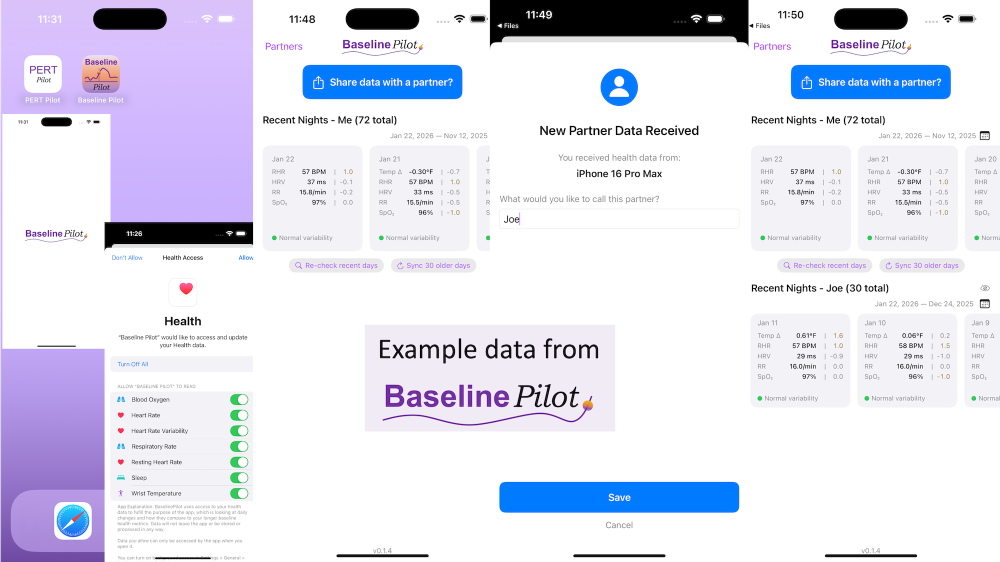
BaselinePilot is an iOS app that pulls in the HealthKit data automatically when you open it, and shows you that day’s data. If you have a wearable that pushes any of these variables (heart rate, heart rate variability, respiratory rate, temperature, blood oxygen) into Apple Health, then that data gets pulled into BaselinePilot. If you don’t have those variables, they don’t show up. For example, I have wearables that push everything but body temp into Apple Health. (I have it on a different device but I don’t allow that device to write to Health). Whereas Scott has all of those variables pushed to Health, so his pulls in and displays all 5 metrics compared to the 4 that I have.

What’s the point of BaselinePilot? Well, instead of having to open Apple Health and click and view every one of those individual metrics to see the raw data and compare it to previous data (and do it across every metric, since Vitals won’t reliably show it), now at a glance I can see all of these variables raw data *and* the standard deviation from my baseline. It has color coding for how big the difference is and settings to flag when there is a single metric that is very far off my baseline or multiple variables that are moderately off the baseline, to help me make sure I pay attention to those. It’s also easy to see the last few days or scroll and continue to see the last while, and I can also pull in historical data in batches and build as much history as I want (e.g. hundreds of days to years: whatever amount of data I have stored in Apple Health).

So for me alone, it’s valuable as a quick glance “fetch my data and make sure nothing is wonky that I need to pay attention to or tell someone about”. But the other valuable part is the partner sharing feature I built in.

With partner sharing, I can tap a button (it shows up as a reminder after your data is synced) and text a file over to Scott (or vice versa). Opening the file in iMessage shows a “open in BaselinePilot” button at the bottom, and it immediately opens the app and syncs the data. You can assign a display name to your person and thus see their data, too, in the same format as yours. You can hide or delete this person or re-show them at any time. This is useful for if you are going on a long vacation and sharing a house with family members, for example, and so you want to share/see your data when you’re going to be in physical proximity but then don’t need to see them after that – you can hide them from view until that use case pops up again.

Screenshots of BaselinePilot, showing 72 days of simulated data for the user (not actually my data) and the display with a simulated partner called "Joe".
Simulated data and simulated partner data displayed in BaselinePilot.

Ideally, I’d love to automate this data syncing with partners (who agree) over Bluetooth, so you don’t have to tap to share the file on a regular basis. But, that won’t work with the current design of phones and the ability to background sync automatically without opening the app, so I’ve stopped working on Bluetooth-based solutions given the technical/policy constraints in the phone ecosystems right now. Eventually, this could also work cross-platform where someone could generate the same style file off of their Android-based BaselinePilot and be able to share back and forth, but Scott and I both use iPhones so right now this is an iOS app. (Like BookPilot, I built this for myself/our use case and didn’t intend to distribute it; but if this sounds like something you’d use let me know and I could push BaselinePilot to the app store for other people to use.)

BaselinePilot: a leading indicator for biometric data and tool for reducing infection spread. A blog post by Dana M. Lewis on DIYPS.orgAll of this data is local to the app and not being shared via a server or anywhere else. It makes it quick and easy to see this data and easier to spot changes from your normal, for whatever normal is for you. It makes it easy to share with a designated person who you might be interacting with regularly in person or living with, to make it easier to facilitate interventions as needed with major deviations. In general, I am a big fan of being able to see my data and the deviations from baseline for all kinds of reasons. It helps me understand my recovery status from big endurance activities and see when I’ve returned to baseline from that, too. Plus the spotting of infections earlier and preventing spread, so fewer people get sick during infection season. There’s all kinds of reasons someone might use this, either to quickly see their own data (the Vitals access problem) or being able to share it with someone else, and I love how it’s becoming easier and easier to whip up custom software to solve these data access or display ‘problems’ rather than just stewing about how the standard design is blocking us from solving these issues!


What else have I built that you might like to check out? I just built “BookPilot”, a tool to help you filter book recommendations by authors you’ve already read, based on the list of books you’ve already read from your library data. If you use iOS, check out Carb Pilot to help get AI-generated estimates (or enter manual data, if you know it) to track carbs or protein etc and only see which macronutrients you want to see. If you have EPI (exocrine pancreatic insufficiency, also called PEI), check out “PERT Pilot” either on iOS or Android to help you track your pancreatic enzyme replacement therapy.

You Can Create Your Own Icons (and animated gifs)

Over the years, I’ve experimented with different tools for making visuals. Some of them are just images but in the last several years I’ve made more animations, too.

But not with any fancy design program or purpose built tool. Instead, I use PowerPoint.

Making animated gifs

I first started using PowerPoint to create gifs around 2018 or 2019. At the time, PowerPoint didn’t have a built-in option to export directly to GIF format, so I had to export animations as a movie file first and then use an online converter to turn them into a GIF. Fortunately, in recent years, PowerPoint has added a direct “Export as GIF” feature.

The process of making an animated GIF in PowerPoint is similar to adding animations or transitions in a slide deck for a presentation. I’ve used this for various projects, including:

Am I especially trained? No. Do I feel like I have design skills? No.

Elbow grease and determination to try is what I have, with the goal of trying to use visuals to convey information as a summary or to illustrate a key point to accompany written text. (I also have a tendency to want to be a perfectionist, and I have to consciously let that go and let “anything is better than nothing” guide my attempts.)

Making icons is possible, too

Beyond animations, I’ve also used PowerPoint to create icons and simple logo designs.

I ended up making the logos for Carb Pilot (a free iOS app that enables you to track the macronutrients of your choice) and PERT Pilot (a free iOS app that enables people with exocrine pancreatic insufficiency, known as EPI or PEI, to track their enzyme intake) using PowerPoint.

This, and ongoing use of LLMs to help me with coding projects like these apps, is what led me to the realization that I can now make icons, too.

I was working to add a widget to Carb Pilot, so that users can have a widget on the home screen to more quickly enter meals without having to open the app and then tap; this saves a click every time. I went from having it be a single button to having 4 buttons to simulate the Carb Pilot home screen. For the “saved meals” button, I wanted a list icon, to indicate the list of previous meals. I went to SF Symbols, Apple’s icon library, and picked out the list icon I wanted to use, and referenced it in XCode. It worked, but it lacked something.

A light purple iOS widget with four buttons - top left is blue and says AI: top right is purple with a white microphone icon; bottom left is periwinkle blue with a white plus sign icon; bottom right is bright green with a custom list icon, where instead of bullets the three items are an apple, cupcake, and banana mini-icons. It occurred to me that maybe I could tweak it somehow and make the bullets of the list represent food items. I wasn’t sure how, so I asked the LLM if it was possible. Because I’ve done my other ‘design’ work in PowerPoint, I went there and quickly dropped some shapes and lines to simulate the icon, then tested exporting – yes, you can export as SVG! I spent a few more minutes tweaking versions of it and exporting it. It turns out, yes, you can export as SVG, but then the way I designed it wasn’t really suited for SVG use. When I had dropped the SVG into XCode, it didn’t show up. I asked the LLM again and it suggested trying PNG format. I exported the icon from powerpoint as PNG, dropped it into XCode, and it worked!

(That was a good reminder that even when you use the “right” format, you may need to experiment to see what actually works in practice with whatever tools you’re using, and not let the first failure be a sign that it can’t work.)

Use What Works

There’s a theme you’ll be hearing from me: try and see what works. Just try. You don’t know if you don’t try. With LLMs and other types of AI, we have more opportunities to try new and different things that we may not have known how to do before. From coding your own apps to doing data science to designing custom icons, these are all things I didn’t know how to do before but now I can. A good approach is to experiment, try different things (and different prompts), and not be afraid to use “nontraditional” tools for projects, creative or otherwise. If it works, it works!

How Medical Research Literature Evolves Over Time Like A Game of Telephone

Have you ever searched for or through medical research on a specific topic, only to find different studies saying seemingly contradictory things? Or you find something that doesn’t seem to make sense?

You may experience this, whether you’re a doctor, a researcher, or a patient.

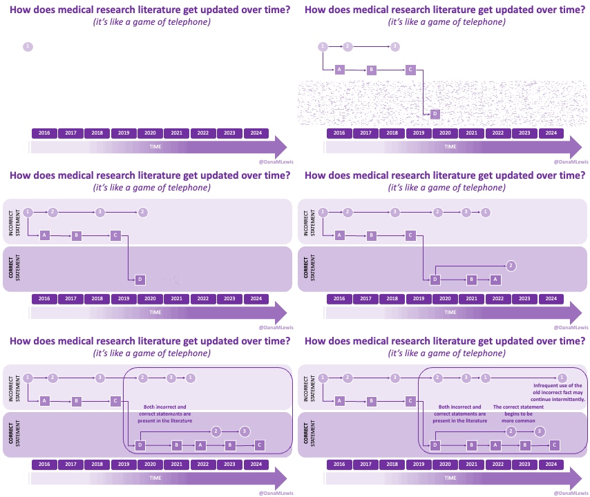
I have found it helpful to consider that medical literature is like a game of telephone, where a fact or statement is passed from one research paper to another, which means that sometimes it is slowly (or quickly!) changing along the way. Sometimes this means an error has been introduced, or replicated.

A Game of Telephone in Research Citations

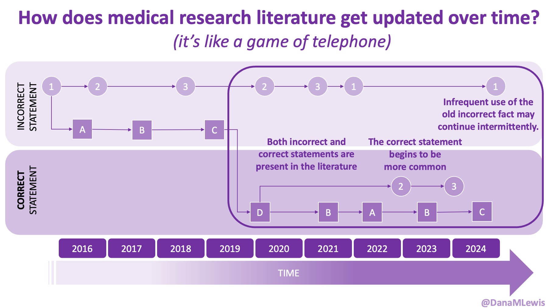
Imagine a research study from 2016 that makes a statement based on the best available data at the time. Over the next few years, other papers cite that original study, repeating the statement. Some authors might slightly rephrase it, adding their own interpretations. By 2019, newer research has emerged that contradicts the original statement. Some researchers start citing this new, corrected information, while others continue citing the outdated statement because they either haven’t updated their knowledge or are relying on older sources, especially because they see other papers pointing to these older sources and find it easiest to point to them, too. It’s not necessarily made clear that this outdated statement is now known to be incorrect. Sometimes that becomes obvious in the literature and field of study, and sometimes it’s not made explicit that the prior statement is ‘incorrect’. (And if it is incorrect, it doesn’t become known as incorrect until later – at the time it’s made, it’s considered to be correct.) 

By 2022, both the correct and incorrect statements appear in the literature. Eventually, a majority of researchers transition to citing the updated, accurate information—but the outdated statement never fully disappears. A handful of papers continue to reference the original incorrect fact, whether due to oversight, habit (of using older sources and repeating citations for simple statements), or a reluctance to accept new findings.

The gif below illustrates this concept, showing how incorrect and correct statements coexist over time. It also highlights how researchers may rely on citations from previous papers without always checking whether the original information was correct in the first place.

Animated gif illustrating how citations branch off and even if new statements are introduced to the literature, the previous statement can continue to appear over time.

This is not necessarily a criticism of researchers/authors of research publications (of which I am one!), but an acknowledgement of the situation that results from these processes. Once you’ve written a paper and cited a basic fact (let’s imagine you wrote this paper in 2017 and cite the 2016 paper and fact), it’s easy to keep using this citation over time. Imagine it’s 2023 and you’re writing a paper on the same topic area, it’s very easy to drop the same citation from 2016  in for the same basic fact, and you may not think to consider updating the citation or check if the fact is still the fact.

Why This Matters

Over time, a once-accepted “fact” may be corrected or revised, but older statements can still linger in the literature, continuing to influence new research. Understanding how this process works can help you critically evaluate medical research and recognize when a widely accepted statement might actually be outdated—or even incorrect.

If you’re looking into a medical topic, it’s important to pay attention not just to what different studies say, but also when they were published and how their key claims have evolved over time. If you notice a shift in the literature—where newer papers cite a different fact than older ones—it may indicate that scientific understanding has changed.

One useful strategy is to notice how frequently a particular statement appears in the literature over time.

Whenever I have a new diagnosis or a new topic to research on one of my chronic diseases, I find myself doing this.

I go and read a lot of abstracts and research papers about the topic; I generally observe patterns in terms of key things that everyone says, which establishes what the generally understood “facts” are, and also notice what is missing. (Usually, the question I’m asking is not addressed in the literature! But that’s another topic…)

I pay attention to the dates, observing when something is said in papers in the 1990s and whether it’s still being repeated in the 2020s era papers, or if/how it’s changed. In my head, I’m updating “this is what is generally known” and “this doesn’t seem to be answered in the literature (yet)” and “this is something that has changed over time” lists.

Re-Evaluating the Original ‘Fact’

In some cases, it turns out the original statement was never correct to begin with. This can happen when early research is based on small sample sizes, incomplete data, or incorrect assumptions. Sometimes that statement was correct, in context, but taken out of context immediately and this out of context use was never corrected. 

For example, a widely cited statement in medical literature once claimed that chronic pancreatitis is the most common cause of exocrine pancreatic insufficiency (EPI). This claim was repeated across numerous papers, reinforcing it as accepted knowledge. However, a closer examination of population data shows that while chronic pancreatitis is a known co-condition of EPI, it is far less common than diabetes—a condition that affects a much larger population and is also strongly associated with EPI. Despite this, many papers still repeat the outdated claim without checking the original data behind it.

(For a deeper dive into this example, you can read my previous post here. But TL;DR: even 80% of .03% is a smaller number than 10% of 10% of the overall population…so it is not plausible that CP is the biggest cause of EPI/PEI.)

Stay Curious

This realization can be really frustrating, because if you’re trying to do primary research to help you understand a topic or question, how do you know what the truth is? This is peer-reviewed research, but what this shows us is that the process of peer-review and publishing in a journal is not infallible. There can be errors. The process for updating errors can be messy, and it can be hard to clean up the literature over time. This makes it hard for us humans – whether in the role of patient or researcher or clinician – to sort things out.

But beyond a ‘woe is me, this is hard’ moment of frustration, I do find that this perspective of literature as a process of telephone makes me a better reader of the literature and forces me to think more critically about what I’m reading, and take papers in context of the broader landscape of literature and evolving knowledge base. It helps remove the strength I would otherwise be prone to assigning any one paper (and any one ‘fact’ or finding from a single paper), and encourages me to calibrate this against the broader knowledge base and the timeline of this knowledge base.

That can also be hard to deal with personally as a researcher/author, especially someone who tends to work in the gaps, establishing new findings and facts and introducing them to the literature. Some of my work also involves correcting errors in the literature, which I find from my outsider/patient perspective to be obvious because I’ve been able to use fresh eyes and evaluate at a systematic review level/high level view, without being as much in the weeds. That means my work, to disseminate new or corrected knowledge, is even more challenging. It’s also challenging personally as a patient, when I “just” want answers and for everything to already be studied, vetted, published, and widely known by everyone (including me and my clinician team).

But it’s usually not, and that’s just something I – and we – have to deal with. I’m curious as to whether we will eventually develop tools with AI to address this. Perhaps a mini systematic review tool that scrapes the literature and includes an analysis of how things have changed over time. This is done in systematic review or narrative reviews of the literature, when you read those types of papers, but those papers are based on researcher interests (and time and funding), and I often have so many questions that don’t have systematic reviews/narrative reviews covering them. Some I turn into papers myself (such as my paper on systematically reviewing the dosing guidelines and research on pancreatic enzyme replacement therapy for people with exocrine pancreatic insufficiency, known as EPI or PEI, or a systematic review on the prevalence of EPI in the general population or a systematic review on the prevalence of EPI in people with diabetes (Type 1 and Type 2)), but sometimes it’s just a personal question and it would be great to have a tool to help facilitate the process of seeing how information has changed over time. Maybe someone will eventually build that tool, or it’ll go on my list of things I might want to build, and I’ll build it myself like I have done with other types of research tools in the past, both without and with AI assistance. We’ll see!

TL;DR: be cognizant of the fact that medical literature changes over time, and keep this in mind when reading a single paper. Sometimes there are competing “facts” or beliefs or statements in the literature, and sometimes you can identify how it evolves over time, so that you can better assess the accuracy of research findings and avoid relying on outdated or incorrect information.

Whether you’re a researcher, a clinician, or a patient doing research for yourself, this awareness can help you better navigate the scientific literature.

A screenshot from the animated gif showing how citation strings happen in the literature, branching off over time but often still resulting in a repetition of a fact that is later considered to be incorrect, thus both the correct and incorrect fact occur in the literature at the same time.

Assessing the Impact of Diabetes on Gastrointestinal Symptom Severity in Exocrine Pancreatic Insufficiency (EPI/PEI): A Diabetes Subgroup Analysis of EPI/PEI-SS Scores – Poster at #ADA2024

Last year, I recognized that there was a need to improve the documentation of symptoms of exocrine pancreatic insufficiency (known as EPI or PEI). There is no standardized way to discuss symptoms with doctors, and this influences whether or not people get the right amount of enzymes (pancreatic enzyme replacement therapy; PERT) to treat EPI and eliminate symptoms completely. It can be done, but like insulin, it requires matching PERT to the amount of food you’re consuming. I also began observing that EPI is underscreened and underdiagnosed, whether that’s in the general population or in people with diabetes. I thought that if we could create a list of common EPI symptoms and a standardized scale to rate them, this might help address some of these challenges.

I developed this scale to address these needs. It is called the “Exocrine Pancreatic Insufficiency Symptom Score” or “EPI/PEI-SS” for short.

I had a handful of people with and without EPI help me test the scale last year, and then I opened up a survey to the entire world and asked people to share their experiences with GI-related symptoms. I specifically sought people with EPI diagnoses as well as people who don’t have EPI, so that we could compare the symptom burden and experiences to people without EPI. (Thank you to everyone who contributed their data to this survey!)

After the first three weeks, I started analyzing the first set of data. While doing that, I realized that (both because of my network of people with diabetes and because I also posted in at least one diabetes-specific group), I had a large sub-group of people with diabetes who had contributed to the survey, and I was able to do a full subgroup analyses to assess whether having diabetes seemed to correlate with a different symptom experience of EPI or not.

Here’s what I found, and what my poster is about (you can view my poster as a PDF here), presented at ADA Scientific Sessions 2024 (#ADA2024):

1985-LB at #ADA2024, “Assessing the Impact of Diabetes on Gastrointestinal Symptom Severity in Exocrine Pancreatic Insufficiency (EPI/PEI): A Diabetes Subgroup Analysis of EPI/PEI-SS Scores”

Exocrine pancreatic insufficiency has a high symptom burden and is present in as many as 3 of 10 people with diabetes. (See my systematic review from last year here). To help improve conversations about symptoms of EPI, which can then be used to improve screening, diagnosis, and treatment success with EPI, I created the Exocrine Pancreatic Insufficiency Symptom Score (EPI/PEI-SS), which consists of 15 individual symptoms that people separately rate the frequency (0-5) and severity (0-3) for which they experience those symptoms, if at all. The frequency and severity get multiplied for an individual symptom score (0-15 possible) and these get added up for a total EPI/PEI-SS score (0-225 possible, because 15 symptoms times 15 possible points per symptom is 225).

I conducted a real-world study of the EPI/PEI-SS in the general population to assess the gastrointestinal symptom burden in individuals with (n=155) and without (n=169) EPI. Because there was a large cohort of PWD within these groups, I separately analyzed them to evaluate whether diabetes contributes to a difference in EPI/PEI-SS score.

Methods:

I calculated EPI/PEI-SS scores for all survey participants. Previously, I had analyzed the differences of people with and without EPI overall. For this sub-analysis, I analyzed and compared between PWD (n=118 total), with EPI (T1D: n=14; T2D: n=20) or without EPI (T1D: n=78; T2D: n=6), and people without diabetes (n=206 total) with and without EPI.

I also looked at sub-groups within the non-EPI cohorts and broke them into two groups to see whether other GI conditions contributed to a higher EPI/PEI-SS score and whether we could distinguish EPI from other GI and non-GI conditions.

Results:

People with EPI have a much higher symptom burden than people without EPI. This can be assessed by looking at the statistically significant higher mean EPI/PEI-SS score as well as the average number of symptoms; the average severity score of individual symptoms; and the average frequency score of individual symptoms.

This remains true irrespective of diabetes. In other words, diabetes does not appear to influence any of these metrics.

People with diabetes with EPI had statistically significant higher mean EPI/PEI-SS scores (102.62 out of 225, SD: 52.46) than did people with diabetes without EPI (33.64, SD: 30.38), irrespective of presence of other GI conditions (all group comparisons p<0.001). As you can see below, that is the same pattern we see in people without diabetes. And the stats confirm what you can see: there is no significant difference overall or in any of the subgroups between people with and without diabetes.
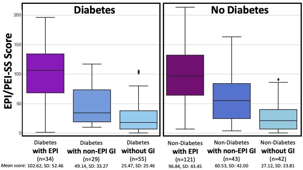
Box plot showing EPI/PEI-SS scores for people with and without diabetes, and with and without EPI or other GI conditions. The scores are higher in people with EPI regardless of whether they have diabetes. The plot makes it clear that the scores are distinct between the groups with and without EPI, even when the people without EPI have other GI conditions. This suggests the EPI/PEI-SS can be useful in distinguishing between EPI and other conditions that may cause GI symptoms, and that the EPI/PEI-SS could be a useful screening tool to help identify people who need screening for EPI.

T1D and T2D subgroups were similar
(but because the T2D cohort is small, I did not break them out separately in this graph).

For example, people with diabetes with EPI had an average of 12.59 (out of 15) symptoms, with an average frequency score of 3.06 and average severity score of 1.79, and an average individual symptom score of 5.48. This is a pretty clear contrast to people with diabetes without EPI who had had an average of 7.36 symptoms, with an average frequency score of 1.4 and average severity score of 0.8, and an average individual symptom score of 1.12. All comparisons are statistically significant (p<0.001).
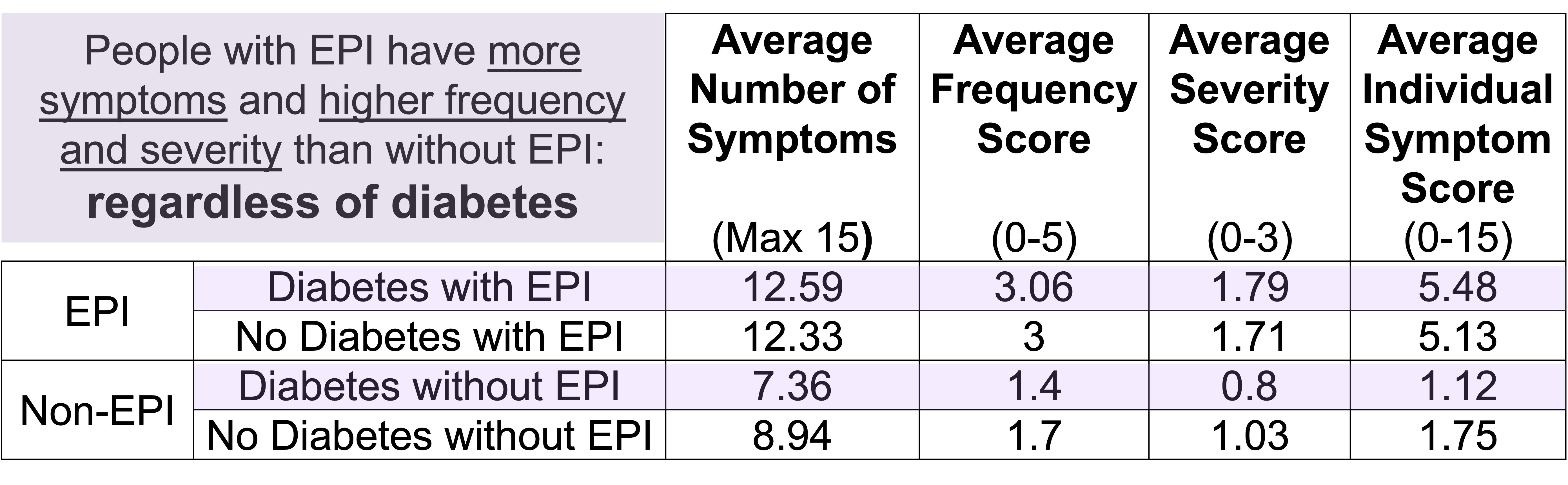
A table comparing the average number of symptoms, frequency, severity, and individual symptom scores between people with diabetes with and without exocrine pancreatic insufficiency (EPI). People with EPI have more symptoms and higher frequency and severity than without EPI: regardless of diabetes.

Conclusion 

  • EPI has a high symptom burden, irrespective of diabetes.
  • High scores using the EPI/PEI-SS among people with diabetes can distinguish between EPI and other GI conditions.
  • The EPI/PEI-SS should be further studied as a possible screening method for EPI and assessed as a tool to aid people with EPI in tracking changes to EPI symptoms over time based on PERT titration.

What does this mean if you are a healthcare provider? What actionable information does this give you?

If you’re a healthcare provider, you should be aware that people with diabetes may be more likely to have EPI – rather than celiac or gastroparesis (source) – if they mention having GI symptoms. This means you should incorporate fecal elastase screening into your care plans to help further evaluate GI-related symptoms.

If you want to further improve your pre-test probability of the elastase testing, you can use the EPI/PEI-SS with your patients to assess the severity and frequency of their GI-related symptoms. I will explain the cutoff and AUC numbers we calculated, but first understand the caveat that these were calculated in the initial real-world study that included people with EPI who are already treating with PERT; thus these numbers might change a little when we repeat this study and evaluate it in people with untreated EPI. (However, I actually predict the mean score to go up in an undiagnosed population, because scores should go down with treatment.) But that different population study may change these exact cutoff and sensitivity specificity numbers, which is why I’m giving this caveat. That being said: the AUC was 0.85 which means a higher EPI/PEI-SS is pretty good for differentiating between EPI and not having EPI. (In the diabetes sub-population specifically, I calculated a suggested cutoff of 59 (out of 225) with a sensitivity of 0.81 and specificity of 0.75. This means we estimate that if people are bringing up GI symptoms to you and you have them take the EPI/PEI-SS and their score is greater than or equal to 59, you would expect that out of 100 people that 81 with EPI would be identified (and 75 of 100 people without EPI would also correctly be identified via scores lower than 59). That doesn’t mean that people with EPI can’t have a lower score; or that people with a higher score do have EPI; but it does mean that the chances of having fecal elastase <=200 ug/g is a lot more likely in those with higher EPI/PEI-SS scores.

In addition to the cutoff score, there is a notable difference in people with diabetes and EPI compared to people with diabetes without EPI in their top individual symptom scores (representing symptom burden based on frequency and severity). For example, the top 3 symptoms of those with EPI and diabetes include avoiding certain food/groups; urgent bowel movements; and avoiding eating large meals. People without EPI and diabetes also score “Avoid certain food/groups” as their top score, but the score is markedly different: the mean score of 8.94 for people with EPI as compared to 3.49 for people without EPI. In fact, the mean score on the lowest individual symptom is higher for people with EPI than the highest individual symptom score for people without EPI.

QR code for EPI/PEI-SS - takes you to https://bit.ly/EPI-PEI-SS-WebHow do you have people take the EPI/PEI-SS? You can pull this link up (https://bit.ly/EPI-PEI-SS-Web), give this link to them and ask them to take it on their phone, or save this QR code and give it to them to take later. The link (and the QR code) go to a free web-based version of the EPI/PEI-SS that will calculate the total EPI/PEI-SS score, and you can use it for shared decision making processes about whether this person would benefit from a fecal elastase test or other follow up screening for EPI. Note that the EPI/PEI-SS does not collect any identifiable information and is fully anonymous.

(Bonus: people who use this tool can opt to contribute their anonymized symptom and score data for an ongoing observational study.)

If you have feedback about whether the EPI/PEI-SS was helpful – or not – in your care of people with diabetes; or if you want to discuss collaborating on some prospective studies to evaluate EPI/PEI-SS in comparison to fecal elastase screening, please reach out anytime to Dana@OpenAPS.org

What does this mean if you are a patient (person with diabetes)? What actionable information does this give you?

If you don’t have GI symptoms that bother you, you don’t necessarily need to take action. (Just put a note in your brain that EPI is more likely than celiac or gastroparesis in people with diabetes so if you or a friend with diabetes have GI symptoms in the future, you can make sure you are assessed for EPI.) You can also choose to take the EPI/PEI-SS regardless, and also opt in to donate your data.

If you do have GI symptoms that are annoying, you may want to take the EPI/PEI-SS to help you evaluate the frequency and severity of your GI symptoms. You can take it for free and anonymously – no identifiable information is needed to access the tool. It will generate the EPI/PEI-SS score for you.

Based on the score, you may want to ask your doctor (which could be the doctor that treats your diabetes, or a primary/general care provider, or a gastroenterologist – whoever you seek routine care from or have an appointment from next) about your symptoms; share the EPI/PEI-SS score; and explain that you think you may warrant screening for EPI.

(You can also choose to contribute your anonymous symptom data to a research dataset, to help us improve the EPI/PEI-SS and help us figure out how to help improve screening and diagnosis and treatment of EPI. Remember, this tool will not ask you for any identifying information. This is 100% optional and you can opt out of doing so if you do not prefer to contribute to research, while still using the tool.)

You can see a pre-print version of the diabetes sub-study here or pre-print of the general population data here.

If you’re looking for more personal experiences about living with EPI, check out DIYPS.org/EPI, and also for people with EPI looking to improve their dosing with pancreatic enzyme replacement therapy – you may want to check out PERT Pilot (a free iOS app to record enzyme dosing, also available for free for Android).

Researchers & clinicians, if you’re interested in collaborating on studies in EPI (in diabetes, or more broadly on EPI), whether specifically on EPI/PEI-SS or broader EPI topics, please reach out! My email is Dana@OpenAPS.org

How to Exercise When Exercise Is Harder Than Your Normal

I’ve been spending a lot of time thinking lately about how to optimize exercise and physical activity when your body doesn’t do what it’s supposed to do (or what you want it to do). We don’t always have control over our bodies; whereas we do, sometimes, have control over our actions and what we can try to do and how we do physical activity. A lot of my strategies for optimizing exercise and physical activity have actually been updating my mental models, and I think they might be useful to other people, too.

But first, let me outline a couple of scenarios and how they differ so we have a shared framework for discussing some of the mental strategies for incorporating activity and exercise into life with chronic diseases like autoimmune diseases.

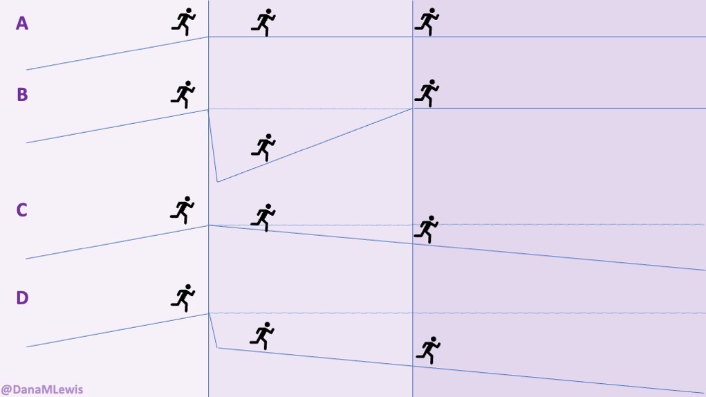
Let’s imagine you’re running and you come to a cliff.

  • In scenario A, there’s a bridge across to the other side at the same level. It’s no big deal to continue running across and continue on your way.
  • In scenario B, there’s no bridge, and you tumble off the cliff, but then you are able to (eventually) work your way back up to the other side at the same level as the person who could just stroll across the bridge.
  • In scenario C, there’s no bridge but the cliff isn’t as steep of a drop off; instead, it’s like a 2% railroad grade trail sloping away and down. You continue down it, but you end up well below the other side where a bridge would’ve connected, and there’s no way up to that level. The longer you go, the farther you are from that level.
  • In scenario D, there is a cliff that you fall off of, and you pick yourself up and keep going but it’s on that 2% railroad grade sloping away and down. Like scenario C, you end up well below – and even farther below – where you would have been if the bridge had been there.

Illustration of a runner crossing a bridge; running up a slope after the trail drops first then returns to the same height (B); running down a slope that takes them below the target height (C); and a combination of a sharp drop then slope down (D), as explained in more words throughout the blog post.

This is basically illustrative of the different types of situations you can find yourself in related to health status.

  • If all is well, you’re in scenario A: no bumps in the road, you just carry on.
  • Scenario B is like when you have a short-term injury or accident (like breaking your ankle or a toe) where you have a sudden drop in ability but you are able to build back up to the level you were at before. It may take longer and feel like a hard slog, but usually you can get there.
  • Scenario C is when you have a chronic disease (or are experiencing aging over time) where there’s small changes in the situation or in your ability. Because of these factors, you end up below where you maybe would like to be.
  • Scenario D is when there’s an acute situation that triggers or results in a significant, sudden drop followed by a chronic state that mimics the downward 2% small change slope that adds up significantly over time, meaning you are well below compared to where you would like to be.

My personal experiences and living in Scenario D

I have dealt with scenario B via a broken ankle and a broken toe in past years. Those stink. They’re hard. But they’re a different kind of hard than scenario C and scenario D, where I’ve found myself in the last few years and more acutely, I now am clearly operating in scenario D: I have had an acute drop-off in lung function and have autoimmune diseases that are affecting my ability to exercise, especially as compared to “before”. In fact, I keep having cycles of scenario D where my VO2 max drops off a cliff (losing a full point or more) within 2-3 days, then plateaus at the low level during the length of that round of symptoms, before maybe responding to my efforts to bring it back up. And it doesn’t always go back up or respond to exercise the way it used to do, “before”, because well, my lungs don’t work like they used to.

It’s been pretty frustrating. I want to keep building on the hard work I’ve put into my last 2-3 years of ultrarunning. Last year around this time, I ran a personal best 100k (62 miles) and beat my brother-in-law’s 100k time. I’m pretty proud of that because I’m pretty slow; but in ultras if you pace well and fuel well, you can beat faster runners. (As opposed to much shorter distances where speed matters more!).

This year, however, I can barely trek out – on the best day – for a 4 mile run. I had originally envisioned that, due to my fitness level and cumulative mileage build up, I would be able to train for and run a fast marathon (26.2 miles / ~42k) this spring, and that was supposed to be what I was training for. (Fast being “fast for me”.) But instead of running ~30-40 miles a week, I have been running 8-16 miles per week and have only clocked in half of the total mileage I had done by this point last year. Argh. I didn’t expect to do as much overall, but 210 instead of 420 miles by the beginning of April shows how different it’s been and how limited I have been. I’ve dropped the scheduled plan for marathon training – or any hopes of ultra training this year, unless something changes drastically in a positive way that I’m not expecting.

I finally realized that comparing my abilities to “before” is the crux of a lot of my angst. It is a little hard when you realize over time (scenario C) that you can’t do something that you think you should be able to. For example, me trying to run fast: it just has never worked the way training to run fast seems to work for other people. Eventually, in “before times”, I had settled into a strategy of running far, but doing so more slowly, and that’s turned out to be way more fun for me. But when you have an acute adjustment in ability that isn’t like scenario B (e.g. you can expect to regain strength/function/ability over time), it’s really hard to wrap your brain around. And comparisons to ‘before’ feel inevitable. They’re probably part of the grieving process in recognizing that things have changed. But at some point, it’s helpful to recognize and picture that you ARE in scenario D. This includes grappling with and accepting the fact that something has changed; and you likely do not have control over it.

I have updated my mental model with some strategies, to help me frame and recognize that on bad days, I don’t have to push myself (even if deep down I want to, because I want to rebuild/gain fitness to where I “should” be) – and that I should save that strategy for “good” days.

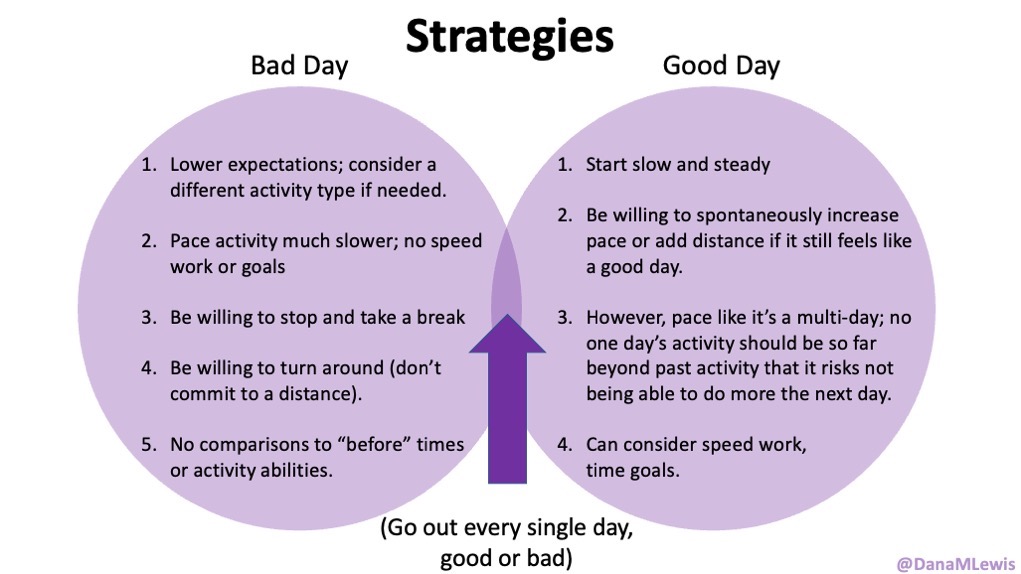
Here’s what I’ve landed on, for general strategy approach, which applies to whatever activity that I ultimately choose for the day:

Overlapping circles of good days and bad days, showing that regardless of which day it is, I still go out every day. Strategies for 'bad' days include lowering expectations; changing activities; pacing slower; taking breaks; turning around; and not comparing to 'before'. Good/better days can involve a slow start but speed up or add distance if it feels good, as long as I pace/do it in a way that doesn't overdo it such that I can't be active as desired any following day.
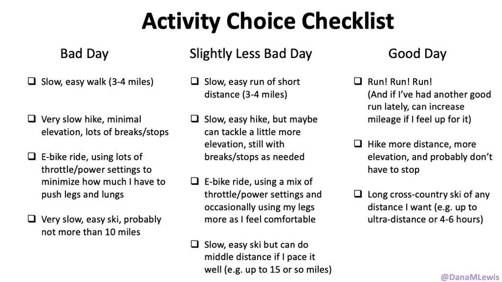
The other thing, in addition to comparing distance, time and pacing to “before” abilities, that I have struggled with, is not having a training plan or schedule. Because my ‘good’ days (where my lungs do not seem to limit my activity) are unpredictable, I can’t build a training schedule and build up mileage/ability the way I used to. Ultimately, I have had to land on a strategy that I don’t like but accept is the most feasible one for now (suggested by Scott): have a “checklist” of activities for my ‘good days’, and have a checklist of activities for my ‘bad days’. This has helped me separate my before-desire for running being my primary activity (and thinking about my running ‘schedule’ that I wish I could go back to), and instead be more realistic on the day-of about what activities are ideal for the type of day I’m actually dealing with.

For example, on my worst days, I cannot run for 30 seconds without gasping for breath and any type of intensive activity (anything more than a really slow meandering walk or a few seconds of a really slow run) feels terrible. Walking feels yuck too but it’s tolerable when I go slow enough, even though my lungs still feel physically uncomfortable inside my rib cage. On medium bad days, I maybe can do a slow, easy, short run with 20 seconds run intervals; a walk; an easy super slow hike with lots of stopping; or an e-bike ride; or easy pace cross-country skiing (when it was winter). On good days? I can do anything! Which means I can hike more elevation at clippier paces (and I can actually push myself on pace) or run with some modicum of effort above a snail’s pace or run a snail’s pace that doesn’t hurt for 30 second intervals. Those are my favorite activities, so those are high on my list (depending on whether it’s the weekday or weekend) to try to do when I’m feeling good. On the bad days or less good days, I take whatever activity is available to me however I can get it.

Activity choice check list for really bad days (e.g. walk or easy e-bike) vs less bad days (slow, easy short run or very slow hike or easy ski) versus the better days where I can run, hike longer/faster, and ski any distance I want.
There are tons of activities so if you’re reading this, know that I’m making this list based on MY favorite types of activities (and the climate I live in). You should make your list of activities and sort them if it’s helpful, to know which ones bring joy even on the worst days and those are what you should prioritize figuring out how to do more of, as the days permit.

Some of this stuff maybe seems “duh” and super intuitive to a lot of people, especially if you’re not living in Scenario D. Hello to everyone in Scenario A! But, when you’ve been thrust off a metaphorical cliff into Scenario D, and there’s no way to do what you did “before”, figuring out how to pace and push yourself to regain what fitness you can OR preserve basic health functionality as long as you can…it’s all an experiment of balancing what amount of activity pushes you in a positive way and builds strength, fitness and health and balancing against going over the point where it causes short-term harm (to the point where it impedes your activity the following days) and/or long-term harm (e.g. further hurts your lungs or other body parts in a way that is either irreversible or hard to recover from).

The pep talk I wish I got that I’m giving to you now

Before I lived in Scenario D (lung stuff), I lived a lot in Scenario C: running with type 1 diabetes AND celiac AND Grave’s AND exocrine pancreatic insufficiency (which means I have to juggle glucose management while only eating gluten free and calculating and eating enzymes for any of that gluten free food I eat as fuel while running) was a lot to juggle, in of itself. I often thought about how much I was juggling while running along, while recognizing that a lot of that juggling was invisible to the outside. Which made me think and observe that even though I feel like every other runner was flying by me and not dealing with the exact same set of balls to juggle; some of those runners WERE probably juggling their own health stuff and limitations, too (or are parents juggling jobs and kid schedules and running, etc). Everyone’s got baggage that they’re carrying, of some sort, or are juggling things in a different way. So, juggling is hard. Kudos to everyone for getting out there for juggling with what they’ve got.

But especially now in Scenario D, it’s even more important to me that it’s not about being out there and running certain paces or hiking certain distances: it’s getting out there AT ALL which is the entire point. And I’ve made it my mission to try to compliment people for getting out there, when it feels like it’s appropriate to do so.

Last week, I was handed the perfect opportunity, and it turned out to be the best conversation I’ve had in a long time. A woman was coming uphill and commented that I had not forgotten my hiking poles like she had. I said yeah, they make a difference going downhill as well as up! She said something about huffing and puffing because she has asthma. DING DING: opportunity to celebrate her for being out there hiking uphill, even with asthma. (I pretty much said that and complimented her). She and Scott were trading comments about it being the beginning of hiking season and how they had forgotten their hiking poles and we told them we were making a list throughout the hike of everything else we had forgotten. They mentioned that they were 70 (wow!) and 75 (wow!) and so they didn’t think they needed walkie talkies because they would not separate on the trail (one of the things that we forgot to bring in case Scott mountain-goated-ahead of me on the trail at any point). We gave them our sincere compliments for being out there hiking (because, goals! I am aiming hard and working hard to get to the age of 70 and be able to hike like that!). She talked about it being hard because she has asthma and was struggling to breathe at first before she remembered to take her albuterol…and I pointed out that even if she was struggling and had to stop every few minutes, it didn’t matter: she was out there, she was hiking, and it doesn’t matter how long it takes! She thought that was the best thing to hear, but it was really what I try to tell myself because I love to hear it, too, which is celebrating going and not worrying about pace/slow/whatever. I told her I had a lung condition too (she’s the first stranger I’ve ever told) and she asked if I was stopping every 2 minutes and whether I had taken an inhaler. I explained most of my lung condition doesn’t respond to an inhaler but that yes, I too had to stop and catch my breath. But it was an awesome, gorgeous day and worth hiking in and that I was glad I had gone up. Ultimately, she said a lot of things that made it seem like my shared experience helped her – but in turn, seeing her and talking to her helped ME just as much, because it reminded me that yes, everyone else is juggling things while hiking too. And it’s really not about speed/pace/time; it’s absolutely about being out there and enjoying it. (And helped me recognize that hiking poles are an instrument of freedom.)

So that’s what I’m trying to do: I’m trying to move beyond the comparison from what I did before, and simply compare to “am I going out at all and trying”. Trying = winning; going = winning, and that’s the new mental model that has been working really well for me as I spend more time in Scenario D.

PS – if you read this and are in a similar situation of Scenario B, C, or D and want a virtual high five and to feel “seen” for what you’re working through – feel free to comment here or email any time. I see you going out and trying; which means you’re winning! And I’m happy to give a virtual comment the way I am trying to give comments out on the trails and compliment folks for the process of being out moving through the world in all the ways that we can, however we can. 

Systematic Review of PERT Research and Guidelines for Exocrine Pancreatic Insufficiency (EPI or PEI)

New Systematic Review And Evaluation of Pancreatic Enzyme Replacement Therapy (PERT) Dosing Guidelines and Research for Exocrine Pancreatic Insufficiency (EPI or PEI)

I wrote a new paper evaluating the research behind pancreatic enzyme replacement therapy (aka, PERT) dosing for people with exocrine pancreatic insufficiency (known as EPI or PEI). I decided to do this research and write this paper because in my previous papers on EPI, I saw a lot of inconsistencies in when PERT was studied, how it was studied, and how that research was then used to develop guidelines.

(Big thanks to Julia Blanchette, Jordan Rieke, Claudia Lewis (no relation), Khaleal Almusaylim , and Anuhya Kanchibhatla for collaborating on this research and co-authoring the paper with me!)

You can find an author copy of the paper here, or see it on the journal website here. As a reminder, all my research papers have author copies and you can find them at DIYPS.org/research! I also have several other EPI-related articles.

A note on methods – this is a systematic review, meaning I used keywords to search multiple electronic databases to find articles about exocrine pancreatic insufficiency. I screened articles to make sure they were about EPI in humans and focused on English-language articles. We then reviewed the title and abstract of 2,530 remaining articles (!) that mentioned EPI, and excluded those that were not focused on EPI or a co-condition and unlikely to include guidelines or specific dose information related to EPI. That left 820 articles, which we then screened again looking for the full text and reviewing them for relevancy. I ended up reading 257 papers that we used for the basis of the research described below!

We found 7 key findings from this body of research:

  1. PERT Titration Protocols Aren’t Very Specific (or useful as typically written)“Most PERT dosing guidelines do not articulate a specific, defined dose range. Instead, PERT is commonly dosed with a general starting dose, such as 50,000 units of lipase per meal and 25,000 units of lipase per snack. If needed, guidelines then recommend increasing (i.e., titrating) the dosage by a factor of two to three (commonly described as increasing by 2x – 3x), and if symptoms persist, adding a proton pump inhibitor (PPI) before exploring other potential diagnoses. As a result, providers are prompted to focus primarily on the starting dose, rather than the full range of recommended doses.”

    I ended up crafting a table (Table 2) for the paper that shows how this dosing process can result in much bigger doses – such as 150,000 units of lipase per meal – to contrast  how prescriptions are often given at very low doses in comparison and often are not sufficient.

    This is a similar version of the table that I had developed for a previous blog post talking about the ranges of PERT dosing:
    Examples of PERT starting doses of 25,000, 40,000, and 50,000 (plus half that for snacks) and what the dose would be if increased according to guidelines to 2x and 3x, plus the sum of the total daily dose needed at those levels.
    Most guidelines, and the underlying studies, do not do a good job describing what doses people actually took in the studies. This may influence then providers’ understanding of how much PERT is needed.

  1. People are not taking enough PERTLike I found in my own previous research, there have been numerous studies showing that people are not getting prescribed enough PERT. This is both based on people reporting ongoing symptoms and reduced quality of life, but also studies that show a huge gap between the doses recommended to start with in guidelines and the fact that >90% of the time, providers don’t prescribe anywhere near this dose (and therefore are not prescribing enough PERT).
  2. Comparing different PERT studies is challengingWhen PERT studies are done, they are typically for safety and efficacy at a specific dose. Very few studies record what dosing people take when they are allowed to take the amount that they need to effectively reduce symptoms.

    As a result, we don’t know how much PERT people need (on average) in order to reduce symptoms.

  3. PERT Dosing Studies and Guidelines Only Focus on Fat (and we need to talk about protein)If you’ve read my previous blog posts about ratios and PERT dosing, you’ll notice I talk about protein dosing. For some people with EPI, protein dosing makes a huge difference in symptom outcomes.

    However, PERT is described based on units of lipase (for fat digestion) and primarily studied for fat, which means that doctors often prescribe it and only talk about changing PERT doses for different sized meals based on fat.

    This is a huge area of need for future studies to determine what role protein malabsorption plays for people with EPI. I suspect, based on personal experience and talking to others in the EPI community about when they have symptoms, this influences a lot of PERT dosing efficacy in real life.

  4. PERT Dosing Guidelines Are Very Different Around The World – But Should They Be?There are dozens of PERT dosing guidelines by condition, and in different parts of the world. They don’t always agree!

    My hypothesis is that this is not because of a true varying need geographically for PERT dosing (meaning your PERT dosing needs aren’t likely different if you live in South America or Europe), but because of the selection of studies used to determine the guidelines. And because most studies have only looked at basic, minimal doses for safety/efficacy, they haven’t studied how much people need to eliminate symptoms. There’s also no data on what people eat in these studies, so the ‘regional’ differences perceived may be a result of different composition of foods, but we have no evidence for this because the studies are poorly described and/or the studies don’t actually record this.

  5. PERT Dosing Guidelines Are Different By Co-Condition The majority of the studies on EPI and PERT dosing are in chronic pancreatitis (CP). As I’ve written previously, this is likely a small fraction of the number of people with EPI. But because this body of research on CP and EPI is so big, it has a very loud voice in determining what the guidelines say about PERT dosing. (Cystic fibrosis (CF) is the second-most studied and also plays the second-biggest role in influencing guidelines).

    If you want to dig in to the differences between conditions, note that the guidelines are influenced by the volume of studies, and so many conditions (such as diabetes) have very few guidelines and very few studies, so most of the ‘guidance’ on dosing is extrapolated from CF and/or chronic pancreatitis. It’s therefore very possible that people with EPI need more dosing or different dosing than is studied in those co-conditions – but we don’t know more because it hasn’t been studied!

    (I have a lot of details in the paper about what has been studied, and you can look at Table 4 for a summary of some of the less-studied conditions or check out the appendix for a narrative description of all of the co-conditions and their bodies of research.)

  6. PERT Dosing Is Determined By Clinicians And They’re Not Following The GuidelinesMost doctors and clinicians are not following PERT guidelines. This means that many people are prescribed a too-low dose of PERT according to the guidelines. This could be because providers are unaware of the guidelines; or don’t agree with the guidelines; or have not seen evidence showing clear effects of PERT on symptom resolution (in part because this hasn’t been studied!).

    More work needs to be done to understand why patients with EPI are under-prescribed and under-dosed when prescribed, and understanding barriers for clinicians may be a key factor to study moving forward.

So, what next?

Here’s what I want to see studied next for EPI, based on the findings in this paper:

  1. All PERT studies should clearly document the titration protocol in a way that can be understood and reproduced.
  2. PERT studies should record what dose people take throughout or at the end of the trial.
  3. PERT should be studied for symptom resolution. (PS – take the anonymous EPI symptom survey if you haven’t already!) This should be done outside of conditions such as chronic pancreatitis, because there is pain associated with CP that is confounding the results of EPI symptoms. And, CP is a tiny fraction of EPI and should not therefore be used to determine whether PERT is effective at resolving EPI-related symptoms.
  4. We need more awareness of the prevalence of EPI and for clinicians to screen for EPI. When elastase results are low (e.g. less than or equal to 200-ish), providers should initiate a trial of PERT and aid people in increasing their doses to the point that symptoms resolve. We need to study the barriers/factors determining why providers are not screening for EPI and why they are not prescribing PERT.
  5. We need more tools to help doctors and patients increase PERT dosing to achieve symptom resolution.
  6. We need studies on the effect of protein in the diet of people with EPI and PERT dosing to improve protein digestion.

If clinicians are reading this, here is your call to action:

  • Screen for EPI using a fecal elastase test. This includes anyone presenting with GI symptoms, not just in people that you suspect have chronic pancreatitis. You’re probably missing a not-insignificant number of people coming to you with EPI. For example, a previous systematic review shows EPI is likely much more common in people with diabetes than celiac or gastroparesis!
  • If fecal elastase results are around or below 200, prescribe PERT. Yes, even if they’re close to 200 – PERT can help for those with EPI who have symptoms!

    This study was published after our systematic review, so I wasn’t able to cite it in the paper, but includes evidence that PERT also can help reduce symptoms when elastase is 200-500. Don’t get too hung up on the elastase result, it’s not very precise but that doesn’t mean you shouldn’t prescribe a trial of PERT. 
  • Prescribe PERT at a minimum of 40,000-50,000 units PER MEAL and tell patients specifically to increase dosing as needed, such as when they’re eating larger meals. Many people need much larger doses (evidence here). Give guidance on how to adjust based on meals. If you want tools, consider things like PERT Pilot or other calculators to aid in matching dosing to food intake. This matches the recent AGA Clinical Practice Update on the Epidemiology, Evaluation, and Management of Exocrine Pancreatic Insufficiency (EPI) by Whitcomb et al which emphasizes that “PERT treats the meal, not the pancreas” meaning that PERT should match food intake.The level of elastase does NOT determine the dosing need, and the size of your prescriptions shouldn’t be influenced by the elastase result.

    All EPI needs PERT, and PERT needs should be driven by the individual’s symptoms and the dose it takes to reduce or eliminate their symptoms.

Here’s how to cite this paper:

Lewis DM, Rieke, JG, Almusaylim, K, Kanchibhatla, A, Blanchette, JE, Lewis, C. Exocrine Pancreatic Insufficiency Dosing Guidelines For Pancreatic Enzyme Replacement Therapy Vary Widely Across Disease Types. Digestive Diseases and Sciences. 2023. https://doi.org/10.1007/s10620-023-08184-w

New Survey For Everyone (Including You – Yes, You!) To Help Us Learn More About Exocrine Pancreatic Insufficiency

If you’ve ever wanted to help with some of my research, this is for you. Yes, you! I am asking people in the general public to take a survey (https://bit.ly/GI-Symptom-Survey-All) and share their experiences.

Why?

Many people have stomach or digestion problems occasionally. For some people, these symptoms happen more often. In some cases, the symptoms are related to exocrine pancreatic insufficiency (known as EPI or PEI). But to date, there have been few studies looking at the frequency of symptoms – or the level of their self-rated severity – in people with EPI or what symptoms may distinguish EPI from other GI-related conditions.

That’s where this survey comes in! We want to compare the experiences of people with EPI to people without EPI (like you!).

Will you help by taking this survey?

Your anonymous participation in this survey will help us understand the unique experiences individuals have with GI symptoms, including those with conditions like exocrine pancreatic insufficiency (EPI). In particular, data contributed by people without EPI will help us understand how the EPI experience is different (or not).

A note on privacy:

  • The survey is completely anonymous; no identifying information will be collected.
  • You can stop the survey at any point.

Who designed this survey:

Dana Lewis, an independent researcher, developed the survey and will manage the survey data. This survey design and the choice to run this survey is not influenced by funding from or affiliations with any organizations.

What happens to the data collected in this survey:

The aggregated data will be analyzed for patterns and shared through blog posts and academic publications. No individual data will be shared. This will help fill some of the documented gaps in the EPI-related medical knowledge and may influence the design of targeted research studies in the future.

Have Questions?
Feel free to reach out to Dana+GISymptomSurvey@OpenAPS.org.

How else can you help?
Remember, ANYONE can take this survey. So, feel free to share the link with your family and friends – they can take it, too!

Here’s a link to the survey that you can share (after taking it yourself, of course!): https://bit.ly/GI-Symptom-Survey-All

You (yes you!) can help us learn about exocrine pancreatic insufficiency by taking the survey linked on this page.

MacrosOnTheRun: an iOS app for tracking activity fuel consumption

Last year, I built a spreadsheet template (and shared it here) to use while training and running ultramarathons to track my fuel consumption. It was helpful for me, as a person with exocrine pancreatic insufficiency, to see and decide based on macronutrient counts for each snack how many enzyme pills I needed to take each time I fueled, which is every 30 minutes.

This year, I got tired of messing with the spreadsheet while running. I don’t mind the data entry, but because of the iterative calculations updating with the hourly and overall totals of carbs, sodium, calories per hour etc, the Google Sheet would get bogged down over time, especially when I was running for 16 hours (like during my 100k in March). That would cause the Google Sheets app to crash and reload, or kick me out of the sheet and require me to click back in, wait for it to catch up, before entering my fuel item. It only took a couple of seconds, but it was annoying to have that delay while I was running.

I thought about not logging my fueling while running, especially because I had switched to a slightly more expensive but also larger over-the-counter (OTC) enzyme pill that basically covers every single snack I take with one single pill. That requires less mid-run decision making about how many to take, so it’s less important during the run to see each snack’s composition: I simply swallow a pill each time I do fuel.

Yet, after 1-2 runs of 2-3 hours where I didn’t log my intake, I still found myself missing the data from the run. Although the primary use case of in-run decision making wasn’t there for enzyme dosing, the secondary use case of making sure I was consuming enough sodium per hour and calories per hour relative to my goals was still there. I still wanted to offload that hourly tracking so I didn’t have to remember how much I had had in the last hour. Plus, the post-run data summary was nice, because it helped me evaluate my fueling overall in the grand scheme of my daily nutritional intake, which is particularly helpful for me in making sure I’m consuming enough protein to match my ultra-running activities.

And, I had figured out last year how to develop iOS apps (check out PERT Pilot if you have EPI, and Carb Pilot if you’re someone who’d like to simply use AI to generate estimates of how many carbs or macronutrients are in what you’re eating) with the help of an LLM. So I decided to try to build a custom, just for me app to mimic my spreadsheet in order to easily track my fueling on the run.

Tada! I made MacrosOnTheRun.Macros on the run logo showing "on the run" below the word Macros, stylized to look like 'on the run' is a drop down menu, reminiscent of the fuel list drop down in the app

It’s pretty simple: I open the app, hit ‘start run’, and then click the drop down and tap the fuel item (or electrolyte) that I’m consuming. I hit “add fuel”, and the items drops into the list on the screen and is added to the hourly and overall estimates shown above the drop down.

Screenshot of MacrosOnTheRun showing a pre-populated fuel list to select from and on the right, a screenshot at the end of a 9 hour run with fuel totals and individual fuel items entered
An example during a long run where after the run I open the app to export my in-run data. This is after the run, so you’ll see it’s been 97 minutes since the last fuel when I took that screenshot, and thus the sodium per hour and calories per hour calculation shows 0 given that it’s been >60 minutes since the last fuel. Below that is the total run stats, including enzymes and electrolytes counts. Given that I fuel like clockwork every 30 minutes, you can infer this was a 9 hour run since I took 18 enzymes!

When I’m done with the run, I tap the “stop and export” button at the bottom, which opens the iOS share sheet and enables me to email the CSV file to myself, so I can copy/paste the data back into the same spreadsheet template I was using before. It’s useful because I have all my runs stored as individual tabs in the sheet, and the template (same one I was using last year) autopopulates the pivot table with hourly summaries so I can see across each hour whether I was meeting my sodium and fueling goals. (Check out the 27 hour summary table in my 100 mile recap if you’re curious to see an example!)

Right now, I haven’t bothered to add a feature to edit in-app what the fuel list is – mine is programmed in via the code of the app itself, since I’m the only one using it – and I haven’t published it to the iOS App Store because I didn’t think anyone else would want to use it.

But, if I’m wrong, and this is something you’d like to use – let me know by commenting here or emailing me (Dana+MacrosOnTheRun@OpenAPS.org) and letting me know. If there’s interest, I can modify the app to allow in-app fuel list entry and modifications of the fuel list and then share it via TestFlight or in the App Store for other people to download and use.