Adding Lines On A Google Sheets Chart To Indicate Today’s Date And Other Dates

Filed under more micro hacks that I’ve been doing lately (see this script I wrote to flag embedded social media content so that I could switch it to an image instead), I have been building time series charts to track various things.

One thing I was doing was exporting the finished chart to an image, then manually adding a line to mark dates of interest on the chart.

Then I realized that I could insert lines automatically to reflect dates, without having to manually add it to the exported image.

How?

First, I added another column to my sheet. I created a value in that column on the date of interest (my date is in the adjacent column). For this particular chart, I had made the data points I was tracking by date as “1”, so to show a different size line I made the date of interest 1.2. I changed the min and max values to be 0.7 and 1.2, which means that the “1”s showed up in the middle of the graph and my “date” markers went the full height of the graph.

Here’s how the source data looks in my sheet:

Example of a spreadsheet with 4 columns. The first two columns have 1s as values to indicate tracking; the second column has a single 1.20 value shown next to a relevant date; the fourth column is a list of dates

Then, I expanded my chart to include the new line as a data source, and my chart then looked something like this:

Example of a generated chart with a date line displayed on top of the tracked data.

Because I am simply tracking the presence of things, I’ve hidden the left horizontal axis, because the value is not a meaningful data point and just an artifact of the numbers I’ve chosen to visualize the data on particular days. (Again, what’s displayed has a min of 0.7 and max of 1.2, so the blue and green lines have 1 values whereas the purple line I’m using to indicate a major date is a value of 1.2)

That’s a fixed date, though. I want to track data over time and be able to have the graph automatically update without me having to constantly expand the series of data the chart includes. I’d rather include a month or two of empty data in advance, and have today’s date flagged.

But that’s not a default feature, so how could I make this work? With a similar trick of graphing the date, but using a feature of Google Sheets where you can enter “=TODAY()” and have the cell fill with today’s value. It automatically updates, so it can therefore shift along my graph as long as I’ve gotten a sufficiently large selection of data past today’s date.

I struggled with having a single cell value selected, though, so I ended up creating another column. In this column, I had it check for what today’s date was (TODAY()) and compare it against the date in my existing date column. If the date matched today’s date, then it would display a 1.2 value. If it didn’t match, it would leave the cell blank. The full formula for this was:

=IF(TODAY()=D3,1.2, )

This checked if my date column (column D for me; make sure to update with the column letter that matches where your dates live) had today’s date and marked it if so.

It worked! Here’s how it looks – I’ve made the today’s date marker a different color (bright orange) than my other dates of interest (purple):

Example chart with the relevant date line shown and later, a date line (in a different color) distinguishing today's date. This chart will auto-update based on the method described in the full text of the blog post

This orange line will keep shifting to today’s date, so I can quickly glance at this chart and not have to be updating the data selection of the chart as often.

Troubleshooting tips:

I ran into a couple of errors. First, I had used quotes around the 1.2 value in my formula, which entered it as text so it wouldn’t graph the line on my chart. Removing the “” in the formula (correctly written above) changed it back to number formatting so it would graph. Also, I had selected a smaller portion of data for this chart, but then I grabbed the entire today’s date column, so the today’s-date line was incorrectly graphed at the far right of the graph rather than on today’s date. That was because of the size of data mismatch; I had something like A334-C360,G3:G360. Instead, I had to make sure the today’s-date checking column matched the size of the other data selection, meaning A334-C360,G334-360 (notice how the first G number is now updated to match the A starting number). So, if you see your value graphed in an unexpected place, check for that.

Other tricks

PS – I actually am getting my “1” values based on data from another tracking spreadsheet. I use a formula to check for the presence of cell values on another tab where I am simply marking with an ‘x’ or various other simple markers. I use another IF checking formula to see if the cell matching the date in the other tab has a value, and if so, printing that 1 value I illustrated in my source data.

The formula I use for that is:

=IF(OTHER-TAB-NAME!E3=””,,1)

It checks to see if the cell (E3) in the other tab for the same date row has a value. If so, it marks a 1 down and otherwise leaves it blank. That way I can create these rows of values for graphing and additional elements, like the today’s-date row, in another sheet without getting in the way of my actual tracking sheet.

Costs, Price and Calculations for Living With Diabetes and Exocrine Pancreatic Insufficiency and Celiac and Graves

Living with diabetes is expensive. However, the cost and price goes beyond the cost of insulin, which you may have heard about lately. In addition to insulin, you need tools and supplies to inject the insulin (e.g. syringes, insulin pens, or an insulin pump). Depending on those methods, you need additional supplies (e.g. pen needles for insulin pens, reservoirs and infusion sets for insulin pumps). You also need blood glucose monitoring supplies, whether that is meter and up to a dozen glucose test strips a day and/or a continuous glucose monitor which is made up of a disposable sensor and a reusable transmitter.

All those costs add up on a daily basis for people living with diabetes, even if you have health insurance.

Understanding the costs of living with chronic illness with health insurance in the US

Every year in the US we have “open enrollment” time when we opt-in or enroll into our choice of health insurance plan for the following year. I am lucky and have access to insurance through my husband’s employer, who covers part of the cost for him and me (as a spouse). We have a high-deductible (HSA-qualified) health plan, so our deductible (the amount we must pay before insurance begins to pay for a portion of the costs) is usually around $1,500-$2,500 USD for me. After that, I might pay either a fixed copay ($10 or $25 or similar) for a doctor’s visit, or a percentage (10% or 20%) while the insurance covers the rest of the cost. Then there is a fixed “out of pocket (OOP) max” cost for the year, which might be something like $3,000 USD total. Sometimes the OOP max is pretty close to the deductible, because we typically choose the ‘high deductible’ plan (with no monthly cost for the insurance plan) over a plan where we have a lower deductible but pay a monthly premium for the insurance.

That’s a very rough summary of how I see my health insurance. Everyone has different health insurers (the company providing the insurance) and different plans (the costs will be different based on whether it’s through a different employer or if it’s an individual plan).

So the costs to people with diabetes can vary quite a bit in the US, depending on whether you have insurance: there is variation in the monthly cost of the plan, the amount of the deductible, and the amount of the out of pocket max.

In order to choose my plan for the following year, I look at the total cost for the year of my health supplies and health care, then look at the plans. Usually, the high deductible plan “feels” more expensive because I might have to reach $2,500 before insurance kicks in; however, the out of pocket cap may only be $500 beyond that, so that I’m going to pay a maximum of $3,000 for the year in insurance-covered costs*. There are other types of plans that are lower deductible, such as insurance kicking in after a $250 deductible. That sounds better, right? Well, those plans come with a monthly cost (premium) of $250. So you need to factor that in ($250×12=$3,000) alongside the deductible and any costs up to the out of pocket max ($2,500). From this, you’d pay the $3,000 total yearly premium plus up to $2,500 OOP, or $5,500. Thus, even though it has a lower deductible and OOP, you’re in total paying much more ($5,500 vs $3,000) if you’re someone like me.

Why? Because I have >$3,000 of health supply costs every year.

This is why every few years (mostly after I forget what I learned the last time), I do the math on how much my supply costs to see if I’m still making the most cost-effective choices for me with my insurance plans.

I wanted to share this math methodology below, also because this year I have new variables, which are two new chronic diseases (exocrine pancreatic insufficiency and Graves) that add additional costs and healthcare needs and require me to want to re-check my math.

* Clarifying that previously and most years I pay out of pocket for minor, relatively low-cost health supplies like vitamins or tape to cover my CGM that I buy and do not get through insurance coverage, so my total costs are usually over that OOP max, but likely not by more than a few hundred dollars.

Note: Do not attempt to use this as an absolute cost of diabetes for anyone else. These numbers are based on my use cases in terms of volume of insulin, insurance coverage, etc. Ditto for trying to use the costs for EPI. Where relevant below, I provide rough estimates of my methodology so that another individual with diabetes or EPI/PEI could use similar methods to calculate their own rough costs, if they wished. However, this cannot be used to determine any average cost to people with diabetes more broadly, so don’t excerpt or cite this in those ways. This is purely n=1 math with conclusions that are unique to this n=1 (aka me) but with methods that can be extended for others.

I’ll cover my estimates for costs of diabetes, celiac, exocrine pancreatic insufficiency (EPI or PEI), and Graves’ disease below. This doesn’t account for visits (e.g. doctor’s appointments), lab tests, or other health costs such as x-rays for breaking bones, because those vary quite a bit year to year and aren’t guaranteed fixed costs. But the supplies I need for diabetes, EPI, etc are fixed costs, which I use to anchor my math. Given that they end up well above my OOP max, the then-variable amount of other costs (doctor’s appointments, lab work, etc) is minor in comparison and irrelevant regardless of how much it varies year to year.

The costs (for me) of daily living with diabetes

(You read the caveat note above, right? This is my math based on my volume of insulin, food intake, personal insulin sensitivity, etc. Lots of variables, all unique to me.)

To calculate the yearly costs of living with diabetes, I make a list of my diabetes supplies.

Primarily for me, those are:

  • Insulin
  • CGM sensors
  • CGM transmitter
  • Pump sites
  • Reservoirs

(Not included: meter/test strips or the cost of a pump or the cost of any hardware I’m using for my open source automated insulin delivery. I’ve not bought a new in-warranty pump in years, and that alone takes care of the OOP max on my insurance plan if I were to buy a pump that year. Anyway, the above list is really my recurring regular costs, but if you were purchasing a pump or on a subscription plan for a pump, you’d calculate that in as well).

First, I calculate the daily cost of insulin. I take the cost of a vial of my insulin and divide it by 1,000, because that’s how many units a vial of insulin has. Then I multiply that by the average number of units I use per day to get the cost per day of insulin, which for me is $4.36. (The yearly cost of insulin would be $1,592.)

Then, I calculate my CGM sensors. I take the total cost for a 3 month order of sensors and divide by the number of sensors; then divide by 10 days (because a sensor lasts about 10 days) to get the cost per day of a CGM sensor: about $11 per day. But, you also have to add in the cost of the re-usable transmitter. Again, factor the cost of a transmitter over the number of days it covers; for me it’s about $2 per day. In total, the cost per day of CGM is about $13 and the yearly cost of CGM is roughly $4,765.

Next is pump sites and reservoirs. You need both to go with your insulin pump: the pump site is the catheter site into your body and the tubing (this cumulatively gets replaced every few days), and the reservoir is disposable and is filled with insulin. The cost per day of pump sites and reservoirs is about $6 ($4.67 for a pump site and $1.17 for a reservoir) and the yearly cost of pump sites and reservoirs is $2,129.

If you add up these supplies (pump sites and reservoirs, CGM sensor and transmitter, insulin), the daily cost of diabetes for me is about $23. The yearly cost of diabetes for me is $8,486.

Give that $8,486 is well over the out of pocket max cost of $3,000, you can see why that for diabetes alone there is reason to pick the high deductible plan and pay a max of $3,000 for these supplies out of pocket.

The daily and yearly costs of living with celiac disease

But I don’t just have type 1 diabetes, so the above are not my only health supply costs.

I also have celiac disease. The treatment is a 100% gluten free diet, and eating gluten free is notoriously more expensive than the standard cost of food, whether that is groceries or eating out.

However, the cost of gluten free food isn’t covered by health insurance, so that doesn’t go in my cost calculation toward pricing the best insurance plan. Yet, it does go into my “how much does it cost every day from my health conditions” mental calculation.

I recently looked at a blog post that summarized the cost of gluten free groceries by state compared to low/medium/high grocery costs for the average person. By extrapolating my state’s numbers from a high-cost grocery budget, plus adding $5 each for eating out twice a week (typically gluten free food has at least a $2-3 surcharge in addition to being at higher cost restaurants, plus the fact that I can’t go eat at most drive-throughs, which is why I use $5/meal to offset the combined cost of the actual surcharge plus my actual options being more expensive).

I ended up estimating about a $3 daily average higher cost of being gluten free, or $1,100 per year cost of eating gluten free for celiac.

That’s probably an underestimate for me, but to give a ballpark, that’s another $1,000 or more I’m paying out of pocket in addition to healthcare costs through insurance.

The daily and yearly cost of living with exocrine pancreatic insufficiency and the daily and yearly cost of pancreatic enzyme replacement therapy

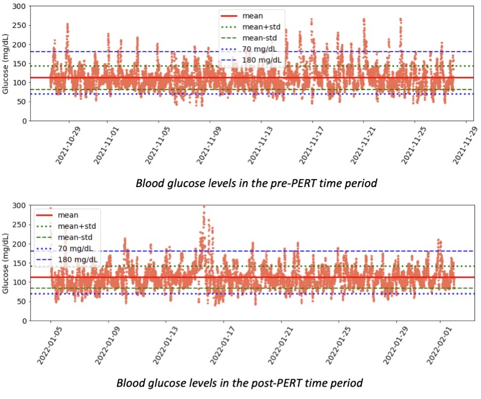
I spent a pleasant (so to speak) dozen or so years when “all” I had to pay for was diabetes supplies and gluten free food. However, in 2022, I was diagnosed with exocrine pancreatic insufficiency (and more recently also Graves’ disease, more on that cost below) and because I have spent ~20 years paying for diabetes, I wasn’t super surprised at the costs of EPI/PEI. However, most people get extreme sticker shock (so to speak) when they learn about the costs of pancreatic enzyme replacement therapy (PERT).

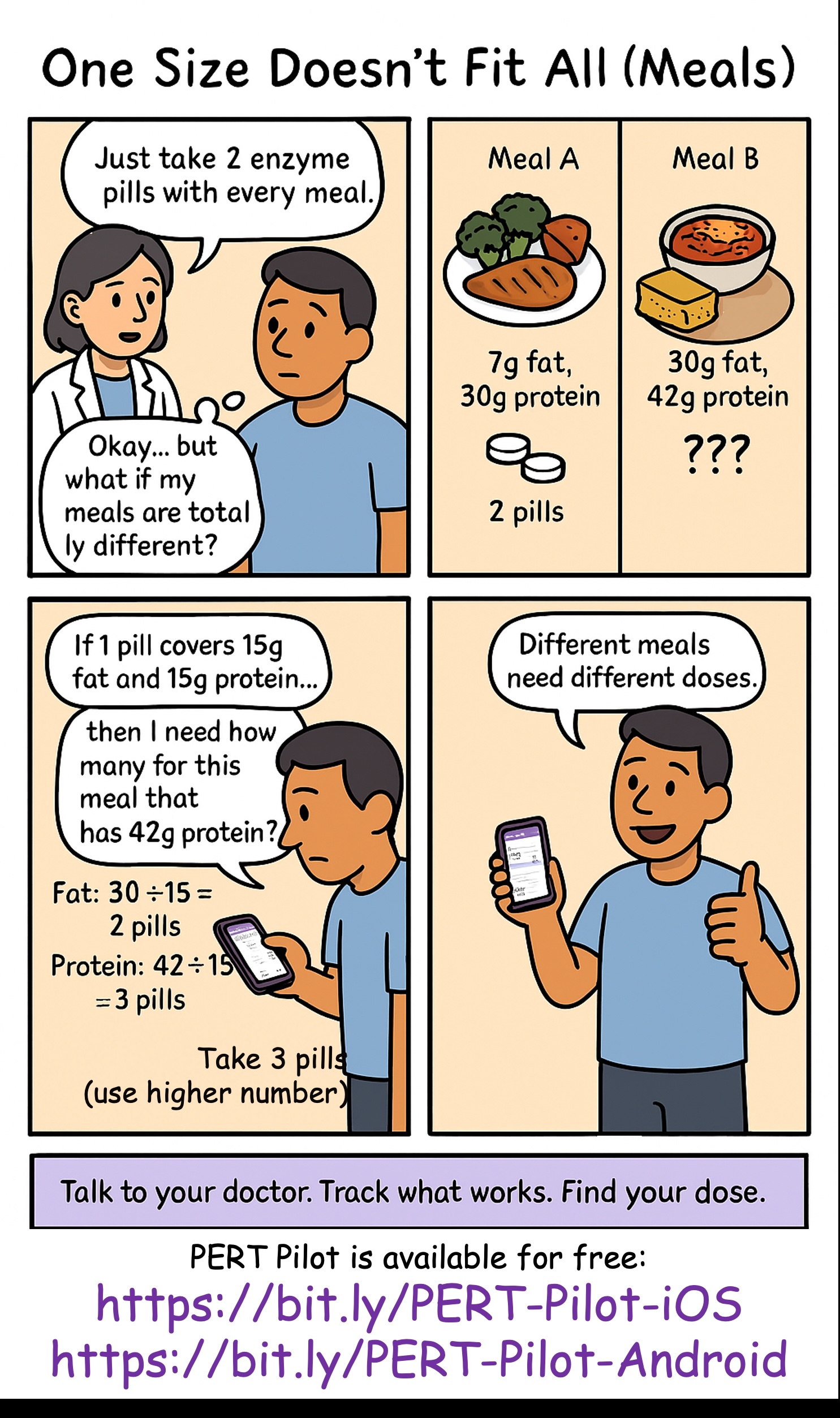
In summary, since most people don’t know about it: exocrine pancreatic insufficiency occurs for a variety of reasons, but is highly correlated with all types of diabetes, celiac, and other pancreatic conditions. When you have EPI, you need to take enzymes every time you eat food to help your body digest fat, protein, and carbohydrates, because in EPI your pancreas is not producing enough enzymes to successfully break down the food on its own. (Read a lot more about EPI here.)

Like diabetes, where different people may use very different amounts of insulin, in EPI people may need very different amounts of enzymes. This, like insulin, can be influenced by their body’s makeup, and also by the composition of what they are eating.

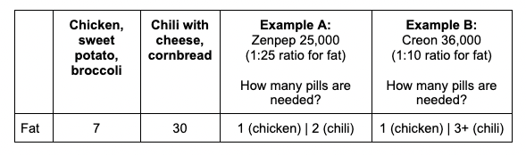
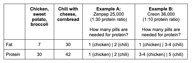
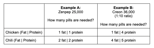
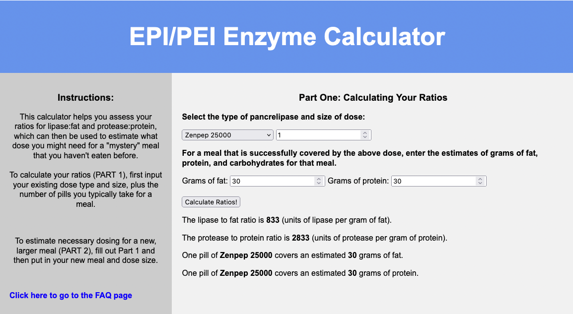
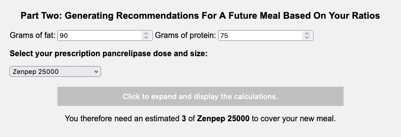
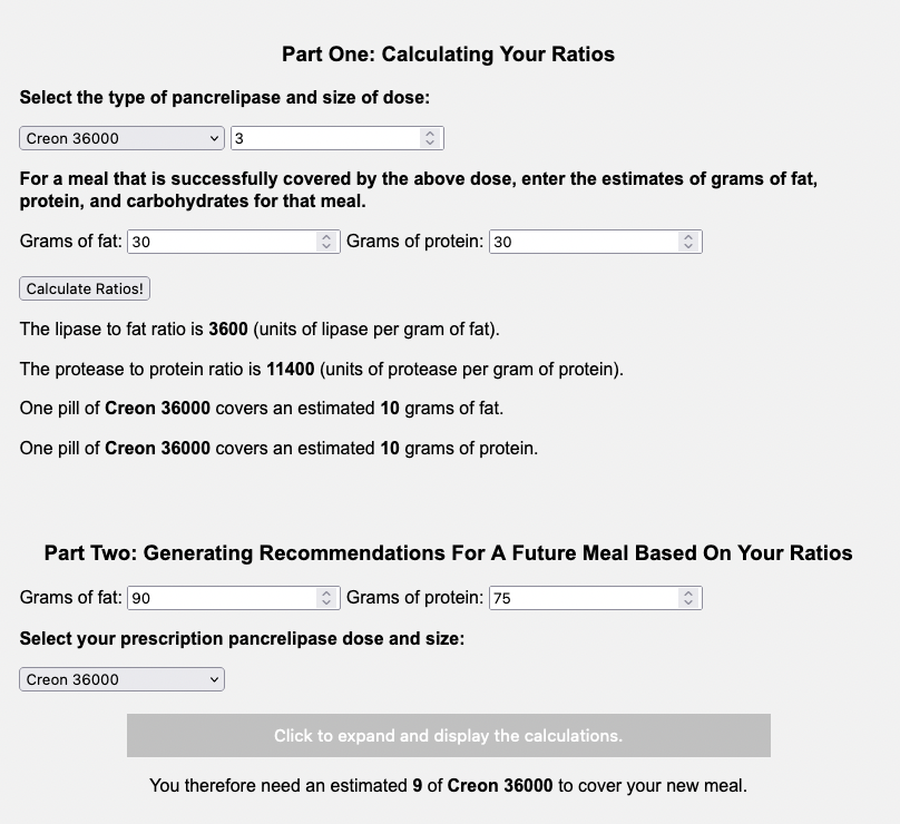
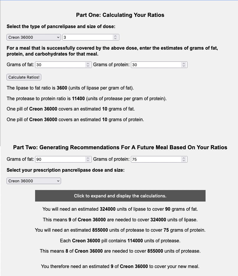
I use PERT (pancreatic enzyme replacement therapy) to also describe the prescription enzyme pills used for EPI. There are 6 different brands approved by the FDA in the US. They also come in different sizes; e.g. Brand A has 3,000, 6,000, 12,000, 24,000, 36,000 size pills. Those size refer to the units of lipase. Brand B has 3,000, 5,000, 10,000, 15,000, 20,000, 25,000, 40,000. Brands C, D, E and F have similar variety of sizes. The point is that when people compare amounts of enzymes you need to take into account 1) how many pills are they taking and 2) how much lipase (and protease and amylase) each of those pills are.

There is no generic for PERT. PERT is made from ground up pig pancreas. It’s expensive.

There are over the counter (OTC) enzymes made from alternative (plant etc) sources. However, there are ZERO studies looking at safety and efficacy of them. They typically contain much less lipase per pill; for example, one OTC brand pill contains 4,000 units of lipase per pill, or another contains 17,500 units of lipase per pill.

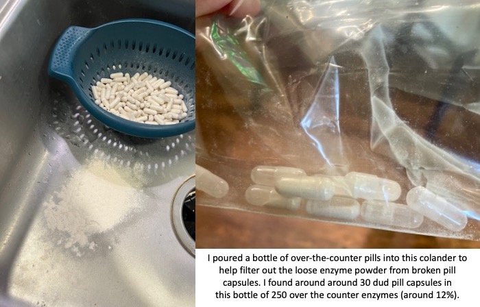
You also need to factor in the reliability of these non-approved pills. The quality of production can vary drastically. I had one bottle of OTC pills that was fine; then the next bottle of OTC pills I started to find empty capsules and eventually dumped them all out of the bottle and actually used a colander to filter out all of the enzyme powder from the broken capsules. There were more than 30 dud pill capsules that I found in that batch; in a bottle of 250 that means around 12% of them were unusable. That makes the reliability of the other ones suspect as well.

A pile of powder in the sink next to a colander where a bunch of pills sit. The colander was used to filter out the loose powder. On the right of the image is a baggie with empty pill capsules, illustrating where this loose powder came from. This shows the unreliability of over the counter (OTC) enzymes.

If the reliability of these pills even making it to you without breaking can be sketchy, then you need to assume that the counts of how much lipase (and protease and amylase) may not be precisely what the label is reporting. Again, there have been no tests for efficacy of these pills, so anyone with EPI or PEI needs to use these carefully and be aware of these limitations.

This unreliability isn’t necessarily true of all brands, however, or all types of OTC enzymes. That was a common brand of pancrelipase (aka contains lipase, protease, and amylase). I’ve had more success with the reliability of a lipase-only pill that contains about 6,000 units of lipase. However, it’s more expensive per pill (and doesn’t contain any of the other enzymes). I’ve used it to “top off” a meal with my prescription PERT when my meal contains a little bit more fat than what one PERT pill would “cover” on its own.

This combination of OTC and prescription PERT is where the math starts to get complicated for determining the daily cost and yearly cost of pancreatic enzyme replacement therapy.

Let’s say that I take 6-8 prescription PERT pills every day to cover what I eat. It varies because I don’t always eat the same type or amount of food; I adjust based on what I am eating.

The cost with my insurance and a 90 day supply is $8.34 for one PERT pill.

Depending on whether I am eating less fat and protein on a particular day and only need 6 PERT, the cost per day of enzymes for EPI might be $50.04, whereas if I eat a little more and need 8 PERT, the cost per day of enzymes for EPI could be up to $66.72.

The costs per year of PERT for EPI then would range from $18,000 (~6 per day) to $24,000 (~8 per day).

Please let that sink in.

Eighteen to twenty four thousand dollars to be able to successfully digest my food for a single year, not taking into account the cost of food itself or anything else.

(See why people new to EPI get sticker shock?!)

Even though I’m used to ‘high’ healthcare costs (see above estimates of $8,000 or more per year of diabetes costs), this is a lot of money. Knowing every time that I eat it “costs” at least one $8.34 pill is stressful. Eating a bigger portion of food and needing two or three pills? It really takes a mental toll in addition to a financial cost to think about your meal costing $25.02 (for 3 pills) on top of the cost of the food itself.

This is why OTC pills are interesting, because they are drastically differently priced. The 4,000 unit of lipase multi-enzyme pill that I described costs $0.09 per pill, which is about $0.02 per 1000 units of lipase. Compared to my prescription PERT which is $0.33 per 1000 units of lipase, it’s a lot cheaper.

But again, check out those pictures above of the 4,000 units of lipase OTC pills. Can you rely on those?

Not in the same way you can with the prescription PERT.

In the course of taking 1,254 prescription PERT pills this year (so far), I have not had a single issue with one of those pills. So in part the high cost is to ensure the safety and efficacy. Compare that to 12% (or more) of the OTC pills being complete duds (empty pill capsules that have emptied their powder into the bottle) and some % of unreliability even with a not-broken capsule.

Therefore it’s not feasible to me to completely replace prescription PERT with OTC pills, although it’s tempting purely on price.

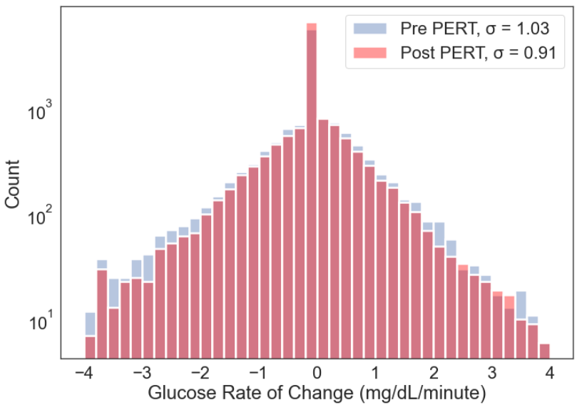
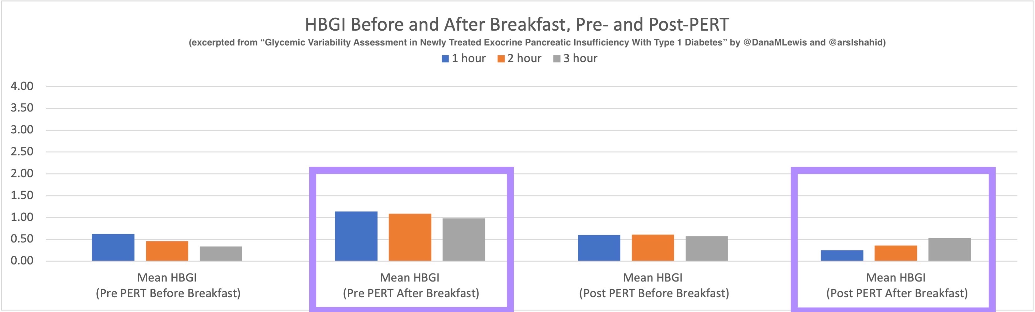
I previously wrote at a high level about the cost calculations of PERT, but given my desire to look at the annual cost for estimating my insurance plan (plus many more months of data), I went deeper into the math.

I need to take anywhere from 2-6 OTC pills (depending on the brand and size) to “match” the size of one PERT. I found a new type (to me) of OTC pills that are more units of lipase (so I need 2 to match one PERT) instead of the two other kinds (which took either 4 or 6 to match one PERT), which would enable me to cut down on the number of pills swallowed.

The number of pills swallowed matters.

So far (as of mid-November, after starting PERT in early January), I have swallowed at least 1,254 prescription PERT enzyme pills. I don’t have as much precision of numbers on my OTC pills because I don’t always log them (there’s probably a few dozen I haven’t written down, but I probably have logged 95% of them in my enzyme tracking spreadsheet that I use to help calculate the amount needed for each meal/snack and also to look at trends.), but it’s about 2,100 OTC enzyme pills swallowed.

This means cumulatively this year (which is not over), I have swallowed over 3,300 enzyme pills. That’s about 10 enzyme pills swallowed every day!

That’s a lot of swallowing.

That’s why switching to a brand that is more units of lipase per pill, where 2 of these new OTC kind matches one PERT instead of 4-6, is also significant. While it is also slightly cheaper than the combination of the two I was using previously (a lipase-only and a multi-enzyme version), it is fewer pills to achieve the same amount.

If I had taken prescription PERT instead of the OTCs, it would have saved me over 1,600 pills to swallow so far this year.

You might be thinking: take the prescription PERT! Don’t worry about the OTC pills! OMG that’s a lot of pills.

(OMG, it *is* a lot of pills: I think that as well now that I’m adding up all of these numbers.)

Thankfully, so far I am not having issues with swallowing these pills. As I get older, that might change and be a bigger factor in determining my strategy for how I dose enzymes; but right now, that’s not the biggest factor. Instead, I’m looking at efficacy (getting the right amount of enzymes to match my food), the cost (in terms of price), and then optimizing and reducing the total number of pills if I can. But the price is such a big variable that it is playing the largest role in determining my strategy.

How should we collectively pay for this?

You see, I don’t have EPI in a vacuum.

As I described at the top of the post, I already have $8,000+ of yearly diabetes costs. The $18,000 (or $24,000 or more) yearly enzyme costs are a lot. Cumulatively, just these two alone mean my supply costs are $26-32,000 (or more), excluding other healthcare costs. Thankfully, I do have insurance to cover costs after I hit my out of pocket max, but the bigger question is: who should be paying for this?

If my insurer pays more, then the employer pays more, which means employees get worse coverage on our pooled insurance plan. Premiums go up and/or the plans cover less, and the out of pocket costs to everyone goes up.

So while it is tempting to try to “stuff” all of my supply needs into insurance-covered supplies, in order to reduce my personal out of pocket costs in the short run, that raises costs for everyone in the long run.

This year, for all of those (remember I estimated 2,100 OTC pills swallowed to date) OTC pills I bought, it cost me $515. Out of pocket. Not billed through insurance; they know nothing about it.

It feels like a lot of money. However, if you calculate how many PERT it replaced and the cost per PERT pill, I saved $4,036 by swallowing 1,652 extra pills.

Is paying $500 to save everyone else $4000 worth it?

I think so.

Again, the “price” question gets interesting.

The raw costs of yearly supplies I don’t pay completely; remember with health insurance I am capped at $3,000 out of pocket for supplies I get through insurance. However, again, it’s worth considering that additional costs do not cost me but they cost the insurer, and therefore the employer and our pool of people in this insurance plan and influences future costs for everyone on insurance. So if I can afford (although I don’t like it) $500-ish out of pocket and save everyone $4,000 – that’s worth doing.

Although, I think I can improve on that math for next year.

I was taking the two OTC kinds that I had mentioned: one that was lipase-only and very reliable, but $0.28/pill or $0.04 per 1000 units of lipase (and contains ~6000 units of lipase). The less reliable multi-enzyme pill was cheaper ($.09) per pill but only contains 4000 units of lipase, and was $.02 per 1000 units of lipase. That doesn’t factor in the duds and the way I had to increase the number of pills to account for the lack of faith I had in the 4000 units of lipase always being 4000 units of lipase.

The new OTC pill I mentioned above is $0.39 per pill, which is fairly equivalent price to a combined lipase-only and multi-enzyme pill. In fact, I often would take 1+1 for snacks that had a few grams of protein and more than a few grams of lipase. So one new pill will cover 17,000 units of lipase (instead of 10,000, made up of 6000+4000) at a similar cost: $0.39 instead of $0.36 (for the two combined). And, it also has a LOT more protease per pill, too. It has >2x the amount of protease as the multi-enzyme OTC pill, and is very similar to the amount of protease in my prescription PERT! I’ve mostly discussed the math by units of lipase, but I also dose based on how much protein I’m eating (thus, protease to cover protein the way lipase covers fat digestion), so this is also a benefit. As a result, two of the new OTC pill now more than match 1 PERT on lipase, double the protease to 1 PERT, and is only two swallows instead of the 4-6 swallows needed with the previous combination of OTCs.

I have only tested for a few days, but so far this new OTC is working fairly well as a substitute for my previous two OTC kinds.

Given the unreliability of OTCs, even with different brands that are more reliable than the above picture, I still want to consume one prescription PERT to “anchor” my main meals. I can then “top off” with some of the new OTC pills, which is lower price than more PERT but has the tradeoff cost of slightly less reliability compared to PERT.

So with 3 main meals, that means at least 3 PERT per day ($8.34 per pill) at $25.02 per day in prescription PERT costs and $9,132 per year in prescription PERT costs. Then to cover the additional 3-5 PERT pills I would otherwise need, assuming 2 of the new OTC covers 1 PERT pills, that is 6-10 OTC pills.

Combined, 3 PERT + 6 OTC pills or 3 PERT + 10 OTC pills would be $27.36 or $28.92 per day, or $9,986 or $10,556 per year.

Still quite a bit of money, but compared to 6-8 PERT per day (yearly cost $18,264 to $24,352), it saves somewhere between $7,708 per year (comparing 6 PERT to 3 PERT + 6 OTC pills per day) all the way up to $14,366 per year (comparing 8 PERT to 3 PERT +10 OTC pills per day).

And coming back to number of pills swallowed, 6 PERT per day would be 2,190 swallows per year; 8 PERT pills per day is 2,920 swallows per year; 3 PERT + 6 OTC is 9 pills per day which is 3,285 swallows per year; and 3 PERT + 10 OTC is 13 swallows per day which is 4,745 swallows per year.

That is 1,095 more swallows per year (3PERT+6 OTC vs 6 PERT) or 1,825 more swallows per year (3 PERT + 10 OTC vs 8 PERT).

Given that I estimated I swallowed ~10 enzyme pills per day this year so far, the estimated range of 9-13 swallows with the combination of PERT and OTC pills (either 3 PERT + (6 or 10) OTC) for next year seems reasonable.

Again, in future this might change if I begin to have issues swallowing for whatever reason, but in my current state it seems doable.

The daily and annual costs of thyroid treatment for Graves’ Disease

No, we’re still not done yet with annual health cost math. I also developed Graves’ disease with subclinical hyperthyroidism this year, putting me to a grand total of 4 chronic health conditions.

Luckily, though, the 4th time was the charm and I finally have a cheap(er) one!

My thyroid med DOES have a generic. It’s cheap: $11.75 for 3 months of a once-daily pill! Woohoo! That means $0.13 per day cost of thyroid treatment and $48 per year cost of thyroid treatment.

(Isn’t it nice to have cheap, easy math about at least one of 4 things? I think so!)

Adding up all the costs of diabetes, celiac disease, exocrine pancreatic insufficiency and Graves’ Disease

High five if you’ve read this entire post; and no problem if you skimmed the sections you didn’t care about.

Adding it all up, my personal costs are:

  • Diabetes: $23.25 per day; $8,486 per year
  • Celiac: $3 per day; $1,100 per year (all out of pocket)
  • Exocrine Pancreatic Insufficiency:
    • Anywhere from $50.04 up to $66.72 per day with just prescription PERT pills; $18,265 (6 per day) to $24,353 (8 per day) per year
    • With a mix of prescription and OTC pills, $27.36 to $28.92 per day; $9,986 to $10,556 per year.
    • Of this, the out of pocket cost for me would be $2.34 to $3.90 per day; or $854 up to $1,424 per year.
  • Thyroid/Graves: $0.13 per day; $48 per year

Total yearly cost:

  • $27,893 (where EPI costs are 6 prescription PERT per day); 2,190 swallows
  • $33,982 (where EPI costs are 8 prescription PERT per day); 2,920 swallows
  • $19,615 (where EPI costs are 3 prescription PERT and 6 OTC per day); 3,285 swallows
  • $20,185 (where EPI costs are 3 prescription PERT and 9 OTC per day); 4,745 swallows

* My out of pocket costs per year are $854-$1424 for EPI when using OTCs to supplement prescription PERT and an estimated $1,100 for celiac-related gluten free food costs. 

** Daily cost-wise, that means $76.42, $93.10, $53.74, or $55.30 daily costs respectively.

*** The swallow “cost” is 1,095-1,825 more swallows per year to get the lower price cost of enzymes by combining prescription and OTC.

Combining these out of pocket costs with my $3,000 out of pocket max on my insurance plan, I can expect that I will therefore pay around $4,900 to $5,600 next year in health supply costs, plus another few hundred for things like tape or vitamins etc. that aren’t major expenses.

TLDR: 

  • Diabetes is expensive, and it’s not just insulin.
    • Insulin is roughly 19% of my daily cost of diabetes supplies. CGM is currently 56% of my diabetes supply costs.
  • EPI is super expensive.
    • OTC pills can supplement prescription PERT but have reliability issues.
    • However, combined with prescription PERT it can help drastically cut the price of EPI.
    • The cost of this price reduction is significantly more pills to swallow on a daily basis, and adds an additional out of pocket cost that insurance doesn’t cover.
    • However in my case; I am privileged enough to afford this cost and choose this over increasing everyone in my insurance plan’s costs.
  • Celiac is expensive and mostly an out of pocket cost.
  • Thyroid is not as expensive to manage with daily medication. Yay for one of four being reasonably priced!

REMEMBER to not use these numbers or math out of context and apply them to any other person; this is based on my usage of insulin, enzymes, etc as well as my insurance plan’s costs.

Yearly costs, prices, and calculations of living with 4 chronic diseases (type 1 diabetes, celiac, Graves, and exocrine pancreatic insufficiency)

What It Feels Like To Take Thyroid Medication

I’ve been taking thyroid medication for a few months now. It surprised me how quickly I saw some symptom resolution. As I wrote previously, I started taking thyroid medication and planned to get more lab work at the 8 week mark.

The theory is that thyroid medication influences the production of new thyroid hormones but not the stored thyroid hormones; thus, since it takes around 6 weeks for you to replace your stores of thyroid hormones, you usually get blood work no sooner than 6 weeks after making a change to thyroid medication.

I had noted, though, that some of my symptoms included changes in my heart rate (HR). This was both my overnight resting HR and how my HR felt during the day. I had hypothesized:

Given I have a clear impact to my heart rate, I’m hypothesizing that I might see changes to the trend in my heart rate data sooner than 6 weeks – 2 months, so that’ll be interesting to track!

This turned out to be an accurate prediction!

My provider had suggested starting me on a low dose of “antithyroid” medication. Guidelines typically suggest 10-20mg per day, with plans to titrate (adjust) the dose based on how things are going. However, in my case, I have subclinical hyperthyroidism – not actual hyperthyroidism – which means my thyroid levels themselves (T3 and T4) were in range. What was out of range for me was my thyroid stimulating hormone (TSH), which was below range, and my thyroid antibodies, all of which were above range. (If you want to read about my decision making and my situation with Graves’ disease with eye symptoms and subclinical hyperthyroidism, read my previous post for more details.)

I ended up being prescribed a 5mg dose. Thinking about it, given my T3 and T4 were well within range, that made sense. I started taking it in early August.

What it felt like to start taking antithyroid medication for the first time:

For context, my primary most bothersome symptoms were eye symptoms (eyelid swelling, sometimes getting a red patchy dry area outside the outer corner of my eye, eye pressure that made me not want to wear my contacts); increased resting overnight HR and higher HR during periods of rest during the day; and possibly mood and energy impacts.

  • Within a week (!) of starting the antithyroid medication, my overnight HR began lowering. This can be influenced by other factors like exercise etc., but it was also accompanied by fewer days with higher heart rate while I was sitting and relaxing! I definitely felt a noticeable improvement within a week of my heart rate-related symptoms. 
  • My eyelid swelling went away toward the end of the first week. Then after 3 or so days, it came back again for a few days, then went away for 12 days. It came back for several days, went away for another 6 days. Came back, then…nothing! I went weeks without eyelid swelling and none of the other eye-related symptoms that typically ebbed and flowed alongside the eyelid swelling. HOORAY!
  • It’s unclear how much my mood and energy were directly effected by the wonky thyroid antibody levels compared to being a correlation with the symptoms themselves. (I was also resuming ultramarathon training during this time period, following the recovery of my broken toe.) However, I definitely was feeling more energetic and less grumpy, as noticed by my husband as well.

What is interesting to me is that my symptoms were changed within a week. They often talk in the medical literature about not knowing exactly how the thyroid medication works. In my case, it’s worth noting again for context that I had subclinical hyperthyroidism (in range T3 and T4 but below range TSH) and Graves’ disease (several thyroid antibodies well above range) with correlated eye symptoms. The theory is that the eye symptoms are influenced by the thyroid antibody levels, not the thyroid levels (T3 and T4) themselves. So although the thyroid medication influences the production of new thyroid hormones and it takes 6 weeks to replace your store of thyroid hormones; my working hypothesis is that the symptoms driven by TSH and thyroid antibodies are influenced by the production of those (rather than the stores) and that is why I see a change to my symptoms within a week or so of starting thyroid medication.

I went for repeat lab work at 8 weeks, and I was pretty confident that I would have improved antibody and TSH levels. I wasn’t sure if my T3 and T4 would drop below range or not. The lab work came back in and… I was right! TSH was back to normal range (HOORAY), T3 and T4 were slightly lower than the previous numbers but still nicely in the middle of the range. Yay! However, my TSI (thyroid stimulating immunoglobulin) was still well above range, and slightly higher than last time. Boo, that was disappointing, because there are some studies (example) showing that out of range TSI can be a predictor for those with Graves’ disease for the need to continue antithyroid medication in the future.

Animated gif showing changes to various thyroid labs two days and 8 weeks after annual lab work. T3 and T4 remain in range, TSH returns from below to in range, TSI remains above range; TRAb, TgAB, and TPO were above range but not re-tested at 8 weeks.

As I wrote in my last post:

I am managing my expectations that managing my thyroid antibody and hormone levels will be an ongoing thing that I get to do along with managing insulin and blood sugars and managing pancreatic enzymes. We’ll see!

The TSI was a pointer that although I had reduced all of my symptoms (hooray) and my T3 and T4 were within range, I would probably need ongoing medication to keep things in range.

However, as a result of the lab work, my provider suggested dropping down to 2.5mg dose, to see if that would manage my thyroid successfully without pushing me over to hypothyroidism (low T3 and T4) levels, which can be a risk of taking too much antithyroid medication. He suggested switching to 2.5mg, and repeating lab work in 3 months or if I felt unwell.

I agreed that it was worth trying, but I was a little nervous about reducing my dose, because my T3 and T4 were still well within the middle of normal. And, I had an upcoming very long ultramarathon. Given that with the start of thyroid medication I saw symptoms change within a week, and I was two weeks out from my ultra, I decided to wait until after the ultramarathon so I could more easily monitor and assess any symptoms separately from the taper and ultra experience.

Recovery from my ultramarathon was going surprisingly well, enough so that I felt ready to switch the medication levels pretty soon after my ultra. I started taking the 2.5mg dose (by cutting the 5mg dose in half, as I had some remaining and it was easier than ordering a changed prescription to 2.5mg).

I carefully watched and saw some slight changes to my HR within the first week. But, I was also recovering from an ultramarathon, and that can also influence HR. Again, I was looking at both the overnight resting HR and noting any periods of time during the day where I was resting when my HR was high (for me). I had two days where it did feel high during the day, but the following days I didn’t observe it again, so I chalked that up to maybe being related to ultramarathon recovery.

But a little over a week and my right eye started feeling gunky. I had just been to the eye doctor for my annual exam and all was well and my eye didn’t look red or irritated. I didn’t think much of it. But a few days after that, I had rubbed my right eyelid and realized it felt poofy. I felt my left eyelid in comparison, and the right was definitely swollen in comparison. Looking in the mirror, I could see the swollen eyelid pushing down the corner of my right eye. Just like it had done before I started thyroid medications. Ugh. So eye symptoms were back. A few days later, I also woke up feeling like my eyes hurt and they needed lubrication (eye drops) as soon as I opened my eyes. That, too, had been a hallmark of my eye symptoms from last October onward.

The plan had been to wait until 3 months after this medication change to repeat labs. I’m going to try to wait until the 6-8 week mark again, so we can see what the 2.5mg does to my T3 and T4 levels alongside my TSH. But, my prediction for this next round of lab work is that T3 and T4 will go up (maybe back to the higher end but likely still within range; although the possibility to fully go above range), and that my TSH will have dropped back down below range, because the symptom pattern I am starting to have mimics the symptom pattern I had for months prior to starting the 5mg thyroid medication.

Why only wait 6-8 weeks, when my provider suggested 3 months?

These symptoms are bothersome. The eyelid swelling thankfully subsided somewhat after 4 days (after the point where it got noticeable enough for my husband to also see it compressing my outer corner of my eye, which means anyone would be able to visibly see it), but I’m watching it to see if it returns with a cyclical pattern the way it went away previously, expecting it to likely return to constant every day eye swelling. Since it influences my vision slightly (because the eyelid is pushed down by the swelling), that impacts my quality of life enough to take action sooner. If it gets really bad, I might discuss with my provider and get labs even sooner, but I’m going to try to tough it out to 6-8 weeks to get a full picture of data of how the 2.5mg impacted all of my levels and also see what pattern of symptoms return when, because it will be interesting to compare the symptom levels at 5mg (essentially all gone within 1-2 weeks) and at 2.5mg compared to my original, pre-thyroid medication symptom levels and patterns.

But depending on those labs, I predict that I will return to taking the 5mg dose, and hopefully my symptoms will go away completely and stay away. Then it’ll be a future decision on if/when to try titrating down again; possibly guided by the TSI level, since the TSI was still above range when we had switched me to 2.5mg (despite the change in TSH back to range).

The good news is, though, that in future I should be able to use the 1-2 weeks of symptom data to determine whether a change in dose is working for me or not, instead of having to wait a full 6-8 weeks, because my symptoms seem to be driven by the TSH and antibody levels, rather than out of range T3 and T4 levels (because they were and are still in the middle of the goal range).

I also discussed this with my eye doctor. You’ll note from my previous post that I was very concerned about the eye impacts and symptoms, so I had asked my eye doctor if she’s still comfortable treating me (she is), and we talked about what things would cause me to get a referral to a specialist. So far my symptoms don’t seem on track for that; it would be my eyes protruding from the socket and having pressure that would possibly need surgery. Disappointingly, she confirmed that there’s really no treatment for the symptoms since they’re caused by the antibody levels. There’s no anti-swelling stuff to put on my eyelid to help. Instead, the goal is to manage the antibody levels so they don’t cause the symptoms. (Which is everything I’m talking about doing above, including likely returning to the 5mg dose given that my eye symptoms resumed on the 2.5mg dose).

In summary, I think it is worth noting for anyone with Graves’ disease (whether or not they have subclinical or actual hyperthyroidism) that it is possible to see symptom changes within a week or two of starting or changing your thyroid medication. I can’t find anything in the literature tracking symptom resolution on anything shorter than a 6 week time period, but maybe in the future someone will design a study to capture some of the real-world data and/or run a prospective study to capture this data and see how prevalent this is for symptoms to resolve on a much shorter time frame, for those of us whose symptoms are driven not by thyroid levels themselves (T3 and T4) but for the TSH and TSI and other thyroid antibodies (TPO etc).

If you do start thyroid medication, it’s worth logging your symptoms as soon as  possible, ideally before you start your medication, or if it’s too late for that, start logging them afterward. You can then use that as a comparison in the future for if you reduce, increase, or are directed to stop taking your medication, so you can see changes in the length of time it takes to develop or reduce symptoms and whether the patterns of symptoms change over time.

What it feels like to take thyroid medication

New Research on Glycemic Variability Assessment In Exocrine Pancreatic Insufficiency (EPI) and Type 1 Diabetes

I am very excited to share that a new article I wrote was just published, looking at glycemic variability in data from before and after pancreatic enzyme replacement therapy (PERT) was started in someone with type 1 diabetes with newly discovered exocrine pancreatic insufficiency (EPI or PEI).

If you’re not aware of exocrine pancreatic insufficiency, it occurs when the pancreas no longer produces the amount of enzymes necessary to fully digest food. If that occurs, people need supplementary enzymes, known as pancreatic enzyme replacement therapy (PERT), to help them digest their food. (You can read more about EPI here, and I have also written other posts about EPI that you can find at DIYPS.org/EPI.)

But, like MANY medications, when someone with type 1 diabetes or other types of insulin-requiring diabetes starts taking them, there is little to no guidance about whether these medications will change their insulin sensitivity or otherwise impact their blood glucose levels. No guidance, because there are no studies! In part, this may be because of the limited tools available at the time these medications were tested and approved for their current usage. Also this is likely in part because people with diabetes make up a small fraction of the study participants that most of these medications are tested on. If there are any specific studies on the medications in people with diabetes, these studies likely were done before CGM, so little data is available that is actionable.

As a result, the opportunity came up to review someone’s data who happened to have blood glucose data from a continuous glucose monitor (CGM) as well as a log of what was eaten (carbohydrate entries) prior to commencing pancreatic enzyme replacement therapy. The tracking continued after commencing PERT and was expanded to also include fat and protein entries. As a result, there was a useful dataset to compare the impacts of pancreatic enzyme replacement therapy on blood glucose outcomes and specifically, looking at glycemic variability changes!

(You can read an author copy here of the full paper and also see the supplementary material here, and the DOI for the paper is https://doi.org/10.1177/19322968221108414 . Otherwise, below is my summary of what we did and the results!)

In addition to the above background, it’s worth noting that Type 1 diabetes is known to be associated with EPI. In upwards of 40% of people with Type 1 diabetes, elastase levels are lowered, which in other cases is correlated with EPI. However, in T1D, there is some confusion as to whether this is always the case or not. Based on recent discussions with endocrinologists who treat patients with T1D and EPI (and have patients with lowered elastase that they think don’t have EPI), I don’t think there have been enough studies looking at the right things to assess whether people with T1D and lowered elastase levels would benefit from PERT and thus have EPI. More on this in the future!

Because we now have technology such as AID (automated insulin delivery) and CGM, it’s possible to evaluate things beyond simple metrics of “average blood sugar” or “A1c” in response to taking new medications. In this paper, we looked at some basic metrics like average blood sugar and percent time in range (TIR), but we also did quite a few calculations of variables that tell us more about the level of variability in glucose levels, especially in the time frames after meals.

Methods

This person had tracked carb entries through an open source AID system, and so carb entries and BG data were available from before they started PERT. We call this “pre-PERT”, and selected 4 weeks worth of data to exclude major holidays (as diet is known to vary quite a bit during those times). We then compared this to “post-PERT”, the first 4 weeks after the person started PERT. The post-PERT data not only included BGs and carb entries, but also had fat and protein entries as well as PERT data. Each time frame included 13,975 BG data points.

We used a series of open source tools to get the data (Nightscout -> Nightscout Data Transfer Tool -> Open Humans) and process the data (my favorite Unzip-Zip-CSVify-OpenHumans-data.sh script).

All of our code for this paper is open source, too! Check it out here. We analyzed time in range, TIR 70-180, time out of range, TOR >180, time below range, TBR <70 and <54, the number of hyperglycemic excursions >180. We also calculated total daily dose of insulin, average carbohydrate intake, and average carbohydrate entries per day. Then we calculated a series of variability related metrics such as Low Blood Glucose Index (LBGI), High Blood Glucose Index (HBGI), Coefficient of Variation (CV), Standard Deviation (SD), and J_index (which stresses both the importance of the mean level and variability of glycemic levels).

Results

This person already had an above-goal TIR. Standard of care goal for TIR is >70%; before PERT they had 92.12% TIR and after PERT it was 93.70%. Remember, this person is using an open source AID! TBR <54 did not change significantly, TBR <70 decreased slightly, and TOR >180 also decreased slightly.

More noticeably, the total number of unique excursions above 180 dropped from 40 (in the 4 weeks without PERT) to 26 (in 4 weeks when using PERT).

The paper itself has a few more details about average fat, protein, and carb intake and any changes. Total daily insulin was relatively similar, carb intake decreased slightly post-PERT but was trending back upward by the end of the 4 weeks. This is likely an artifact of being careful to adjust to PERT and dose effectively for PERT. The number of meals decreased but the average carb entry per meal increased, too.

What I find really interesting is the assessment we did on variability, overall and looking at specific meal times. The breakfast meal was identical during both time periods, and this is where you can really SEE visible changes pre- and post-PERT. Figure 2 (displayed below), shows the difference in the rate of change frequency. There’s less of the higher rate of changes (red) post-PERT than there is from pre-PERT (blue).

Figure 2 from GV analysis on EPI, showing lower frequency of high rate of change post-PERT

Similarly, figure 3 from the paper shows all glucose data pre- and post-PERT, and you can see the fewer excursions >180 (blue dotted line) in the post-PERT glucose data.

Figure 3 from GV analysis paper on EPI showing lower number of excursions above 180 mg/dL

Table 1 in the paper has all the raw data, and Figure 1 plots the most relevant graphs side by side so you can see pre- and post-PERT before and after after all meals on the left, versus pre and post-PERT before and after breakfast only. Look at TOR >180 and the reduction in post-breakfast levels after PERT! Similarly, HBGI post-PERT after-breakfast is noticeably different than HBGI pre-PERT after-breakfast.

Here’s a look at the HBGI for breakfast only, I’ve highlighted in purple the comparison after breakfast for pre- and post-PERT:

High Blood Glucose Index (HBGI) pre- and post-PERT for breakfast only, showing reduction in post-PERT after breakfast

Discussion

This is a paper looking at n=1 data, but it’s not really about the n=1 here. (See the awesome limitation section for more detail, where I point out it’s n=1, it’s not a clinical study, the person has ‘moderate’ EPI, there wasn’t fat/protein data from pre-PERT, it may not be representative of all people with diabetes with EPI or EPI in general.)

What this paper is about is illustrating the types of analyses that are possible, if only we would capture and analyze the data. There are gaping holes in the scientific knowledge base: unanswered and even unasked questions about what happens to blood glucose with various medications, and this data can help answer them! This data shows minimal changes to TIR but visible and significant changes to post-meal glycemic variability (especially after breakfast!). Someone who had a lower TIR or wasn’t using an open source AID may have more obvious changes in TIR following PERT commencement.

This paper shows several ways we can more easily detect efficacy of new-onset medications, whether it is enzymes for PERT or other commonly used medications for people with diabetes.

For example, we could do a similar study with metformin, looking at early changes in glycemic variability in people newly prescribed metformin. Wouldn’t it be great, as a person with diabetes, to be able to more quickly resolve the uncertainty of “is this even working?!” and not have to suffer through potential side effects for 3-6 months or longer waiting for an A1c lab test to verify whether the metformin is having the intended effects?

Specifically with regards to EPI, it can be hard for some people to tell if PERT “is working”, because they’re asymptomatic, they are relying on lab data for changes in fat soluble vitamin levels (which may take time to change following PERT commencement), etc. It can also be hard to get the dosing “right”, and there is little guidance around titrating in general, and no studies have looked at titration based on macronutrient intake, which is something else that I’m working on. So, having a method such as these types of GV analysis even for a person without diabetes who has newly discovered EPI might be beneficial: GV changes could be an earlier indicator of PERT efficacy and serve as encouragement for individuals with EPI to continue PERT titration and arrive at optimal dosing.

Conclusion

As I wrote in the paper:

It is possible to use glycemic variability to assess changes in glycemic outcomes in response to new-onset medications, such as pancreatic enzyme replacement therapy (PERT) in people with exocrine pancreatic insufficiency (EPI) and insulin-requiring diabetes. More studies should use AID and CGM data to assess changes in glycemic outcomes and variability to add to the knowledge base of how medications affect glucose levels for people with diabetes. Specifically, this n=1 data analysis demonstrates that glycemic variability can be useful for assessing post-PERT response in someone with suspected or newly diagnosed EPI and provide additional data points regarding the efficacy of PERT titration over time.

I’m super excited to continue this work and use all available datasets to help answer more questions about PERT titration and efficacy, changes to glycemic variability, and anything else we can learn. For this study, I collaborated with the phenomenal Arsalan Shahid, who serves as technology solutions lead at CeADAR (Ireland’s Centre for Applied AI at University College Dublin), who helped make this study and paper possible. We’re looking for additional collaborators, though, so feel free to reach out if you are interested in working on similar efforts or any other research studies related to EPI!

A DIY Fuel Enzyme Macronutrient Tracker for Running Ultras (Ultramarathons)

It takes a lot of energy to run ultramarathons (ultras).

To ensure they have enough fuel to complete the run, people usually want to eat X-Y calories per hour, or A-B carbs per hour, while running ultramarathons. It can be hard to know if you’re staying on top of fueling, especially as the hours drag on and your brain gets tired; plus, you can be throwing away your trash as you go so you may not have a pile of wrappers to tell you what you ate.

During training, it may be useful to have a written record of what you did for each run, so you can establish a baseline and work on improving your fueling if that’s something you want to focus on.

For me specifically, I also find it helpful to record what enzyme dosing I am taking, as I have EPI (exocrine pancreatic insufficiency, which you can read more about here) and if I have symptoms it can help me identify where my dosing might have been off from the previous day. It’s not only the amount of enzymes but also the timing that matters, alongside the timing of carbs and insulin, because I have type 1 diabetes, celiac, and EPI to juggle during runs.

Previously, I’ve relied on carb entries to Nightscout (an open source CGM remote monitoring platform which I use for visualizing diabetes data including OpenAPS data) as a record of what I ate, because I know 15g of carbs tracks to a single serving of chili cheese Fritos that are 10g of fat and 2g of protein, and I take one lipase-only and one pancrelipase (multi-enzyme) pill for that; and 21g of carbs is a Honey Stinger Gluten Free Stroopwaffle that is 6g of fat and 1g of protein, and I typically take one lipase-only. You can see from my most recent ultra (a 50k) where I manually took those carb entries and mapped them on to my blood sugar (CGM) graph to visualize what happened in terms of fuel and blood sugar over the course of my ultra.

However, that was “just” a 50k and I’m working toward bigger runs: a 50 mile, maybe a 100k (62 miles), and/or a 100 mile, which means instead of running for 7-8 hours I’ll be running for 12-14 and 24-30(ish) hours! That’s a lot of fuel to need to eat, and to keep track of, and I know from experience my brain starts to get tired of thinking about and eating food around 7 hours. So, I’ll need something better to help me keep track of fuel, enzymes, and electrolytes over the course of longer runs.

I also am planning on being well supported by my “crew” – my husband Scott, who will e-bike around the course of my ultra or my DIY ultra loops and refill my pack with water and fuel. In some cases, with a DIY ultra, he’ll be bringing food from home that I pre-made and he warms up in the microwave.

One of the strategies I want to test is for him to actually hand me the enzymes for the food he’s bringing me. For example, hand me a baggie of mashed potatoes and also hand me the one multi-enzyme (pancrelipase, OTC) pill I need to go with it. That reduces mental effort for me to look up or remember what enzyme amount I take for mashed potatoes; saves me from digging out my baggie of enzymes and having to get the pill out and swallow it, put the baggie away without dropping it, all while juggling the snack in my hands.

He doesn’t necessarily know the counts of enzymes for each fuel (although he could reproduce it, it’s better if I pre-make a spreadsheet library of my fuel options and that helps me both just pick it off a drop down and have an easy reference for him to glance at. He won’t be running 50-100 miles, but he will be waking up every 2-3 hours overnight and that does a number on his brain, too, so it’s easier all around if he can just reference the math I’ve already done!

So, for my purposes: 1) easy tracking of fuel counts for real-time “am I eating according to plan” and 2) retrospective “how did I do overall and should I do something next time” and 3) for EPI and BG analysis (“what should I do differently if I didn’t get the ideal outcome?”), it’s ideal to have a tracking spreadsheet to log my fuel intake.

Here’s what I did to build my ultimate fuel self-tracking self-populating spreadsheet:

First, I created a tab in my spreadsheet as a “Fuel Library”, where I listed out all of my fuel. This ranges from snacks (chili cheese Fritos; Honey Stinger Gluten Free Stroopwaffle; yogurt-covered pretzels, etc.); to fast-acting carbs (e.g. Airhead Minis, Circus Peanuts) that I take for fixing blood sugars; to other snack/treats like chocolate candy bars or cookies; as well as small meals and warm food, such as tomato soup or part of a ham and cheese quesadilla. (All gluten free, since I have celiac. Everything I ever write about is always gluten free!)

After I input the list of snacks, I made columns to input the sodium, calories, fat, protein, and carb counts. I don’t usually care about calories but a lot of recommendations for ultras are calories/hr and carbs/hr. I tend to be lower on the carb side in my regular daily consumption and higher on fat than most people without T1D, so I’m using the calories for ultrarunning comparison to see overall where I’m landing nutrient-wise without fixating on carbs, since I have T1D and what I personally prefer for BG management is likely different than those without T1D.

I also input the goal amount of enzymes. I have three different types of pills: a prescription pancrelipase (I call PERT, which stands for pancreatic enzyme replacement therapy, and when I say PERT I’m referring to the expensive, prescription pancrelipase that’s been tested and studied for safety and efficacy in EPI); an over-the-counter (OTC) lipase-only pill; and an OTC multi-enzyme pancrelipase pill that contains much smaller amounts of all three enzymes (lipase, protease, amylase) than my PERT but hasn’t been tested for safety and efficacy for EPI. So, I have three enzyme columns: Lipase, OTC Pancrelipase, and PERT. For each fuel I calculate which I need (usually one lipase, or a lipase plus a OTC pancrelipase, because these single servings are usually fairly low fat and protein; but for bigger meal-type foods with more protein I may ‘round up’ and choose to take a full PERT, especially if I eat more of it), and input the number in the appropriate column.

Then, I opened another tab on my spreadsheet. I created a row of headers for what I ate (the fuel); time; and then all the macronutrients again. I moved this down to row 3, because I also want to include at the top of the spreadsheet a total of everything for the day.

Example-DIY-Fuel-Enzyme-Tracker-ByDanaMLewis

In Column A, I selected the first cell (A4) for me, then went to Data > Data Validation and clicked on it. It opens this screen, which I input the following – A4 is the cell I’m in for “cell range”, the criteria is “list from a range”, and then I popped over to the tab with my ‘fuel library’ and highlighted the relevant data that I wanted to be in the menu: Food. So that was C2-C52 for my list of food. Make sure “show dropdown list in cell” is marked, because that’s what creates the dropdown in the cell. Click save.

Use the data validation section to choose to show a dropbox in each cell

You’ll want to drag that down to apply the drop-down to all the cells you want. Mine now looked like this, and you can see clicking the dropdown shows the menu to tap on.

Clicking a dropbox in the cell brings up the "menu" of food options from my Fuel Library tab

After I selected from my menu, I wanted column B to automatically put in the time. This gets obnoxious: google sheets has NOW() to put in the current time, but DO NOT USE THIS as the formula updates with the latest time any time you touch the spreadsheet.

I ended up having to use a google script (go to “Extensions” > Apps Script, here’s a tutorial with more detail) to create a function called onEdit() that I could reference in my spreadsheet. I use the old style legacy script editor in my screenshot below.

Older style app script editor for adding scripts to spreadsheet, showing the onEdit() function (see text below in post for what the script is)

Code I used, if you need to copy/paste:

function onEdit(e) {

var rr = e.range;

var ss = e.range.getSheet();

var headerRows = 2;  // # header rows to ignore

if (rr.getRow() <= headerRows) return;

var row = e.range.getRow();

var col = e.range.getColumn();

if(col == 1){

e.source.getActiveSheet().getRange(row,2).setValue(new Date());

}

}

After saving that script (File > Save), I went back to my spreadsheet and put this formula into the B column cells: =IFERROR(onEdit(),””). It fills in the current date/time (because onEdit tells it to if the A cell has been updated), and otherwise sits with a blank until it’s been changed.

Note: if you test your sheet, you’ll have to go back and paste in the formula to overwrite the date/time that gets updated by the script. I keep the formula without the “=” in a cell in the top right of my spreadsheet so I can copy/paste it when I’m testing and updating my sheet. You can also find it in a cell below and copy/paste from there as well.

Next, I wanted to populate my macronutrients on the tracker spreadsheet. For each cell in row 4, I used a VLOOKUP with the fuel name from A4 to look at the sheet with my library, and then use the column number from the fuel library sheet to reference which data element I want. I actually have things in a different order in my fuel library and my tracking sheet; so if you use my template later on or are recreating your own, pay attention to matching the headers from your tracker sheet and what’s in your library. The formula for this cell ended up being “=IFERROR(VLOOKUP(A4,’Fuel Library’!C:K,4, FALSE),””)”, again designed to leave the column blank if column A didn’t have a value, but if it does have a value, to prefill the number from Column 4 matching the fuel entry into this cell. Columns C-J on my tracker spreadsheet all use that formula, with the updated values to pull from the correctly matching column, to pre-populate my counts in the tracker spreadsheet.

Finally, the last thing I wanted was to track easily when I last ate. I could look at column B, but with a tired brain I want something more obvious that tracks how long it’s been. This also is again to maybe help Scott, who will be tasked with helping me stay on top of things, be able to check if I’m eating regularly and encourage me gently or less gently to be eating more as the hours wear on in my ultras.

I ended up creating a cell in the header that would track the last entry from column B. To do this, the formula I found is “INDEX(B4:B,MATCH(143^143,B4:B))”, which checks for the last number in column B starting in B4 and onward. It correctly pulls in the latest timestamp on the list.

Then, in another cell, I created “=NOW()-B2”, which is a good use for the NOW() formula I warned about, because it’s constantly updating every time the sheet gets touched, so that any time I go to update it’ll tell me how long it’s been since between now and the last time I ate.

But, that only updates every time I update the sheet, so if I want to glance at the sheet, it will be only from the last time I updated it… which is not what I want. To fix it, I need to change the autorefresh calculation settings. Go to File > Settings. Click “Calculations” tab, and the first drop down you want to change to be “On change and every minute”.

Under File > Settings there is a "Calculate" tab with a dropdown menu to choose to update on change plus every minute

Now it does what I want, updating that cell that uses the NOW() formula every minute, so this calculation is up to date even when the sheet hasn’t been changed!

However, I also decided I want to log electrolytes in my same spreadsheet, but not include it in my top “when did I last eat” calculator. So, I created column K and inserted the formula IF(A4=”Electrolytes”,””,B4), which checks to see if the Dropdown menu selection was Electrolytes. If so, it doesn’t do anything. If it’s not electrolytes, it repeats the B4 value, which is my formula to put the date and time. Then, I changed B2 to index and match on column K instead of B. My B2 formula now is INDEX(K4:K,MATCH(143^143,K4:K)), because K now has the food-only list of date and time stamps that I want to be tracking in my “when did I last eat” tracker. (If you don’t log electrolytes or don’t have anything else to exclude, you can keep B2 as indexing and matching on column B. But if you want to exclude anything, you can follow my example of using an additional column (my K) to check for things you do want to include and exclude the ones you don’t want. Also, you can hide columns if you don’t want to see them, so column K (or your ‘check for exclusions’ column wherever it ends up) could be hidden from view so it doesn’t distract your brain.

I also added conditional formatting to my tracker. Anytime A2, the time since eaten cell, is between 0-30 minutes, it’s green: indicating I’m on top of my fueling. 30-45 minutes it turns yellow as a warning that it’s time to eat. After 45 minutes, it’ll turn light red as a strong reminder that I’m off schedule.

I kept adding features, such as totaling my sodium consumption per hour, too, so I could track electrolytes+fuel sodium totals. Column L gets the formula =IF(((ABS((NOW()-B4))*1440)<60),F4,””) to check for the difference between the current time and the fuel entry, multiplying it by 1440 to convert to minutes and checking to see that it’s less than 60 minutes. If it is, then it prints the sodium value, and otherwise leaves it blank. (You could skip the ABS part as I was testing current, past, and future values and wanted it to stop throwing errors for future times that were calculated as negatives in the first argument). I then in C2 calculate the sum of those values for the total sodium for that hour, using =SUM(L4:L)

(I thought about tracking the past sodium per hour values to average and see how I did throughout the run on an hourly basis…but so far on my 3 long runs where I’ve used the spreadsheet, the very fact that I am using the tracker and glancing at the hourly total has kept me well on top of sodium and so I haven’t need that yet. However, if I eventually start to have long enough runs where this is an issue, I’ll probably go back and have it calculate the absolute hour sodium totals for retrospective analysis.)

This works great in the Google Sheets app on my phone, which is how I’ll be updating it during my ultras, although Scott can have it open on a browser tab when he’s at home working at his laptop. Every time I go for a long training run, I duplicate the template tab and label it with the date of the run and use it for logging my fueling.

(PS – if you didn’t know, you can rearrange the order of tabs in your sheet, so you can drag the one you want to be actively using to the left. This is useful in case the app closes on your phone and you’re re-opening the sheet fresh, so you don’t have to scroll to re-find the correct tab you want to be using for that run. In a browser, you can either drag and drop the tabs, or click the arrow next to the tab name and select “move left” or “move right”.)

Clicking the arrow to the right of a tab name in google sheets brings up a menu that includes the option to move the tab left or right

Click here to make a copy of my spreadsheet.

If you click to make a copy of a google spreadsheet, it pops up a link confirming you want to make a copy, and also might bring the app script functionality with it. If so, you can click the button to view the script (earlier in the blog post). If it doesn't include the warning about the script, remember to add the script yourself after you make a copy.

Take a look at my spreadsheet after you make a copy (click here to generate a copy if you didn’t use the previous mentioned link), and you’ll note in the README tab a few reminders to modify the fuel library and make sure you follow the steps to ensure that the script is associated with the sheet and validation is updated.

Obviously, you may not need lipase/pancrelipase/PERT and enzyme counts; if you do, your counts of enzymes needed and types of enzyme and quantity of enzymes will need updating; you may not need or want all of these macronutrients; and you’ll definitely be eating different fuel than I am, so you can update it however you like with what you’re eating and what you want to track.

This spreadsheet and the methods for building it can also be used for other purposes, such as tracking wait times or how long it took you to do something, etc.

(If you do find this blog post and use this spreadsheet concept, let me know – I’d love to hear if this is useful for you!)

Designing digital interactive activities that aren’t traditional icebreakers

A participant from Convening The Center recently emailed and asked what technology we had used for some of our interactive components within the phase 2 and 3 gatherings for the project. The short answer was “Google Slides” but there was a lot more that went into the choice of tech and the design of activities, so I ended up writing this blog post in case it was helpful to anyone else looking for ideas for interactive activities, new icebreakers for the digital era, etc.

Design context:

We held four small (8 people max) gatherings during “Phase 2” of CTC and one large (25 participants) gathering for “Phase 3”, and used Zoom as our videoconference platform of choice. But throughout the project, we knew we were bringing together random strangers to a meeting with no agenda (more about the project here, for background), and wanted to have ways to help people introduce themselves without relying on rote introductions that often fall back to name, title/organization (which often did not exist in this context!), or similar credentials.

We also had a few activities during the meeting where we wanted people to interact, and so the “icebreakers” (so to speak) were a low-stress way to introduce people to the types of activities we’d repeat later in the meeting.

Technology choice:

I’ve seen people use Jamboard (made by Google) for this purpose (icebreakers or introductory activities), and it was one that came to mind. However, I’ve been a participant on a Jamboard for a different type of meeting, and there are a few problems with it. There’s a limit to the number of participants; it requires participants to create the item they want to put on the board (e.g. figure out how to add a sticky note), and the examples I’ve seen content-wise ended up using it in a very binary way. That in some cases was due to the people designing the activity (more on content design, below), but given that we wanted to also use Google Slides to display information to participants and also enable notetaking in the same location, it also became easy to replicate the basic functionality in Google Slides instead. (PS – this article was helpful for comparing pros/cons of Jamboard and Google Slides.)

Content choices:

The “icebreakers” we chose served a few purposes. One, as mentioned above, was familiarizing people with the platform so we could use it for meeting-related activities. The other was the point of traditional icebreakers, which is to help everyone feel comfortable and also enable people to introduce themselves. That being said, most of the time introductions rely on credentials, and this was specifically a credential-less or non-credential-focused gathering, so we brainstormed quite a bit to think of what type of activities would allow people to get comfortable interacting with Google Slides and also introduce themselves in non-stressful ways.

The first activity we did for the small groups was a world map image and asked people to drag and drop their image to “if you could be anywhere in the world right now, where would you be?”. (I had asked all participants to send some kind of image in advance, and if they didn’t, supplied an image and told them what it was during the meeting.) I had the images lined up to the side of the map, and in this screenshot you can see the before and after from one of the groups where they dragged and dropped their images.

Visual of a world map with images representing individuals and different places they want to be in the world

The second activity was a slide where we asked everyone to type “one boring or uninteresting fact about themselves”. Again, this was a push back against traditional activities of “introduce yourself by credentials/past work” that feels performative and competitive. I had everyone’s names listed on the slide, so each could type in their fact. It ended up being a really fun discussion and we got to see people’s personalities early on! In some cases, we had people drop in images (see screenshot of example) when there was cross-cultural confusion about the name of something, such as the name of a vegetable that varies worldwide! (In this case, it was okra!)

List of people's names and a boring fact about themselves

We also did the same type of “type in” activity for “Ask me about my expertise in..” and asked people to share an expertise they have personally, or professionally. This is the closest we got to ‘traditional’ introductions but instead of being about titles and organizations it was about expertise in activities.

Finally, we did the activity most related to our meeting that I had wanted people to be comfortable with dragging and dropping their image for. We had a slide, again with everyone’s image present, and a variety of types of activities listed. We queried participants about “where do you spend most of your time now?”. Participants dragged and dropped their images accordingly. In some cases, they duplicated their image (right click, duplicate in Google Slides) to put themselves in multiple categories. We also had an “other” category listed where people could add additional core activities.

Example of slide activity where people drag their image to portray activities they're doing now and want to do in the future

Then, we had another slide asking where do they want to spend most of their time in the future? The point of this was to be able to switch back and forth between each slide and visualize the changes for group members – and also so they could see what types of activities their fellow participants might have experience in.

Some of these activities are similar to what you might do in person at meetings by “dot voting” on topics. This type of slide is a way to achieve the same type of interactivity digitally.

Facilitating or moderating these types of interactive activities

In addition to choosing and designing these activities, I also feel that moderating or facilitating these activities played a big role in the success of them for this project.

As I had mentioned in the technology choice section,  I’ve previously been a participant in other meeting-driven activities (using Jamboard or other tech) where the questions/activities were binary and unrelated to the meeting. Questions such as “are you a dog or cat person? Pick one.” or “Is a hot dog a sandwich?” are binary, and in some cases a meeting facilitator may fall into the trap of then ascribing characteristics to participants based on their response. In a meeting where you’re trying to use these activities to create a comfortable environment for participation amongst virtual strangers…that can backfire and actually cause people to shut down and limit participation in the meeting following those introductory activities.

As a result of having been on the receiving end of that experience, I really wanted to design activities with relevance to our meeting (both in terms of technology used and the content) as well as enough flexibility to support whatever level of involvement people wanted to do. That included being prepared to move people’s images or type in for them, especially if they were on the road and not able to sit stationary and use google slides. (We had recommended people be stationary for this meeting, but knew it wasn’t always possible, and were prepared to still help them verbally direct us to move their image, type in their fact, etc. This also can be very important for people with vision impairment as well, so be prepared to assist people in completing the activities for whatever reason, and also to verbally describe what is going on the slides/boards as people move things or type in their facts. This can aid those with vision impairment and also those who are on the go and can’t look at a screen during the meeting for whatever reason.)

One other reason we used Google Slides is so we’d end up with a slide for each breakout group to be able to take notes, and a “parking lot” slide at the end of the deck for people to add questions or comments they wanted to bring back up in the main group or moving forward in future discussions. Because people already had the Google Slide deck open for the activity, it was easy for them to scroll down and be in the notetaking slide for their breakout group (we colored the background of the slides, and told people they were in the purple, blue, green, etc. slides to make it easier to jump into the right slide).

One other note regarding facilitation with Zoom + Google Slides is that the chat feature in Zoom doesn’t show previous chat to people who join the Zoom meeting after that message is sent. So if you want to use Zoom chat to share the Google Slides link, have your link saved elsewhere and assign someone to copy and paste that message into the chat frequently, so all participants have access and can open the URL as they join the meeting. (This also includes if someone leaves and re-enters the meeting: you may need to re-post the link yet again into chat.)

TLDR, we used Google Slides to facilitate meeting note taking, digital “dot voting” and other interactive icebreaker activities alongside Zoom.

Poster and presentation content from @DanaMLewis at #ADA2020 and #DData20

In previous years (see 2019 and 2018), I mentioned sharing content from ADA Scientific Sessions (this year it’s #ADA2020) with those not physically present at the conference. This year, NO ONE is present at the event, and we’re all virtual! Even more reason to share content from the conference. :)

I contributed to and co-authored two different posters at Scientific Sessions this year:

  • “Multi-Timescale Interactions of Glucose and Insulin in Type 1 Diabetes Reveal Benefits of Hybrid Closed Loop Systems“ (poster 99-LB) along with Azure Grant and Lance Kriegsfeld, PhD.
  • “Do-It-Yourself Artificial Pancreas Systems for Type 1 Diabetes Reduce Hyperglycemia Without Increasing Hypoglycemia” (poster 988-P in category 12-D Clinical Therapeutics/New Technology—Insulin Delivery Systems), alongside Jennifer Zabinsky, MD MEng, Haley Howell, MSHI, Alireza Ghezavati, MD, Andrew Nguyen, PhD, and Jenise Wong, MD PhD.

And, while not a poster at ADA, I also presented the “AID-IRL” study funded by DiabetesMine at #DData20, held in conjunction with Scientific Sessions. A summary of the study is also included in this post.

First up, the biological rhythms poster, “Multi-Timescale Interactions of Glucose and Insulin in Type 1 Diabetes Reveal Benefits of Hybrid Closed Loop Systems” (poster 99-LB). (Twitter thread summary of this poster here.)

Building off our work as detailed last year, Azure, Lance, and I have been exploring the biological rhythms in individuals living with type 1 diabetes. Why? It’s not been done before, and we now have the capabilities thanks to technology (pumps, CGM, and closed loops) to better understand how glucose and insulin dynamics may be similar or different than those without diabetes.

Background:

Mejean et al., 1988Blood glucose and insulin exhibit coupled biological rhythms at multiple timescales, including hours (ultradian, UR) and the day (circadian, CR) in individuals without diabetes. The presence and stability of these rhythms are associated with healthy glucose control in individuals without diabetes. (See right, adapted from Mejean et al., 1988).

However, biological rhythms in longitudinal (e.g., months to years) data sets of glucose and insulin outputs have not been mapped in a wide population of people with Type 1 Diabetes (PWT1D). It is not known how glucose and insulin rhythms compare between T1D and non-T1D individuals. It is also unknown if rhythms in T1D are affected by type of therapy, such as Sensor Augmented Pump (SAP) vs. Hybrid Closed Loop (HCL). As HCL systems permit feedback from a CGM to automatically adjust insulin delivery, we hypothesized that rhythmicity and glycemia would exhibit improvements in HCL users compared to SAP users. We describe longitudinal temporal structure in glucose and insulin delivery rate of individuals with T1D using SAP or HCL systems in comparison to glucose levels from a subset of individuals without diabetes.

Data collection and analysis:

We assessed stability and amplitude of normalized continuous glucose and insulin rate oscillations using the continuous wavelet transformation and wavelet coherence. Data came from 16 non-T1D individuals (CGM only, >2 weeks per individual) from the Quantified Self CGM dataset and 200 (n = 100 HCL, n = 100 SAP; >3 months per individual) individuals from the Tidepool Big Data Donation Project. Morlet wavelets were used for all analyses. Data were analyzed and plotted using Matlab 2020a and Python 3 in conjunction with in-house code for wavelet decomposition modified from the “Jlab” toolbox, from code developed by Dr. Tanya Leise (Leise 2013), and from the Wavelet Coherence toolkit by Dr. Xu Cui. Linear regression was used to generate correlations, and paired t-tests were used to compare AUC for wavelet and wavelet coherences by group (df=100). Stats used 1 point per individual per day.

Wavelets Assess Glucose and Insulin Rhythms and Interactions

Wavelet Coherence flow for glucose and insulin

Morlet wavelets (A) estimate rhythmic strength in glucose or insulin data at each minute in time (a combination of signal amplitude and oscillation stability) by assessing the fit of a wavelet stretched in window and in the x and y dimensions to a signal (B). The output (C) is a matrix of wavelet power, periodicity, and time (days). Transform of example HCL data illustrate the presence of predominantly circadian power in glucose, and predominantly 1-6 h ultradian power in insulin. Color map indicates wavelet power (synonymous with Y axis height). Wavelet coherence (D) enables assessment of rhythmic interactions between glucose and insulin; here, glucose and insulin rhythms are highly correlated at the 3-6 (ultradian) and 24 (circadian) hour timescales.

Results:

Hybrid Closed Loop Systems Reduce Hyperglycemia

Glucose distribution of SAP, HCL, and nonT1D
  • A) Proportional counts* of glucose distributions of all individuals with T1D using SAP (n=100) and HCL (n=100) systems. SAP system users exhibit a broader, right shifted distribution in comparison to individuals using HCL systems, indicating greater hyperglycemia (>7.8 mmol/L). Hypoglycemic events (<4mmol/L) comprised <5% of all data points for either T1D dataset.
  • B) Proportional counts* of non-T1D glucose distributions. Although limited in number, our dataset from people without diabetes exhibits a tighter blood glucose distribution, with the vast majority of values falling in euglycemic range (n=16 non-T1D individuals).
  • C) Median distributions for each dataset.
  • *Counts are scaled such that each individual contributes the same proportion of total data per bin.

HCL Improves Correlation of Glucose-Insulin Level & Rhythm

Glucose and Insulin rhythms in SAP and HCL

SAP users exhibit uncorrelated glucose and insulin levels (A) (r2 =3.3*10-5; p=0.341) and uncorrelated URs of glucose and insulin (B) (r2 =1.17*10-3; p=0.165). Glucose and its rhythms take a wide spectrum of values for each of the standard doses of insulin rates provided by the pump, leading to the striped appearance (B). By contrast, Hybrid Closed Loop users exhibit correlated glucose and insulin levels (C) (r2 =0.02; p=7.63*10-16), and correlated ultradian rhythms of glucose and insulin (D) (r2 =-0.13; p=5.22*10-38). Overlays (E,F).

HCL Results in Greater Coherence than SAP

Non-T1D individuals have highly coherent glucose and insulin at the circadian and ultradian timescales (see Mejean et al., 1988, Kern et al., 1996, Simon and Brandenberger 2002, Brandenberger et al., 1987), but these relationships had not previously been assessed long-term in T1D.

coherence between glucose and insulin in HCL and SAP, and glucose swings between SAP, HCL, and non-T1DA) Circadian (blue) and 3-6 hour ultradian (maroon) coherence of glucose and insulin in HCL (solid) and SAP (dotted) users. Transparent shading indicates standard deviation. Although both HCL and SAP individuals have lower coherence than would be expected in a non-T1D individual,  HCL CR and UR coherence are significantly greater than SAP CR and UR coherence (paired t-test p= 1.51*10-7 t=-5.77 and p= 5.01*10-14 t=-9.19, respectively). This brings HCL users’ glucose and insulin closer to the canonical non-T1D phenotype than SAP users’.

B) Additionally, the amplitude of HCL users’ glucose CRs and URs (solid) is closer (smaller) to that of non-T1D (dashed) individuals than are SAP glucose rhythms (dotted). SAP CR and UR amplitude is significantly higher than that of HCL or non-T1D (T-test,1,98, p= 47*10-17 and p= 5.95*10-20, respectively), but HCL CR amplitude is not significantly different from non-T1D CR amplitude (p=0.61).

Together, HCL users are more similar than SAP users to the canonical Non-T1D phenotype in A) rhythmic interaction between glucose and insulin and B) glucose rhythmic amplitude.

Conclusions and Future Directions

T1D and non-T1D individuals exhibit different relative stabilities of within-a-day rhythms and daily rhythms in blood glucose, and T1D glucose and insulin delivery rhythmic patterns differ by insulin delivery system.

Hybrid Closed Looping is Associated With:

  • Lower incidence of hyperglycemia
  • Greater correlation between glucose level and insulin delivery rate
  • Greater correlation between ultradian glucose and ultradian insulin delivery rhythms
  • Greater degree of circadian and ultradian coherence between glucose and insulin delivery rate than in SAP system use
  • Lower amplitude swings at the circadian and ultradian timescale

These preliminary results suggest that HCL recapitulates non-diabetes glucose-insulin dynamics to a greater degree than SAP. However, pump model, bolusing data, looping algorithms and insulin type likely all affect rhythmic structure and will need to be further differentiated. Future work will determine if stability of rhythmic structure is associated with greater time in range, which will help determine if bolstering of within-a-day and daily rhythmic structure is truly beneficial to PWT1D.
Acknowledgements:

Thanks to all of the individuals who donated their data as part of the Tidepool Big Data Donation Project, as well as the OpenAPS Data Commons, from which data is also being used in other areas of this study. This study is supported by JDRF (1-SRA-2019-821-S-B).

(You can download a full PDF copy of the poster here.)

Next is “Do-It-Yourself Artificial Pancreas Systems for Type 1 Diabetes Reduce Hyperglycemia Without Increasing Hypoglycemia” (poster 988-P in category 12-D Clinical Therapeutics/New Technology—Insulin Delivery Systems), which I co-authored alongside Jennifer Zabinsky, MD MEng, Haley Howell, MSHI, Alireza Ghezavati, MD, Andrew Nguyen, PhD, and Jenise Wong, MD PhD. There is a Twitter thread summarizing this poster here.

This was a retrospective double cohort study that evaluated data from the OpenAPS Data Commons (data ranged from 2017-2019) and compared it to conventional sensor-augmented pump (SAP) therapy from the Tidepool Big Data Donation Project.

Methods:

  • From the OpenAPS Data Commons, one month of CGM data (with more than 70% of the month spent using CGM), as long as they were >1 year of living with T1D, was used. People could be using any type of DIYAPS (OpenAPS, Loop, or AndroidAPS) and there were no age restrictions.
  • A random age-matched sample from the Tidepool Big Data Donation Project of people with type 1 diabetes with SAP was selected.
  • The primary outcome assessed was percent of CGM data <70 mg/dL.
  • The secondary outcomes assessed were # of hypoglycemic events per month (15 minutes or more <70 mg/dL); percent of time in range (70-180mg/dL); percent of time above range (>180mg/dL), mean CGM values, and coefficient of variation.
Methods_DIYAPSvsSAP_ADA2020_DanaMLewis

Demographics:

  • From Table 1, this shows the age of participants was not statistically different between the DIYAPS and SAP cohorts. Similarly, the age at T1D diagnosis or time since T1D diagnosis did not differ.
  • Table 2 shows the additional characteristics of the DIYAPS cohort, which included data shared by a parent/caregiver for their child with T1D. DIYAPS use was an average of 7 months, at the time of the month of CGM used for the study. The self-reported HbA1c in DIYAPS was 6.4%.
Demographics_DIYAPSvsSAP_ADA2020_DanaMLewis DIYAPS_Characteristics_DIYAPSvsSAP_ADA2020_DanaMLewis

Results:

  • Figure 1 shows the comparison in outcomes based on CGM data between the two groups. Asterisks (*) indicate statistical significance.
  • There was no statistically significant difference in % of CGM values below 70mg/dL between the groups in this data set sampled.
  • DIYAPS users had higher percent in target range and lower percent in hyperglycemic range, compared to the SAP users.
  • Table 3 shows the secondary outcomes.
  • There was no statistically significant difference in the average number of hypoglycemic events per month between the 2 groups.
  • The mean CGM glucose value was lower for the DIYAPS group, but the coefficient of variation did not differ between groups.
CGM_Comparison_DIYAPSvsSAP_ADA2020_DanaMLewis SecondaryOutcomes_DIYAPSvsSAP_ADA2020_DanaMLewis

Conclusions:

    • Users of DIYAPS (from this month of sampled data) had a comparable amount of hypoglycemia to those using SAP.
    • Mean CGM glucose and frequency of hyperglycemia were lower in the DIYAPS group.
    • Percent of CGM values in target range (70-180mg/dL) was significantly greater for DIYAPS users.
    • This shows a benefit in DIYAPS in reducing hyperglycemia without compromising a low occurrence of hypoglycemia. 
Conclusions_DIYAPSvsSAP_ADA2020_DanaMLewis

(You can download a PDF of the e-poster here.)

Finally, my presentation at this year’s D-Data conference (#DData20). The study I presented, called AID-IRL, was funded by Diabetes Mine. You can see a Twitter thread summarizing my AID-IRL presentation here.

AID-IRL-Aim-Methods_DanaMLewis

I did semi-structured phone interviews with 7 users of commercial AID systems in the last few months. The study was funded by DiabetesMine – both for my time in conducting the study, as well as funding for study participants. Study participants received $50 for their participation. I sought a mix of longer-time and newer AID users, using a mix of systems. Control-IQ (4) and 670G (2) users were interviewed; as well as (1) a CamAPS FX user since it was approved in the UK during the time of the study.

Based on the interviews, I coded their feedback for each of the different themes of the study depending on whether they saw improvements (or did not have issues); had no changes but were satisfied, or neutral experiences; or saw negative impact/experience. For each participant, I reviewed their experience and what they were happy with or frustrated by.

Here are some of the details for each participant.

AID-IRL-Participant1-DanaMLewisAID-IRL-Participant1-cont_DanaMLewis1 – A parent of a child using Control-IQ (off-label), with 30% increase in TIR with no increased hypoglycemia. They spend less time correcting than before; less time thinking about diabetes; and “get solid uninterrupted sleep for the first time since diagnosis”. They wish they had remote bolusing, more system information available in remote monitoring on phones. They miss using the system during the 2 hour CGM warmup, and found the system dealt well with growth spurt hormones but not as well with underestimated meals.

AID-IRL-Participant2-DanaMLewis AID-IRL-Participant2-cont-DanaMLewis2 – An adult male with T1D who previously used DIYAPS saw 5-10% decrease in TIR (but it’s on par with other participants’ TIR) with Control-IQ, and is very pleased by the all-in-one convenience of his commercial system.He misses autosensitivity (a short-term learning feature of how insulin needs may very from base settings) from DIYAPS and has stopped eating breakfast, since he found it couldn’t manage that well. He is doing more manual corrections than he was before.

AID-IRL-Participant5-DanaMLewis AID-IRL-Participant5-cont_DanaMLewis5 – An adult female with LADA started, stopped, and started using Control-IQ, getting the same TIR that she had before on Basal-IQ. It took artificially inflating settings to achieve these similar results. She likes peace of mind to sleep while the system prevents hypoglycemia. She is frustrated by ‘too high’ target; not having low prevention if she disables Control-IQ; and how much she had to inflate settings to achieve her outcomes. It’s hard to know how much insulin the system gives each hour (she still produces some of own insulin).

AID-IRL-Participant7-DanaMLewis AID-IRL-Participant7-cont-DanaMLewis7 – An adult female with T1D who frequently has to take steroids for other reasons, causing increased BGs. With Control-IQ, she sees 70% increase in TIR overall and increased TIR overnight, and found it does a ‘decent job keeping up’ with steroid-induced highs. She also wants to run ‘tighter’ and have an adjustable target, and does not ever run in sleep mode so that she can always get the bolus corrections that are more likely to bring her closer to target.

AID-IRL-Participant3-DanaMLewis AID-IRL-Participant3-cont-DanaMLewis3 – An adult male with T1D using 670G for 3 years didn’t observe any changes to A1c or TIR, but is pleased with his outcomes, especially with the ability to handle his activity levels by using the higher activity target.  He is frustrated by the CGM and is woken up 1-2x a week to calibrate overnight. He wishes he could still have low glucose suspend even if he’s kicked out of automode due to calibration issues. He also commented on post-meal highs and more manual interventions.

AID-IRL-Participant6-DanaMLewis AID-IRL-Participant6-contDanaMLewis6 – Another adult male user with 670G was originally diagnosed with T2 (now considered T1) with a very high total daily insulin use that was able to decrease significantly when switching to AID. He’s happy with increased TIR and less hypo, plus decreased TDD. Due to #COVID19, he did virtually training but would have preferred in-person. He has 4-5 alerts/day and is woken up every other night due to BG alarms or calibration. He does not like the time it takes to charge CGM transmitter, in addition to sensor warmup.

AID-IRL-Participant4-DanaMLewis AID-IRL-Participant4-contDanaMLewis4 – The last participant is an adult male with T1 who previously used DIYAPS but was able to test-drive the CamAPS FX. He saw no TIR change to DIYAPS (which pleased him) and thought the learning curve was easy – but he had to learn the system and let it learn him. He experienced ‘too much’ hypoglycemia (~7% <70mg/dL, 2x his previous), and found it challenging to not have visibility of IOB. He also found the in-app CGM alarms annoying. He noted the system may work better for people with regular routines.

You can see a summary of the participants’ experiences via this chart. Overall, most cited increased or same TIR. Some individuals saw reduced hypos, but a few saw increases. Post-meal highs were commonly mentioned.

AID-IRL-UniversalThemes2-DanaMLewis AID-IRL-UniversalThemes-DanaMLewis

Those newer to CGM have a noticeable learning curve and were more likely to comment on number of alarms and system alerts they saw. The 670G users were more likely to describe connection/troubleshooting issues and CGM calibration issues, both of which impacted sleep.

This view highlights those who more recently adopted AID systems. One noted their learning experience was ‘eased’ by “lurking” in the DIY community, and previously participating in an AID study. One felt the learning curve was high. Another struggled with CGM.

AID-IRL-NewAIDUsers-DanaMLewis

Both previous DIYAPS users who were using commercial AID systems referenced the convenience factor of commercial systems. One DIYAPS saw decreased TIR, and has also altered his behaviors accordingly, while the other saw no change to TIR but had increased hypo’s.

AID-IRL-PreviousDIYUsers-DanaMLewis

Companies building AID systems for PWDs should consider that the onboarding and learning curve may vary for individuals, especially those newer to CGM. Many want better displays of IOB and the ability to adjust targets. Remote bolusing and remote monitoring is highly desired by all, regardless of age. Post-prandial was frequently mentioned as the weak point in glycemic control of commercial AID systems. Even with ‘ideal’ TIR, many commercial users still are doing frequent manual corrections outside of mealtimes. This is an area of improvement for commercial AID to further reduce the burden of managing diabetes.

AID-IRL-FeedbackForCompanies-DanaMLewis

Note – all studies have their limitations. This was a small deep-dive study that is not necessarily representative, due to the design and small sample size. Timing of system availability influenced the ability to have new/longer time users.

AID-IRL-Limitations-DanaMLewis

Thank you to all of the participants of the study for sharing their feedback about their experiences with AID-IRL!

(You can download a PDF of my slides from the AID-IRL study here.)

Have questions about any of my posters or presentations? You can always reach me via email at Dana@OpenAPS.org.

Presentations and poster content from @DanaMLewis at #ADA2019

Like I did last year, I want to share the work being presented at #ADA2019 with those who are not physically there! (And if you’re presenting at #ADA2019 or another conference and would like suggestions on how to share your content in addition to your poster or presentation, check out these tips.) This year, I’m co-author on three posters and an oral presentation.

  • 1056-P in category 12-D Clinical Therapeutics/New Technology–Insulin Delivery Systems, Preliminary Characterization of Rhythmic Glucose Variability In Individuals With Type 1 Diabetes, co-authored by Dana Lewis and Azure Grant.
    • Come see us at the poster session, 12-1pm on Sunday! Dana & Azure will be presenting this poster.
  • 76-OR, In-Depth Review of Glycemic Control and Glycemic Variability in People with Type 1 Diabetes Using Open Source Artificial Pancreas Systems, co-authored by Andreas Melmer, Thomas Züger, Dana Lewis, Scott Leibrand, Christoph Stettler, and Markus Laimer.
    • Come hear our presentation in room S-157 (South, Upper Mezzanine Level), 2:15-2:30 pm on Saturday!
  • 117-LB, DIWHY: Factors Influencing Motivation, Barriers and Duration of DIY Artificial Pancreas System Use Among Real-World Users, co-authored by Katarina Braune, Shane O’Donnell, Bryan Cleal, Ingrid Willaing, Adrian Tappe, Dana Lewis, Bastian Hauck, Renza Scibilia, Elizabeth Rowley, Winne Ko, Geraldine Doyle, Tahar Kechadi, Timothy C. Skinner, Klemens Raille, and the OPEN consortium.
    • Come see us at the poster session, 12-1pm on Sunday! Scott will be presenting this poster.
  • 78-LB, Detailing the Lived Experiences of People with Diabetes Using Do-it-Yourself Artificial Pancreas Systems – Qualitative Analysis of Responses to Open-Ended Items in an International Survey, co-authored by Bryan Cleal, Shane O’Donnell, Katarina Braune, Dana Lewis, Timothy C. Skinner, Bastian Hauck, Klemens Raille, and the OPEN consortium.
    • Come see us at the poster session, 12-1pm on Sunday! Bryan Cleal will be presenting this poster.

See below for full written summaries and pictures from each poster and the oral presentation.

First up: the biological rhythms poster, formally known as 1056-P in category 12-D Clinical Therapeutics/New Technology–Insulin Delivery Systems, Preliminary Characterization of Rhythmic Glucose Variability In Individuals With Type 1 Diabetes!

Lewis_Grant_BiologicalRhythmsT1D_ADA2019

As mentioned in this DiabetesMine interview, Azure Grant & I were thrilled to find out that we have been awarded a JDRF grant to further this research and undertake the first longitudinal study to characterize biological rhythms in T1D, which could also be used to inform improvements and personalize closed loop systems. This poster is part of the preliminary research we did in order to submit for this grant.

There is also a Twitter thread for this poster:

Poster from #ADA2019

Background:

  • Human physiology, including blood glucose, exhibits rhythms at multiple timescales, including hours (ultradian, UR), the day (circadian, CR), and the ~28-day female ovulatory cycle (OR).
  • Individuals with T1D may suffer rhythmic disruption due not only to the loss of insulin, but to injection of insulin that does not mimic natural insulin rhythms, the presence of endocrine-timing disruptive medications, and sleep disruption.
  • However, rhythms at multiple timescales in glucose have not been mapped in a large population of T1D, and the extent to which glucose rhythms differ in temporal structure between T1D and non-T1D individuals is not known.

Data & Methods:

  • The initial data set used for this work leverages the OpenAPS Data Commons. (This data set is available for all researchers  – see www.OpenAPS.org/data-commons)
  • All data was processed in Matlab 2018b with code written by Azure Grant. Frequency decompositions using the continuous morlet wavelet transformation were created to assess change in rhythmic composition of normalized blood glucose data from 5 non-T1D individuals and anonymized, retrospective CGM data from 19 T1D individuals using a DIY closed loop APS. Wavelet algorithms were modified from code made available by Dr. Tanya Leise at Amherst College (see http://bit.ly/LeiseWaveletAnalysis)

Results:

  • Inter and Intra-Individual Variability of Glucose Ultradian and Circadian Rhythms is Greater in T1D
Figure_BiologicalRhythms_Lewis_Grant_ADA2019

Figure 1. Single individual blood glucose over ~ 1 year with A.) High daily rhythm stability and B.) Low daily rhythm stability. Low glucose is shown in blue, high glucose in orange.

Figure 2. T1D individuals (N=19) showed a wide range of rhythmic power at the circadian and long-period ultradian timescales compared to individuals without T1D (N=5).

A). Individuals’ CR and UR power, reflecting amplitude and stability of CRs, varies widely in T1D individuals compared to those without T1D. UR power was of longer periodicity (>= 6 h) in T1D, likely due to DIA effects, whereas UR power was most commonly in the 1-3 hour range in non-T1D individuals (*not shown).  B.) On average, both CR and UR power were significantly higher in T1D (p<.05, Kruskal Wallis). This is most likely due to the higher amplitude of glucose oscillation, shown in two individuals in C.

Conclusions:

  • This is the first longitudinal analysis of the structure and variability of multi-timescale biological rhythms in T1D, compared to non-T1D individuals.
  • Individuals with T1D show a wide range of circadian and ultradian rhythmic amplitudes and stabilities, resulting in higher average and more variable wavelet power than in a smaller sample of non-T1D individuals.
  • Ultradian rhythms of people with T1D are of longer periodicity than individuals without T1D. These analyses constitute the first pass of a subset of these data sets, and will be continued over the next year.

Future work:

  • JDRF has recently funded our exploration of the Tidepool Big Data Donation Project, the OpenAPS Data Commons, and a set of non-T1D control data in order to map biological rhythms of glucose/insulin.
  • We will use signal processing techniques to thoroughly characterize URs, CRs, and ORs in the glucose/insulin for T1D; evaluate if stably rhythmic timing of glucose is associated with improved outcomes (lower HBA1C); and ultimately evaluate if modulation of insulin delivery based on time of day or time of ovulatory cycle could lead to improved outcomes.
  • Mapping population heterogeneity of these rhythms in people with and without T1D will improve understanding of real-world rhythmicity, and may lead to non-linear algorithms for optimizing glucose in T1D.

Acknowledgements:

We thank the OpenAPS community for their generous donation of data, and JDRF for the grant award to further this work, beginning in July 2019.

Contact:

Feel free to contact us at Dana@OpenAPS.org or azuredominique@berkeley.edu.

Next up, 78-LB, Detailing the Lived Experiences of People with Diabetes Using Do-it-Yourself Artificial Pancreas Systems – Qualitative Analysis of Responses to Open-Ended Items in an International Survey, co-authored by Bryan Cleal, Shane O’Donnell, Katarina Braune, Dana Lewis, Timothy C. Skinner, Bastian Hauck, Klemens Raille, and the OPEN consortium.

78-LB_LivedExperiencesDIYAPS_OPEN_ADA2019

There is also a Twitter thread for this poster:

Poster from OPEN survey on lived experiences

Introduction

There is currently a wave of interest in Do-it-Yourself Artificial Pancreas Systems (DIYAPS), but knowledge about how the use of these systems impacts on the lives of those that build and use them remains limited. Until now, only a select few have been able to give voice to their experiences in a research context. In this study we present data that addresses this shortcoming, detailing the lived experiences of people using DIYAPS in an extensive and diverse way.

Methods

An online survey with 34 items was distributed to DIYAPS users recruited through the Facebook groups “Looped” (and regional sub-groups) and Twitter pages of the Diabetes Online Community (DOC). Participants were posed two open-ended questions in the survey, where personal DIYAPS stories were garnered; including knowledge acquisition, decision-making, support and emotional aspects in the initiation of DIYAPS, perceived changes in clinical and quality of life (QoL) outcomes after initiation and difficulties encountered in the process. All answers were analyzed using thematic content analysis.

Results

In total, 886 adults responded to the survey and there were a combined 656 responses to the two open-ended items. Knowledge of DIYAPS was primarily obtained via exposure to the communication fora that constitute the DOC. The DOC was also a primary source of practical and emotional support (QUOTES A). Dramatic improvements in clinical and QoL outcomes were consistently reported (QUOTES B). The emotional impact was overwhelmingly positive, with participants emphasizing that the persistent presence of diabetes in everyday life was markedly reduced (QUOTES C). Acquisition of the requisite devices to initiate DIYAPS was sometimes problematic and some people did find building the systems to be technically challenging (QUOTE D). Overcoming these challenges did, however, leave people with a sense of accomplishment and, in some cases, improved levels of understanding and engagement with diabetes management (QUOTE E).

QuotesA_OPEN_ADA2019 QuotesB_OPEN_ADA2019 QuotesC_OPEN_ADA2019 QuotesD_OPEN_ADA2019 QuotesE_OPEN_ADA2019

Conclusion

The extensive testimony from users of DIYAPS acquired in this study provides new insights regarding the contours of this evolving phenomenon, highlighting factors inspiring people to adopt such solutions and underlining the transformative impact effective closed-loop systems bring to bear on the everyday lives of people with diabetes. Although DIYAPS is not a viable solution for everyone with type 1 diabetes, there is much to learn from those who have taken this route, and the life-changing results they have achieved should inspire all with an interest in artificial pancreas technology to pursue and dream of a future where all people with type 1 diabetes can reap the benefits that it potentially provides.

Also, see this word cloud generated from 665 responses in the two open-ended questions in the survey:

Wordle_OPEN_ADA2019

Next up is 117-LB, DIWHY: Factors Influencing Motivation, Barriers and Duration of DIY Artificial Pancreas System Use Among Real-World Users, co-authored by Katarina Braune, Shane O’Donnell, Bryan Cleal, Ingrid Willaing, Adrian Tappe, Dana Lewis, Bastian Hauck, Renza Scibilia, Elizabeth Rowley, Winne Ko, Geraldine Doyle, Tahar Kechadi, Timothy C. Skinner, Klemens Raille, and the OPEN consortium.

DIWHY_117-LB_OPEN_ADA2019

There is also a Twitter thread for this poster:

DIWHY Poster at ADA2019

Background

Until recently, digital innovations in healthcare have typically followed a ‘top-down’ pathway, with manufacturers leading the design and production of technology-enabled solutions and patients involved only as users of the end-product. However, this is now being disrupted by the increasing influence and popularity of more ‘bottom-up’ and patient-led open source initiatives. A primary example is the growing movement of people with diabetes (PwD) who create their own “Do-it-Yourself” Artificial Pancreas Systems (DIY APS) through remote-control of medical devices employing an open source algorithm.

Objective

Little is known about why PwD leave traditional care pathways and turn to DIY technology. This study aims to examine the motivations of current DIYAPS users and their caregivers.

Research Design and Methods

An online survey with 34 items was distributed to DIYAPS users recruited through the Facebook groups “Looped” (and regional sub-groups) and Twitter pages of the “DOC” (Diabetes Online Community). Self-reported data was collected, managed and analyzed using the secure REDCap electronic data capture tools hosted at Charité – Universitaetsmedizin Berlin.

Results

1058 participants from 34 countries (81.3 % Europe, 14.7 % North America, 6.0 % Australia/WP, 3.1 % Asia, 0.1 % Africa), responded to the survey, of which the majority were adults (80.2 %) with type 1 diabetes (98.9 %) using a DIY APS themselves (43.0 % female, 56.8 % male, 0.3 % other) with a median age of 41 y and an average diabetes duration of 25.2y ±13.3. 19.8 % of the participants were parents and/or caregivers of children with type 1 diabetes (99.4 %) using a DIY APS (47.4 % female, 52.6 % male) with a median age of 10 y and an average diabetes duration of 5.1y ± 3.8. People used various DIYAPS (58.2 % AndroidAPS, 28.5 % Loop, 18.8 % OpenAPS, 5.7 % other) on average for a duration of 10.1 months ±17.6 and reported an overall HbA1c-improvement of -0.83 % (from 7.07 % ±1.07 to 6.24 % ±0.68 %) and an overall Time in Range improvement of +19.86 % (from 63.21 % ±16.27 to 83.07 % ±10.11). Participants indicated that DIY APS use required them to pay out-of-pocket costs in addition to their standard healthcare expenses with an average amount of 712 USD spent per year.

Primary motivations for building a DIYAPS were to improve the overall glycaemic control, reduce acute and long-term complication risk, increase life expectancy and to put diabetes on ‘auto-pilot’ and interact less frequently with the system. Lack of commercially available closed loop systems and improvement of sleep quality was a motivation for some. For caregivers, improvement of their own sleep quality was the leading motivation. For adults, curiosity (medical or technical interest) had a higher impact on their motivation compared to caregivers. Some people feel that commercial systems do not suit their individual needs and prefer to use a customizable system, which is only available to them as a DIY solution. Other reasons, like costs of commercially available systems and unachieved therapy goals played a subordinate role. Lack of medical or psychosocial support was less likely to be motivating factors for both groups.

Figure_OPEN_DIWHY_ADA2019

Conclusions

Our findings suggest that people using Do-it-Yourself Artificial Pancreas systems and their caregivers are highly motivated to improve their/their children’s diabetes management through the use of this novel technology. They are also able to access and afford the tools needed to use these systems. Currently approved and available commercial therapy options may not be sufficiently flexible or customizable enough to fulfill their individual needs. As part of the project “OPEN”, the results of the DIWHY survey may contribute to a better understanding of the unmet needs of PwD and current challenges to uptake, which will, in turn, facilitate dialogue and collaboration to strengthen the involvement of open source approaches in healthcare.

This is a written version of the oral presentation, In-Depth Review of Glycemic Control and Glycemic Variability in People with Type 1 Diabetes Using Open Source Artificial Pancreas Systems, co-authored by Andreas Melmer, Thomas Züger, Dana Lewis, Scott Leibrand, Christoph Stettler, and Markus Laimer.

APSComponents_Melmer_ADA2019

Artificial Pancreas Systems (APS) now exist, leveraging a CGM sensor, pump, and control algorithm. Faster insulin can play a role, too.  Traditionally, APS is developed by commercial industry, tested by clinicians, regulated, and then patients can access it. However, DIYAPS is designed by patients for individual use.

There are now multiple different kinds of DIYAPS systems in use: #OpenAPS, Loop, and AndroidAPS. There are differences in hardware, pump, and software configurations. The main algorithm for OpenAPS is also used in AndroidAPS.  DIYAPS can work offline; and also leverage the cloud for accessing or displaying data, including for remote monitoring.OnlineOffline_Melmer_ADA2019

This study analyzed data from the OpenAPS Data Commons (see more here). At the time this data set was used, there were n=80 anonymized data donors from the #OpenAPS community, with a combined 53+ years worth of CGM data.

TIR_PostLooping_Melmer_ADA2019Looking at results for #OpenAPS data donors post-looping initiation, CV was 35.5±5.9, while eA1c was 6.4±0.7. TIR (3.9-10mmol/L) was 77.5%. Time spent >10 was 18.2%; time <3.9 was 4.3%.

SubcohortData_Melmer_ADA2019We selected a subcohort of n=34 who had data available from before DIY closed looping initiation (6.5 years combined of CGM records), as well as data from after (12.5 years of CGM records).

For these next set of graphs, blue is BEFORE initiation (when just on a traditional pump); red is AFTER, when they were using DIYAPS.

TIR_PrePost_Melmer_ADA2019Time in a range significantly increased for both wider (3.9-10 mmol/L) and tighter (3.9-7.8 mmol/L) ranges.

TOR_PrePost_Melmer_ADA2019Time spent out of range decreased. % time spent >10 mmol/L decreased -8.3±8.6 (p<0.001); >13 mmol/L decreased -3.3±5.0 (p<0.001). Change in % time spent <3.9 mmol/L (-1.1±3.8 (p=0.153)), and <3.0 mmol/L (-0.7±2.2 (p=0.017)) was not significant.

We also analyzed daytime and nightime (the above was reflecting all 24hr combined; these graphs shows the increase in TIR and decrease in time out of range for both day and night).

TIR_TOR_DayAndNight_Melmer_ADA2019

Hypoglemic_event_reduction_Melmer_ADA2019There were less CGM records in the hypoglycemic range after initiating DIYAPS.

Conclusion: this was a descriptive study analyzing available CGM data from  #OpenAPS Data Commons. This study shows OpenAPS has potential to support glycemic control. However, DIYAPS are currently not regulated/approved technology. Further research is recommended.

Conclusion_Melmer_ADA2019

(Note: a version of this study has been submitted and accepted for publication in the Journal of Diabetes. Obesity, and Metabolism.)

Presentations and poster content from @DanaMLewis at #2018ADA

DanaMLewis_ADA2018As I mentioned, I am honored to have two presentations and a co-authored poster being presented at #2018ADA. As per my usual, I plan to post all content and make it fully available online as the embargo lifts. There will be three sets of content:

  • Poster 79-LB in Category 12-A Detecting Insulin Sensitivity Changes for Individuals with Type 1 Diabetes using “Autosensitivity” from OpenAPS’ poster, co-authored by Dana Lewis, Tim Street, Scott Leibrand, and Sayali Phatak.
  • Content from my presentation Saturday, The Data behind DIY Diabetes—Opportunities for Collaboration and Ongoing Research’, which is part of the “The Diabetes Do-It-Yourself (DIY) Revolution” Symposium!
  • Content from my presentation Monday, Improvements in A1c and Time-in-Range in DIY Closed-Loop (OpenAPS) Users’, co-authored by Dana Lewis, Scott Swain, and Tom Donner.

First up: the autosensitivity poster!

Dana_Scott_ADA2018_autosens_posterYou can find the full write up and content of the autosensitivity poster in a post over on OpenAPS.org. There’s also a twitter thread if you’d like to share this poster with others on Twitter or elsewhere.

Summary: we ran autosensitivity retrospectively on the command line to assess patterns of sensitivity changes for 16 individuals who had donated data in the OpenAPS Data Commons. Many had normal distributions of sensitivity, but we found a few people who trended sensitive or resistant, indicating underlying pump settings could likely benefit from a change.
2018 ADA poster on Autosensitivity from OpenAPS by DanaMLewis


Presentation:
The Data behind DIY Diabetes—Opportunities for Collaboration and Ongoing Research’

This presentation was a big deal to me, as it was flanked by 3 other excellent presentations on the topic of DIY and diabetes. Jason Wittmer gave a great overview and context setting of DIY diabetes, ranging from DIY remote monitoring and CGM tools all the way to DIY closed loops like OpenAPS. Jason is a dad who created OpenAPS rigs for his son with T1D. Lorenzo Sandini spoke about the clinician’s perspective for when patients come into the office with DIY tools. He knows it from both sides – he’s using OpenAPS rigs, and also has patients who use OpenAPS. And after my presentation, Joyce Lee also spoke about the overarching landscape of diabetes and the role DIY plays in this emerging technology space.

Why did I present as part of this group today? One of the roles I’ve taken on in the last few years in the OpenAPS community (among others) is a collaborator and facilitator of research with and about the community. I put together the first outcomes study (see here in JDST or here in a blog post form on OpenAPS.org) in 2016. We presented a poster on Autotune last year at ADA (see here in a blog post form on OpenAPS.org). I’ve also worked to create and manage the OpenAPS Data Commons, as well as build tools for researchers to use this data, so individuals can easily and anonymously donate their DIY closed loop data for other research projects, lowering the friction and barriers for both patients and researchers. And, I’ve co-led or led several research projects with the community’s data as a result.

My presentation was therefore about setting the stage with background on OpenAPS & how we ended up creating the OpenAPS Data Commons; presenting a selection of research projects that have utilized data from the community; highlighting other research projects working with the OpenAPS community; announcing a new international collaboration (OPEN – more coming on that in the future!) for research with the DIY community; and hopefully encouraging other diabetes researchers to think about sharing their work, data, methods, tools, and insights as openly possible to help us all move forward with improving the lives of people with diabetes.

That is, of course, quite an abbreviated summary! I’ve shared a thread on Twitter that goes into detail on each of the key points as part of the presentation, or there’s a version of this Twitter/presentation content also written below.

If you’re someone who wants to do research with retrospective data from the OpenAPS Data Commons, you can find out more about it here (including instructions on how to request data). And if you’re interested in prospective research, please do reach out as well!

Full content for those who don’t want to read Twitter:

Patients are often seen as passive recipients of care, but many of us PWDs have discovered that problems are opportunities to change things. My journey to DIY began after I was frustrated by my inability to hear CGM alarms at night. 4 years ago, there was no way for me to access my own device data in real time OR retrospectively. Thanks to John Costik for sharing his code, I was able to get my CGM data & send it to the cloud and down to my phone, creating a louder alarm. Scott and I created an algorithm to push notifications to me to take action. This was an ‘open loop’ system we called #DIYPS. With Ben West’s help, we realized could combine our algorithm with small, off-the-shelf hardware & a radio stick to automate insulin delivery. #OpenAPS was thus created, open sourcing all components of DIY closed loop system so others could close the loop, too. An #OpenAPS rig consists of a small computer, radio chip, & battery. The hardware is constantly evolving. Many of us also use Nightscout to visualize our closed loop data, and share with loved ones.

2018ADA_slide12018ADA_slide 42018ADA_slide 32018ADA_Slide 2


I closed the loop in December of 2015. As people learned about it, I got pushback: “It works for you, but how do you know it’s going to work for others?” I didn’t, and I said so. But that didn’t mean I shouldn’t share what was working for me.

Once we had dozens of users of #OpenAPS, we presented a research study at #2016ADA, with 18 individuals sharing outcomes data on A1c, TIR, and QOL improvements. (See that publication here: https://twitter.com/danamlewis/status/763782789070192640 ). I was often asked to share my data for people to analyze, but I’m not representative of entire #OpenAPS community. Plus, the community has kept growing: we estimate there are more than (n=1)*710+ (as of June 2018) people worldwide using different kinds of DIY APs. (Note: if you’d like to keep track of the growing #OpenAPS community, the count of loopers worldwide is updated periodically at  https://openaps.org/outcomes ).  I began to work with Open Humans to build the #OpenAPS Data Commons, enabling individuals to anonymously upload their data and consent to share it with the Data Commons.

2018ADA_Slide 52018ADA_Slide 62018ADA_Slide 72018ADA_Slide 8


Criteria for using the #OpenAPS Data Commons:

  • 1) share insights back with the community, especially if you find something about an individual’s data set where we should notify them
  • 2) publish in an accessible (and preferably open) manner

I’ve learned that not many are prepared to take advantage of the rich (and complex) data available from #OpenAPS users; and many researchers have varying background and skillsets.  To aid researchers, I created a series of open source tools (described here: http://bit.ly/2l5ypxq, and tools available at https://github.com/danamlewis/OpenHumansDataTools ) to help researchers & patients working with data.

2018ADA_Slide 10 2018ADA_Slide 9


We have a variety of research projects that have leveraged the anonymously donated, DIY closed loop data from the #OpenAPS Data Commons.

  • 2018ADA_Slide 112018ADA_Slide 12One research project, in collaboration with a Stanford team, evaluated published machine learning model predictions & #OpenAPS predictions. Some models (particularly linear regression) = accurate predictions in short term, but less so longer term when insulin peaks. This study is pending publication, but I’d like to note the challenge of more traditional research keeping pace with DIY innovation: the code (and data) studied was from January 2017. #OpenAPS prediction code has been updated 2x since then.
  • In response to the feedback from the #2016ADA #OpenAPS Outcomes study we presented, a follow up study on #OpenAPS outcomes was created in partnership with a team at Johns Hopkins. That study will be presented on Monday, 6-6:15pm (352-OR).
  • 2018ADA_Slide 13Many people share publicly online their outcomes with DIY closed loops. Sulka Haro has shared his script to evaluate the reduction in daily manual diabetes interventions after they began using #OpenAPS. Before: 4.5/day manual corrections; now they treat <1/day.
  • #OpenAPS features such as autosensitivity automatically detect sensitivity changes and insulin needs, improving outcomes. (See above at the top of this post for the full poster content).
  • If you missed it at #2017ADA (see here: http://bit.ly/2rMBFmn) , Autotune is a tool for assessing changes to basal rates, ISF, and carb ratio. Developed for #OpenAPS users but can also be used by traditional pumpers (and some MDI users also utilize it).

I’m also thrilled to share a new tool we’ve created: an #OpenAPS simulator to allow us to more easily back-test and compare settings changes & feature changes in #OpenAPS code.
2018ADA_Slide 14

  • Screen Shot 2018-06-22 at 4.48.06 PM2018ADA_Slide 16  We pulled a recent week of data for n=1 adult PWD who does no-bolus, rough carb entry meal announcements, and ran the simulator to predict what the outcomes would be for no-bolus and no meal-announcement.


  • 2018ADA_Slide 172018ADA_Slide 18 We also ran the simulator on n=1 teen PWD who does no-bolus and no-meal-announcement in real life. The simulator tracked closely to his actual outcomes (validated this week with a lab-A1c of 6.1)


The new #OpenAPS simulator will allow us to better test future algorithm changes and features across a diverse data set donated by DIY closed loop users.

There are many other studies & collaborations ongoing with the DIY community.

  • Michelle Litchman, Perry Gee, Lesly Kelly, and myself have a paper pending review analyzing social-media-reported outcomes & themes from DIY community.
  • 2018ADA_Slide 19There are also multiple other posters about DIY outcomes here at #2018ADA:
  • 2018ADA_Slide 20 There are many topics of interest in DIY community we’d like to see studies on, and have data for. These include: “eating soon” (optimal insulin dosing for lesser post-prandial spikes); and variability in sensitivity for various ages, pregnancy, and menstrual cycle.
  • 2018ADA_Slide 21I’m also thrilled to announce funding will be awarded to OPEN (a new collaboration on Outcomes of Patients’ Evidence, with Novel, DIY-AP tech), a 36-month international collaboration assessing outcomes, QOL, further development, access of real-world AP tech, etc. (More to come on this soon!)

In summary: we don’t have a choice in living with diabetes. We *do* have a choice to DIY, and also to research to learn more and improve knowledge and availability of tools for us PWDs, more quickly. We would love to partner and collaborate with anyone interested in working with the DIY community, whether that is utilizing the #OpenAPS Data Commons for retrospective studies or designing prospective studies. If you take away one thing today: let it be the request for us to all openly share our tools, data, and insights so we can all make life with type 1 diabetes better, faster.

2018ADA_Slide 222018ADA_Slide 23


A huge thank you as always to the community: those who have donated and shared data; those who have helped develop, test, troubleshoot, and otherwise help power the #OpenAPS and other DIY diabetes communities.

2018ADA_Slide 24

Presentation:
Improvements in A1c and Time-in-Range in DIY Closed-Loop (OpenAPS) Users

(full tweet thread available here; or a description of this presentation below)

#OpenAPS is an open and transparent effort to make safe and effective Artificial Pancreas System (APS) technology widely available to reduce the burden of Type 1 diabetes. #OpenAPS evolved from my first DIY closed loop system and our desire to openly share what we’ve learned living with DIY closed loops. It takes a small, off-the-shelf computer; a radio; and a battery to communicate with existing insulin pumps and CGMs. As a PWD, I care a lot about safety: the safety reference design is the first thing in #OpenAPS that was shared, in order to help set expectations around what a DIY closed loop can (and cannot) do.

ADA2018_Slide 23ADA2018_Slide 24As I shared about my own DIY experience, people questioned whether it would work for others, or just me. At #2016ADA, we presented an outcomes study with data from 18 of the first 40 DIY closed loop users. Feedback on that study included requests to evaluate CGM data, given concerns around accuracy of self-reported outcomes.

This 2018 #OpenAPS outcomes study was the result. We performed a retrospective cross-over analysis of continuous BG readings recorded during 2-week segments 4-6 weeks before and after initiation of OpenAPS.

ADA2018_Slide 26For this study, n=20 based on the availability of data that met the stringent protocol requirements (and the limited number of people who had both recorded that data and donated it to the #OpenAPS Data Commons in early 2017).  Demographics show that, like the 2016 study, the people choosing to #OpenAPS typically have lower A1C than the average T1D population; have had diabetes for over a decade; and are long-time pump and CGM users. Like the 2016 study, this 2018 study found mean BG and TIR improved across all time categories (overall, day, and nighttime).

ADA2018_Slide 28ADA2018_Slide 29ADA2018_Slide 30ADA2018_Slide 31ADA2018_Slide 32

Overall, mean BG (mg/dl) improved (135.7 to 128.3); mean estimated HbA1c improved (6.4 to 6.1%). TIR (70-180) increased from 75.8 to 82.2%. Overall, time spent high and low were all reduced, in addition to eAG and A1c reduction. Overnight (11pm-7am) had smaller improvement in all categories compared to daytime improvements in these categories.

Notably: although this study primarily focused on a 4-6 week time frame pre-looping vs. 4-6 weeks post-looping, the improvements in all categories are sustained over time by #OpenAPS users.

ADA2018_Slide 33 ADA2018_Slide 34

ADA2018_Slide 35Conclusion: Even with tight initial control, persons with T1D saw meaningful improvements in estimated A1c, TIR, and a reduction in time spent high and low, during the day and at night, after initiating #OpenAPS. Although this study focused on BG data from CGM, do not overlook additional QOL benefits when analyzing benefits of hybrid closed loop therapy or designing future studies! See these examples shared from Sulka Haro and Jason Wittmer as example of quality of life impacts of #OpenAPS.

A huge thank you to the community: those who have donated and shared data; those who have helped develop, test, troubleshoot, and otherwise help power the #OpenAPS and other DIY diabetes communities.

And, special thank you to my co-authors, Scott Swain & Tom Donner, for the collaboration on this study. Lewis_Donner_Swain_ADA2018

Making it possible for researchers to work with #OpenAPS or general Nightscout data – and creating a complex json to csv command line tool that works with unknown schema

This is less of an OpenAPS/DIYPS/diabetes-related post, although that is normally what I blog about. However, since we created the #OpenAPS Data Commons on Open Humans, to allow those of us who desire to donate our diabetes data to research, I have been spending a lot of time figuring out the process from uploading your data to how data is managed and shared securely with researchers. The hardest part is helping researchers figure out how to handle the data – because we PWDs produce a lot of data :) . So this post explains some of the challenges of the data management to get it to a researcher-friendly format. I have been greatly helped over the years by general purpose open-source work from other people, and one of the things that helps ME the most as a non-traditional programmer is plain language posts explaining the thought process by behind the tools and the attempted solution paths. Especially because sometimes the web pages and blog posts pop higher in search than nitty gritty tool documentation without context. (Plus, I’ve been taking my own advice about not letting myself hold me back from trying, even when I don’t know how to do things yet.) So that’s what this post is!

OH that I "certainly stress tested" a tool with lots of data

Background/inspiration for the project and the tools I had to build:

We’re using Nightscout, which is a remote data-viewing platform for diabetes data, made with love and open source and freely available for anyone with diabetes to use. It’s one of the best ways to display not only continuous glucose monitor (CGM) data, but also data from our DIY closed loop artificial pancreases (#OpenAPS). It can store data from a number of different kinds and brands of diabetes devices (pumps, CGMs, manual data entries, etc.), which means it’s a rich source of data. As the number of DIY OpenAPS users are growing, we estimate that our real-world use is overtaking the amount of total hours of data from clinical trials of closed loop artificial pancreas systems.  In the #WeAreNotWaiting spirit of moving quickly (rather than waiting years for research teams to collect and analyze their own data) we want to see what we can learn from OpenAPS usage, not only by donating data to help traditional researchers speed up their work, but also by co-designing research studies of the things of most value to the diabetes community.

Step 1: Data from users to Open Humans

I thought Step 1 would be the hardest. However, thanks to Madeleine Ball, John Costik, and others in the Nightscout community, a simple Nightscout Data Transfer App was created that enables people with Nightscout data to pop it into their Open Humans accounts. It’s then very easy to join different projects (like the OpenAPS Data Commons) and share your data with those projects. And as the volunteer administrator of the OpenAPS Data Commons, it’s also easy for me to provide data to researchers.

The biggest challenge at this stage was figuring out how much data to pull from the API. I have almost 3 years worth of DIY diabetes data, and I have numerous devices over time uploading all at once…which makes for large chunks of data. Not everyone has this much data (or 6-7 rigs uploading constantly ;)). Props to Madeleine for the patience in working with me to make sure the super users with large data sets will be able to use all of these tools!

Step 2: Sharing the data with researchers

This was easy. Yay for data-sharing tools like Dropbox.

Step 3: Researchers being able to use the data

Here’s where thing started to get interesting. We have large data files that come in json format from Nightscout. I know some researchers we will be working with are probably very comfortable working with tools that can take large, complex json files. However…not all will be, especially because we also want to encourage independent researchers to engage with the data for projects. So I had the belated realization that we need to do something other than hand over json files. We need to convert, at the least, to csv so it can be easily viewed in Excel.

Sounds easy, right?

According to basic searches, there’s roughly a gazillion ways to convert json to csv. There’s even websites that will do it for you, without making you run it on the command line. However, most of them require you to know the types of data and the number of types, in order to therefore construct headers in the csv file to make it readable and useful to a human.

This is where the DIY and infinite possibility nature of all the kinds of diabetes tools anyone could be using with Nightscout, plus the infinite ways they can self-describe profiles and alarms and methods of entering data, makes it tricky. Just based on an eyeball search between two individuals, I was unable to find and count the hundred+ types of data entry possibilities. This is definitely a job for the computer, but I had to figure out how to train the computer to deal with this.

Again, json to csv tools are so common I figured there HAD to be someone who had done this. Finally, after a dozen varying searches and trying a variety of command line tools, I finally found one web-based tool that would take json, create the schema without knowing the data types in advance, and convert it to csv. It was (is) super slick. I got very excited when I saw it linked to a Github repository, because that meant it was probably open source and I can use it. I didn’t see any instructions for how to use it on the command line, though, so I message the author on Twitter and found out that it didn’t yet exist and was a not-yet-done TODO for him.

Sigh. Given this whole #WeAreNotWaiting thing (and given I’ve promised to help some of the researchers in figuring this out so we can initiate some of the research projects), I needed to figure out how to convert this tool into a command line version.

So, I did.

  • I taught myself how to unzip json files (ended up picking `gzip -cd`, because it works on both Mac and Linux)
  • I planned to then convert the web tool to be able to work on the command line, and use it to translate the json files to csv.

But..remember the big file issue? It struck again. So I first had to figure out the best way to estimate the size and splice or split the json into a series of files, without splitting it in a weird place and messing up the data. That became jsonsplit.sh, a tool to split a json file based on the size you give it (and if you don’t specify, it defaults to something like 100000 records).

FWIW: 100,000 records was too much for the more complex schema of the data I was working with, so I often did it in smaller chunks, but you can set it to whatever size you prefer.

So now “all” I had to do was:

  • Unzip the json
  • Break it down if it was too large, using jsonsplit.sh
  • Convert each of these files from json to csv

Phew. Each of these looks really simple now, but took a good chunk of time to figure out. Luckily, the author of the web tool had done much of the hard json-to-csv work, and Scott helped me figure out how to take the html-based version of the conversion and make it useable in the command line using javascript. That became complex-json2csv.js.

Because I knew how hard this all was, and wanted other people to be able to easily use this tool if they had large, complex json with unknown schema to deal with, I created a package.json so I could publish it to npm so you can download and run it anywhere.

I also had to create a script that would pass it all of the Open Humans data; unzip the file; run jsonsplit.sh, run complex-json2csv.js, and organize the data in a useful way, given the existing file structure of the data. Therefore I also created an “OpenHumansDataTools” repository on Github, so that other researchers who will be using Nightscout-based Open Humans data can use this if they want to work with the data. (And, there may be something useful to others using Open Humans even if they’re not using Nightscout data as their data source – again, see “large, complex, challenging json since you don’t know the data type and count of data types” issue. So this repo can link them to complex-json2csv.js and jsonsplit.sh for discovery purposes, as they’re general purpose tools.) That script is here.

My next TODO will be to write a script to take only slices of data based on information shared as part of the surveys that go with the Nightscout data; i.e. if you started your DIY closed loop on X data, take data from 2 weeks prior and 6 weeks after, etc.

I also created a pull request (PR) back to the original tool that inspired my work, in case he wants to add it to his repository for others who also want to run his great stuff from the command line. I know my stuff isn’t perfect, but it works :) and I’m proud of being able to contribute to general-purpose open source in addition to diabetes-specific open source work. (Big thanks as always to everyone who devotes their work to open source for others to use!)

So now, I can pass researchers json or csv files for use in their research. We have a number of studies who are planning to request access to the OpenAPS Data Commons, and I’m excited about how work like this to make diabetes data more broadly available for research will help improve our lives in the short and long term!