Filed under more micro hacks that I’ve been doing lately (see this script I wrote to flag embedded social media content so that I could switch it to an image instead), I have been building time series charts to track various things.
One thing I was doing was exporting the finished chart to an image, then manually adding a line to mark dates of interest on the chart.
Then I realized that I could insert lines automatically to reflect dates, without having to manually add it to the exported image.
How?
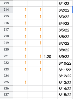
First, I added another column to my sheet. I created a value in that column on the date of interest (my date is in the adjacent column). For this particular chart, I had made the data points I was tracking by date as “1”, so to show a different size line I made the date of interest 1.2. I changed the min and max values to be 0.7 and 1.2, which means that the “1”s showed up in the middle of the graph and my “date” markers went the full height of the graph.
Here’s how the source data looks in my sheet:
Then, I expanded my chart to include the new line as a data source, and my chart then looked something like this:
![]()
Because I am simply tracking the presence of things, I’ve hidden the left horizontal axis, because the value is not a meaningful data point and just an artifact of the numbers I’ve chosen to visualize the data on particular days. (Again, what’s displayed has a min of 0.7 and max of 1.2, so the blue and green lines have 1 values whereas the purple line I’m using to indicate a major date is a value of 1.2)
That’s a fixed date, though. I want to track data over time and be able to have the graph automatically update without me having to constantly expand the series of data the chart includes. I’d rather include a month or two of empty data in advance, and have today’s date flagged.
But that’s not a default feature, so how could I make this work? With a similar trick of graphing the date, but using a feature of Google Sheets where you can enter “=TODAY()” and have the cell fill with today’s value. It automatically updates, so it can therefore shift along my graph as long as I’ve gotten a sufficiently large selection of data past today’s date.
I struggled with having a single cell value selected, though, so I ended up creating another column. In this column, I had it check for what today’s date was (TODAY()) and compare it against the date in my existing date column. If the date matched today’s date, then it would display a 1.2 value. If it didn’t match, it would leave the cell blank. The full formula for this was:
=IF(TODAY()=D3,1.2, )
This checked if my date column (column D for me; make sure to update with the column letter that matches where your dates live) had today’s date and marked it if so.
It worked! Here’s how it looks – I’ve made the today’s date marker a different color (bright orange) than my other dates of interest (purple):
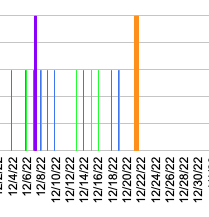
This orange line will keep shifting to today’s date, so I can quickly glance at this chart and not have to be updating the data selection of the chart as often.
Troubleshooting tips:
I ran into a couple of errors. First, I had used quotes around the 1.2 value in my formula, which entered it as text so it wouldn’t graph the line on my chart. Removing the “” in the formula (correctly written above) changed it back to number formatting so it would graph. Also, I had selected a smaller portion of data for this chart, but then I grabbed the entire today’s date column, so the today’s-date line was incorrectly graphed at the far right of the graph rather than on today’s date. That was because of the size of data mismatch; I had something like A334-C360,G3:G360. Instead, I had to make sure the today’s-date checking column matched the size of the other data selection, meaning A334-C360,G334-360 (notice how the first G number is now updated to match the A starting number). So, if you see your value graphed in an unexpected place, check for that.
Other tricks
PS – I actually am getting my “1” values based on data from another tracking spreadsheet. I use a formula to check for the presence of cell values on another tab where I am simply marking with an ‘x’ or various other simple markers. I use another IF checking formula to see if the cell matching the date in the other tab has a value, and if so, printing that 1 value I illustrated in my source data.
The formula I use for that is:
=IF(OTHER-TAB-NAME!E3=””,,1)
It checks to see if the cell (E3) in the other tab for the same date row has a value. If so, it marks a 1 down and otherwise leaves it blank. That way I can create these rows of values for graphing and additional elements, like the today’s-date row, in another sheet without getting in the way of my actual tracking sheet.