I used to make a lot of statements about things I thought I couldn’t do. I thought I couldn’t run overnight, so I couldn’t attempt to run 100 miles. I could never run 200 mile races the way other people did. Etc. Yet last year I found myself training for and attempting 100 miles (I chose to stop at 82, but successfully ran overnight and for 25 hours) and this year I found myself working through the excessive mental logistics and puzzle of determining that I could train for and attempt to run 200 miles, or as many miles as I could across 3-4 days.
Like my 100 mile attempt, I found some useful blog recaps and race reports of people’s official races they did for 200-ish mile races. However, like the 100 attempts, I found myself wanting more information for the mental training and logistical preparation people put into it. While my 200 mile training and prep anchored heavily on what I did before, this post describes more detail on how my training, prep, and ‘race’ experience for a multi-day or 200 mile ultra attempt.
DIY-ing a 200
For context, I have a previous post describing the myriad reasons of why I often choose to run DIY ultras, meaning I’m not signing up for an official race. Most of those reasons hold true for why I chose to DIY my 200. Like my 100 (82) miles, I mapped a route that was based on my home paved trail that takes me out and around the trails I’m familiar with. It has its downsides, but also the upsides: really good trail bathrooms and I feel safe running them. Plus, it’s easy and convenient for my husband to crew me. Since I expected this adventure to take 3-4 days (more on that below), that’s a heavy ask of my husband’s time and energy, so sticking with the easy routes that work for him is optimal, too. So while I also sought to run 200 miles just like any other 200-mile ultra runner, my course happens to have minimal elevation. Not all 200 mile ultramarathon races have a ton of elevation – some like the Cowboy 200 are pretty flat – so my experience is closer to that than the experience of those running mountain based ultras with 30,000 feet (or more) of elevation gain. And I’m ok with that!
Sleep
One of the puzzles I had to figure out to decide I could even attempt a 200 miler is sleep. With a 100 mile race, most people don’t sleep at all (nor did I) and we just run through the night. With 200 miles, that’s impossible, because it takes 3, 4, 5 days to finish and biologically you need sleep. Plus, I need more sleep than the average person. I’m a champion sleeper; I typically sleep much longer than everyone else; and I know I couldn’t function with an hour here or there like many people do at traditional races. So I actually designed my 200 mile ultra with this in mind: how could I cover 200 miles AND get sleep? Because I’m running to/from home, I have access to my kitchen, shower, and bed, so I decided that I would set up my run to run each day and come home and eat dinner, shower, and sleep each night for a short night in my bed.
I then decided that instead of winging it and running until I dropped before eating, showering, and sleeping, I would aim for running 50 miles each day. Then I’d come in, eat, shower, and sleep and get up the next morning and go again. 4 days, 3 nights, 50 miles each day: that would have me finishing around 87-90ish hours total (with the clock running from my initial start), including ~25 hours or more of total downtime between the eating/showering/sleeping/getting ready. That breakdown of 3.67 days is well within the typical finish times of many 200 mile ultras (yes, comparing to those with elevation gain), so it felt like it was both a stretch for me but also doable and in a sensible way that works for me and my needs. I mapped it all out in my spreadsheet, with the number of laps and my routes and pacing to finish 50 miles per day; the two times per day I would need my husband to come out and crew me at ‘aid station stops’ in between laps, and what time I would finish each night. I then factored in time to eat and shower and get ready for bed, sleep, and time to get up in the morning. Given the fact that I expected to run slower each day, the sleep windows go from 8 hours down to less than 6 hours by night 3. That being said, if I managed to sleep 5 hours per night and 15 hours total, that’s probably almost twice as much as most people get during traditional races!
Like sleep, I was also very cognizant of the fact that a 200 probably comes down to mental fortitude and will power to keep going; meticulous fueling; and excellent foot care. Plus reasonable training, of course.
Meticulous fueling
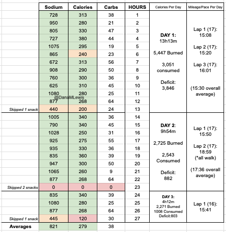
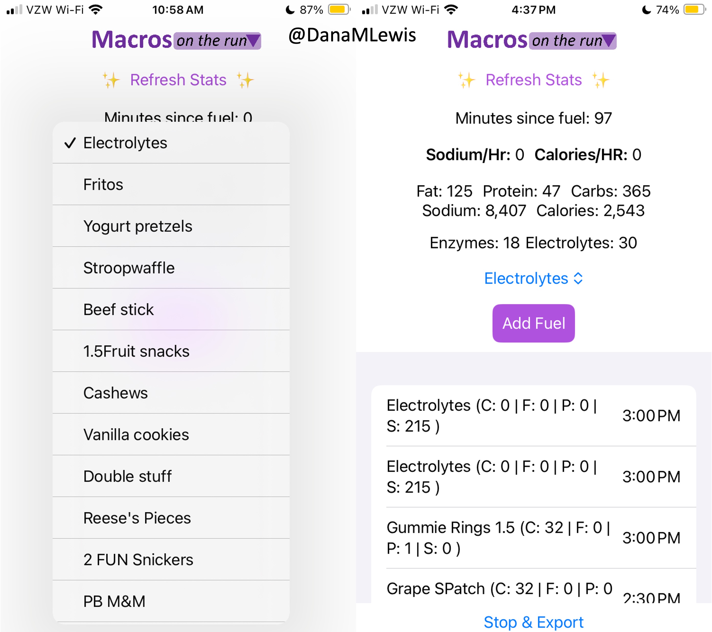
I have previously written about building and using a spreadsheet to track my fuel intake during ultras. This method works really well for me because after each training run I can see how much I consumed and any trends. I started to spot that as I got tired, I would tend to choose certain snacks that happened to be slightly lower calorie. Not by much, but the snack selections went from those that are 150-180 calories to 120-140 calories, in part because I perceived them to be both ‘smaller’ (less volume) and ‘easier to swallow’ when I was tired. Doubled up in the same hour, this meant that I started to have hours of 240 calories instead of more than 250. That doesn’t sound like much, but I need every calorie I can get.
I mapped out my estimated energy expenditure based on the 50 miles per day, and even consuming 250 calories per hour, I would end up with several thousand calories of deficit each day! I spent a lot of time testing food that I think I can eat for dinner on the 3 nights to ensure that I get a good 1000 calories or more in before going to bed, to help address and reduce the growing energy deficit. But I also ended up optimizing my race fuel, too. Because I ran so many long runs in training where I fueled every 30 minutes, and because I had been mapping out my snack list for each lap for 50 miles a day for 4 days, I’ve been aware for months that I would probably get food fatigue if I didn’t expand my fuel list. I worked really hard to test a bunch of new snacks and add them to the rotation. That really helped even in training, across all 12 laps (3 laps a day to get 50 miles, times 4 days), I carefully made sure I wouldn’t have too many repeats and get sick of one food or one group of things I planned to eat. I also recently realized that some of the smaller items (e.g. 120 calorie servings) could be increased. I’m already portioning out servings from a big bag into small baggies; in some cases adding one more pretzel or one more piece of candy (or more) would drive up the calories by 10-20 per serving. Those small tweaks I made to 5 of my ~18 possible snacks means that I added about 200 calories on top of what was already represented in those snacks. If I happen to choose those 5 snacks as part of my list for any one lap, that means I have a bonus 200 calories I’ve convinced myself to consume without it being a big deal, because it’s simply one more pretzel or one more piece of candy in the snack that I’m already use to consuming. (Again, because I’m DIYing my race and have specific needs relative to running with celiac, diabetes, and exocrine pancreatic insufficiency, for me, pre-planning my fuel and having it laid out in advance for every run, or in the race every single lap, is what works for me personally.)
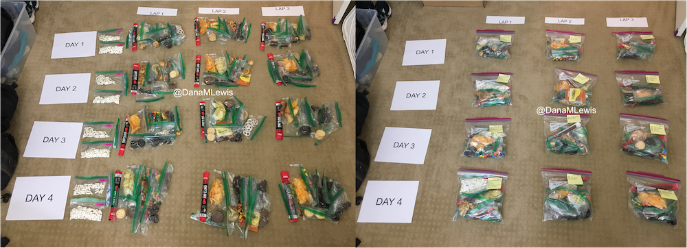
Here’s a view of how I laid out my fuel. I had worked on a list of what I wanted for each lap, checking against repeats across the same day and making sure I wasn’t too heavily relying on any one snack throughout all the days. I then bagged up all snacks individually, then followed my list to lay them out by each lap and day accordingly. I also have a bag per day each for enzymes and electrolytes, which you’ll see on the left. Previously, I’ve done one bag per lap, but to reduce the number of things I’m pulling in and out of my vest each time, I decided I could do one big bag each per day (and that did end up working out well).
Contingency planning
Like I did for my 100, I was (clearly) planning for as many possibilities as I could. I knew that during the run – and each evening after the run – I would have limited excess mental capacity for new ideas and brainstorming solutions when problems come up. The more I prepared for things that I knew were likely to happen – fatigue, sore body, blisters, chafing, dropping things, getting tired of eating, etc – the more likely that they would be small things and not big things that can contribute to ending a race attempt. This includes learning from my past 100 attempt and how I dealt with the rain. First of all, I planned to move my race if it looks like we’ll get 6 months of rain in a single 24 hour period! But also, I scheduled my race so that if I do have a few hours of really hard rain, I could choose to take a break and come in and eat/shower/change/rest and go back out later, or extend and finish a lap on the last day or the day after that. I was not running a race that would yank me from the course, but I did have a hard limit after day 5 based on a pre-planned doctor’s appointment that would be a hassle to reschedule, so I needed to finish by the night after day 5. But this gave me the flexibility to take breaks (that I wasn’t really planning to take but was prepared to if I needed to due to weather conditions).
Training for a 200 mile ultramarathon
Like training plans for marathons and 100 milers, the training plans I’ve read about for 200 mile ultramarathons intimidate me. So much mileage! So much time for a slow run/walker like me. I did try to look at sample 200 mile ultra plans and get a sense for what they’re trying to achieve – e.g. when do they peak their mileage before the race, how many back to back runs of what general length in terms of time etc – and then loosely keep that in mind.
But basically, I trained for this 200 mile ultra just like I trained for my marathon, 50k, 100k, and 82 miler. I like to end up doing long runs (which for me are run/walks of 30 seconds run, 60 seconds walk, just like I do shorter runs) of up to around 50k distance. This time, I did two total training runs that were each around 29 miles, just based on the length of the trail I had to run. I could have run longer, but mentally had the confidence that another ~45 minutes per run wasn’t going to change my ability to attempt 50 miles a day for 4 days. If I didn’t have 3 years of this training style under my personal belt, I might feel different about it. That’s longer than many people run, but I find the experience of 7-8 hours of time on my feet fueling, run/walking, and problem solving (including building up my willpower to spend that much time moving) to be what works for me.
The main difference for my 200 is probably also that it’s my 3rd year of ultrarunning. I was able to increase my long runs a little bit more of a time, when historically I used to add 2 miles a time to a long run. I jumped up 4 miles at a time – again, run/walking so very easy on my legs – when building up my long runs, so I was able to end up with 2 different 29 mile runs, two weeks apart, even though I really kicked off training specifically for this 8 weeks prior (10 weeks including taper) to the run. In between I also did a weekend of back to back to back runs (meaning 3 days in a row) where I ran 16 miles, another 16 miles, and 13 miles to practice getting up and running on tired legs. In past cycles I had done a lot more back to back (2-day) with a long and a medium run, but this time I did less of the 2-day and did the one big 3-day since I was targeting a 4-day experience. In future, if I were to do this again, given how well my body held up with all this training, I might have done more back to back, but I took things very cautiously and wanted to not overtrain and cause injury from ramping up too quickly.
As part of that (trying not to over do it), instead of doing several little runs throughout the week I focused on more medium-long runs with my vest and fueling, so I would do something like a long run (starting at 10 miles building up to 29 miles), a medium-long run (8 miles up to 13 miles or 16 miles) and another medium-ish run (usually 8 miles). Three runs a week, and that was it. Earlier in the 8 weeks, I was still doing a lot of hiking off the season, so I had plenty of other time-on-feet experiences. Later in the season I sometimes squeezed in a 4th short run of the week if we wouldn’t be hiking, and ran without my vest and tried to do some ‘speed work’ (aka run a little faster than my easy long run pace). Nothing fancy. Again, this is based on my slow running style (that’s actually a fixed interval of short run and short walk, usually 30 seconds run and 60 seconds walk), my schedule, my personality, and more. If you read this, don’t think my mileage or training style is the answer. But I did want to share what I did and that it generally worked for me.
I did struggle with wondering if I was training “enough”. But I never train “enough” compared to others’ marathon, 50k, 100k, 100 mile plans, either. I’m a low mileage-ish trainer overall, even though I do throw in a few longer runs than most people do. My peak training for marathon, 50k, and 100k is usually around low 50s (miles per week). Surprisingly, this 200 cycle did get me to some mid 60 mile weeks! One thing that also helped me mentally was adding in a rolling 7 day calculation of the miles, not just looking at miles per calendar week. That helped when I shifted some runs around due to scheduling, because I could see that I was still keeping a reasonable 55-low60s mileage over 7 days even though the calendar week total dropped to low 40s because of the way the runs happened to land in the calendar weeks.
Generally, though, looking back at how my training was more than I had accomplished for previous races; I feel better than ever (good fueling really helps!); I didn’t have any accidents or overtraining injuries or niggles; I decided a few weeks before peak that I was training enough and it was the right amount for me.
Another factor that was slightly different was how much hiking I had done this year. I ran my 100k in March then took some time off, promising my husband that we would hike “more” this year. That also coincided with me not really bouncing back from my 100k recovery period: I didn’t feel like doing much running, so we kept planning hiking adventures. Eventually I realized (because I was diagnosed with Graves’ disease last year, I’m having my thyroid and antibody and other related blood work done every 3 months while we work on getting everything into range) that this coincided with my TSH going too high for my body’s happiness; and my disinterest in long runs was actually a symptom (for me) of slightly too-high TSH. I changed my thyroid medication and within two weeks felt HUGELY more interested in long running, which is what coincided with reinvigorating my interest in a fall ultra, training, and ultimately deciding to go for the 200. But in the meantime, we kept hiking a lot – to the tune of over 225 miles hiked and over 53,000 feet of elevation gain! I never tracked elevation gain for hiking before (last year, not sure I retrospectively tracked it all but it was closer to 100 miles – so definitely likely 2x increase), but I can imagine this is definitely >2x above what I’ve done on my previous biggest hiking year, just given the sheer number of hikes that we went out on. So overall, the strengthening of my muscles from hiking helped, as did the time on feet. Before I kicked off my 8 week cycle, we were easily spending 3-4 hours a hike and usually at least two hikes a weekend, so I had a lot of time on feet almost every hike equivalent to 12 or more miles of running at that point. That really helped when I reintroduced long runs and aided my ability to jump my long run in distance by 4 miles at a time instead of more gently progressing it by 2 miles a week as I had done in the past.
How my 200 mile attempt actually went
Spoiler alert: I DNF (did not finish) 200 miles. Instead, I stopped – happily – at 100 miles. But it wasn’t for a lack of training.
Day 1 – 51 miles – All as planned
I set out on lap 1 on Day 1 as planned and on time, starting in the dark with a waist lamp at 6am. It was dark and just faintly cool, but warm enough (51F) that I didn’t bother with long sleeves because I knew I would warm up. (Instead, for all days, I was happy in shorts and a short sleeve shirt when the temps would range from 49F to 76F and back down again.) I only had to run for about an hour in the dark and the sky gradually brightened. It ended up being a cloudy, overcast and nice weather day so it didn’t get super bright first thing, but because it wasn’t wet and cold, it wasn’t annoying at all. I tried to start and stay at an easy pace, and was running slow enough (about ~30s/mile slower than my training paces) that I didn’t have to alter my planned intervals to slow me down any more. All was fairly well and as planned in the first lap. I stopped to use the bathroom at mile 3.5 and as planned at my 8 mile turnaround point, and also stopped to stuff a little more wool in a spot in my shoe a mile later. That added 2 minutes of time, but I didn’t let it bother me and still managed to finish lap 1 at about a 15:08 min/mi average pace, which was definitely faster than I had predicted. I used the bathroom again at the turnaround while my husband re-filled my hydration pack, then I stuffed the next round of snacks in my vest and took off. The bathroom and re-fueling “aid station” stop only took 5 minutes. Not bad! And on I went.
 Lap 2 was also pretty reasonable, although I was surprised by how often I wanted a bathroom. My period had started that morning (fun timing), and while I didn’t have a lot of flow, the signals my abdomen was giving my brain was telling me that I needed to go to the bathroom more often than I would have otherwise. That started to stress me out slightly, because I found myself wishing for a bathroom in the longest stretch without trail bathrooms and in a very populated area, the duration of which was about 5.5 miles long. I tried to drink less but was also aware of trying not to under hydrate or imbalance my electrolytes. I always get a little dehydrated during my period; and I was running a multi-day ultra where I needed a lot of hydration and more sodium than usual; this situation didn’t add up well! But I made it without any embarrassing moments on the trail. The second aid station again only took 5 minutes. (It really makes a world of difference to not have to dry off my feet, Desitin them up, and re-do socks and shoes every single aid station like I did last year!) I could have moved faster, but I was trying to not let small minutes of time frazzle me, and I was succeeding with being efficient but not rushed and continuing on my way. I had slowed down some during lap 2, however – dropping from a 15:08 to 15:20ish min/mi pace. Not much, but noticeable.
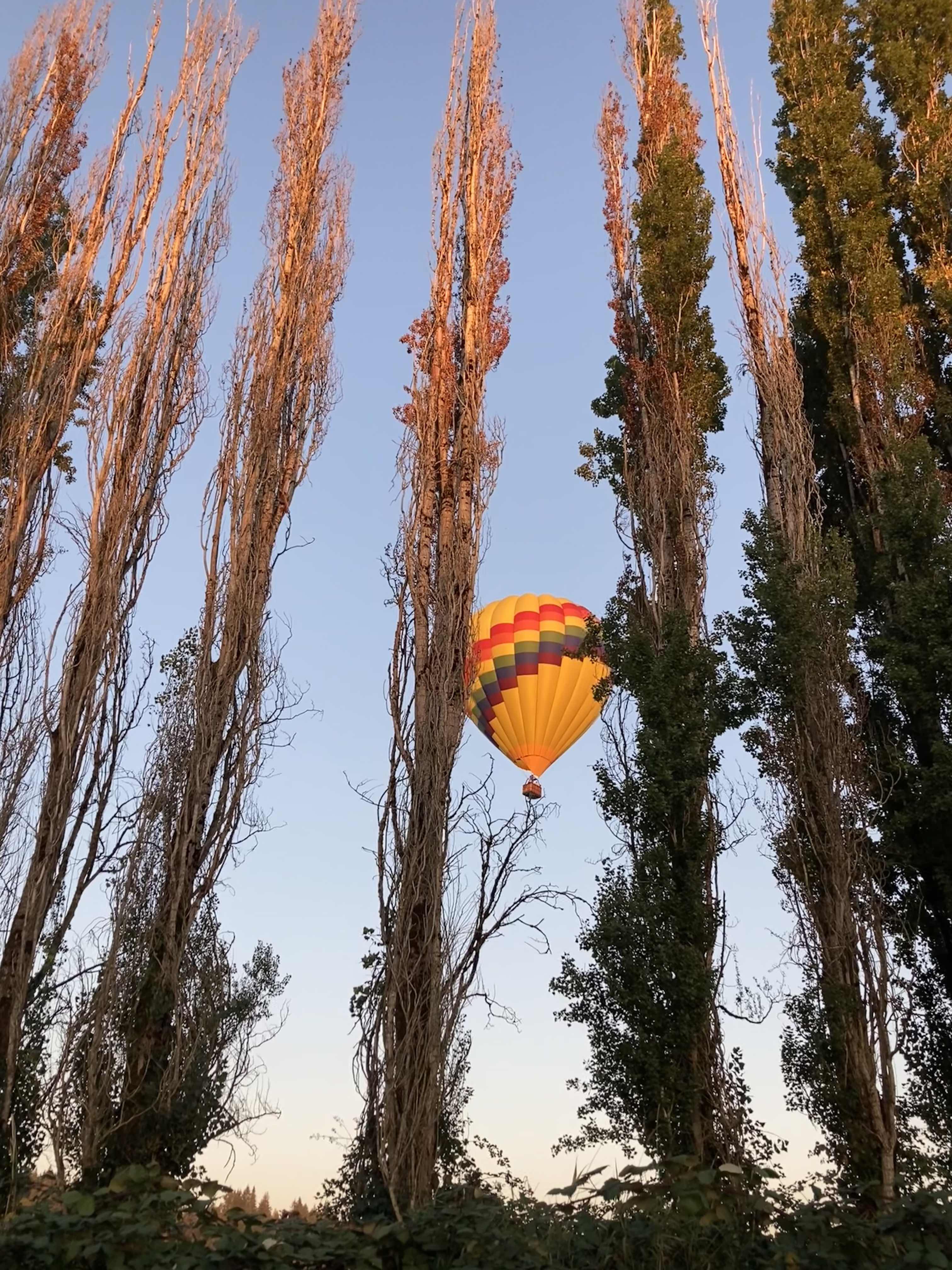 Lap 3 I did feel more tired. I talked my husband into bringing me my headlamp toward the end of the last lap, instead of me having to carry it for 4+ hours before the sun went down. (Originally, I thought I would need it 2-3 hours into this last lap, but because I was moving so well it was now looking like 4 hours, and it would be a 2-3 mile e-bike ride for him to bring me the lamp when I wanted it. That was a mental win to not have to run with the lamp when I wasn’t using it!) I was still run/walking the same duration of intervals, but slowed down to about 16:01 pace for this lap. Overall, I would be at 15:40 average for the whole day, but the fatigue and my tired feet started to kick in on the third lap between miles 34-51. Plus, I stopped to take a LOT more pictures, because there was a hot air balloon growing in the distance as it was flying right toward me – and then by me next to the trail! It ended up landing next to the soccer fields a mile behind me after it passed me in this picture. I actually made it home right as the sun set and didn’t have to wear my lamp at all that evening.
Day 1 recovery was better and worse than I expected. I sat down and used my foot massager on my still-socked feet, which felt very good. I took a shower after I peeled my socks off and took a look at my feet for the first time. I had one blister that I didn’t know was growing at all pop about an hour before I finished, but it was under some of my pre-taped area. I decided to leave the tape and see how it looked and felt in the morning. I had 2-3 other tiny, not a big deal blisters that I would tape in the morning but didn’t need any attention that night.
I had planned to eat a reasonably sized dinner – preferably around 1000 calories – each night, to help me address my calorie deficit. And I had a big deficit: I had burned 5,447 calories and consumed 3,051 calories in my 13 hours and 13 minutes of running. But I could only eat ¼ of the pizza I planned for dinner, and that took a lot of work to force myself to eat. So I gave up, and went to bed with a 3,846 calorie deficit, which was bigger than I wanted.
And going to bed hurt. I was stiff, which I could deal with, but my feet that didn’t hurt much while running started SCREAMING at me. All over. They hurt so bad. Not blisters, just intense aches. Ouch! I started to doubt my ability to run the next day, but this is where my pre-planning kicked in (aided by my husband who had agreed to the rules we had decided upon): no matter what, I would get up in the morning, get dressed, and go out and start my first lap. If I decided to quit, I could, but I could not quit at night in bed or in the morning in the bed or in the house. I had to get up and go. So I went to sleep, less optimistic about my ability to finish 50 miles again on day 2, but willing to see what would happen.
Day 2: 34 instead of 50 miles, and walking my first ever lap
I actually woke up before my alarm went off on day 2. Because I had finished so efficiently the day before, I was able to again get a good night’s sleep, even with the early alarm and waking up again at 4:30am with plans to be going by 6am. The extra time was helpful, because I didn’t feel rushed as I got ready to go. I spent some extra time taping my new blisters. Because they hadn’t popped, I put small torn pieces of Kleenex against them and used cut strips of kinesio tape to protect the area. (Read “Fixing Your Feet” for other great ultra-related foot care tips; I learned about Kleenex from that book.) I also use lambs’ wool for areas that rub or might be getting hot spots, so I put wool back in my usual places (between big and second toes, and on the side of the foot) plus another toe that was rubbing but not blistered and could use some cushion. I also this year have been trying Tom’s blister powder in my socks, which seems to help since my feet are extra sweat prone, and I had pre-powdered a stack of socks so I could simply slip them on and get going once I had done the Kleenex/tape and wool setup. The one blister that had popped under my tape wasn’t hurting when I pressed on it, so I left it alone and just added loose wool for a little padding.
 And off I went. I managed to run/walk from the start, and faster than I had projected on my spreadsheets originally and definitely faster than I thought was possible the night before or even before I started that morning. Sure, I was slower than the day before, but 15:40 min/mi pace was nothing to sneeze at, and I was feeling good. I was really surprised that my legs, hips and body did not hurt at all! My multi-day or back-to-back training seemed to pay off here. All was well for most of the first lap (17 miles again), but then the last 2 or so miles, my pace started dipping unexpectedly so I was doing 16+ min/mi without changing my easy effort. I was disappointed, and tired, when I came into my aid station turnaround. I again didn’t need foot care and spent less than 5 minutes here, but I told Scott as I left that I was going to walk for a while, because my feet had been hurting and they were getting worse. Not blisters: but the balls of my feet were feeling excruciating.
 I headed out, and within a few minutes he had re-packed up and biked up to ride alongside me for a few minutes and chat. I told him I was probably going to need to walk this entire lap. We agreed this was fine and to be expected, and was in fact built into my schedule that I would slow down. I’ve never walked a full lap in an ultra before, so this would be novel to me. But then my feet got louder and louder and I told him I didn’t think I could even walk the full lap. We decided that I should take some Tylenol, because I wasn’t limping and this wouldn’t mask any pain that would be important cues for my body that I would be overriding, but simply muting the “ow this is a lot” screams that the bones in the balls of my feet were feeling. He biked home, grabbed some, and came back out. I took the Tylenol and sent him home again, walking on. Luckily, the Tylenol did kick in and it went from almost unbearable to manageable super-discomfort, so I continued walking. And walking. And walking. It took FOREVER, it felt like, having gone from 15-16 min/mi pace with 30 seconds of running, 60 seconds of walking, to doing 19-20 minute miles of pure walking. It was boring. I had podcasts, music, audiobooks galore, and I was still bored and uncomfortable and not loving this experience. I also was thinking about it on the way back about how I did not want to do a 3rd lap that day (to get me to my planned 50 miles) walking again.
Scott biked out early to meet me and bring me extra ice, because it was getting hot and I was an hour slower than the day before and risking running out of water that lap if he didn’t. After he refilled my hydration pack and brought it back to me while I walked on, I told him I wanted to be done for the day. He pointed out that when I finished this lap, I would be at 34 miles for the day, and combined with the day before (51), that put me at 85 miles, which would be a new distance PR for me since last year I had stopped at 82. That was true, and that would be a nice place to stop for the day. He reminded me of our ‘rules’ that I could go out the next day and do another lap to get me to 100, and decide during that lap what else I wanted to do. I was pretty sure I didn’t want to do more, but agreed I would decide the next day. So I walked home, completing lap 2 and 34 miles for the day, bringing me to 85 miles overall across 2 days.
Day 2 recovery went a little better, in part because I didn’t do 51 miles (only 34) and I had walked rather than ran the second lap, and also stopped earlier in the day (4pm instead of 7pm). I had more time to shower and bring myself to finally eat an entire 1000 calories before going to bed, again with my feet screaming at me. I had more blisters this time, mostly again on my right foot, but the balls of my feet and the bones of my feet ached in a way they never had before. This time, though, instead of setting my alarm to get up and go by 6am, I decided to sleep for longer, and go out a little later to start my first lap. This was a deviation from my plan, but another deviation I felt was the right one: I needed the sleep to help my body recover to be able to even attempt another lap.
Day 3: Only 16 miles, but hitting 100 for the first time ever
Instead of 6am, I set out on Day 3 around 8:30am. I would have taken even longer to go, but the forecast was for a warm day (we ended up hitting 81F) and I wanted to be done with the lap before the worst of the heat. I thought there was a 10% chance I’d keep going after this lap, but it was a pretty small chance. However, I set out for the planned 16 mile lap and was pleasantly surprised that I was run/walking at about a 15:40 pace! Again, better than I had projected (although yes, I had deviated from my mileage plan the day before), and it felt like a good affirmation that stopping the day before instead of slogging out another walking lap was the right thing to do.
After a first few miles, I toyed with the idea of continuing on. But I knew with the heat I probably wouldn’t stand more than one more lap, which would get me to 116. Even if I went out again the fourth day, and did 1-2 laps, that would MAYBE get me to 150, but I doubted I could do that without starting to cause some serious damage. And it honestly wasn’t feeling fun. I had enjoyed the first day, running in the dark, the fog, the daylight, and the twilight, seeing changing fall leaves and running through piles of them. The second day was also fun for the first lap, but the second lap walking was probably what a lot of ultra marathoners call the “death march” and just not fun. I didn’t want to keep going if it wasn’t fun, and I didn’t want to run myself into the ground (meaning to be so worn down that it would take weeks to months to recover) or into injury, especially when the specific milestones didn’t really mean anything. Sure, I wanted to be a 200 mile ultramarathoner, something that only a few thousand people have ever done – but I didn’t want to do it at the expense of my well-being. I spent a lot of time thinking about it, especially miles 4-8, and was thinking about the fact that the day before I had started, I had gone to a doctor’s appointment and had an official diagnosis confirming my fifth autoimmune disease, then proceeded to run (was running) 100 miles. Despite all the fun challenges of running with autoimmune conditions, I’m in really good health and fitness. My training this year went so well and I really enjoyed it. Most of this ultra had gone so well physically, and my legs and body weren’t hurting at all: the weakness was my feet. I didn’t think I could have trained any differently to address that, nor do I think I could change it moving forward. It’s honestly just hard to run that many hours or that many miles, as most ultramarathoners know, and your feet take a beating. Given that I was running on pavement for all of those hours, it can be even harder – or a different kind of hard – than kicking roots and rocks on a dirt trail. I figured I would metaphorically kick myself if I tried for 116 or 134 and injured myself in a way that would take 6-8 weeks to recover, whereas I felt pretty confident that if I stopped after this lap (at 100), I would have a relatively short and easy recovery, no major issues, and bounce back better than I ever have, despite it being my longest ever ultramarathon. Yes, I was doing it as a multi-day with sleep in between, but both in time on feet and in mileage, it was still the most I’d ever done in 2 or 3 days.
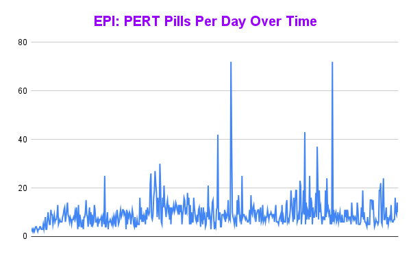
And, I was tired of eating. I was fueling SO well. Per my plans, I set out to do >500 mg of sodium per hour and >250 calories per hour. I had been nailing it every lap and every day! Day 1 I averaged 809 mg of sodium per hour and 290 calories per hour. Day 2 was even increased from that, averaging 934 mg of sodium per hour and 303 calories per hour! Given the decreased caloric burn of day 2 because I walked the second lap, my caloric deficit for day 2 was a mere ~882 calories (given that I also managed to eat a full dinner that night), even though I skipped the last hour as I finished the walking lap. Day 3 I was also fueling above my goals, but I was tired of it. Sooooo tired of it. Remember, I have to take a pill every time I eat, because I have exocrine pancreatic insufficiency (EPI or PEI). I was eating every 30 minutes as I ran or walked, so that meant swallowing at least one pill every 30 minutes. I had swallowed 57 pills on Day 1 and 48 pills on Day 2, between my enzymes and electrolyte pills. SO MANY PILLS. The idea of continuing to eat constantly every 30 minutes for another lap of ~5 or more hours was also not appealing. I knew if I didn’t eat, I couldn’t continue.
And so, I decided to stop after one more lap on day 3, even though I was holding up a respectable 15:41 min/mi pace throughout. I hit 100 miles and finished the lap at home, happy with my decision.
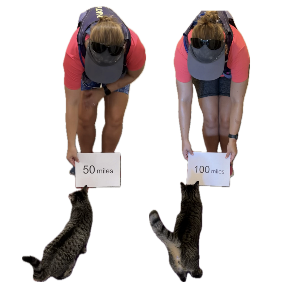 (You can see from these two pictures that I smelled VERY interesting, sweaty and salty and exhausted at the end of day 1 and day 3, when I hit 50 miles and 100 miles, respectively. We have two twin kittens (now 3 years old) and one came out to sniff me first on the first day, and the other came out as I came home on the third day!)
Because I had only run one final lap (16 miles) on day 3, and had so many bonus hours in the rest of the day afterward when I was done and home, I was able to eat more and end up with only a 803 calorie deficit for the day. So overall, day 1 had the biggest deficit and probably influenced my fatigue and perception of pain on day 2, but because I had shortened day 2 and then day 3, my very high calorie intake every hour did a pretty good job matching my calorie expenditure, which is probably why I felt very little muscle fatigue in my body and had no significant sore areas other than the bottoms of my feet. I ended up averaging 821 mg/hr of sodium and 279 calories per hour (taking into account the fact that I skipped two final snacks at the end of day 2 when I was walking it out; ignoring that completely skipped hour would mean the average caloric intake on hours I ate anything at all was closer to 290 calories/hr!)
In total, I ended up consuming 124 pills in approximately 27 hours of move time across my 100 miles. (This doesn’t include enzyme pills for my breakfast or dinners each of those days, either – just the electrolyte and enzyme pills consumed while running!)
AFTERMATH
Recovery after day 3 was pretty similar to day 2, with me being able to eat more and limit my calorie deficit. I’ve had long ~30 mile training runs where I wasn’t very hungry afterward, but it surprised me that even two days after my ultra, I still haven’t really regained my appetite. I would have figured my almost 4000 calorie deficit from day 1 would drive a lot of hunger, so this surprised me.
So too has my physical state: 48 hours following the completion of my 100 miles, I am in *fantastic* shape compared to other multi-day back to back series of runs I’ve done, ultramarathons or not. The few blisters I got, mainly on my right foot, have already flattened themselves up and mostly vanished. I think I get more blisters on my right foot because of breaking my toe last year: my right foot now splays wider in my shoe, so it tends to get more blisters and cause more trouble than my left foot. I got only one blister on my left foot, which is still fluid filled but not painful and starting to visibly deflate now that I’m not rubbing it onto a shoe constantly any more. And my legs don’t feel like I ran at all, let alone running 51+34+16 miles!
I am tired, though. I don’t have brain fog, probably because of my excellent fueling, but I am fatigued in terms of overall energy and lack of motivation to get a lot done yesterday and today (other than writing this blog post!). So that’s probably pretty on par with my effort expended and matches what I expected, but it’s nice to be able to move around without hurting (other than my feet).
My feet in terms of general aches and ows are what came out the worst from my run. Day 2, what hurt was the bottom of the balls of my feet. Starting each night though, I was getting aches all over in all of the bones of my feet. After day 3, that night the foot aches were particularly strong, and I took some Tylenol to help with that. Yesterday evening and today though, the ache has settled down to very minor and only occasionally noticeable. The tendon from the top of my left foot up my ankle is sore and gets cranky when I wear my sneakers (although it didn’t bother me at all while running any of the days), so after tying and re-tying my shoelaces 18 times yesterday to try to find the perfect fit for my left foot, today I went on my recovery walk in flip flops and was much happier.
What I’m taking away from this 200 mile attempt that was only 100 miles:
I feel a little disappointed that I didn’t get anywhere near 200 miles, but obviously, I was not willing to hurt long enough or hard enough to get there. My husband called it a stretch goal. Rationally, I am very happy with my choices to stop at 100 and end up in the fantastic physical shape that I am in, and I recognize that I made a very rational choice and tradeoff between ending in good shape (and health) and the mainly ego-driven benefits of possibly achieving 200 miles (for me).
Would I do anything different? I can’t think of anything. If I somehow had an alternate do-over, I can’t think of anything I would think to change. I’d like to reduce my risk of blisters but I’m already doing all I can there, and dealing with changes in my right foot shape post-broken toe that I have no control over. And I’m not sure how to train more/better for reducing the bottom ball of foot pain that I got: I already trained multiple days, back to back, long hours of feet on pavement. It’s possible that having my doctor’s appointment the day before I started influenced my mental calculation of my future risk/benefit tradeoff of continuing more miles, and so not having had that then may have changed my calculations to do another lap or two, or go out on the 4th day (which I did not). But, I don’t have a do over, and I’ll never know, and I’m not too upset about that because I was able to control what I could control and am again pretty happy with the outcomes. 100 or 150 miles felt about the same to me, psychologically, in terms of satisfaction.
What I would tell other people about attempting multiple day ultramarathons or 200 mile ultramarathons:
Training back to back days is one option, as is long spurts of time on feet walking/hiking/running. I don’t think “just running” has to be the only way to train for these things. I’m also a big proponent of short intervals: If you hear people recommend taking walk breaks, it doesn’t have to be 1 minute every 10 minutes or every mile. It can be as short as every 30 seconds of running, take a walk break! There’s no wrong way to do it, whatever makes your body and brain happy. I get bored running longer (and don’t like it); other people get bored running the short intervals that I do – so find what works for you and what you’re actually willing to do.
Having plans for how you’ll rest X hours and go out and try to make it another lap or to the next aid station works really well, especially if you have crew/pacers/support (for me, my husband) who will stick to those rules and help you get back out there to try the next lap/section. Speaking of sleep/rest, laying down for a while helps as much as sleeping, so even if you can’t sleep, committing to the rest of X hours is also good for resting your feet and everything. I found that the hour laying down before I fell asleep helped my body process the noise of the “ouch” from my feet and it was a lot easier to sleep after that. Plan that you’ll have some down/up time before and after your sleep/rest time, and figure that into your time plans accordingly.
The cheesy “know your why” and “know what you want” recommendations do help. I didn’t want 200 miles badly enough to hurt more for longer and risk months of recovery (or the inability to recover). Maybe you’d be lucky enough to achieve 200 without hurting that bad, that long, or risking injury – or maybe you’ll have to make that choice, and you might make it differently than I did. (Maybe you’re lucky enough to not have 5 autoimmune things to juggle! I hope you don’t have to!) I kind of knew going in that I was only going to hit 200 if all went perfect.
Diabetes and this 200 mile ultramarathon that was a 100 mile ultra:
I just realized that I managed to write an ENTIRE race report without talking about diabetes and glucose management…because I had zero diabetes-related thoughts or issues during these several days of my run! Sweet! (Pun fully intended.)
Remember, I have type 1 diabetes and use an open source automated insulin delivery (AID) system (in my case, still using OpenAPS after alllllll these years), and I’ve talked previously about how I fuel while ultrarunning and juggling blood glucose management. Unlike previous ultras, I had zero pump site malfunctions (phew) and my glucose stayed nicely in range throughout. I think I had one small drift above range for 2 hours due to an hour of higher carb activity right when I shifted to walking the second lap on day 2, but otherwise was nicely in range all days and all nights without any extra thought or energy expended. I didn’t have to take a single “low carb”/hypoglycemia treatment! I think there was one snack I took a few minutes early when I saw I was drifting down slightly, but that was mostly a convenience thing and I probably would not have gone low (below target) even if I had waited for my planned fuel interval. But out of 46 snacks, only one 5-10 minutes early is impressive to me.
I had no issues after each day’s run, either: OpenAPS seamlessly adjusted to the increasing insulin sensitivity (using “autosensitivity” or “autosens”) so I didn’t have to do manual profile shifts or overrides or any manual interference. I did decide each night whether I wanted to let it SMB (supermicrobolus) as usual or stick to temp basal only to reduce the risk of hypoglycemia, but I had no post-dinner or overnight lows at all.
The most “work” I had to do was deciding to wear a second CGM sensor (staggered, 5 days after my other one started) so that I had a CGM sensor session going with good quality data that I could fall back to if my other sensor started to get jumpy, because the sensor session was supposed to end the night of day 4 of my planned run. I obviously didn’t run day 4, but even so I was glad to have another sensor going (worth the cost of overlapping my sensors) in order to have the reassurance of constant data if the first one died or fell out and I could seamlessly switch to an already-warmed up sensor with good data. I didn’t need it, but I was glad to have done that in prep.
(Because I didn’t talk about diabetes a lot in this post, because it was not very relevant to my experiences here, you might want to check out my previous race recaps and posts about utlrarunning like this one where I talk in more detail about balancing fueling, insulin, and glucose management while running for zillions of hours.)
—
TLDR: I ran 100 miles, and I did it my DIY way: my own course, my own (slow pace), with sleep breaks, a lot of fueling, and a lot of satisfaction of setting big goals and attempting to achieve them. I think for me, the process goals of figuring out how to even safely attempt ultramarathons are even more rewarding than the mileage milestones of ultrarunning.
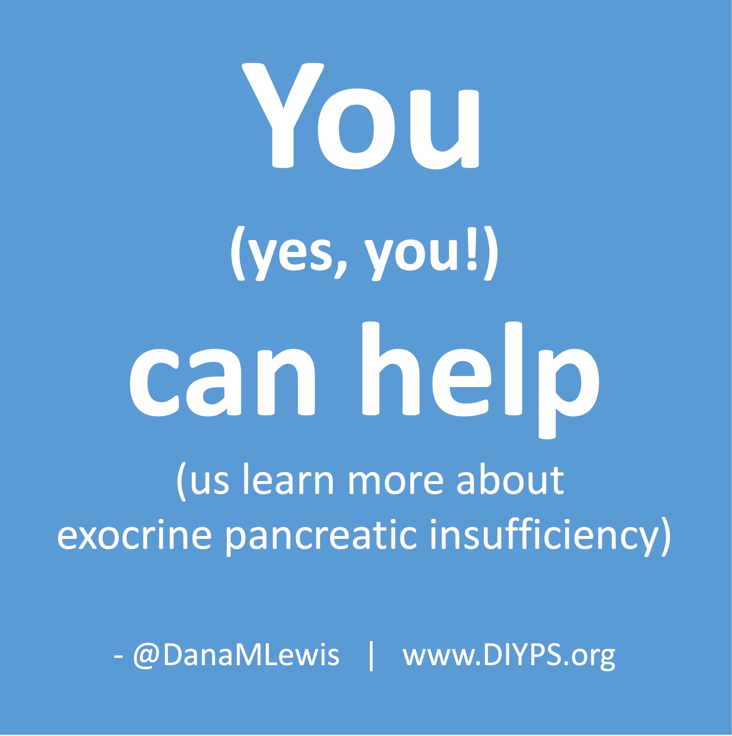
 How do you have people take the EPI/PEI-SS? You can pull this link up (https://bit.ly/EPI-PEI-SS-Web), give this link to them and ask them to take it on their phone, or save this QR code and give it to them to take later. The link (and the QR code) go to a free web-based version of the EPI/PEI-SS that will calculate the total EPI/PEI-SS score, and you can use it for shared decision making processes about whether this person would benefit from a fecal elastase test or other follow up screening for EPI. Note that the EPI/PEI-SS does not collect any identifiable information and is fully anonymous.
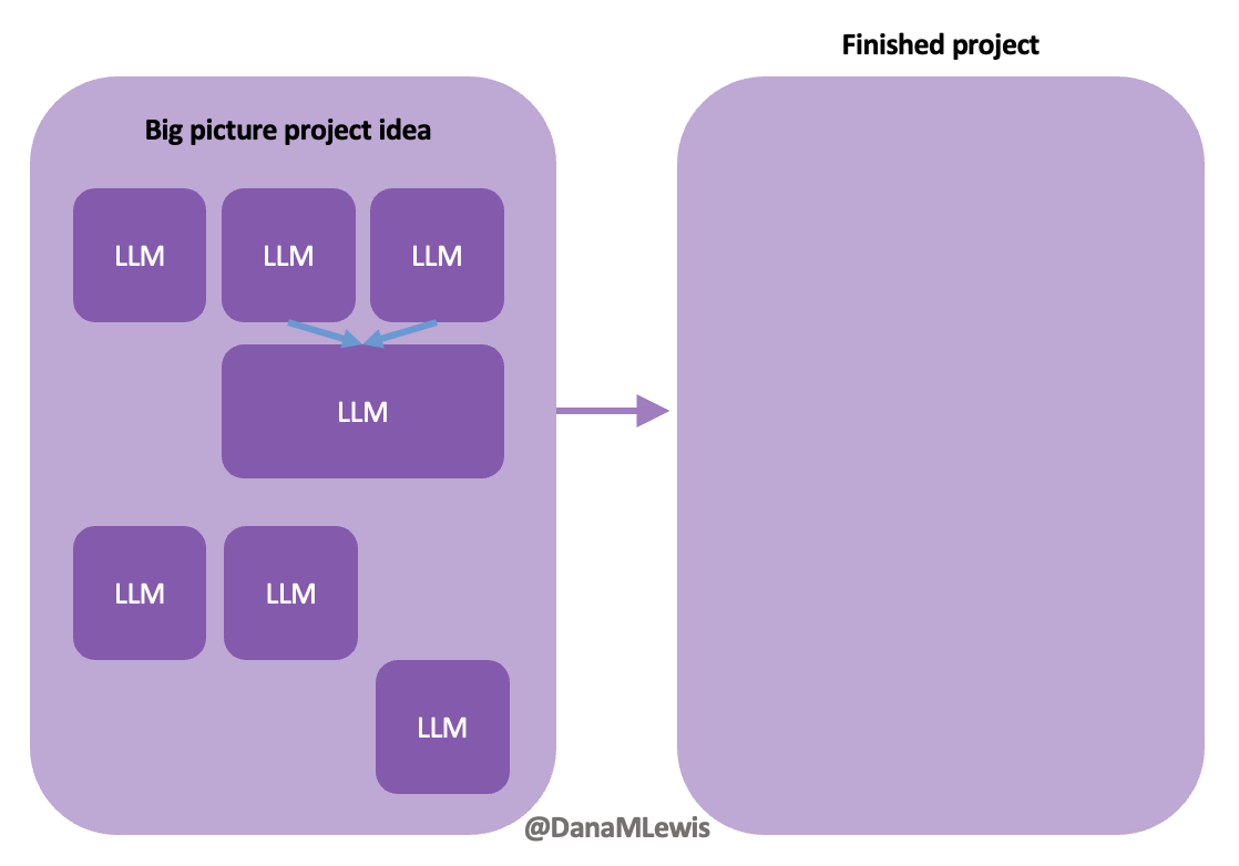 Today, I would say the same is true. It doesn’t matter – for my types of projects – if a human or an LLM “wrote” the code. What matters is: does it work as intended? Does it achieve the goal? Does it contribute to the goal of the project?

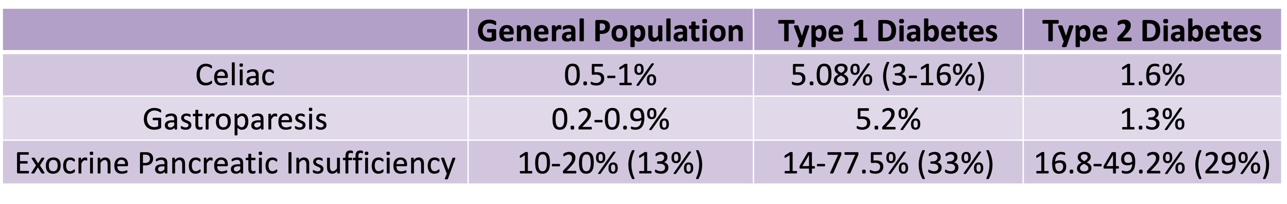 Celiac disease is more common in people with diabetes (~5%) than in the general public (0.5-1%). Gastroparesis, when gastric emptying is delayed, is also more common in people with diabetes (5% in PWD).However, the prevalence of EPI is 14-77.5% (median 33%) in Type 1 diabetes and 16.8-49.2% (median 29%) in Type 2 diabetes (and 5.4-77% prevalence when type of diabetes was not specified). This again is higher than general population prevalence of EPI.
Recent Comments