As I prepared for months for my first-ever 100 mile run, I did a lot of research to figure out how I should be prepared. There’s no one way to “prepare” for an ultramarathon of any distance, and much of the stuff online is about your training plan and physical preparations. Which is definitely important, but not the only thing that needs preparation.
After a lot of reading, thinking about my own plans and preparation, I’ve realized there are 4 general types of preparation for an ultramarathon that I’ve been doing: mental preparation and training; nutrition preparation and training; race day strategy preparation; and the actual physical training and running to prepare for an ultramarathon.
Usually, blog posts either cover the last category (training plans and physical training philosophies) or one of the other categories. This blog post summarizes everything I’ve done in all of these categories together in one place – in part to help me if I ever run another ultra following my first 100 mile attempt!
- Mental preparation and training
It’s commonly said online that running 100 miles (or most ultra distances) is 80% mental and only 20% physical. (Or similar splits like 90/10). This is in part because it is not feasible to physically train to run the distance prior to your race (usually); and the first time you tackle a new distance, you always have many (often dozens!) of miles of distance that you’ve never covered before. It’s going to be uncomfortable, and you have to plan for that. Thus, mental preparation and training as much as possible to be prepared to deal with these challenges.
The first major aspect of this, for me, is practicing and reminding my brain how to process and work through discomfort. Discomfort is distinct from pain and being injured. (Pain and an injury should include evaluating whether you should cease your activity.) I’ve fortunately (and unfortunately) had recent experiences of pain when I broke my toe. Returning to walking and then running involved some discomfort as my body got used to covering miles again. It was a very distinct feeling that was not easily confused with pain from a broken bone, which to me feels like an “electrical” type of feeling.
This recent experience with pain is easy to differentiate from the discomfort of running long distances and being tired and sore. I’m working to capture these thoughts when I have them, and transition from “I’m tired and this hurts and this is terrible” during training runs and convert these thought patterns to “I’m tired and uncomfortable. But this is not pain; this is discomfort. This is how I’m going to feel at mile 34 or 57 or the back half of my 100M, and I’m going to keep running then and I’m going to keep running now to practice this feeling.” I want to register and save this feeling and mental state for what it’ll feel like during my 100M, so it’s easier to pull that out when I’m exhausted and uncomfortable at 3am and still likely have another 40-50 miles to go.
Similarly, I also try to envision different scenarios that I will experience in my “race” or 100 mile experience. In my case, I plan to run on a paved trail for a solo endeavor (DIY or self-organized, rather than an organized race with other people). Some of the scenarios I am expecting to experience and deal with include:
- I will be running a course with 7 “laps” or loops of various lengths. This involves me coming back to the same point seven times so that I can get re-fueled by my crew (my husband), change clothes if needed, etc. I envision coming in for my second or third lap, having to turn around to head back out for another (but not my last) lap and not wanting to leave.
- How I planned to deal with this scenario: I’ve written down crew instructions for my husband, which include how to refuel and replenish my supplies; a list of troubleshooting scenarios and supplies; but also specific things that would be constructive to say to me. In this instance, any of the following:
- You are strong and you can do this.
- You only have to do the current lap.
- Walk as much as you need to.
- How I planned to deal with this scenario: I’ve written down crew instructions for my husband, which include how to refuel and replenish my supplies; a list of troubleshooting scenarios and supplies; but also specific things that would be constructive to say to me. In this instance, any of the following:
- This 100M will be one of the first times (other than a training run where I practice the transition) running all day and into the the night. I’m a little apprehensive about this idea of running for 14 hours in the dark (due to the time of year). Partially, this is because I’ve never run 14 hours before, and I’ll be doing it after already having run for 10 or so hours! And because I’m not as experienced running in the dark.
- How I planned to deal with this scenario: I have a clear set of “day to night” transition supplies and instructions to gear up for the night. I will be equipped with reflective components on my vest; a bright colored shirt; a waist lamp; a head lamp; a blinky red light on the back of my vest. I will focus on getting geared up and recognizing that it’s a mental transition as well as a physical gear transition. I will also try to think about the novelty and adventure aspects of running through the night. It’ll probably be wet and cloudy – but it might clear up in patches enough to see some stars! And – the running through the night is something I didn’t think I could do, which is actually why I’m doing a 100M, to prove to myself that I can do anything I want to set my mind to. This is the purpose of being out here, and it’s a necessary part of achieving 100M.
- At some point, most people do a lot of walking. I’m fairly unique in my “running” approach – I run/walk from the start, and also not like many people run/walk. In ultras, most folks walk every X minutes or when they reach hills. I consistently run/walk with 30s of running, then 60s or 90s of walking – from the very start. These are short intervals, but it’s what works well for me. But like everyone else, regardless of initial strategy, I expect there will be a time where it might be more efficient to try a brisk, consistent walk for a few minutes (or miles!), or a slow slog (inefficient walk) because that’s all I can convince myself to do.
- How I planned to deal with this scenario: The goal is forward motion, however I can move. Walking is ok, and expected – and I will remind myself of that. I know there is a crossover point when running speed slows down to a certain degree and running becomes as efficient at a certain point. I also know these points, speeds, and effort levels will change throughout my 100M. It helps that I’m already a proactive walker; I have no shame, guilt, or hangups related to walking because it’s ½ or ⅔ of my forward motion strategy from the start! But I will remind myself that my plans for intervals can change and I can experiment to see what feels good throughout.
- It’s possible that I could trip and fall, especially as I get tired and scuffle my feet on the trail, even though I’m on the paved trail. I also might get swooped by an owl or startled by something which causes me to trip and fall unexpectedly.
- How I planned to deal with this scenario: I’ve got my safety plan in place (more on that below) and know I will first while on the ground disable the alarm on my watch so it does not call 911 (assuming this doesn’t appear to be needed). I will move my body to see if I’m just sore or if there are any scrapes or injuries that need addressing. I will stand up if possible, continuing to check myself out. I will slowly walk, if possible, and see how I feel. I’ll also probably call and let my husband know, and either ask him to come meet me earlier than expected that lap or just let him know so he can check on me when we meet up as planned. I will let myself walk any soreness off for a while (and turn off my interval alerts) before resuming a planned run/walk strategy.
So these are some of the scenarios I’m envisioning dealing with and my plans for them, with the hope and expectation that my brain will be better equipped to deal with them as a result of thinking about them in advance.
Depending on your race/route/plans, you might need to add other types of scenarios – such as leaving the aid station with warmth and light before heading into the night; or what to do if your crew doesn’t show up as planned; or your drop bag gets soaked with water; or the aid station is out of supplies or there is no one where you expect an aid station.
The other part of my mental preparation is a lot of pre-problem solving. Similar to the above scenarios, I have thought through what I need to do for the following:
- I drop my fuel, enzymes, or electrolytes and can’t find them.
- How I planned to deal with this scenario: I will call or text my husband and adjust plans for where he meets me. I will use the backup fuel supplies in my pack as needed to tide me over. (For my race, I have fuel in individual baggies and separated out for each “lap” or segment, plus extras and backups, so my husband can grab the backup bag or the next lap bag and bring it to me.)
- I run out of water.
- How I planned to deal with this scenario: There are 3-4 water fountains along or nearby my planned run route, and I can re-fill my hydration bladder within ~3 miles from any spot on the trail. I can also again call my husband and have him meet me sooner to re-fill my hydration pack.
- My stomach gets upset.
- How I planned to deal with this scenario: I have supplies (such as Immodium, GasX, Tums, etc) in my running pack that I can use. I also have more supplies laid out at home that I can ask my husband to bring.
- I don’t feel like eating.
- How I planned to deal with this scenario: I included this on the list because I read that it happens to a lot of people. But, as a person with type 1 diabetes…I have 20 years of practice of consuming sugar or food when my blood sugar is dropping or low, even when I’m not hungry. I have also practiced consistently fueling throughout my long runs, and I am used to eating when not hungry. I expect it is more likely that I will get tired of certain textures, so I have planned out my fuel so that “harder to chew” or crunchy foods that might hurt my mouth are the snacks I eat earlier, and then eat softer snacks or snacks that require less chewing later in the run. I also have a variety of backups that include different textures and some liquid options that I can substitute for my planned fuel.
- Other scenarios I’ve pre-problem-solved are getting blisters or sore spots on my feet; chafing; getting low on sodium/electrolytes; muscles hurting on other parts of my body other than my feet; having feet that swell; getting itchy or having other types of allergic reactions; having trouble breathing; my eyes hurting; being really tired; being hot or cold or wet; my blood sugar staying higher or lower for a longer period of time; and mentally feeling “low” and unmotivated and wavering in the pursuit of my goal.
- How I planned to deal with this scenario: As part of the ‘crew instruction’ list I’ve made for my husband, I have listed out all the supplies I have to address these categories. I will also have all of these supplies grouped and set out at home. My husband is awesome at troubleshooting problems in general, but he’ll also be tired at 2 am after only sleeping for 2 hours (plus I will be tired), so I created this to help me prep all the gear but also when I tell him “I’m ____”, he can offer the requisite supplies to address the problem without me having to try to figure out what my options are and decide what to do. All of this is to help mitigate the decision fatigue I will have and the overall fatigue he will have.
- Note: I’ve also previously read a really good tip about managing decision fatigue. Tell your crew – in my case I’ve told my husband and written it onto the crew sheet – not to ask open-ended question, but to offer specific suggestions or options. For example, say “Do you want 2 or 2.5 liters of water in your hydration pack?” instead of “How much water do you want?”. For refilling my snacks, I’ve told my husband to refill my snack pack from the pre-filled bags, but the bag also has a sticky note about grabbing fresh prepared food. I told him to specifically ask “Do you want your waffle; sweet potato tots; mashed potatoes; or” (whatever is on my list of pre-prepared food for him to make and bring), instead of “What do you want?”
A lot of these I put on my list to think about based on race reports I’ve read from other people, that covers what they experienced (e.g. feet swelling and finding it helpful to have a half size bigger shoe to change into) and how they troubleshot things during the race while in between or at aid stations.
Some of my favorite race reports/blogs that I’ve learned a lot from include Rebecca Walker’s race reports; Wes Plate’s race recaps; Debbie Norman’s race reports (check out her sample crew sheet in that linked post); Bob Hearn’s thoughtfulness around pacing and walk strategy; and Sarah Lavender Smith’s race reports.
I have learned quite a bit and improved my planning and preparation by reading race reports of DNFs and also of finished races of different lengths. The longer the race, the more challenges there are and the more time to learn and sort them out. So that’s why I appreciate reading Wes’s multi day (eg 240 mile) recaps as well as 100 mile race reports, even though my focus has been on 50ks previously and now “just” a 100M.
One other thing I’ve thought about is the importance of knowing what your criteria for quitting/stopping/DNFing. For me this links back to discomfort versus pain. An injury should involve stopping temporarily and maybe permanently. But being tired, sore, uncomfortable – for me those should not qualify as reasons to stop. My goal is not to stop before 100 miles unless I have an actual injury (eg broken toe level pain).
2. Nutrition preparation and training
Yes, it’s worth “training” your nutrition. This means training your body by practicing fueling with the same foods and strategies as you want to use on your race. There’s a mantra of “nothing new on race day” that is both useful and not applicable to ultrarunning. In general, a lot of ultrarunners seem to do well (per my above search through many race reports) with eating small portions of “whatever looks good” at aid stations. If it looks good, their body is probably going to deal with it ok. But not always. And a lot of time people will bring fuel and rely on things they haven’t tested on their long runs prior to race day. Don’t be that person!
- Test your fueling options and strategy (e.g. timing of fueling) on most runs, not just your very longest runs. For me, I do fuel for any runs of 2 hours or longer, because that correlates with when I bother to bring hydration and therefore also bring fuel. (That’s 8 miles for me at an average 15min/mile pace). Some folks use 1 hour or an hour and a half as their cutoff. But the point is – don’t just test your fuel on 6 hour runs. Fueling on shorter runs helps those runs feel better; you’ll likely recover from those runs more quickly; and it helps your body practice with those fueling options. You don’t want to find out at hour 8 of your 36 hour race that your body doesn’t do well with ___. It’s better to find that out at hour 3 of a 4 hour run, or similar.
- Create your list of fuel that works for you. This should be based on your preferences but also how it helps you meet your fueling goals. When you have an idea for a new fuel, make sure you take it on your next run and try it. If you’re like me, you might want to try it near the end of your run, just in case your body doesn’t like it while running. If your body doesn’t like it, cross it off your list. You don’t want to be hauling or trying to eat food you know your body doesn’t like during a 100 mile run! I’ve found some things that I like to eat and found tasty fresh out of the oven – like ½ of a GF banana bread muffin – felt terrible in my mouth during runs. Some combination of the dry muffin (vs. freshly moist out of the oven) and the taste was not ideal for me. I ate it, and didn’t have GI distress, but I got home and promptly moved the remaining half portioned muffin baggies to my husband’s section of the fridge/freezer where my snack rejects go, and crossed it off my list. If it doesn’t bring you joy, or if it makes your brain cranky, it’s probably not a food you want for your ultra.
- Don’t feel like there is a “wrong” food, as long as it’s something that’s not going to spoil easy or melt or be too hard to eat on the go. Look at snacks and meals you like to eat; is there a serving size or a variation that you like to eat? If so, try it! People eat all sorts of things in ultras, from puréed fruits and vegetables like applesauce or baby food pouches, to candy and chips to hamburgers and soup. Walk the store aisles (physically or virtually) and get ideas for food to try. But don’t limit yourself to sports “products” like blocks, gels, gu, drink mix, and similar. You’d be surprised about the variety of food that is portable, and in individual portions is close to the same macronutrients (calories, carbs, fat or protein, sodium, etc) as more expensive sports products. A lot of time you are paying for convenience and a certain texture/delivery method. But you can achieve the same intake of macronutrients through a variety of foods and beverages.
- Some people stick with 1-2 foods or fuel sources (like liquid calorie/electrolyte solutions or gels/gu/blocks), but get tired of the sweet taste or the taste/texture of what they’re eating. Having a variety can help with this. Make your list, and for each run make sure you’re working through trying out and approving or removing the foods that you want to use during your race. Ideally, try them 1-2 times before your big run.
- If you can, practice with some of the aid station type food including warm food (eg quesadilla or burger or whatever). Have someone meet you on longest runs with this freshly prepared, or take it with you and eat it for your first fuel. (Watch out for food spoiling/going bad – I always eat the hot/fresh prepared stuff first out of my set of fuel options when I get my pack refueled, to reduce the chance of bacteria growing or the food otherwise spoiling.) This is harder to do and may not be possible, but it could help expand your options for what you’re willing to take at aid stations if you’ve tested a version of a similar food before during a training run.
- More planning ahead on nutrition for race day and training runs: figure out your timing of nutrition strategy and how many snacks or how much fuel (liquid or otherwise) you need to consume each hour or segment or between aid station. Pre-portion your fuel/snacks and if possible, label them. Plans can change and you can adapt on the fly, but having everything pre-portioned and ready to go means you can more easily start your training runs, fill your drop bags, or prep bags for your crew by having everything portioned out.
- Planning ahead also means you get to the store or order however much you need so you’re not adding stress the last few days before you race or run in order to have your fuel set up and ready to go.
- Don’t be afraid to use a timer. Some people wear running GPS watches that have alert/alarm features for fueling. You can use regular phone alarms, too, or apps like “Timer+” or “Intervals Pro” – both are ios apps that have free versions that allow one alarm each. You can choose whether it pushes a notification to your phone or watch or provides a verbal audio alert. I use both these apps and have one alarm that’s verbal audio reminding me to take electrolytes every 45 minutes; and the other one is a push-notification only that helps me remember to fuel roughly every 30 minutes. I generally am checking my watch so it’s easier to remember to fuel every :30 and 1:00 from when I start running, which is why I choose that one to be a push notification just in case. That works for me, but figure out your ideal timing and alert/alarm strategy to help you remember to fuel and electrolyte as you need to.
If anyone is curious about my individual approach to nutrition, I’ve written a bit more about it here, including how and why I actually use a spreadsheet to track nutrition and fueling during ultras and training runs. I separate my hydration (water only) and electrolytes (electrolyte pills; plus tracking the sodium in what I’m eating), so tracking my fueling serves many goals both during a run and after a run when I can look back and see if I need to tweak anything (such as not putting two smaller/lower-calorie, lower-sodium snacks back to back).
Since I’m running my ultra solo/DIY, I’m taking advantage of some fresh/heated fuel options, like mashed potatoes, ¼ of a ham and cheese (gluten-free) quesadilla, etc. For these, I am leaving a pre-printed sticky note on the baggie of shelf-stable fuel with a reminder for my husband to bring 2 of my fresh/hot options each time as well as anything else I need him to bring for that lap. To aid the bringing of the fresh/home food, I made a printed set of instructions that lists what these are, broken down by location (freezer, fridge, or on the counter) and instructions on how to make them. This is a critical step because what he predicts I want or how I want something to be cooked or prepped for a run doesn’t always match what I was wanting or expecting. Having clear instructions he can follow (eg heat ¼ quesadilla in microwave for 30s) works well for both of us and further helps with limiting his decision/processing fatigue since he’ll be responsible for grabbing and making 2 things; getting the lap bag of refuel; packing up ice and water; and getting all that and any other requested supplies out to the trail on time to refuel me as I pass by again.
If you have crew, think similarly about what food you want to have; how they’ll make it and serve it to you; how you’ll consume it at the aid station or as you move along on the trail. All of this planning will pay off.
(Another benefit of my macronutrient/fuel tracking spreadsheet is that my husband has access to it and can check it to see if I’m sticking to my fueling and electrolyte strategy, so he can troubleshoot and recommend things if I need support in fixing a problem. I don’t think he’ll use it much, but this secondary use of the spreadsheet was inspired by one of Heather Hart’s many excellent ultra posts talking about showing her empty fuel wrappers to her crew to prove that she was fueling. In my case, instead of counting wrappers, my husband can check my spreadsheet.)
3. Race day strategy (and pre-race and post-race strategy)
Continuing on the theme of pre-planning and laying out your strategy, I also think about strategy related to race day and leading up to race day as well as after race day.
My goal is to eliminate stress; pre-do as much work as I can physically and mentally to reduce the load when I will be physically and cognitively fatigued and overloaded.
Pre-race
For example, I look at my schedule prior to the race and try to clear out stressful activities (or prevent scheduling them, if possible). I know I’ll need to spend hours physically prepping (per above, making fuel and organizing supplies), so I put that on a to-do list and make a block of time on my calendar for it. I think about tasks that I will have before and after the race, such as changing my continuous glucose monitor (CGM) and pump sites to be in optimal locations on my body for the race; but also changing them early enough prior to the race so that they are settled in and I know they are working well. I also do things like pre-fill my reservoirs with insulin, and do enough reservoirs for a few days before and a week or so after the race. Like during the race, anything I can do to help reduce cognitive fatigue or pre-do steps of tasks that I know I will find harder to do is the goal.
This includes also blocking off my schedule with reminders to go to bed earlier. I think about when I’ll be waking up on race day and the night before, set my bedtime reminder for about 8 hours prior. Then every day before that I set it 15 minutes later, working back about a week and a half. I don’t always hit these sleep times, but progressively slightly shifting my sleep like this has been effective prior to international trips with a lot of time zone changes and also has paid off for getting a better night’s sleep the night or two before a race that involves waking up early.
I also specifically think through all the steps from waking up to starting my race, and how to optimize those. I eat a particular breakfast prior to the race, time it so that I can best get some macronutrients in, and time the insulin so I don’t have much of a BG spike but also then don’t have much insulin activity happening when I start my run. I don’t always get this right, but I attempt to line up my schedule so that I wake up and immediately eat what I have laid out on my bedside table and start hydrating, so that I can sleep as long as possible and don’t have to spend extra minutes convincing myself to get out of bed to go make breakfast. Some of these strategies are unique to me being a person with insulin-requiring (in my case, type 1) diabetes; but it’s pretty common for other ultrarunners to have strategies around what to eat the morning before a race; how many hours prior to the race; etc. I’d suggest you decide based on first principles and your own knowledge what to do for you.
Pro tip/personal vent: most people who blog or write about “avoiding insulin spikes” prior to the race or during the race – if they don’t actually administer exogenous insulin (aka inject or pump it, their pancreas makes it) – they also don’t usually actually know anything about the insulin response to food in their body. They are mostly repeating that from hearing it from others who repeat it from a long chain of people. You are SUPPOSED to spike insulin in response to what you’re eating: that’s good because it manages your blood glucose levels and helps your body process and store what it needs to be storing. It is also very normal for your blood sugar to rise in response to eating. The only people who need to think about “insulin spikes” are people who don’t think about it as insulin “spikes” but as insulin activity or more commonly “insulin on board” (IOB), which are people with insulin-requiring diabetes. This is different for us because we have to inject/pump insulin separately (our pancreases don’t make it on demand in response to sensing food in our bodies) AND because the insulin we use takes longer to act – 45-60 minutes instead of mere minutes – as well as has an hours-long “tail” effect. So it’s a lot of work to match the peak timing of insulin to the impact of different types of food in our bodies as well as watching out for insulin “stacking” over the many-hour activity curve for each dose. Your body, if you don’t have insulin-requiring diabetes? It does this, on its own, like magic. Yay, you! So ignore the stuff about “avoiding insulin spikes” and focus instead on things like whether the food feels heavy in your stomach when you run or gives you GI distress or otherwise doesn’t make you feel good. If it doesn’t, try different food and try different timing.
4. Race start and race strategy
You should definitely have a plan for how you run your race. In my case, because I’m a run/walker, I think about which set of intervals I will start at (likely 30:90, meaning 30s run and 90s walk, because that’s also how I train and helps me achieve my easy effort and easy paces). My goal is to start easy and limit excitement. Since I’m solo running, I don’t get swept up in other people running and racing. But, I always find the start and the first mile to be hard. So my strategy instead is to start, make sure all my intervals and run trackers are turned on; my electrolyte and fuel timers are set; and that I get my audiobook or podcast going. I troubleshoot any of these as needed on the walk intervals as I get going. I specifically try not to think about pace, especially the first half mile, nor how it’s feeling so I don’t catastrophize. I know the first 0.75 miles or so always feels pretty rough, so I aim to do no foreshadowing of how anything else is going to feel.
For most people running organized races, it helps to have studied the course maps and elevation profiles. Learn the course by heart, in terms of knowing how many miles to each aid station and what the elevation profile is like, and what your strategy is for each section. This means having a pace plan from the start and if you are going way too fast (due to excitement and other people around you), switching to walk breaks to help moderate your pace if you can’t slow your run pace down on its own. It also might help to not only have a pace plan but to also put time estimates on aid stations or check points. Use any extra time – especially if you are far ahead – to address any issues popping up (chafing, blisters or hot spots on your feet, etc.). Don’t start foreshadowing and forecasting that you can hold this too-fast pace through the whole race. You likely can’t (physically), and skipping the plan to stop and address issues will also doubly backfire later.
Even though I’m not running an organized race, this is still something I struggle with. I’m setting the goal to stop for bathroom breaks or shoe re-lacing or hotspot fixing in the first out and back “lap”, recognizing that it will help get my average time here to slow down a bit and keep me from powering through it too hard based on initial excitement. My goal is to make sure I don’t skimp on self-support (e.g. foot care or re-applying anti-chafe) by folding that it in to my goal pacing.
In general, though, because I’m running a 7 “lap” course, I focus on each lap. And only that lap. I’m running known out-and-back or triangle shaped “loops” that I know and love, so I can treat the first out-and-back like a long extra-easy run and settle in to watch landmarks while I listen to my audiobook and focus solely on managing effort. When I get back after the first loop and refill my vest, I then can think about the lap that I’m on (13 miles next, a much shorter loop). When I’m back, then I think about the next out and back (about 16 miles). And so on. My goal is to never think about how much time or distance is left. I’m not good at “running the mile I’m in”, as people often advise, but I am fairly good at focusing on a sub-component and the process overall. So focusing on each lap, and knowing there are 7 laps of varying lengths, helps me compartmentalize the experience. I’ll run ¼ of the first out and back in the dark and transition into the daylight; the second lap should also be during the day; then I’ll transition to my night gear for the third lap and be in the dark on the 4th, 5th, and 6th lap. I don’t have aid stations or elevation changes to really break up the course, but since I know the course and all the landmarks well, even with the variable distance “laps”, that aids me in knowing what to watch for and keep moving toward, even if I transition to a walk or get off track pace-wise from problem solving and am trying to re-orient myself again afterward.
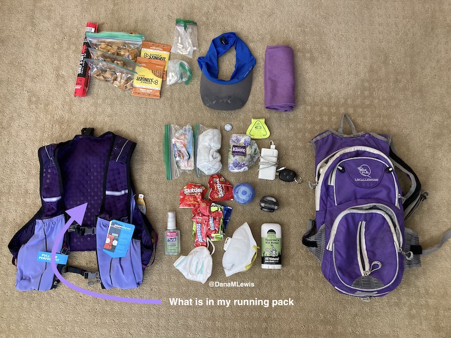
It’s good to think about what supplies you’ll carry versus what you will have access to at aid stations, what you have in drop bags, and what your crew will have. I generally carry most of my needed first-aid/don’t feel good supplies on me: anti-chafing, kinesio tape for blisters or muscles, anti-nausea medication, etc. But I have a set of supplies prepped and ready for my husband (who is my crew) to bring to me if needed. I won’t have aid stations, so I think about my planned re-fuel stops as aid stations where he’ll primarily be. If something gets really bad, though, he can bike out to meet me. In some races you may have crew access to the trails wherever you need them; in other races, they are not allowed or able to access you outside designated points. Plan and carry supplies accordingly.
And, plan for your crew how to help you and how you’ll communicate with them. I will have cell service on my run, so I plan to text my husband to give him updates (in addition, he can geo-track my phone’s location) of when I’m on or off the last predicted pace to a refuel stop; what I want him to bring (e.g. the 2 hot/fresh food items, or any extra supplies from my laid-out stash); and how it’s going. We have practiced on training runs for him to grab my vest and refill ice and water, fuel, electrolytes/enzymes/eye drops, then bring it back to me (biking) or when I re-pass him after I’ve turned around and come back to the spot where he is per my course plan. But I also expect him, as crew, to also get tired and mentally fatigued, so I’ve made a checklist that he will use to make sure he completes the steps every lap. There’s also a checklist for day to night transition and night to day transition. This is in the same online document as my expert list of supplies and strategies to troubleshoot every issues, so he doesn’t have to guess what the good options are for fixing blisters or low sodium or whatever the issue may be. He runs, but he doesn’t do ultra runs, and regardless everyone is different in terms of what works for them and especially what works for them at different stages of an ultra; thus, having this crew guide or checklist or supply/strategy “cheatsheet” is a benefit, especially as both he and I get more and more tired through the night.
My strategy also includes making sure my devices stay powered. I always carry a small battery and a charging cord for my phone, and will keep my phone power topped off. This is because I use it for run tracking; geolocation for my crew (husband); fuel/electrolyte reminders; fuel tracking via my spreadsheet; and it is the “receiver” for my CGM so I know what my blood sugars are. Thus, it’s a mission-critical device and I always like to keep it charged. I will also grab a watch charger from my husband after a certain number of laps to top off the charge on my watch 1-2x, based on how it’s battery is doing. He’ll replace the battery in my vest each time after I’ve used it (we’ve got 2-3 small batteries for this purpose so he can take one home and re-charge it while I’m using the other, plus another backup). My phone then also serves as an emergency back-up light if my other two lights fail at night.
Speaking of lights and night gear, have a plan for when and how you’ll transition to night gear. Because I’m running a solo/DIY race and I’m not experienced at running at night (although I’ll do a run or two in training to practice the transition and my gear), I’m actually choosing to start my run at 6am so I run about 1.5-2 hours in the dark at the start of my race. Why? My husband doesn’t believe it’s necessary and is still arguing with me about it, but my strategy is intentional. I want to start the run in my lights and night gear and practice running in the dark again so that I can see if I need to tweak or adjust it for later that night around 6pm when I need to run in the dark again. This gives me one more practice round and mentally will help me – or at least, that’s the goal – know what it’s like to run in the dark. Given that I’ll run in the dark for 14h overnight, I don’t want to pick up my lights and take off and be 6-8 miles down trail from my husband and my backup gear if I realize something isn’t working well. I know I’ll be prone to just sticking it out for the entire lap; this way, I get a mini, 1.5h test of the gear on the same day and that way when I do a 3-5 hour first lap in the dark that evening, it’ll be slightly more likely to go smoothly and I’ll take all the smoothing I can get for my first 100M and my first all night and overnight run!
My other strategy involves self-care in the sense of regular medications that I need. Of course, I’ll be managing my blood sugars and insulin very carefully all day throughout (often thinking about it every 10-15 minutes to make sure everything is on track). But I also take allergy medication twice a day at morning and night, as well as a thyroid medication at night. So I have set reminders on my husband’s calendar to make sure he brings out my bags of night medication (e.g. allergy and thyroid) and in the morning (allergy) medication to make it less likely that I’ll forget to take them. Thankfully if I mess this up and am super delayed or forget to take them, it won’t derail my race/run much, but I definitely will feel not taking my allergy medication within hours so that will also help me remember to take my thyroid evening medication, too.
Another self-care strategy is around keeping my eyes hydrated with eye drops on a regular basis. In October 2021 I started to have really dry, gritty eyes and went to my eye doctor and was diagnosed with…dry, gritty eyes. Helpful! But, sarcasm aside (I love my eye doctor), I got eye gel to use before bedtime and eye drops to use throughout the day. Then in August 2022 I realized I had subclinical hyperthyroidism from Graves’ disease, which is an autoimmune disease (to go with type 1 diabetes, celiac disease, and exocrine pancreatic insufficiency) that causes eye issues. So! My dry gritty eyes were a precursor to my thyroid level changes. At any rate, learning how and when to use eye drops has become routine and I know how helpful it is to keep my eyes lubricated. I use preservative-free eye drops, not because the preservatives bother my eyes but because they come in miniature vials that are very easy to put in your pocket. Supposedly they are designed to be single use, but they usually contain enough lubrication for 2-3 rounds of drops for both eyes. So I twist off the lid, drop in both eyes, put the lid back on, and stuff it back in my pocket. I have set reminders on my calendar during the run to do this every few hours in case I forget, but I have also put vials in each lap bag (along with electrolytes and enzymes) and this presence of new eye drop mini-vials will help remind me (hopefully) to stay on top of eye lubrication.
Keeping my eyes from getting dry will hopefully help me be able to wear my contacts longer, because I usually take them out at night. But, I also will have my husband ready with my contact case and contact solution to take them out; then I will switch to my glasses or run without them (because I don’t need to see far or read signs off in the distance) for some period of hours, while still using the eye drops to keep them happy.
I’m fairly nervous about my eyes being an issue, since I’ve never run this long or all night. This was exacerbated by reading race recaps where folks talked about losing their vision! Yikes! I read a little bit more and realized they’re talking about corneal edema, where there is temporary swelling in the edema that makes your retinas visually look cloudy (if someone else looks at your eye). It usually goes away when people stop running after a few hours or day. But given my eye issues, before I had realized I was dealing with eye stuff related to Graves’ disease and thyroid stuff, I was concerned that my tendency to dry/gritty eyes would make me at higher risk of this, even though it seems like only 1-2% of 100M finishers ever deal with this. But, like everything else, I decided to have a strategy for this. I’ll seek to prevent it with regular lubrication and if it’s cold and windy, using my glasses (in lieu of contacts) or clear biker glasses or sunglasses to help protect my eyes from irritation and drying out further. But if it does happen, I’m using the advice from this post and bought a small vial of 5% hypertonic eye drops to use and try. (I had a regular annual eye doctor appointment a month prior, so I checked with my eye doctor about this. She had never heard of it and consulted a cornea specialist who had also not heard of it, which helps confirm that it’s pretty rare! Although they admitted they don’t get a lot of endurance athletes, looked it up on PubMed like I had, and agreed that if it happens to try the 5% hypertonic eye drops. Note that contact wearers want to take the contacts out before using these drops.) If I start to have vision issues; and I have the clear visual symptoms of this (according to Scott’s assessment of looking at my eyeballs); I’ll try the eye drops and ideally they’ll help. Since this is a known issue, if I still have some vision and can run safely (given my 6 foot wide paved trail in a safe location with no navigation required); I will likely try to continue – again based on discussion and advice with my doctor. But having a plan for this is much better than suddenly having vision issues in the ultra and feeling like I need to abort, when it might be ok to continue running (again on advice from my doctor).
Another strategy is thinking about how I’ll use caffeine. I usually drink caffeine up until noon, then switch to caffeine-free diet soda (and more water) in the afternoon and evening. I’ll drink a diet Mtn Dew when I wake up with my breakfast, but only one, and I will aim not to drink any throughout the day and save them for after midnight, when I’ll have been running for 18+ hours and have spent 6 hours in the dark. That way I have a “pick me up” to look forward to, both in terms of the taste/flavor of diet Mtn Dew, which I love, and some caffeine. There’s some suggestion that weaning off caffeine in the weeks prior to the race would make this a more effective strategy; but for me I think removing the joy of diet Mtn Dew would not be a net benefit. I’m also not convinced that I know what amount of caffeine is needed for an overnight boost, nor that I can test this reliably enough to have a solid evidence-based strategy here. So instead, I’m likely going for the mental boost of the taste change and the placebo effect of thinking the caffeine is helping. I have, however, tested drinking a diet Mtn Dew during a long run in the morning; so I do know that my body is ok taking it in.
This is yet another example of how I’m trying to remove decision-making during the race by pre-planning wherever possible for decisions like when to take caffeine or not; what to eat when; etc. I have laid out pacing sheets for a wide variety of run paces – so wide that the fastest pace (if all goes amazingly well) would have me finishing 8 hours faster than the slowest pace I have charted out. But the reason this matters is because I’m using the slowest time to estimate how much fuel I need to have prepared, then preparing more as backups (see more detail in the nutrition section). I created my overall fuel list then started putting in estimates of how many of each I would be willing to consume, also factoring in palate fatigue and texture fatigue and not wanting to chew or put ‘hard’ things (like Fritos) into my mouth in the later hours of my run. I balanced all of these variables and came up with 6 max servings of my chili cheese Fritos, most of which will be consumed in the earlier hours; 6 max servings of a few other routine things I can eat in most situations, then smaller counts (eg 1-4) of other things like the hot/home food that my husband will bring out in addition to the shelf-stable food. Once I had my overall counts totaling enough fuel for the slowest hour estimate and the number of servings; I then made a lap-by-lap list of what I wanted to eat when. I’m going to prepare these bags with the numbers I need per lap based on the timing (e.g. 10 snacks for the slowest pace estimated for my longest lap in between refuels, of which 8 are shelf stable and 2 will be added based on the sticky note reminder for the fresh/home options). Each of these lap bags will also include the requisite number of electrolyte pills I need, based on similar estimates from my “slow” paces, and the enzymes I need (because I have exocrine pancreatic insufficiency and need these to actually digest the fuel I consume), plus new eye drops. The point of this strategy is to remove decision making for both me and my husband: we don’t need to figure out how many enzymes or electrolytes I have “left” from the last lap (because I am off my fueling plan or more likely because I packed extra for each); instead, he can simply pull out all the trash, old enzyme/electrolyte bags, and replace with the new fuel, electrolyte, and enzymes along with my water/ice refill.
You may not have the complexity of my situation (type 1 diabetes, celiac, exocrine pancreatic insufficiency) influencing your fueling strategy and choices and how you’ll deal with fuel on the run. But, you might want to consider similarly planning your fuel. You may need to adapt your strategy based on how you’re feeling and what options you have in your pack, drop bag, with crew, or at an aid station, but you can plan for options to address issues of fatigue, palate/texture fatigue, etc. That, essentially, is what I have done.
Finally, I also consider a safety strategy part of my important race planning. I wear a watch that will generate an SOS alert and call emergency services if I fall during a run. I have the ability to press and hold a button on my watch or my phone to similarly generate an emergency services call. My location is tracked by my husband (and my mom from afar); and my husband also has access to my CGM for blood glucose tracking. He’ll have extra alerts and alarms set at different thresholds than we typically do for glucose levels. Finally, we’ve also created what I call the “DanaWatch” plan/squad, which is 3 people who will be texting me periodically from midnight to 9am my time, which is the overnight hours when Scott will be intermittently sleeping for 1-2 hour snatches in between refueling me. The plan is for my friend in the UK to text me every half hour and watch for a response that I’ll generate from my watch – probably a simple thumbs up emoji or tapping one of the auto-generated responses like “thanks” or “hi” or “I’m good”. After a few hours, a friend on the east coast will take over. Then my mom in central time zone after she wakes up will start texting. Nothing fancy, but the point is that they have ensured I’m still moving and ok. If I don’t respond within 5 minutes, they’ll call me; if I don’t pick up the phone, they’ll call Scott. This means that there wouldn’t be more than about 30 minutes where I’m not actively being “watched” virtually in case I get swooped by an owl, fall down and hit my head and am too disoriented to call for help (or some other very rare situation). I don’t expect that will happen; but I also think I’ll appreciate the “company” since I’m again, running a solo, DIY race where there aren’t aid stations, other runners, and other crew out and about to cheer me on. It’ll also help my husband sleep better/feel better, so any of those reasons are worth this strategy!
Post-race strategy
Like pre-race strategy, post-race strategy and planning is also critical for me. Once I cross the finish “line” and stop, I get cold and start to feel being wet (from sweat or rain) very quickly. My feet and everything hurt even more. I am absolutely not hungry despite knowing I need to re-fuel. But later I am ravenously hungry like a switch has shifted. So I plan accordingly.
First up, gear change. I want to change into dry clothes. I remind my husband to remind me that yes, despite the pain/hassle of getting out of a wet sports bra and changing it, I’ll regret not changing out of it in addition to changing my shirt. Sometimes, if we are getting in the car to drive home, I quickly swap to a dry shirt and then take the sports bra off under my shirt and just leave it off. No need for gymnastics to put another one on if I am just riding in the car. Same with shoes: once I take my sneakers off, my feet will not want to go back in sneakers. Definitely not the same sweaty, dirty shoes I was running in, but also not cleaner and even bigger shoes. Instead, I prefer sandals/arch support flip flops. I have those, compression sleeves, and my clean dry clothes ready to go. I learned after my first trail marathon how good a washcloth feels for rubbing off sweat and dirt, so I also have a washcloth. It works for removing masses of mud before you get in the car, too. Or if you’re not muddy and hot and sweaty, pouring some cool water on it and washing your face feels heavenly.
Next up is fueling. When running an organized race, I don’t want to eat any of the race food, even if I can have it. (By “can have it” I mean that it’s safely gluten free with no cross-contamination risk, since I have celiac disease.) Usually I can’t have it, and I plan accordingly to bring food that is not the same food I’ve been eating throughout my ultra (because I have palate fatigue). I don’t want to eat as soon as I stop running, but usually after changing in the car and driving off, my body switches into “you’re safe” mode and wants to start refueling. Make sure you have all your food in the seat with you so you don’t have to stop and dig it out; or worse, have to try to twist around or reach for it (because you won’t want to do that most likely).
And again, you may have palate fatigue or similar (or it may disappear as soon as you are done), so having a few good options will be useful.
I also try to get enough groceries and prepare food for the following several days, too, when I’ll still be hungrier and making up for burned energy. My motivation to cook/prepare/put together food will be low, so having a stocked fridge and freezer with easy to prepare food is important.
Also, you may not be driving home from your race (or being driven home), so make sure to plan your logistics accordingly. Can you get to the airport that same day? Should you? Do you want to? And the next day? Is it safe to fly in your physical state? What different supplies do you need for flying that might be different (due to security regulations around liquid etc) than you would if you were driving home? Do you have enough snacks/food for the travel days following your run?
Training strategy
Oh, and yes, you have to physically train for your ultra. I am by no means a coach or an expert ultra runner. I am a solid, places-from-last back-of-the-pack runner who is a consistent run/walker. So get or make a training plan (Heather Hart has some great free ones for various distances). And stick to it. Except for when you don’t stick to it.
Wait, what?
You set your training strategy for “if all goes well”, but also build in flexibility and extra time for when things don’t go well. Like wildfire smoke season making it unsafe to run outside for a few days or weeks. Or you break your toe and spend 4 weeks not weight bearing. Or you have a lot of life stress, child or parental care, job stress, or any number of things. All this stress impacts training. Give yourself grace and be prepared to be flexible.
I have a hard time with this; I like my spreadsheets and my plans. But wildfire smoke and a broken toe were part of my 2022 ultra training experience this year, and I had to adjust training (and race plans) accordingly. At some point, you have to make the go/no-go decision about whether you’re going to run your race.
Think about what the “ideal training” is. Think about what is the “minimum training” to complete your event safety. If you’re somewhere in between, it’s going to be mental training and planning that can make the difference. At some point, if you’re above ‘minimum’ training you can decide to run even if your training isn’t ideal. Remember, it probably won’t be ideal and it isn’t for a lot of people. But per the mental training section and the wisdom I’ve gained from a lot of ultra runners…the most important factor might be deciding to do it. If you decide to, barring injury during the race or an accident, you will. If you decide mid-race you can’t or don’t want to, likely you won’t.
I think one thing I observe people not training is their walking strategy. Mine is baked in, because all my training short and long runs are intervals of run/walk. Many folks talk about walking hills or walking X minutes per Y minutes or Z miles. If that’s the plan for your race, train it during long runs. Walk hills or powerwalk or hike hills during runs or at the ends of runs. Practice a slow walk mixed in or a faster more efficient power walk. This will help build different muscles and help you maintain more efficient form (and speed) when you shift to it during the race, and help you go longer.
Similarly, practice with your vest/pack/handheld and other hydration gear. Practice with a similar stuffed and weighted pack. Practice with your head lamp. Do a run early in the morning as it transitions from dark to light; do a run into the evening as it transitions from light to dark to get used to your gear; practice troubleshooting it; and to improve your strategy for these transitions. If it’s wildfiresmoke season where you live, practice running masked as well. (On my last long run, I wore my mask for the full 8 hour run because air quality was so yucky.)
Also train and practice with your crew, if possible. Especially things like helping them tape or lubricate, tying your shoes, helping you put your pack on, them packing your pack/vest with supplies, etc. Any of these steps can be practiced during a training run so you and they can figure out what questions and assumptions you each have, and to build the crew checklist and instructions.
In my case, I’ve trained with my husband on refilling my ice and water in my pack during several training runs and previous races. We haven’t trained yet on him re-packing my (new) vest, though, so that’s on our list to practice on runs heading into my 100M. We did practice one run where I needed him to pick me up at a trail construction closure and drive me to the other side, with him bringing me a fresh/hot home-prepared fuel option. It worked well to a degree; I had a ¼ ham and cheese quesadilla slice in the microwave and had told him how to microwave it, which I had factored in cooling time for when he would be driving it to me before I would eat it. But he also tried to optimize and then put it in our car-based portable food warmer, which doesn’t do well with plastic bags (it needs a tupperware container) in general and was way too much heat. So it was scalding hot when I got in the car! Oops. Lesson learned. That was maybe unique to the car scenario but we will also test and practice the other food warming up options to make sure he doesn’t accidentally re-optimize where I’ve already optimized the food process; and make sure I have in fact optimally optimized the food strategy for each item.
Conclusion
Wow, that’s a lot of planning and strategy now that I’ve written it all out. Which makes sense, because I’ve been thinking about all these things for months and iterating on my strategies and plans. Hopefully, it’ll pay off and help immensely with making my 100M experience more smooth (note that I doubt any 100M would be easy/easier but I hope for “smoother”!) than it otherwise would be.
In summary, I pre-plan mentally for how it’ll feel running; I attempt to solve as many problems in advance as I can and prep supplies for fixing problems; I test, plan, and practice my fueling as much as possible; I aim to carefully pace effort as well as speed during my run; I break my run up into mental chunks so I am not dwelling on what’s to come but focusing on running the current segment; I try to minimize decision fatigue during and after the race by pre-doing anything I can and pre-supplying myself to make it easier; and of course, I train for months to prepare physically as best as possible while realizing that my training might not ever be ideal but that I can still safely attempt to run 100 miles.
PS – if there are any strategies, tips, or approaches you take to ultrarunning, especially 100 miles or more distance-wise, I’d love to hear them! Please share them in the comments or link to any posts you’ve written. I’m still learning and likely will always be evolving my strategies!
—
Note: I wrote this post before my 100 mile attempt. I ended up completing 82 miles and happily choosing to stop, knowing that I could physically keep going. Looking back at the above and reflecting on my experiences, I didn’t have a single challenge or experience that I wasn’t prepared to deal with or couldn’t deal with, thanks to all of the above work. So I’m thrilled and proud of my 82 mile experience!
—
If you found this post useful, you might also be interested to read this post with more details on how I developed my pacing, enzyme, and electrolyte estimates and more tactical specifics of how I prepped myself and my crew for my ultramarathon.

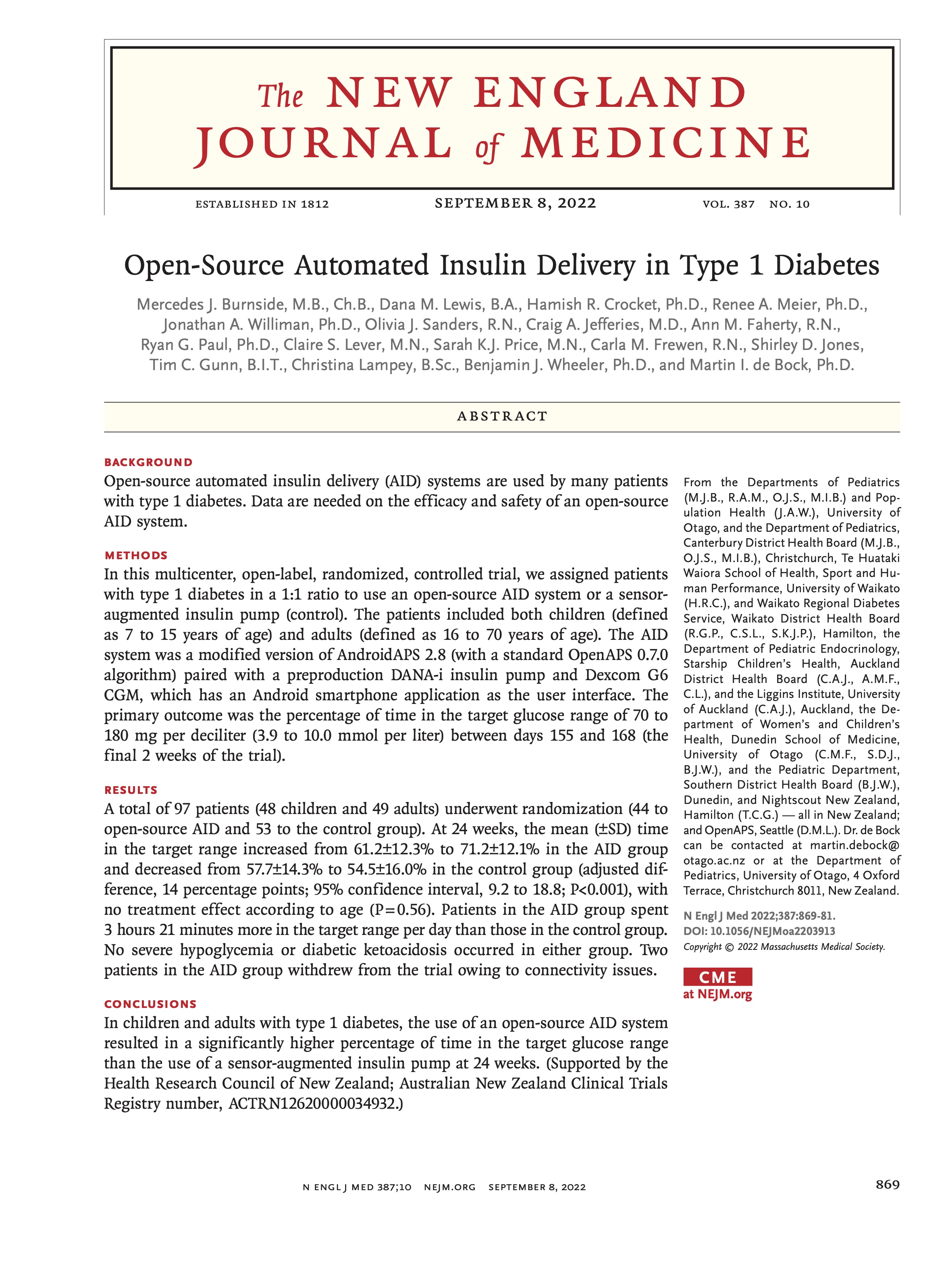 I’m thrilled to share that the results of the first RCT on open source automated insulin delivery (AID) is now published in a peer-reviewed medical journal (New England Journal of Medicine, known as NEJM). You can find it at NEJM
Recent Comments