I’ve been using Google Sheets for tracking and illustrating data for a number of reasons, such as tracking macronutrient and enzyme consumption patterns to help me understand my experiences with exocrine pancreatic insufficiency (EPI). It took me a while to figure out there was an easy way to display slope, though, to quantify what the trendline was.
Once you have a chart with your data, you can go into the “Customize” tab on the right and scroll down. Under “Series”, you can select which series you want, then scroll down and click “Trendline” to make the trendline appear. The customize menu then expands with trendline options.
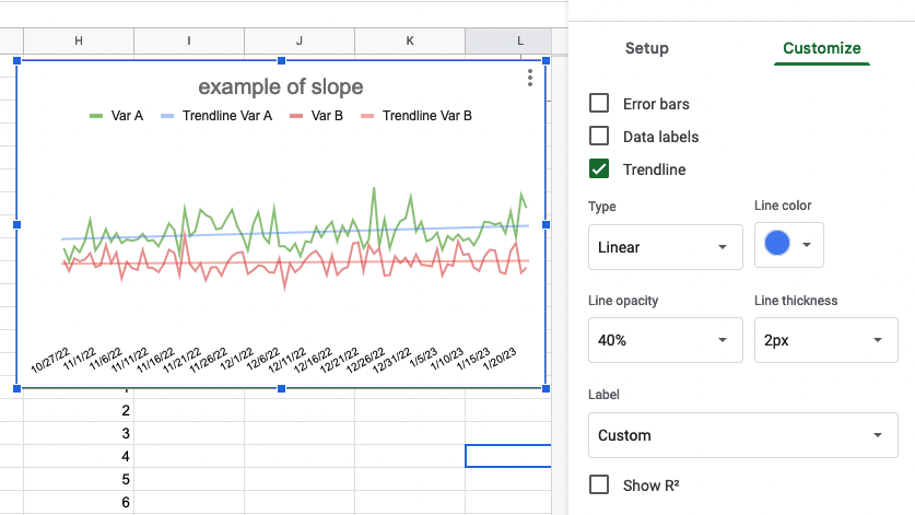
I had never noticed this before, but “Label” is set to default to “Custom”. This creates a label that defaults to “Trendline __YourSeriesName___”. In the example I’m showing here, I have series A labeled as “Var A”, so if I turn the Trendline on, it defaults to adding the “Custom” label of Trendline Var A.
But you can change this!
Click the dropdown where it says “Custom” and select “Use Equation”.
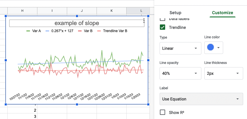
Now it will show the label as the y=mx+b equation, so you can find out the slope (m) of your trendline.
In my example this means the slope of the Var A green line is 0.267.
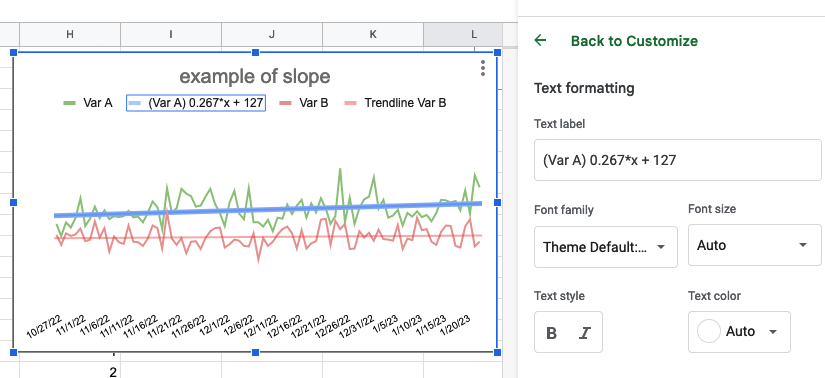
You can modify this name, though, and get the best of both worlds. Click on the equation in the legend, and you will get an editable text box. I like to put the series name (e.g., Var A) in front of the equation so I can more easily see at a glance which series trend line it is explaining:
In my particular case, I want a quick glance of the slope, so I modify mine to read (Var A) 0.267 and (Var B) 0.061.
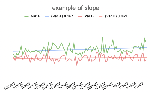
The only downside to this is the custom names will not automatically update. So if your brain can handle seeing the full mx+B equation, it might be better to leave it with the default equation as the trendline label name without modifying it at all, so it hopefully updates if you update the data on your graph. Otherwise, you’ll want to make a mental note to come back and update this manually by re-toggling the variable to equation and then editing it again to show the updated slope.