What if you could stop the spread of infection once it arrives at your house? This is easier to do now than ever before in the era of wearables like smart watches and smart rings that gather biometric data every day and help you learn what your baseline is, making it easier to spot when your data starts to deviate from baseline. This data often is the first indicator that you have an infection, even before you develop symptoms sometimes.
But, you need to know your baseline in order to be able to tell that your data is trending away from that. And despite the fact that these new devices making it easier to have the data, they actually make it surprisingly challenging to *quickly* get the new data on a daily basis, and the software they have programmed to catch trends usually only catches *lagging* trends of changes from baseline. That’s not fast enough (on either of those metrics) for me.
(The other situation that prompted this is companies changing who gets access to which form of data and beginning to paywall long-time customers out of previous data they had access to. Ahem, looking at you, Oura.)
Anyway, based on past experiences (Scott getting RSV at Thanksgiving 2024 followed by another virus at Christmas 2024) we have some rich data on how certain metrics like heart rate (RH), heart rate variability (HRV), and respiratory rate (RR) can together give a much earlier indication that an infection might be brewing, and take action as a result. (Through a lot of hard work detailed here, I did not get either of those two infections that Scott got.) But we realized from those experiences that the lagging indicators and the barriers in the way of easily seeing the data on a daily basis made this harder to do.
Part of the problem is Apple and their design of “Vitals” in Apple Health. They have a “Vitals” feature that shows you ‘vital’ health metrics in terms of what is typical for you, so you can see if you fall in the range of normal or on the higher or lower end. Cool, this is roughly useful for that purpose, even though their alerts feature usually lag the actual meaningful changes by several days (usually by the time you are fully obviously symptomatic). But you can’t reliably get the data to show up inside the Vitals section, even if the raw data is there in Apple Health that day! Refreshing or opening or closing doesn’t reliably force it into that view. Annoying, especially because the data is already there inside of Apple Health.
This friction is what finally prompted me to try to design something: if the data is there inside Apple Health and Apple won’t reliably show it, maybe I could create an app that could show this data, relative to baseline, and do so more reliably and quickly than the “Vitals” feature?
Turns out yes, yes you can, and I did this with BaselinePilot.
BaselinePilot is an iOS app that pulls in the HealthKit data automatically when you open it, and shows you that day’s data. If you have a wearable that pushes any of these variables (heart rate, heart rate variability, respiratory rate, temperature, blood oxygen) into Apple Health, then that data gets pulled into BaselinePilot. If you don’t have those variables, they don’t show up. For example, I have wearables that push everything but body temp into Apple Health. (I have it on a different device but I don’t allow that device to write to Health). Whereas Scott has all of those variables pushed to Health, so his pulls in and displays all 5 metrics compared to the 4 that I have.
What’s the point of BaselinePilot? Well, instead of having to open Apple Health and click and view every one of those individual metrics to see the raw data and compare it to previous data (and do it across every metric, since Vitals won’t reliably show it), now at a glance I can see all of these variables raw data *and* the standard deviation from my baseline. It has color coding for how big the difference is and settings to flag when there is a single metric that is very far off my baseline or multiple variables that are moderately off the baseline, to help me make sure I pay attention to those. It’s also easy to see the last few days or scroll and continue to see the last while, and I can also pull in historical data in batches and build as much history as I want (e.g. hundreds of days to years: whatever amount of data I have stored in Apple Health).
So for me alone, it’s valuable as a quick glance “fetch my data and make sure nothing is wonky that I need to pay attention to or tell someone about”. But the other valuable part is the partner sharing feature I built in.
With partner sharing, I can tap a button (it shows up as a reminder after your data is synced) and text a file over to Scott (or vice versa). Opening the file in iMessage shows a “open in BaselinePilot” button at the bottom, and it immediately opens the app and syncs the data. You can assign a display name to your person and thus see their data, too, in the same format as yours. You can hide or delete this person or re-show them at any time. This is useful for if you are going on a long vacation and sharing a house with family members, for example, and so you want to share/see your data when you’re going to be in physical proximity but then don’t need to see them after that – you can hide them from view until that use case pops up again.
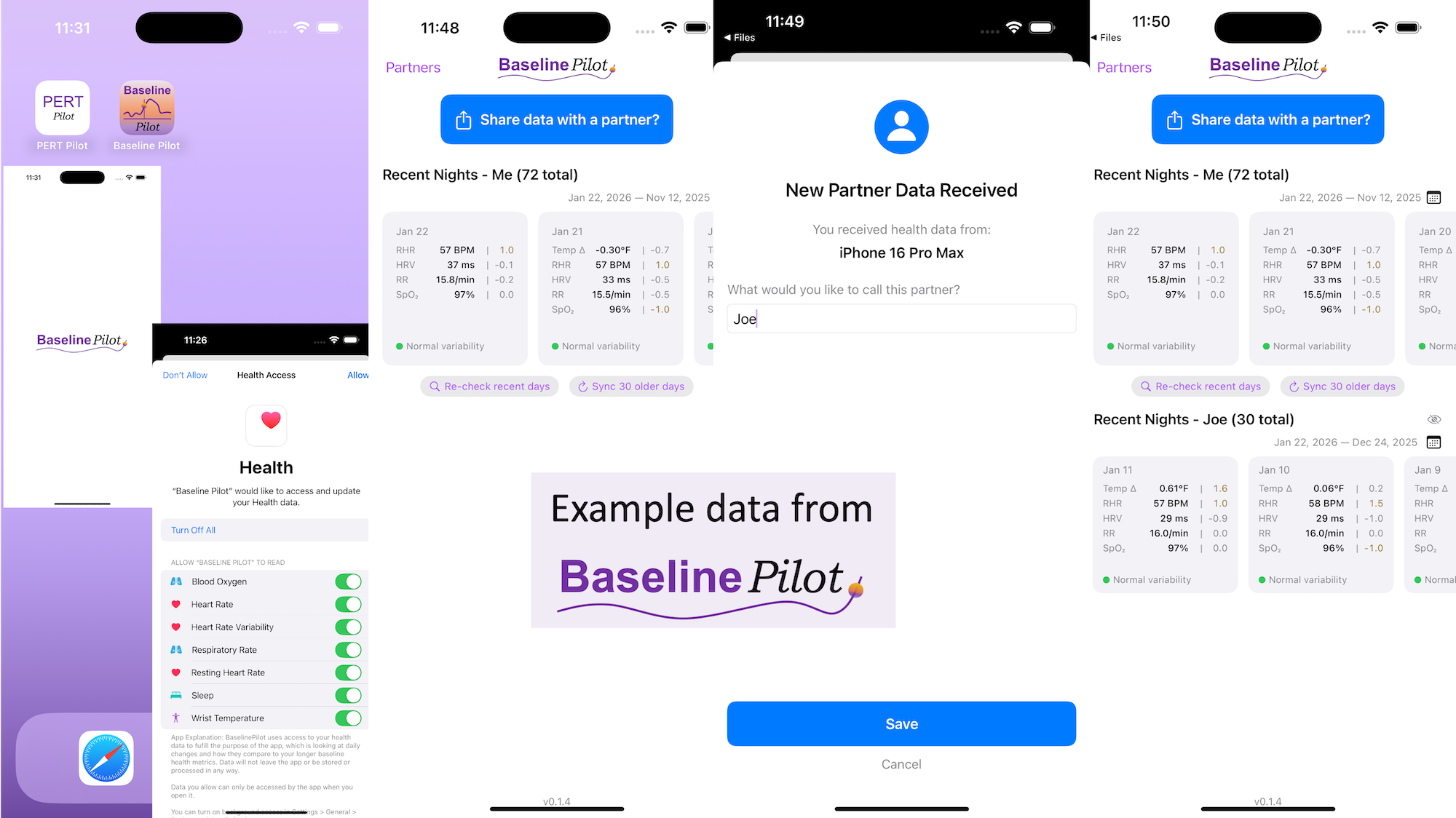
Ideally, I’d love to automate this data syncing with partners (who agree) over Bluetooth, so you don’t have to tap to share the file on a regular basis. But, that won’t work with the current design of phones and the ability to background sync automatically without opening the app, so I’ve stopped working on Bluetooth-based solutions given the technical/policy constraints in the phone ecosystems right now. Eventually, this could also work cross-platform where someone could generate the same style file off of their Android-based BaselinePilot and be able to share back and forth, but Scott and I both use iPhones so right now this is an iOS app. (Like BookPilot, I built this for myself/our use case and didn’t intend to distribute it; but if this sounds like something you’d use let me know and I could push BaselinePilot to the app store for other people to use.)
 All of this data is local to the app and not being shared via a server or anywhere else. It makes it quick and easy to see this data and easier to spot changes from your normal, for whatever normal is for you. It makes it easy to share with a designated person who you might be interacting with regularly in person or living with, to make it easier to facilitate interventions as needed with major deviations. In general, I am a big fan of being able to see my data and the deviations from baseline for all kinds of reasons. It helps me understand my recovery status from big endurance activities and see when I’ve returned to baseline from that, too. Plus the spotting of infections earlier and preventing spread, so fewer people get sick during infection season. There’s all kinds of reasons someone might use this, either to quickly see their own data (the Vitals access problem) or being able to share it with someone else, and I love how it’s becoming easier and easier to whip up custom software to solve these data access or display ‘problems’ rather than just stewing about how the standard design is blocking us from solving these issues!
What else have I built that you might like to check out? I just built “BookPilot”, a tool to help you filter book recommendations by authors you’ve already read, based on the list of books you’ve already read from your library data. If you use iOS, check out Carb Pilot to help get AI-generated estimates (or enter manual data, if you know it) to track carbs or protein etc and only see which macronutrients you want to see. If you have EPI (exocrine pancreatic insufficiency, also called PEI), check out “PERT Pilot” either on iOS or Android to help you track your pancreatic enzyme replacement therapy.